
This little story starts with my difficult relationship with Kodak Portra, but in the end, a set of photos like a lot. I never really liked this film that folks say is warm toned and, of course, should be great for portraits. I never understood why Kodak sell their good Ultramax or Gold cheaper than Portra. In order to get the colors ballanced I have to work a lot with the RGB filters in Vuescan to get an inverted positive to a basic good balance. To have a proper white point shadows seem to shift to much. Sometimes I think maybe I am kind of working against the nature of this film.
Over the years there were lots of different kinds of scanning methods and software I had tried – but in summary, for me Portra had always been the least good choice. Ok – Phoenix color film and Wolfen NC500 are even less of a good choice for me. I recognized that the first look at an image, the moment it appears on the screen for the first time as a positive, has a very strong impact on my overall feeling for the frame. If it turns out too dark or too green or what ever, I maybe react in a way of searching for a fault, with a minimal amount of flexibility for different kind of aesthetics. I am clearly not the experimental film type. The featured image, as a positive example, was shot on Kodak Gold and I had no problem to get the colors as they were naturally and/or I liked them.
But look how beautiful Portra can be in the right hands – here are 2 examples from Massimiliano Grivetti and Curtis Heikkinen both that I like a lot! So what about my results?
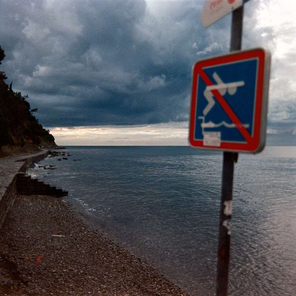
Two rolls of this expensive film were growing old in my fridge, so I had the idea to shoot one on a short trip to the Slowenian coast, where lots of sun, blue skies and the sea provide the right colors for this film, at least that was the plan. I loaded a roll into my square shooting Pentax SLR with my “custom” Nikon 28 f2.0 and was looking forward to three days of being with my partner, walking and having my eyes focused on infinity.
One thing I can’t blame on the film is that I did forget to check the battery with the effect that exposure was a little low. That sure does not help to get good results.The other thing was the fact that, the whether didn’t really show us those blue skies. When we started walking we had some hard times to keep our mood positive as we went through cold and heavy rain, but strong winds blew it away, and with our glasses dry, it was a kind of childhood-like fun to walk on and experience the elements.
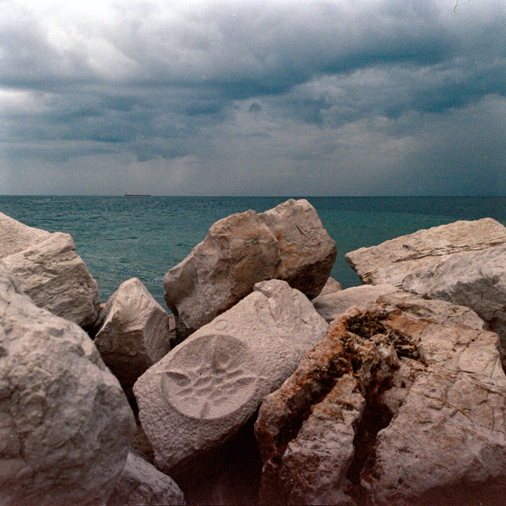
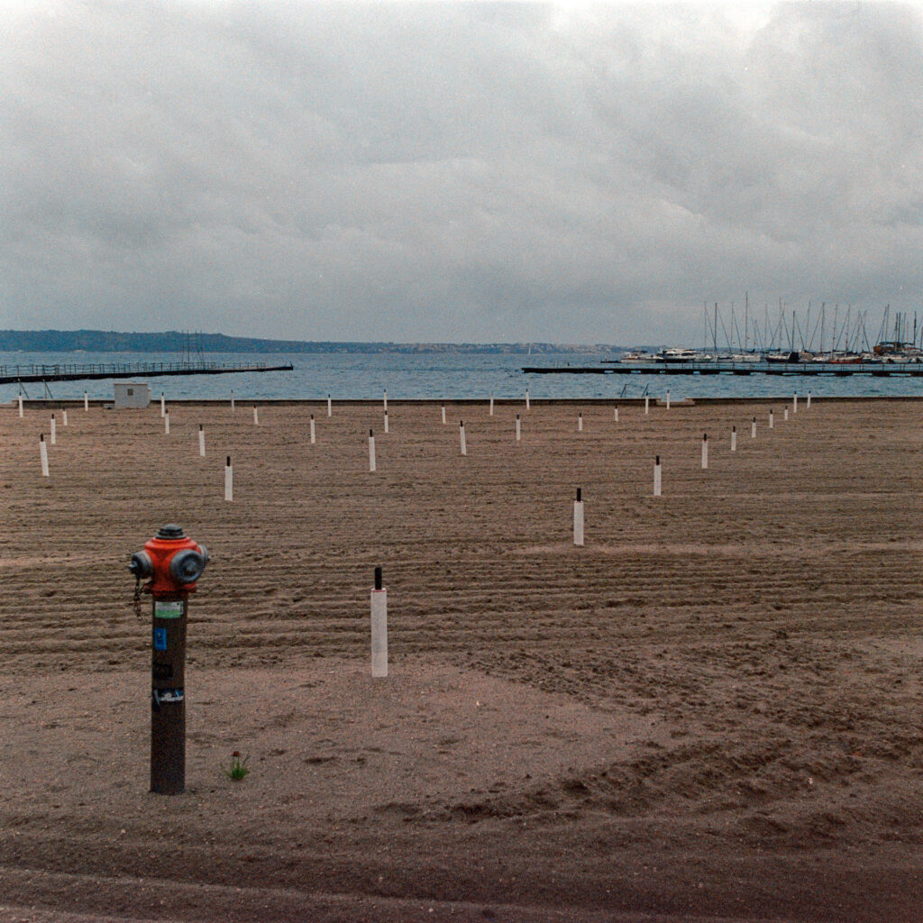
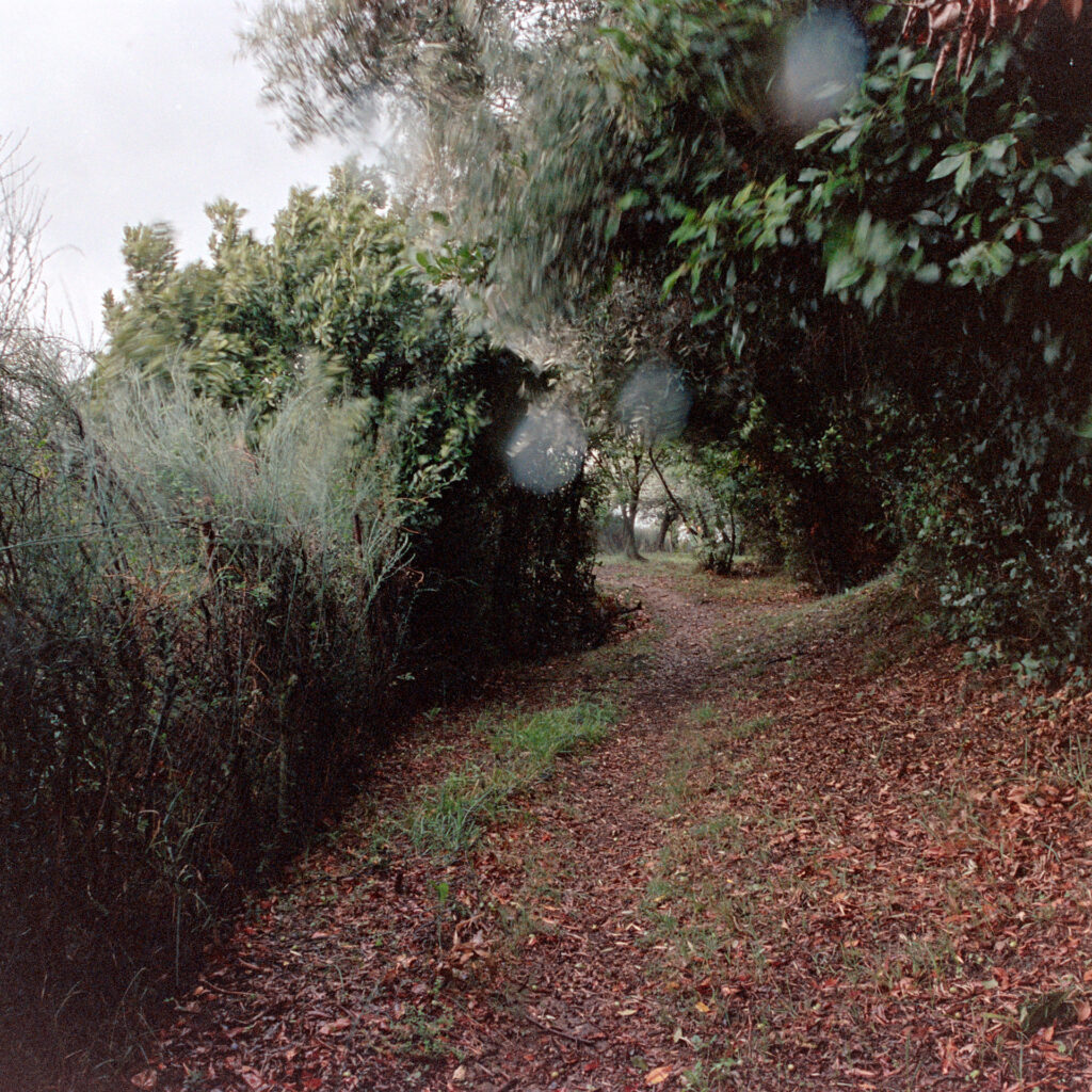
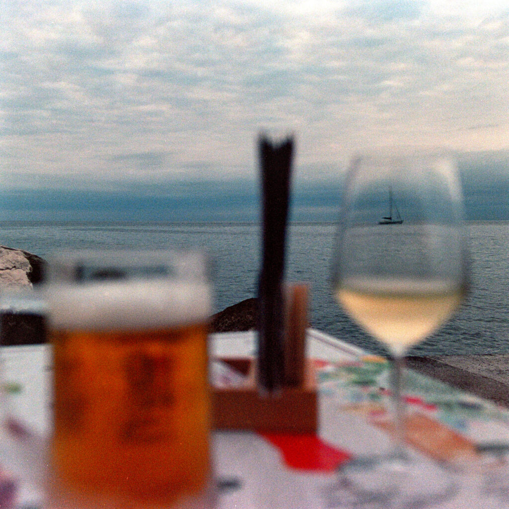
So what made me think about sharing these photos? The answer to this question seems difficult to me. When I first saw the results I had been searching for a balance of colors and white point – tried to get a good mix of natural felling and my own taste. But I was not satisfied at all. There were some mistakes that added to a suboptimal result: old Portra (but not expired), low exposure and maybe also old C41. So I went back to edit the images again on a new day and again and once more – until I began to look at the pictures themselves and let them take me there. At this point I started to like the look as it is. I remembered the beautiful day. I heard the blues.
Thank you for reading, and please be generous with my Austrian english.
Share this post:


Comments
Harry Machold on 5 Blue Frames on Kodak Portra
Comment posted: 01/04/2025
All showing us the shady side of the Slovenian coast line...
Interesting the use of the Pentax with the Nikon lens adapted...
And the final photograph leaves some hope to a nice evening..
The glasses half full or half empty; without going into that sophisticated discussion any further...
Cheers seems to me a good closing of both the photographs and the day..
Best wishes..
Harry
Gary Smith on 5 Blue Frames on Kodak Portra
Comment posted: 01/04/2025
I have only recently begun to develop and scan color negative film (3 rolls of Fuji 400). Since I never developed color negative film previously I was initially worried about maintaining the correct temperature throughout the process. Then there was the question of fiddle with curves or just break down and buy an inversion s/w tool. It seems that no matter which way you go, there is no magic answer.
Your English is certainly better than my Austrian!
Thanks for sharing your experiences with the Pentax and Portra.
Tony Warren on 5 Blue Frames on Kodak Portra
Comment posted: 01/04/2025
Comment posted: 01/04/2025
Stephen Meese on 5 Blue Frames on Kodak Portra
Comment posted: 01/04/2025
Gus on 5 Blue Frames on Kodak Portra
Comment posted: 01/04/2025
Nice compositions, the colours do communicate the mood!
Alexander Seidler on 5 Blue Frames on Kodak Portra
Comment posted: 02/04/2025