Lomography Redscale: I confess, I have been avoiding this film way too long. Weird material, I thought, will give you only crappy results. Oh, but you like orange explosions? Good for you, go ahead! – Read on to find out how wrong I was.
Using Lomography Redscale for the First Time
For my recent birthday in March, my girlfriend gifted me a variety of rather uncommon films. Among them were two rolls of Lomography Redscale in 35mm. This brought me to a short research on Instagram, which yielded quite convincing results. Definitely: I had underestimated the capabilities of this material. I liked images the most when the film was exposed rather generously – Lomography suggests an ISO range from 50 to 200. Less light gives a rather pronounced effect, more intense orange and yellow. So I fed the film into my Canon SLR and – as I preferred a more subtle effect – rated it at 40.
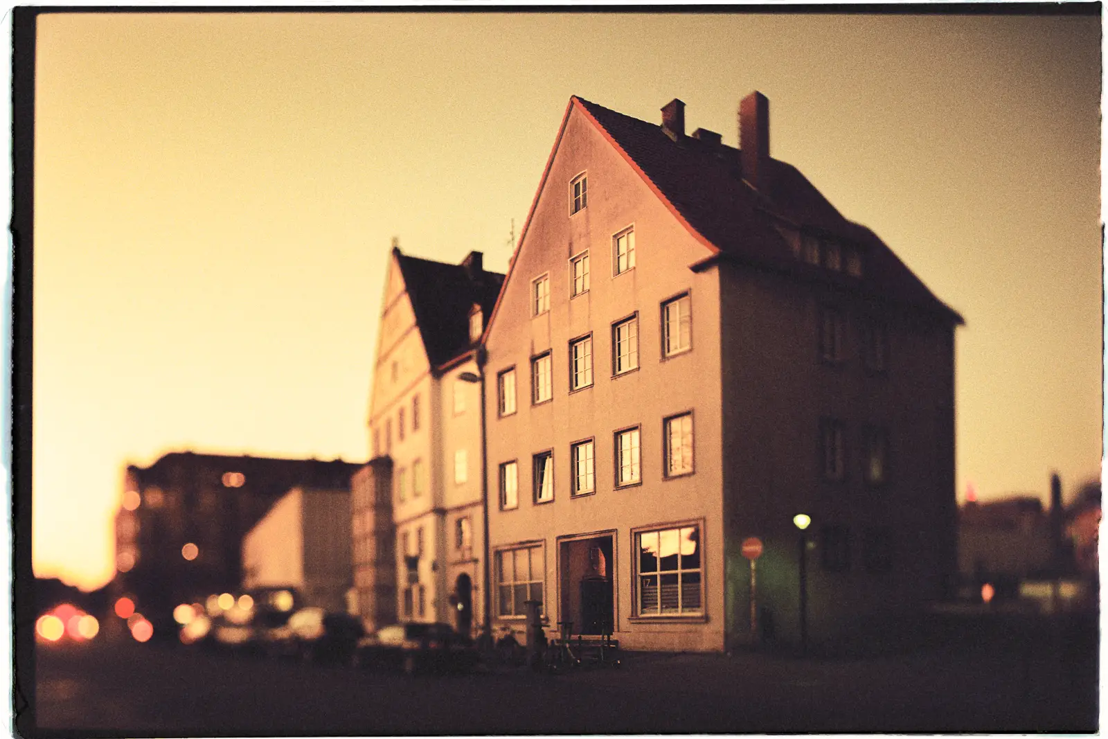
As usual with new (to me) films – and the Redscale making no difference here –, I decided to play safe first and went for some bread-and-butter subjects. In my case, this means buildings in my close neighborhood. Well, I have taken many images of these houses before – but the unusual film should provide me with a new facet of them, I thought. To further deviate from the familiar path, I planned to use the tilt function of my tilt-shift lens. Tilting the focus plane can create this miniature-world effect that was quite popular ten years ago. So I waited until the sun was about to set and made a dash.
On the Results
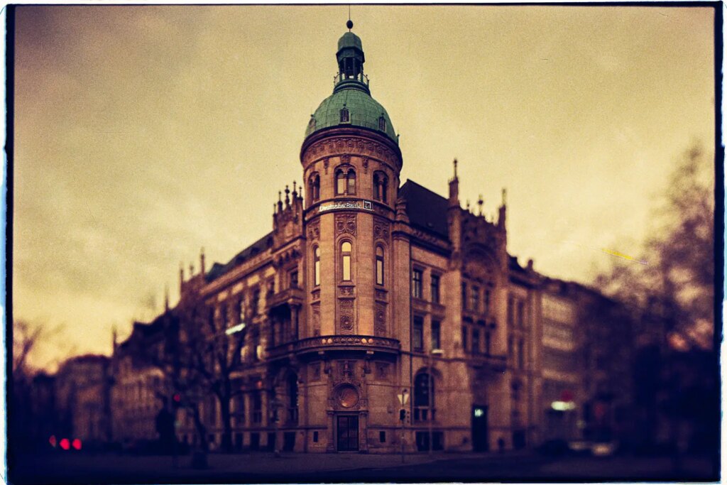
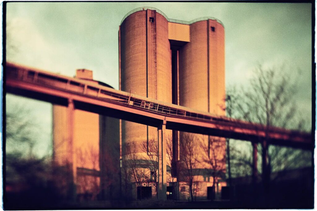
So, how did my photographs turn out? Well… Although I rated the Redscale at a rather low ISO, all tilt images appear quite dark and moody. But: I really like that! Interestingly, all regular images (without a tilt effect) turned out bright and evenly lit. The lens’ open aperture in combination with the tilted focus plane seem to cause a heavy vignette, which isn’t that pronounced with other film stocks (at least I haven’t noticed it before). Color-wise the images reveal a restraint character, as preferred.
Now I absolutely want to shoot more of this stuff! Next time, I am also going to use it under intense sun, to achieve that baking oven look. As much as I like the normal film stocks like Kodak Portra or Fuji Superia and rely on them – they tend to get boring after a while. Specialty films like Lomography Redscale let me get excited again, when my surroundings can’t. A experienced a similar effect when I shot Lomography’s Metropolis and Purple films last summer.
Images on Lomography Redscale
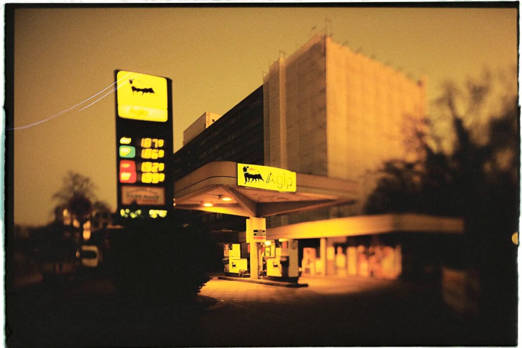
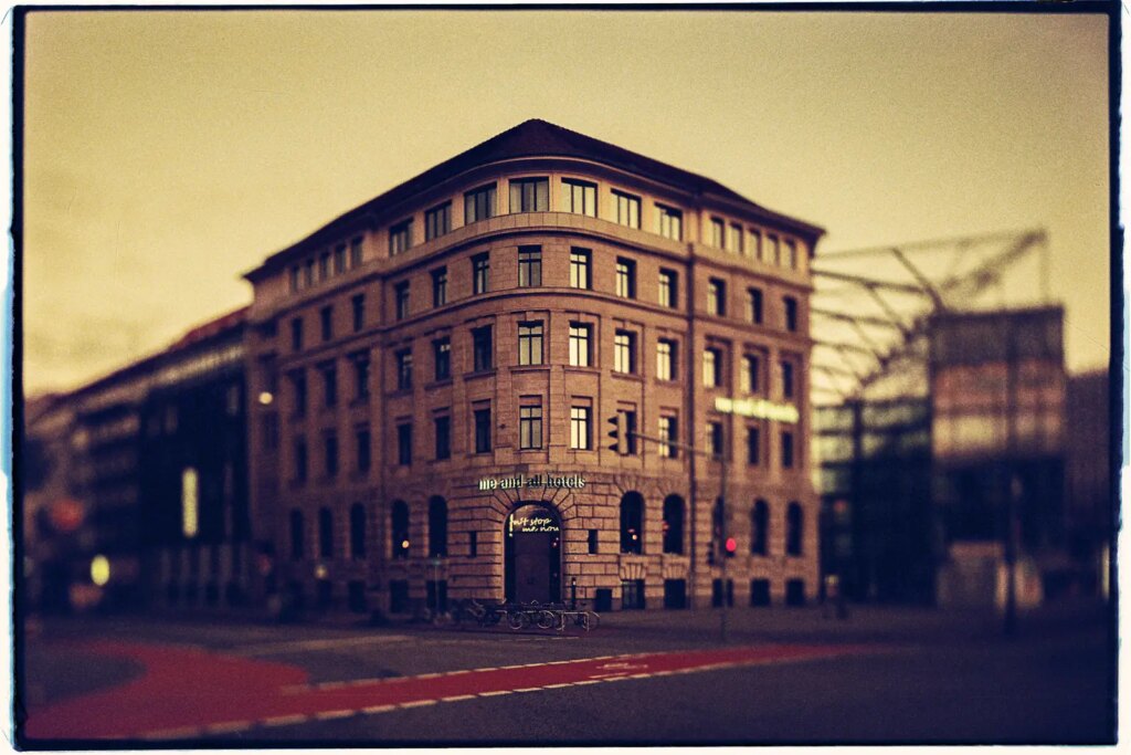
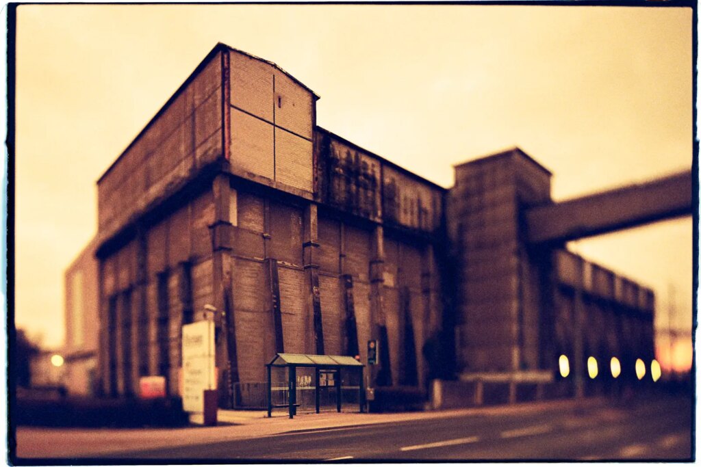
Thanks for reading!
Share this post:
Comments
thorsten on 6 Frames of Architecture on Lomography Redscale – by Christian Schroeder
Comment posted: 01/05/2022
Comment posted: 01/05/2022
Donald on 6 Frames of Architecture on Lomography Redscale – by Christian Schroeder
Comment posted: 01/05/2022
Comment posted: 01/05/2022
Terry B on 6 Frames of Architecture on Lomography Redscale – by Christian Schroeder
Comment posted: 01/05/2022
The film isn't my cup of tea, but with an appropriate subject, and I am referring to the image of the venerable banking house, the two combined have yielded a very olde-worlde evocation of late C 19 and early C 20 German architecture as though the building had been photographed back then. The somewhat severe use of swing to control focus to the very centre vertical plane has added to the impression of a very early lens, too.
Comment posted: 01/05/2022
Martin JONES on 6 Frames of Architecture on Lomography Redscale – by Christian Schroeder
Comment posted: 01/05/2022
Comment posted: 01/05/2022
David Hume on 6 Frames of Architecture on Lomography Redscale – by Christian Schroeder
Comment posted: 01/05/2022
Comment posted: 01/05/2022
Scott Gitlin on 6 Frames of Architecture on Lomography Redscale – by Christian Schroeder
Comment posted: 03/05/2022
Comment posted: 03/05/2022
Matthew Bigwood on 6 Frames of Architecture on Lomography Redscale – by Christian Schroeder
Comment posted: 06/05/2022
Comment posted: 06/05/2022