Probably the trickiest thing to do manually in photography software is to digitise a colour negative and convert it into a positive. That orange base colour can play havoc with the process.
Having switched to a hybrid analogue/digital workflow in the late 1990s, I bought a Nikon Coolscan in order to digitise my 35mm film and was fortunate to have access at work to a high quality Agfa flatbed scanner with larger format transparency capability up to 8×10.
Later on, nearing retirement, I bought an Epson 2450 flatbed which could scan transparent originals up to 5×4 and made an excellent job of inverting colour negatives. I brought this scanner with me when we moved to New Zealand from the UK in 2002 and it served me well for another 10 years or so. Sadly, it died on me and I went fully digital for a few years, a non-transparency capable flatbed serving my general scanning needs.
With film pulling me increasingly back from digital, and needing the use of older colour negatives along with newly shot stock, a means of digitising a range of negative formats from 5×4 down became a necessity. Feeling that the cost of a decent scanner just for this purpose was over-indulgent, I built a copying rig to use my digital camera and a Micro-Nikkor on adapters and tubes to do the job. It meant I would have to find a means of achieving an acceptable inversion of colour negatives in software as a result.
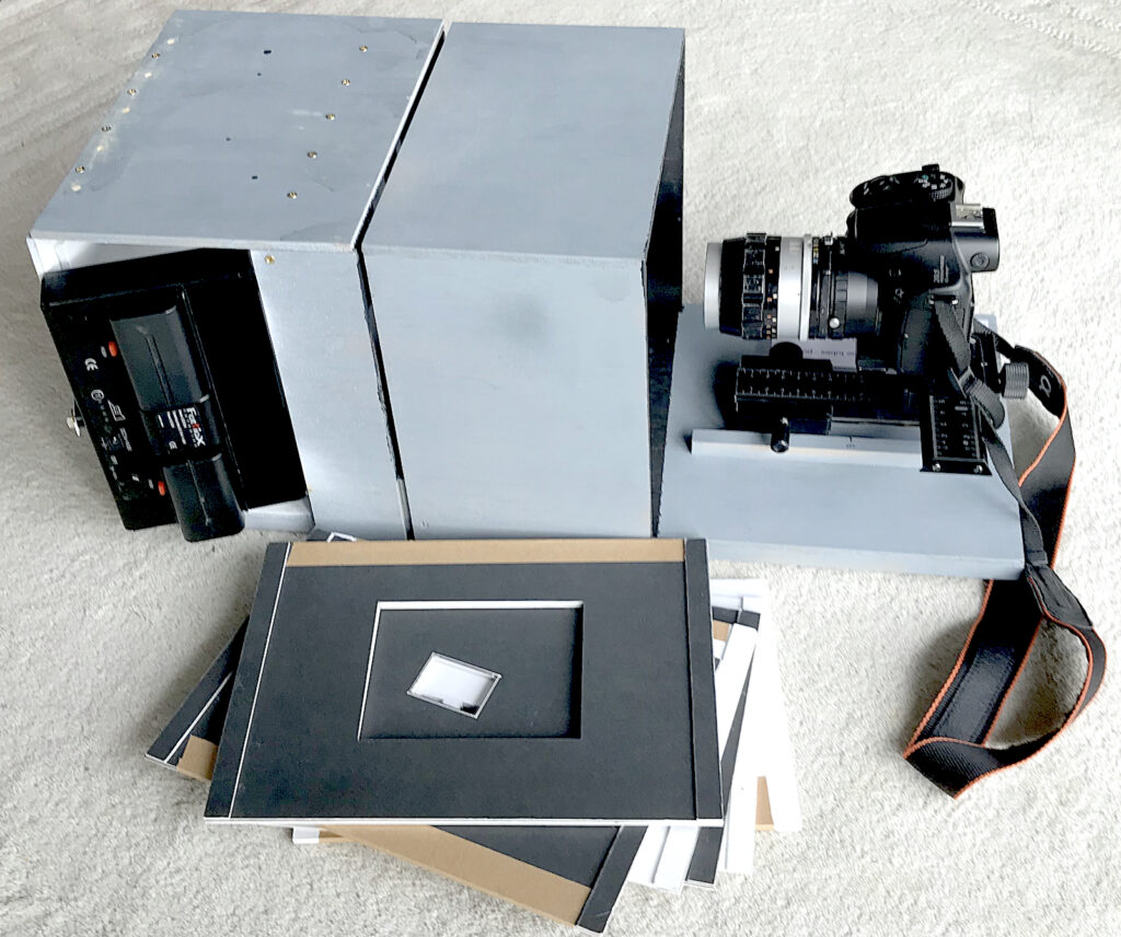
The copier has proved to be a good decision, coping with everything from 5×4 down to 110/16mm and having no problem with mono and trannies, but colour negs are a different animal altogether. I have had some success though and hopefully my findings may help others with same task before them.
File size
Files from 35mm colour originals with the Coolscan and from the Epson were around the same file size as my current copying camera produces, 20-25Mb, so all three are in the same ball park in output terms. The advantage with my current set up is that I can stitch copies of sections of an image if I need a really big file. The largest so far has been around 100MB from a 5×4. This example is from a 4-image stitch of a 5×4 FP4+ negative and a mere 40Mb.
The process
Having no problems with file size or transparencies/mono negatives the major headache was getting decent colour from a colour negative. (C41 colour printing déjà vue anyone?) It has taken a great deal of trial and error (again) plus a little serendipity for me to reach a reliable approach that works in most cases. I say in most cases because there are some negatives that seem to completely resist my efforts but there are fewer nowadays happily.
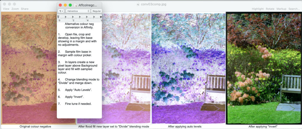
A brief summary of my journey started with my ancient G5 Apple and Photoshop Creative Suite, the original version. Here I would make sure there was some film base visible which was then sampled and used to fill a new layer, blended with the original using ’Overlay’ before merging down and inverting. Subsequent small adjustments to colour, brightness and contrast as necessary were applied for the desired result.
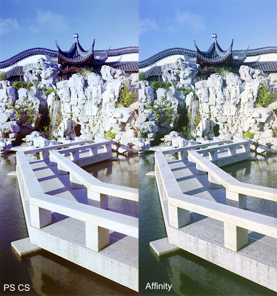
After moving to an iMac and Affinity Photo, further experimentation along the same lines from RAW files and the discovery of the’ Divide’ blend mode, better results were achieved.
These were quite lengthy processes, however, involving a fair number of stages.
Serendipity
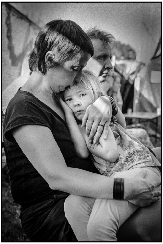
Tinkering with a colour negative one day and working from memory, I somehow mixed things up and a near perfect positive image appeared, the feature image I have used here. I checked the history and realised I had simply applied Auto-levels to the digital file straight from the camera and inverted it. Repeating it on a different file was less successful so I was intrigued to see what had made the first one so good.
This first negative was very well exposed and fully toned throughout needing no adjustment. The less successful example was a quite dense negative out of the camera, lacking less tonal or colour information.
By first making the overall density lighter with the Gamma adjustment in Affinity’s Levels, pulling up minimum density areas to just a light tint, produced a much better result. I decided this should be the first step followed by Auto-levels and then inverting before making any necessary final adjustments.
What I think is happening is that the Auto Levels command is automatically adjusting the colour of the lightest areas of the negative to appear like clear film, taking out the orange base colour. So far this method has been effective in most cases, needing very little subsequent adjustment.
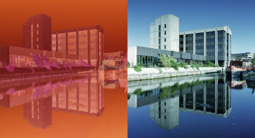
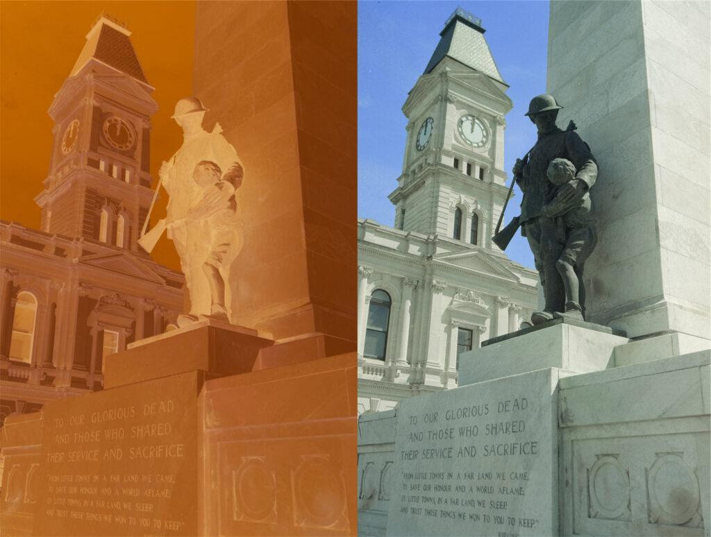
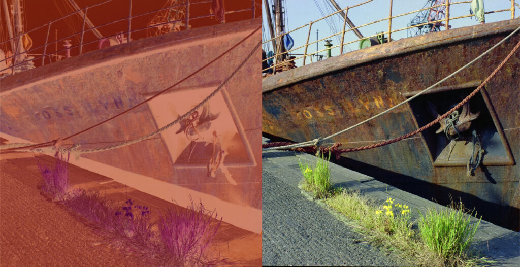
Examples
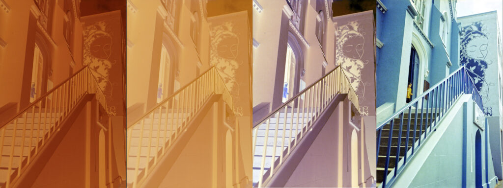
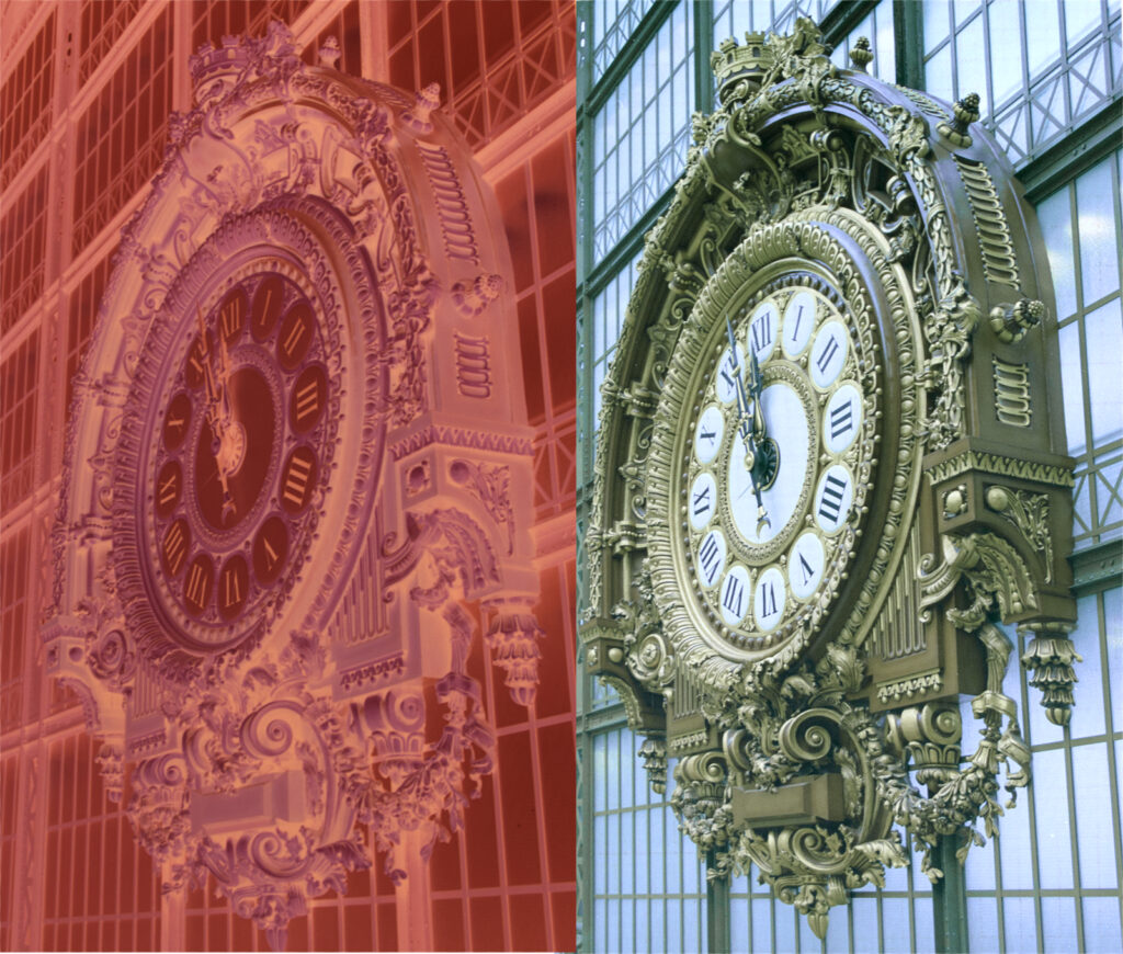
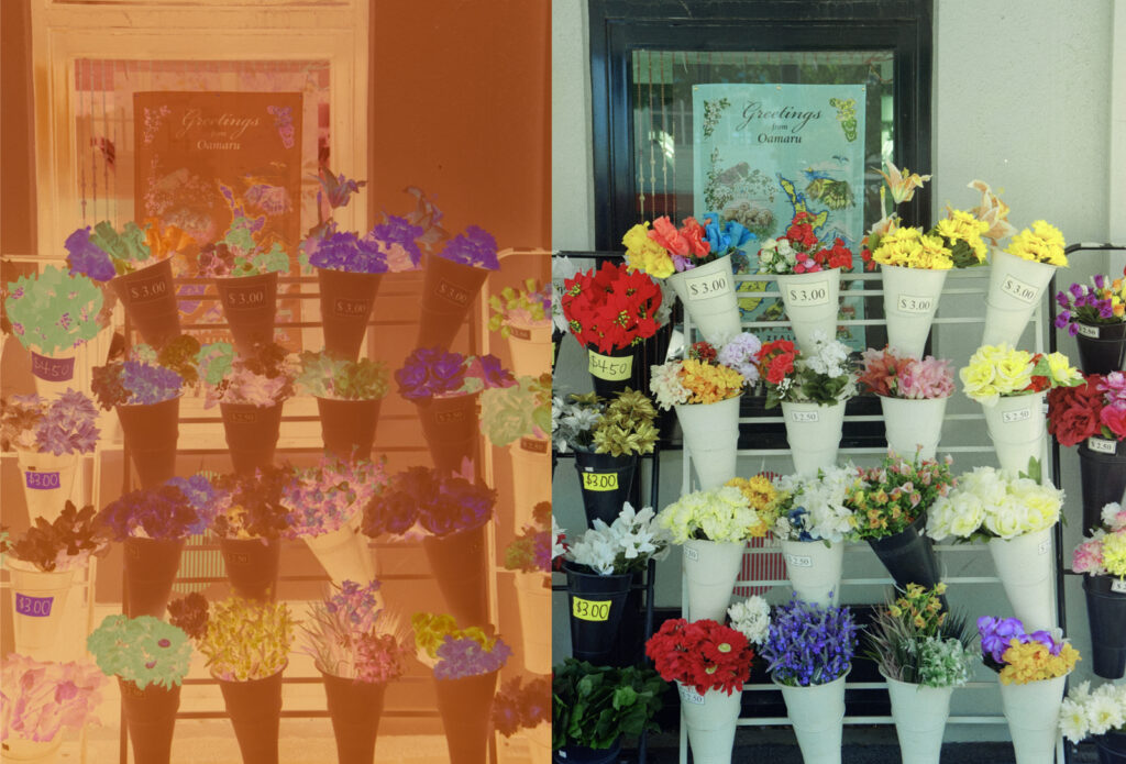
I include here a few examples alongside the negative, unadjusted, and produced using the simplified method. Some have needed more follow-up adjustment than others and this appears to be the result of negative quality and, in the case of some old negs, the base colour, but I am surmising here with no evidence to offer other than visual.
Comment
The older examples I processed using Neofin Color kits which produced a much redder base colour than trade processed ones. The station clock at the Gare D’Orsay (now the Musée D’Orsay) in Paris had a strong green cast after inversion (red complimentary?) that required far more adjustment after the basic steps and doesn’t look to have been completely removed after extensive colour adjustments. Examples from Grimsby’s docks area in the UK on the other hand were less affected, especially the last example, the rusty old deep sea trawler, the Ross Lynx, which needed hardly any later adjustment. So I’m afraid this isn’t the silver bullet proving there’s no such thing as a free lunch for sure. But it has brought me to a much more reliable base point in my workflow with colour negs.
This really has taken me back to the early days of home processed and printed colour negative. It was really frustrating learning a process that demanded considerable investment of time and resources back in the ’70s and ’80s. And however systematic you tried to be there was always the odd rogue to throw you a curve ball. Thankfully, digital has made things so much simpler these days with much less waste of anything more than time. Even the curve balls are less curly.
Share this post:


Comments
Gary Smith on From Negative to Positive in Colour – My Experience & Workflow
Comment posted: 04/10/2024
Comment posted: 04/10/2024
Rich on From Negative to Positive in Colour – My Experience & Workflow
Comment posted: 04/10/2024
--Rich
Comment posted: 04/10/2024
Doug Anderson on From Negative to Positive in Colour – My Experience & Workflow
Comment posted: 04/10/2024
Quick Color Negative Film edit in Affinity Photo: https://www.youtube.com/watch?v=hbZHUGLsa7w
Comment posted: 04/10/2024
Comment posted: 04/10/2024
Comment posted: 04/10/2024
Jeremy on From Negative to Positive in Colour – My Experience & Workflow
Comment posted: 04/10/2024
I use a product called Negmaster BR (one-time $80), which integrates with Adobe Bridge (free), to bulk invert very quickly and then I finish in DxO Photolab. I like Negmaster because it doesn't seem to matter how bad I mess up a negative, is pops out a solid baseline inversion almost every time. I've used Silverfast Negafix, Lightroom with Negative Lab Pro, Filmlab App, and cooked my own profiles. They all just struggled on a regular basis. Now I have no monthly charges and I spend very little time futzing fixing colors and such. I use an Easy35 adapter for the 35mm and half frame, a Blackscale Labs rig for medium format, and I still fall back on an Epson for 4x5. I got lucky and picked up a used Kinetronics Staticvac too, so I don't miss ICE dust removal.
Comment posted: 04/10/2024
Ulrich on From Negative to Positive in Colour – My Experience & Workflow
Comment posted: 05/10/2024
thanks for sharing your experiences ! I may have a thought on what your comment that your process works well except for some particular negatives.
I‘ve tried some negative scanning by camera and conversion using an often recommended white balance operation to remove the orange mask. I observed some weird color shifts which got me more interested in the infamous masking topic. I understood that the orange mask has no constant color and density on the complete film but rather depends on the local cyan and magenta negative image densities. This used to be a necessary evil in the negative film chemistry foundations to overcome imperfect color sensitivity separation of the available color couplers. There is interesting, very detailed (and complicated) information mainly by Kodak on the web (if someone has time and much interest).
Therefore, the inverting software needs to consider this behavior of individual films. Scanning software like Silverfast likely has it (with individual film profiles). I approached some software contacts, but only got reply from Nate from Negative Lab who says it is covered there.
One thing I planned to try for my own process, was to build a Lightroom profile by taking a color negative picture of a sophisticated enough color target and photograph this negative with a digital camera. I was going for ColorChecker target and the ColorChecker Lightroom profile creator tool. If I would then take images in the same environment where I took the picture of the negative target image, I would assume the profile would reproduce exactly the target. Since the target holds a good selection of the relevant colors, I would assume the mapping works for the inversion of all other images of that particular film as well. I have not yet found the time to try this further but will likely proceed when I retire end of next year.
Not sure if that helps at all,
Ulrich
Comment posted: 05/10/2024
Marco Andrés on From Negative to Positive in Colour – My Experience & Workflow
Comment posted: 07/10/2024
https://www.alexburkephoto.com/blog/2019/10/16/manual-inversion-of-color-negative-film
This removes the affect of the base (unexposed) layer. He has additional tips for modifying the rgb vzlues.
I use Gimp, a free open source image manipulation program:for a variety of operating systems.
https://www.gimp.org/
Comment posted: 07/10/2024