Have you ever thought that everything you wanted to say could be printed on one page? Now you can do this with a zine.
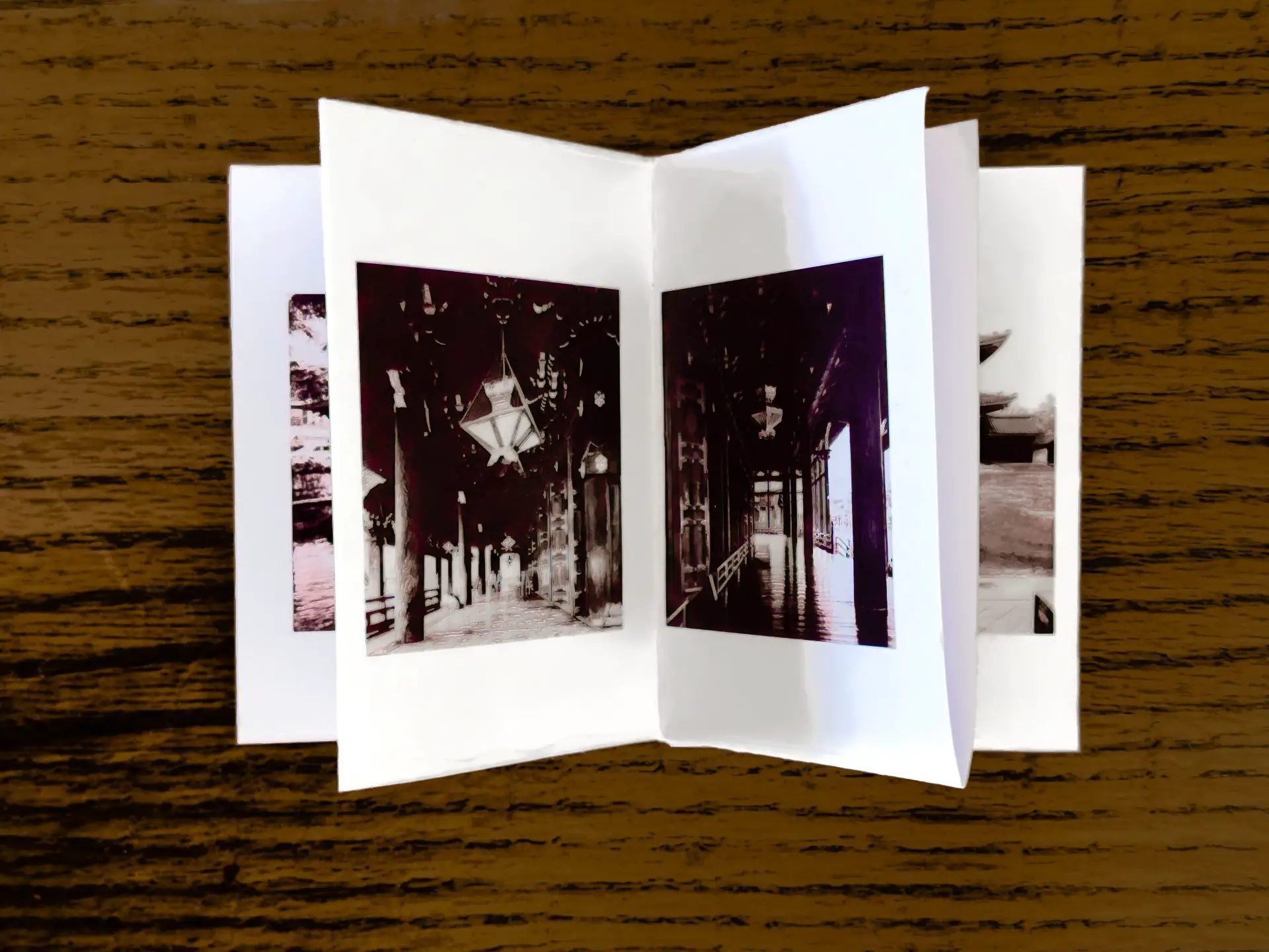
I have come across concepts for a one page zine several times, but never attempted one myself until recently. These zines are printed on a single sheet of paper, but with clever cuts and folds that morphs that one paper sheet into a multipage publication, albeit in a much smaller final size. There are various formulas for doing this, and I will show you the one I used.
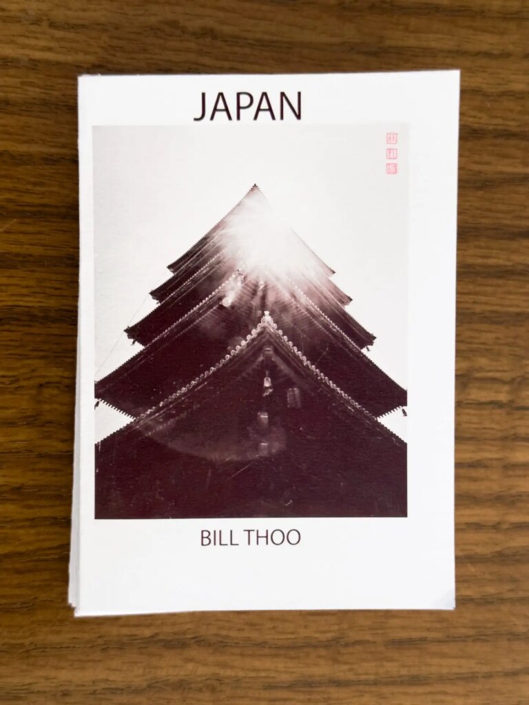
I found my template for a 16 image “one page” zine here: anatomicair.com/how-to-make-a-one-page-zine, but I have modified the template for my own use. The direction of the paper folds and the placement of the cuts are critical to the zine folding together, but if you get this right, it will almost fold by itself into the zine booklet.
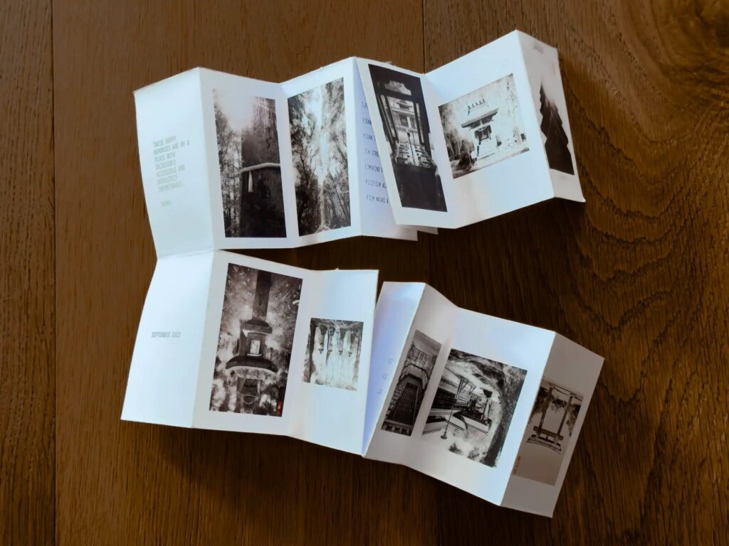
The other important information is the orientation and sequencing of the images. The generic template explains very well what direction the images should face and in what order they will appear once the zine is folded. For my zine, instead of 16 images I included 24, and in addition I used the remaining panels for text that could be accessed by opening the zine vertically from the “front” and from the “back”. To understand the orientation and sequencing of these images I made a mock version of the zine out of a blank sheet of paper to create my own template. I made the correct folds and cuts, and then folded the zine into the booklet. I then wrote on the blank pages, labelling the front and back “cover”, and then numbered each page and indicating whether it was a photo page or a text page. When I then opened up the zine back up into a single page I had a labelled template to work off utilizing all the panels.
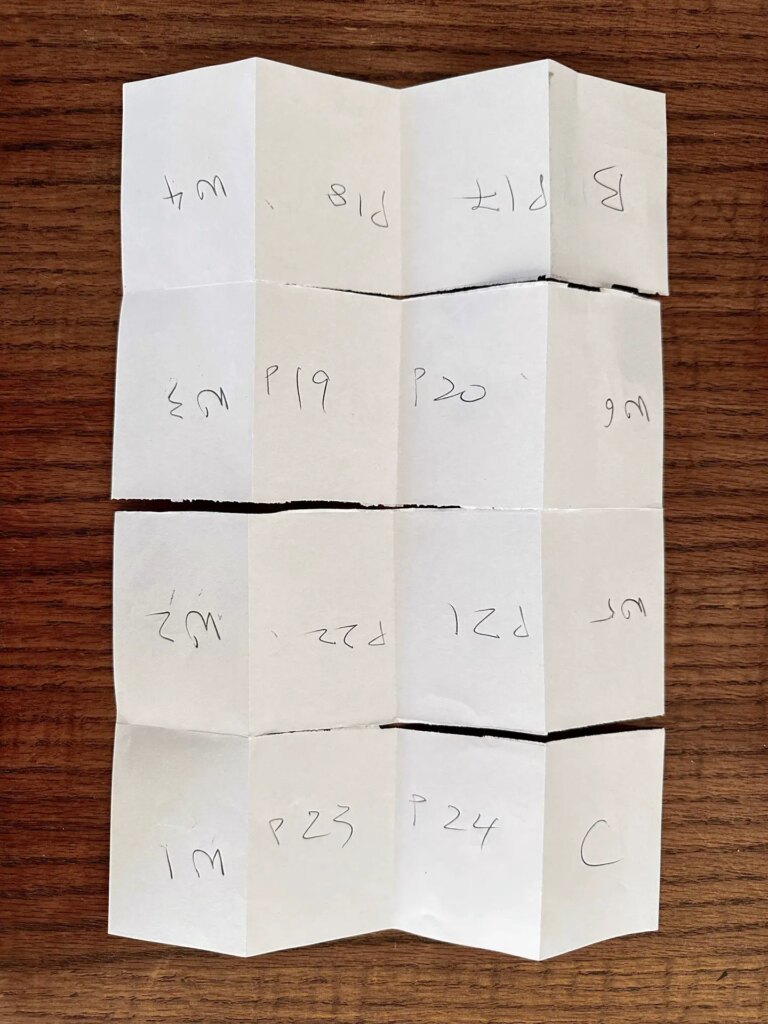
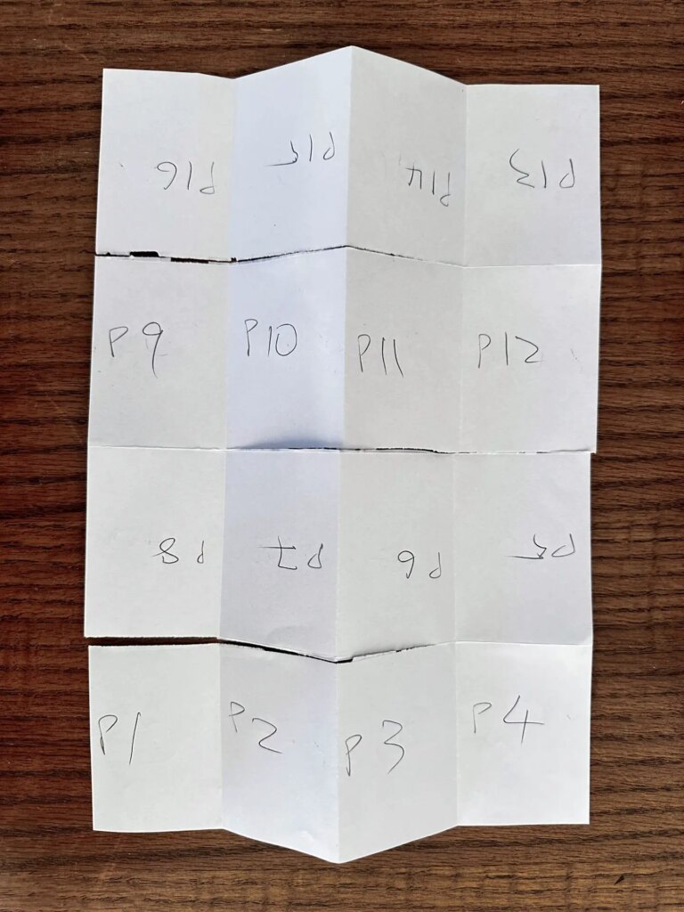
The next step is finding a way to format a document so you could print the one page zine. I use Adobe InDesign so it was relatively straight forward to create a document template that divided a page into 16 rectangles which I could populate with images and text in the correct orientation available for printing. You could do the same manually in Photoshop. For a 24 image “one page zine” you need to remember that you are printing the sheet on both sides, so you need two pages formatted.
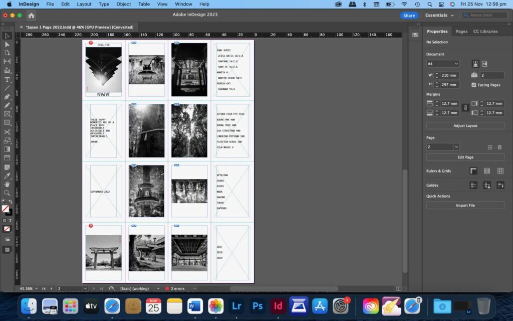
There are also paper choices to make. What size printer or prints do you have access to? What size zine do you want? For an A4 sheet the final zine dimensions are 5x8cm, and for an A3 sheet it is 10x16cm. Are you printing double sided? Then you will need double sided paper. Is the paper thin enough that images will bleed or show through the back? Not desirable for two sided printing. Is the paper so thick that it will be difficult to fold?
I chose double sided matte paper for my A3 size zine. It prints beautifully, but it is a little thick for fine folding, but the images are gorgeous. Plain A4 printing paper makes a cute little booklet that is easy to fold and with no bleed through, but the prints lack a certain quality. I’m sticking with the double sided matte, but it would be too difficult to fold in any size smaller than A3.
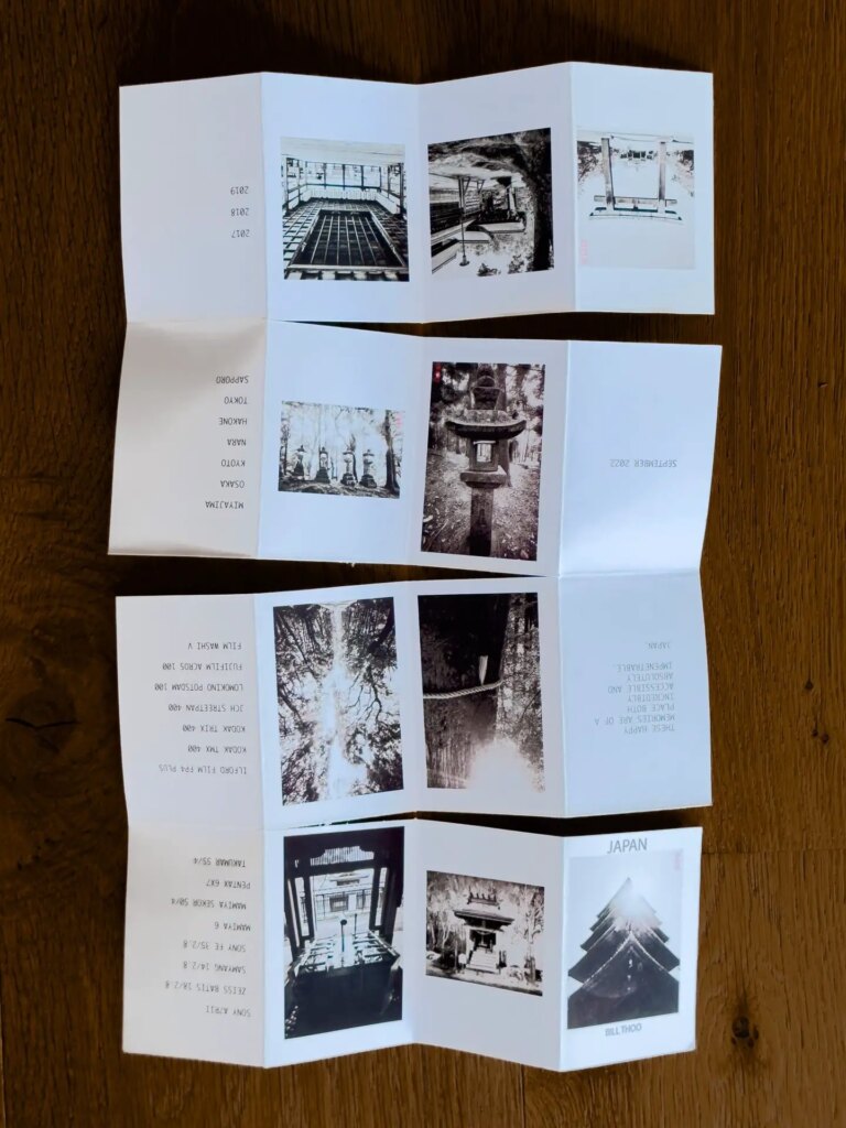
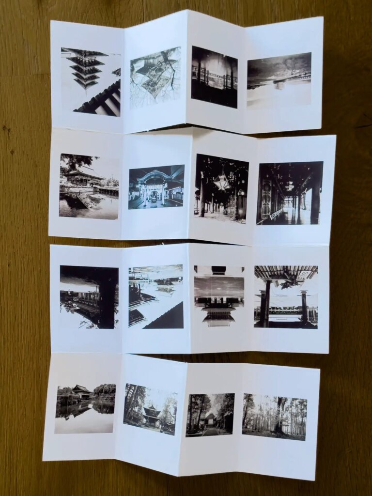
The final step is making creative choices about images and text. The publications are physically small. I figured the images needed to be relatively graphic and blocky for impact, but with just enough detail for interest. I was thinking more like what would work on social media consumed on a phone, rather than what would work as a large print or on a big screen. There are also the usual decisions about sequencing, and then what text would accompany it. I think the process of considering these choices is the fun part of zine making.
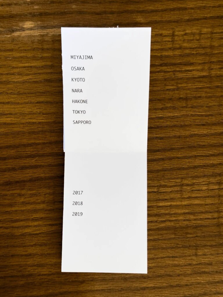

And there you have it, a zine booklet from a single piece of paper. It is easy enough that you could make hand illustrations or comics, short story books, glued images, or any sort of small multipage publication with it, and it would be a perfect children’s project (with help from the adults for cutting). And there are other ways of formatting and folding a one page zine that may suit you better. I was intrigued by a template that allowed for an eight page zine on one side, with the possibility of using the back for a single full page print.
I can’t wait to see what you all do with this.
You can find me as part of the Pixels and Grain Collective https://pixelsandgrain.photo.blog, on Mastodon at https://mastodon.art/@Billthoo, and Instagram.com @billthoo.
Share this post:




Comments
Erik Brammer on One Page Zines – By Bill Thoo
Comment posted: 05/01/2023
excellent idea! Need to try this on an A2 sheet of paper at some stage - first need to get duplex printable sheets. The A-series having the big advantage that the page height vs page width ratio is always SQRT(2).
Another cut and fold pattern for a 16 page signature can be found here:
https://clearimageprinting.com/inc/2016/03/21/what-is-a-print-signature-an-imposition-and-a-spread/
This company didn't invent this, but I can no longer find the website of those origami folks where I first saw it. This cut and fold pattern keeps better consistency of the printed sheet, I think.
Best regards,
Erik
Comment posted: 05/01/2023
Karen on One Page Zines – By Bill Thoo
Comment posted: 05/01/2023
I assume you folded the paper first and then cut it after with a knife? Any tips on the cutting and folding for those of us that would like to try it?
Thanks so much for the article.
Karen
Comment posted: 05/01/2023
DeeDee Yelverton on One Page Zines – By Bill Thoo
Comment posted: 05/01/2023
Comment posted: 05/01/2023
Bill Brown on One Page Zines – By Bill Thoo
Comment posted: 05/01/2023
I would have liked to see a ruler next to the paper so I could understand the scale. A burnishing bone with a crisp edge really helps with scoring and an exacto knife with a #11 blade LIGHTLY run over the burnished line helps to ease a fold.
Thanks for the story.
Comment posted: 05/01/2023
Billy Sanford on One Page Zines – By Bill Thoo
Comment posted: 05/01/2023
Comment posted: 05/01/2023
Kate on One Page Zines – By Bill Thoo
Comment posted: 25/01/2023
Comment posted: 25/01/2023