It was Hamish’s piece on the Plaubel Makina and Agfa 1035 that finally pushed me into typing my thoughts about a camera with a not dissimilar design ethos. I hope it doesn’t trouble any readers to discover it is a digital camera that wasn’t particularly successful and belongs to a camera line that is now discontinued.
The camera is the Nikon 1 V1, the debut camera and flagship of Nikon’s much heralded 1 series of digital cameras, a camera line that wasn’t quite what photographers were expecting.
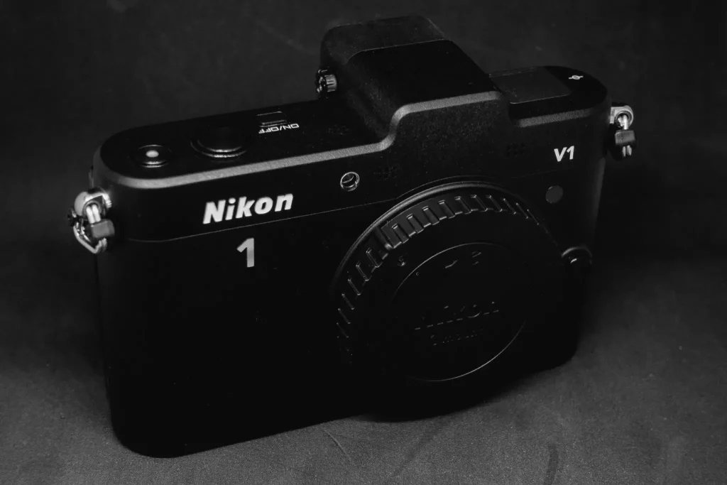
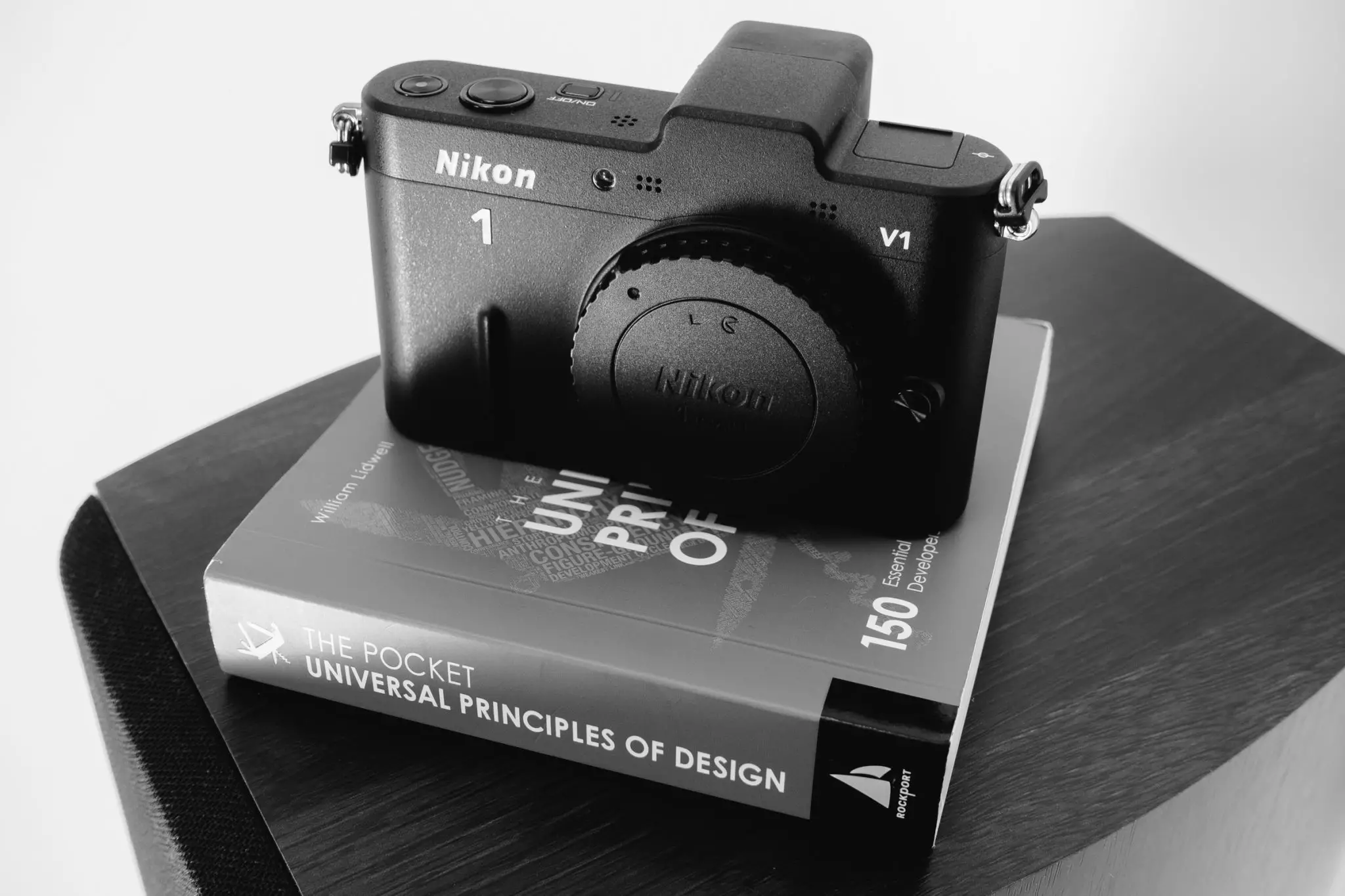
Ah, the V1, what a beauty! Seemingly hewn from a chipped off block of TMA-1, the black crystalline monolith from 2001: A Space Odyssey. Look at the clean line of the top; the shutter, power button and record buttons all recessed like the LED spots in the ceiling of a modernist interior. Run your eye over the raised line on the front (the suggestion of a grip), through the number 1 and the ‘k’ in Nikon and right across the middle of the shutter release. Look how the four buttons compliment the circular multi-selector dial by their shape. Lovely. Check out the slightly textured matt paint finish, designed to reflect precisely nowt. Modest. Understated but purposeful looking. It’s the essence of anti-bling.
It looks like no other interchangeable lens camera Nikon was producing at the time, and nothing since. Their DSLR’s looked like their late film SLRs, and 7 years on they still do (apart from the obese FE-alike). The V1 seems to hail from a different school; it looks to me like a homage to the German modernism movement born in the inter-war years – it’s straight outta Weimar.
I am sure you know about Bauhaus, the art school that has had a profound effect on how our world looks, whether it be interiors, buildings, art, graphic design or typography. Whether consciously or not, Nikon made a camera whose design salutes the achievements of Bauhaus. But it doesn’t stop at functional design. The V1’s menu system too is a little different to the regular DSLR menu system font, and the colour scheme is monochromatic with a splash of pale yellow.
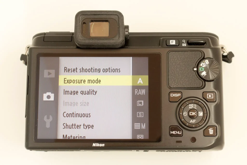
So here we have a picture taking machine wrapped in a functional design. No shiney chrome or faux leather. No looking like the 60’s just for the sake of it. By the way, did I just write ‘picture taking machine’? Hmm, thought so. This is where Nikon’s stealth camera, that probably doesn’t show up on airport scans, starts to go a little birne-shaped for me. It looks great, it feels great, but as soon as you want to change settings you run into trouble – major cognitive friction. Let me illustrate.
Camera mode dials are designed to help both beginners and experienced photographers find where they want to be. For beginners, automated modes are represented by universal icons. They are independent of language. Advanced modes (or normal exposure modes to regular photographers) are shown with abbreviations – the very familiar MSAP. On my Sony RX100 III mode dial, I see this mix of icons and abbreviations. When I bought the Sony camera I instantly knew what each mode was and what I could do with it. I didn’t have to consult the manual. People the world over know what these represent. You want to take photos in aperture priority? Well, turn the dial to A. You want the camera to do all the thinking? No problem, choose P for Program. You want the camera to do even more thinking? That’s the green camera icon. These symbols and abbreviations are universally understood. They are bedrocks of sound user experience design. Meddle with them or remove them at your peril.
Well, Nikon meddled.
Imagine changing the universal no entry sign on a public road to something else that nobody understands, or (and this happens) meddle with the signs at a themed restaurant for mens and womens toilets? At the least, the outcome is embarrassing. Nikon obfuscated the hell out of the V1’s mode dial. Take a look at the exposure mode dial and see why; only 4 modes and all icons. I only recognise two of them – the green camera icon is a stills mode and the cine camera icon is, well, video. With the green camera icon, Nikon changed what the symbol means from the largely understood automatic mode into a general stills photography mode with many options in the menu.
What is that first symbol? What does it mean? Is it an eye or a leaf. What’s the white camera with a plus sign icon mean? Then you try the eye icon (motion snapshot) mode. Hey presto! Your WTF moment arrives – congratulations, you just made a video with some elevator music slapped on it. Why, Nikon why? Why did you deem this fluff ‘feature’ so important?
And why no MSAP? There is acres of space left on that mode dial. It’s roughly two thirds blank. How much would a fully functional mode dial have improved this cameras usability? I will answer – by a very large amount.
The white camera with a plus sign mode apparently plucks choice frames from a fast burst of 20 frames at 30 feet per second. I have never used it. Admittedly, it is amazing technology that still impresses 7 years later, but it’s an assistive technology surely. It isn’t why anyone buys a camera. Video and associated whizz bang technology feature far too prominently in the easy to reach functionality of the V1. They neglected experienced stills photographers. Apparently, this camera wasn’t made for them. So, who exactly was it made for?
It turns out, based on research, Nikon discovered a new class of person who they expected to buy and use the camera – the compact camera upgrader who didn’t want a DSLR because they felt intimidated by them. Unfortunately for Nikon, the compact camera upgrader who didn’t want an SLR either didn’t exist, or they chose the iPhone instead, and the stills photographer who really fancied the V1 was dumbfounded by its video first functionality.
Mix a high asking price for a camera aimed at beginners and the ‘intimidated’ with an aesthetic design aimed at the higher end, and you get a product with an identity crisis.
Ah well, I still like the thing.
Lovely to look at and hold. It’s a great street camera when you get your head around its stills mode. One innovation that works for me is the lever for changing aperture. It swaps to controlling the shutter speed when you change to shutter priority, but you have to go into the Menu to change modes.
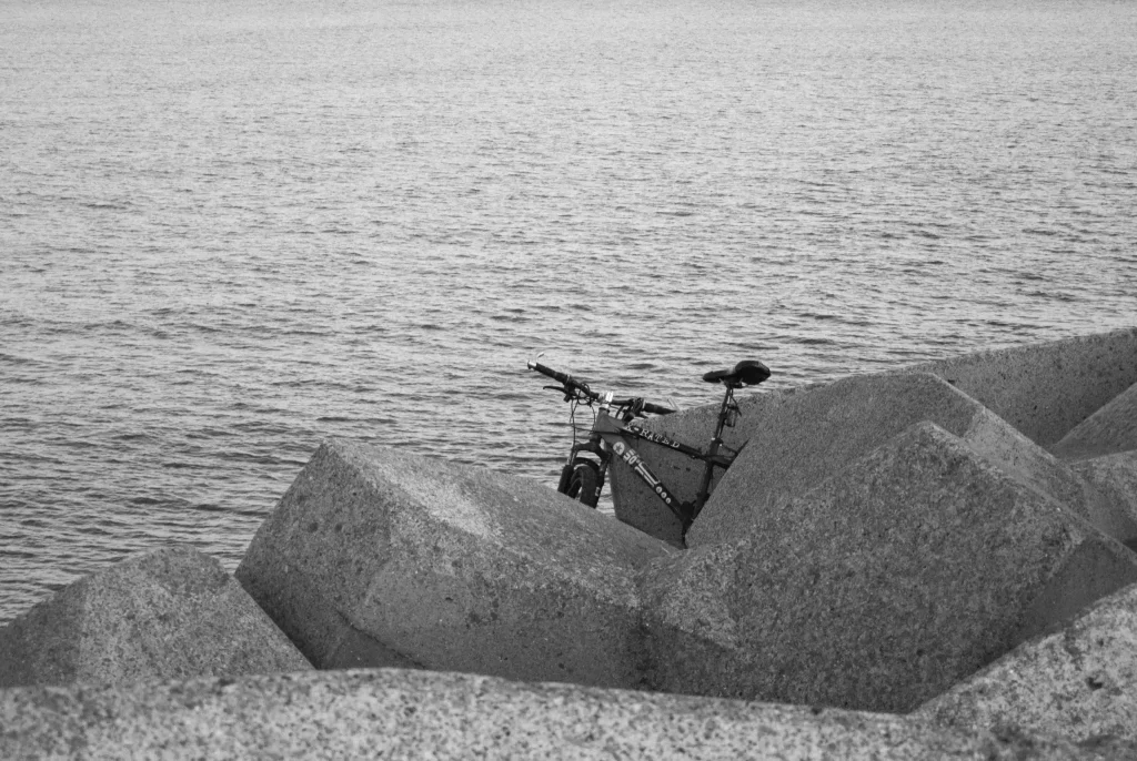
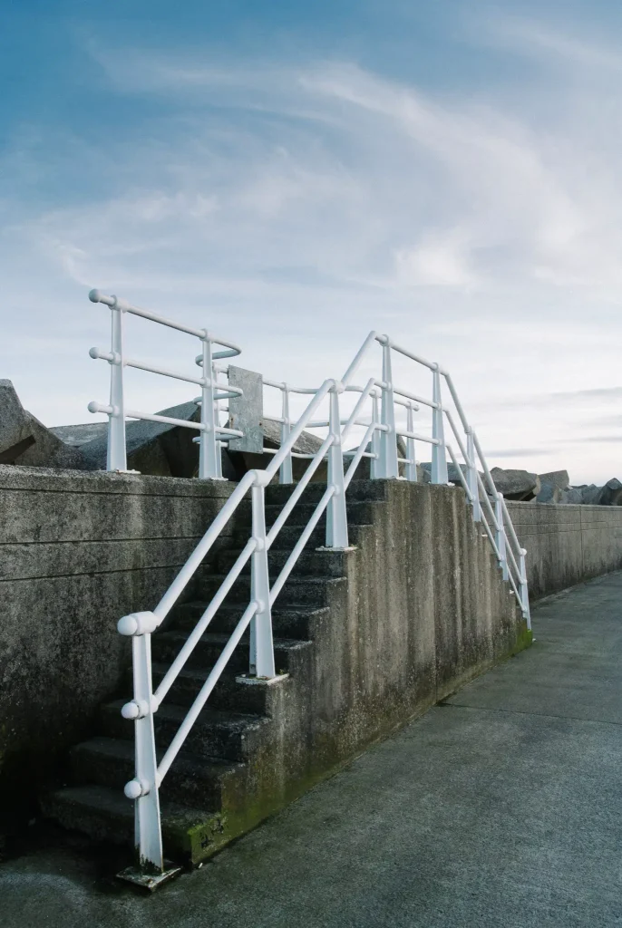
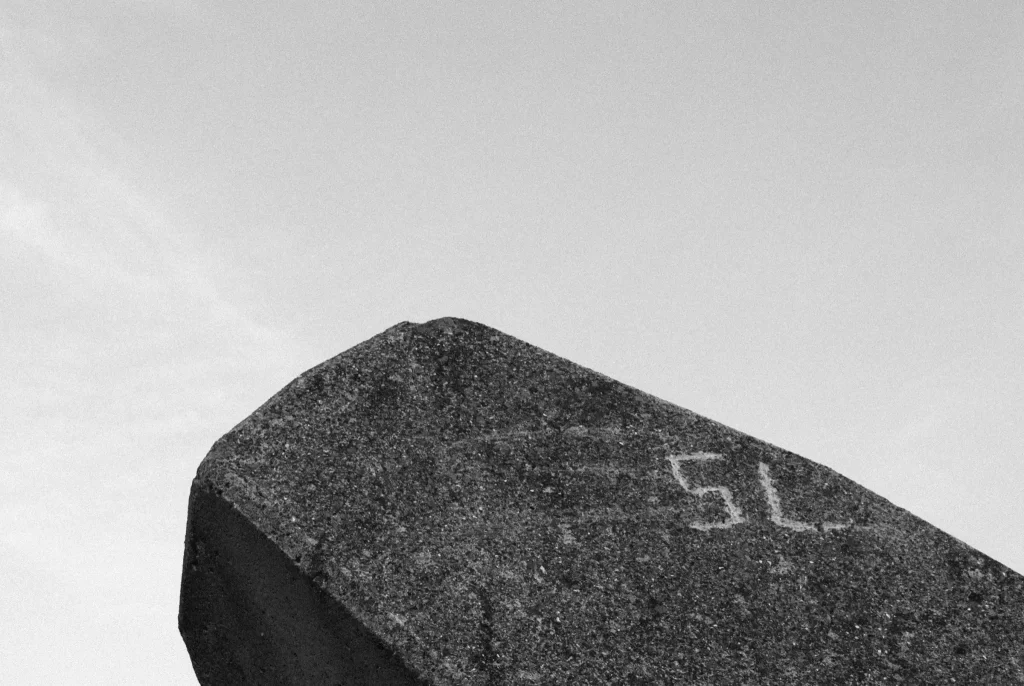
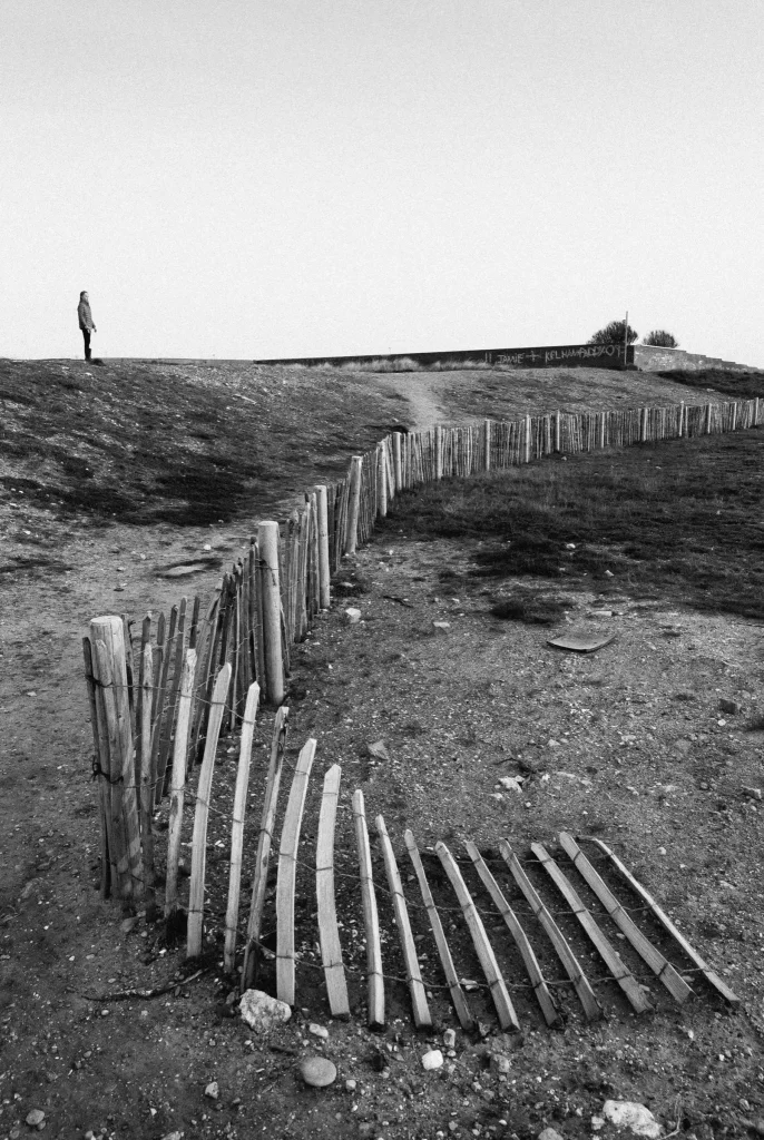
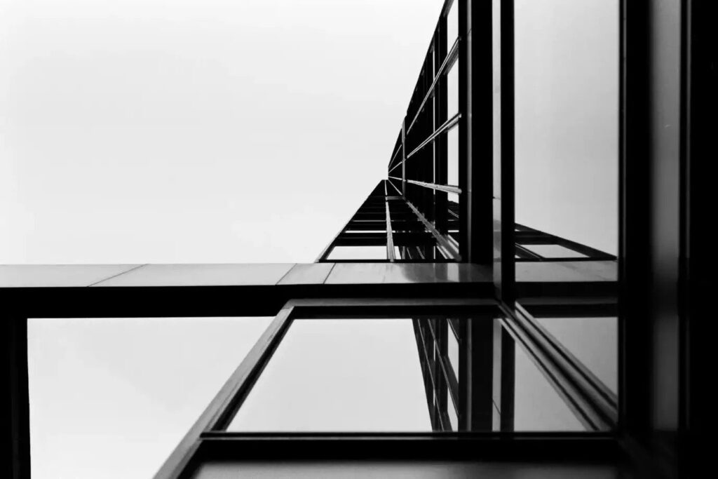
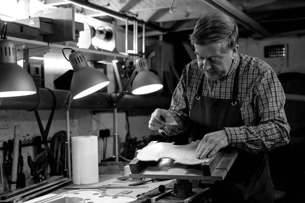
However, the V1’s saving grace for me is image quality; a humble 10 megapixels of loveliness. The kit lens too, seems to resolve very well indeed. It’s image quality helped me get a colour image into Landscape Photographer of the Year back in 2013. Where I think this camera truly excels is in monochrome though. The black and white images accompanying this piece were made with VSCO Tri-X emulation. I wonder whether it’s the relatively low pixel count making the difference.



Nikon tried to change things with its successor the V2. A fully realised mode dial was added. However, if the V1 aesthetic was designed by a truly inspired team, then surely the V2 was designed, camel style, by a dysfunctional committee with Mr Potato Head as its Chairperson. They morphed one of Nikon’s coolest and distinctive cameras into one of its ugliest, by sticking bits on it like a massive grip and a viewfinder hump that reminds me of the monster’s head from Aliens (okay, I have a bit of a vivid imagination).
I would have settled for a V1s with a full mode dial.
You can find more of my photographs at https://www.instagram.com/christopher.pattison/
Share this post:


Comments
Terry B on Nikon 1 V1 Review – One For All or One for None?
Comment posted: 05/06/2018
Comment posted: 05/06/2018
Kate Johnson on Nikon 1 V1 Review – One For All or One for None?
Comment posted: 05/06/2018
Comment posted: 05/06/2018
'@Eugenecapielo on Nikon 1 V1 Review – One For All or One for None?
Comment posted: 05/06/2018
Comment posted: 05/06/2018
Eduardo Vecchio on Nikon 1 V1 Review – One For All or One for None?
Comment posted: 05/06/2018
It is still a very capable camera. Has its quirks (weird hotshoe, compulsory reviewing of the picture). But, when you settle with not having PSAM controls, she fly. Auto focus speed is superfast. The shutter goes to insanely speeds. It uses the same battery as my D7200. The 18.5mm f1.8 prime is amaizing (although I'm more of a 35mm guy). Pairing it with a fotodiox grip really improve the handling.
I got one barely used in 2012, with the 10-30mm, the 30-110mm and the SB N5 flash. I got the grip and the 18.5, in B & H, and later got the 10mm, not even used, from a guy whose grandparent bought the lens thinking it would fit in a DX mount.
It was my travel camera in NYC 2017, and it will be my camera in San Francisco later this year.
Regards from Argentina
Eduardo Vecchio on Nikon 1 V1 Review – One For All or One for None?
Comment posted: 06/06/2018
It is still a very capable camera. Has its quirks (weird hotshoe, compulsory reviewing of the picture). But, when you settle with not having PSAM controls, she fly. Auto focus speed is superfast. The shutter goes to insanely speeds. It use the same battery than my D7200. The 18.5mm f1.8 prime is amaizing (although I'm more of a 35mm guy). Pairing it with a fotodiox grip really improve the handling.
Got one barely used in 2012, with the 10-30mm, the 30-110mm and the SB N5 flash. I got the grip and the 18.5, in B&H, an later got the 10mm, not even used, from a guy whose grandparent bought the lens thinking it would fit in a DX mount.
It was my travel camera in NYC 2017 , and it will be my camera in San Francisco later this year.
Regards from Argentina
Comment posted: 06/06/2018
Wayne on Nikon 1 V1 Review – One For All or One for None?
Comment posted: 06/06/2018
Arthur Robert Tafil on Nikon 1 V1 Review – One For All or One for None?
Comment posted: 06/06/2018
I had the Nikon handgrip for it, the fitted case and Nikon flash.
The camera took great photos but never felt proper. I've shot Nikons since I bought my first one in 1965 while in Officers basic in Quantico, VA. I've had most Nikon SLR's and rangefinders including DSLR's up to and including the D4. This was a Nikon Boo Boo.
Comment posted: 06/06/2018
Comment posted: 06/06/2018
Colin on Nikon 1 V1 Review – One For All or One for None?
Comment posted: 06/06/2018
BUT...I agree 100% about Nikon's infuriating design choices. The decision to put the silly mode options as the easily accessible items on the back of the camera was so horribly misguided that I hope Nikon has fired the team responsible and changed the locks at HQ. Not being able to turn off image review is also infuriating. And the toggle switch for changing aperture in manual mode is very fiddly and apt to get stuck in the up or down position rather than clicking back to the mid-way point. Finally, of course, important features like metering mode, ISO settings and single or continuous shooting options are buried in the menus. Having said that, the menus system is very clear and straightforward which is a refreshing change.
So the camera is far from perfect. And yet I still have it and use it regularly. Why? Well if I look around the house, most of the family and landscape pictures we have on display were taken by the V1. I've got enlargements up to 11x16 which look superb and there's something about the images that come out of the camera that is really special. It's small enough to carry anywhere and the lenses (especially the 10, 18 and 32 primes) are excellent.
I think the key is to use the V1 like an old film camera. Choose an ISO for the occasion and stick with it. Choose a metering mode (I use centre-weighted), leave the camera on manual or aperture priority - fortunately exposure compensation is one of the items selectable directly on the back of the camera - and get on with it. Then the V1 just gets out of the way and you can produce some great results. Crazy as it might sound, used in that way it feels like using my favourite film camera, a Nikon FM2, which also just gets out of the way.
If the proof of the pudding with regard to a camera is the proportion of your favourite photographs that came from it, the V1 is a big winner for me.
Comment posted: 06/06/2018
Comment posted: 06/06/2018
Comment posted: 06/06/2018
Comment posted: 06/06/2018
Mario on Nikon 1 V1 Review – One For All or One for None?
Comment posted: 06/07/2018
great report! I still like the 1V today. Great colors and fast AF.
Mario
My Latest Article on 35mmc.com on Nikon 1 V1 Review – One For All or One for None?
Comment posted: 18/10/2018
JOHN D on Nikon 1 V1 Review – One For All or One for None?
Comment posted: 21/10/2018
At the outset I felt the there was a significant difference in features between the J1 and V1 to justify the marketing to two distinct groups of customers; however by the last incarnations (the J5 and V3) I thought the two ranges had moved much closer together - and even looked a lot alike.
I think by the J5 Nikon had really sorted out the 'punter J' range; the articulated touch screen has proved a real boon; my sole complaint is the 4K video is only 15fps. Otherwise I love the J5 and the 18.5mm lens, I also love the reliable and very fast autofocusing.
Like everyone else I was amazed at the negative reviews this system got especially at the outset (probably from people reading stats sheets). It's possibly very telling that once people actually used the system the reviews were much more favourable.
Chad G on Nikon 1 V1 Review – One For All or One for None?
Comment posted: 12/12/2019
Keith Grewcock on Nikon 1 V1 Review – One For All or One for None?
Comment posted: 05/06/2022
jason gold on Nikon 1 V1 Review – One For All or One for None?
Comment posted: 24/10/2022
I prefer CCD sensors in spite of being restrictive. Great write up!
Zelda on Nikon 1 V1 Review – One For All or One for None?
Comment posted: 09/01/2023
Duncan B on Nikon 1 V1 Review – One For All or One for None?
Comment posted: 21/04/2024