In Part 1 of this three-part series, I used histograms of famous photographs to introduce some key ideas about contrast and tonality. Part 2 was about software curves, and what contrast means in various photographic contexts. This – the third and final part – is a practical guide to characteristic curves for film and paper. I’ll try to explain how characteristic curves can help us with film choice, metering, exposure, developing and printing – in short, at pretty much every stage of the (film) photography process.
Parts 1 and 2 of this series are relevant for both film and digital photography, and for both B&W and colour. In this part, however, I’ll focus on B&W negative film. If you’re into B&W film photography but not into darkroom printing, you can ignore the last section on paper curves, but the earlier sections might still be useful for you.
Preliminaries
Purpose of this post
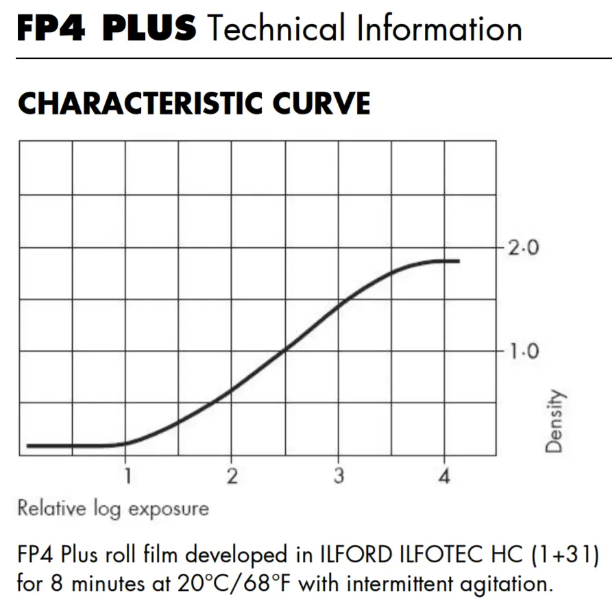
Most major manufacturers of film and photographic paper release datasheets with technical details about their product. If you’ve ever looked at such a datasheet, you’ve probably seen graphs like the ones below:
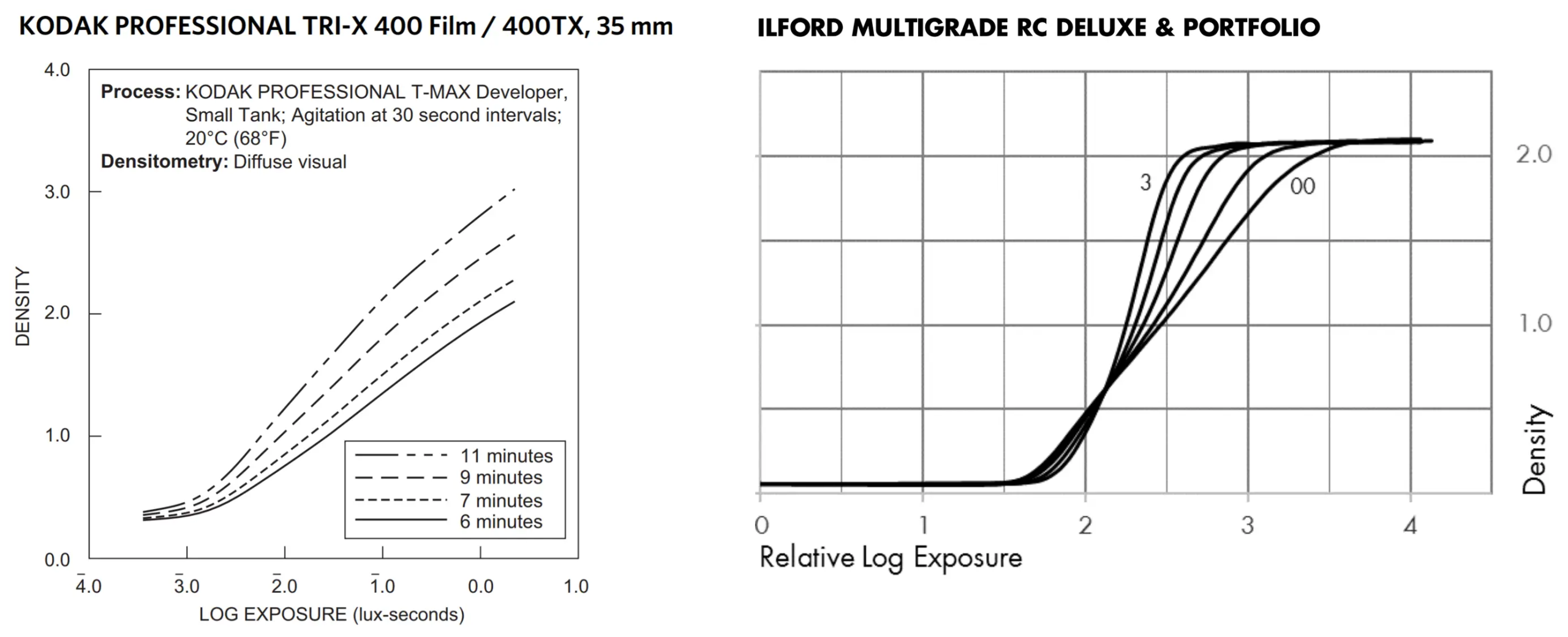
These graphs are called characteristic curves (because they show they show the characteristic properties of film or paper) or sensitometric curves (sensitometry being the study of light-sensitive materials).
For those of us who shoot B&W film, I think it can be both useful and interesting to understand what characteristic curves are all about. Unfortunately, most books and articles which deal with sensitometry are written by, and targeted at, photographers who are into (or even obsessed with!) maths, graphs and testing. My goal is to put together a resource which:
- Is fairly rigorous and in-depth.
- …But is not too nerdy – i.e. also accessible to people who don’t love graphs and equations. (I’ve included a few ‘math notes’ in italics, for those who are mathematically inclined. If you’re not, feel free to skip them; they’re not essential to understanding the article.)
- Does not require a lot of prior knowledge (all you really need is to understand the relationship between ISO, aperture and shutter speed).
- Does not require expensive equipment like densitometers.
- Uses actual characteristic curves from manufacturers’ datasheets (as opposed to hypothetical or illustrative curves).
- Includes not just graphs and figures, but also ‘real photos’ (after all, the desired end-product, for most of us, is a satisfactory photo, not a perfectly-plotted graph).
- Keeps extraneous stuff to a minimum – e.g. the physics of light, or the chemistry of film processing (these things, while nice to know, are not essential for what I cover in this post).
I know of online resources which check some of these boxes, but none which check all.
Will knowing this stuff make you a better photographer? Probably not. But it will hopefully give you a better understanding of film and paper – the basic tools of our trade – and how they respond to light. By relying more on that knowledge (and less on trial-and-error), maybe you can more easily get the results you want, and save some materials, money and time. When the results turn out different to what you expected, you may be better equipped to figure out what happened. You can toss around terms like shadow detail in short-toe films and highlight separation at lower paper-grades, earning the admiration of your friends and the envy of your enemies. And practical considerations aside, I think this stuff is interesting to know.
How I use the theory
Before I get into the theory, it’s only fair to disclose how I use it in practice. There are three main stages where you can use the theory: (a) exposure (that is, when taking pictures), (b) development and (c) printing. Frankly, I mainly use it at the printing stage.
My photography is mostly on the fly – street photos, candids and so forth – and I don’t have the time or inclination to take multiple spot-meter readings (I don’t even own a spot-meter). On some cameras I simply use the TTL meter in aperture priority mode, occasionally fine-tuning with exposure compensation or auto exposure lock. Some of my cameras don’t have a meter at all. With these, I use a free light-meter app on my phone (gasp!) or just guess. Maybe this all sounds quite slapdash, but it mostly works for me. Sometimes I mess up, but such is life.
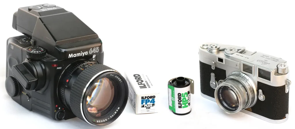
Likewise, with rare exceptions, I develop film normally with no push or pull. If I were a large-format photographer, it may have been a different story, but as it happens, I only shoot roll-film – 35mm and 120. Almost all my rolls are shot over days, sometimes months, in a variety of lighting conditions. Normal development gives me the best chance of ensuring that the majority of my photos have normal (or close to normal) contrast. The ones which have too much or too little contrast can usually be salvaged, if needed, in the darkroom (or in case of scans, with software).
So I end up using the theory mainly when printing – when I have more time, and the luxury to try different interpretations of the same negative. In this post I’ll focus on the general theory, but in subsequent posts about printing specific negatives, I’ll try to illustrate how I apply it in the darkroom.
All that said, I think the general theory is useful at all three stages, for all the reasons I mentioned earlier, i.e. to understand the materials we work with, get the results we want, to troubleshoot mistakes, and because it’s fun to know. Of course, what I outlined above is just my own workflow. How you use the theory (or whether you use it at all) is entirely up to you.
Light and density
In Part 2 of this series, I talked about the Curves tool in software, and how the shape of the curve determines how the tones of the original image (input) are translated into the edited image (output). Characteristic curves for film and paper, like the ones shown above, are essentially the same. Only in this case, the ‘input’ is light, and the ‘output’ is density.
When you take a photograph, light from the subject enters via the lens and hits the film, causing certain chemical changes. When you print, light from the enlarger is shone through the negative and onto photosensitive paper, again causing chemical changes. In both cases, the input is light. The result of these chemical changes – the output – is density.
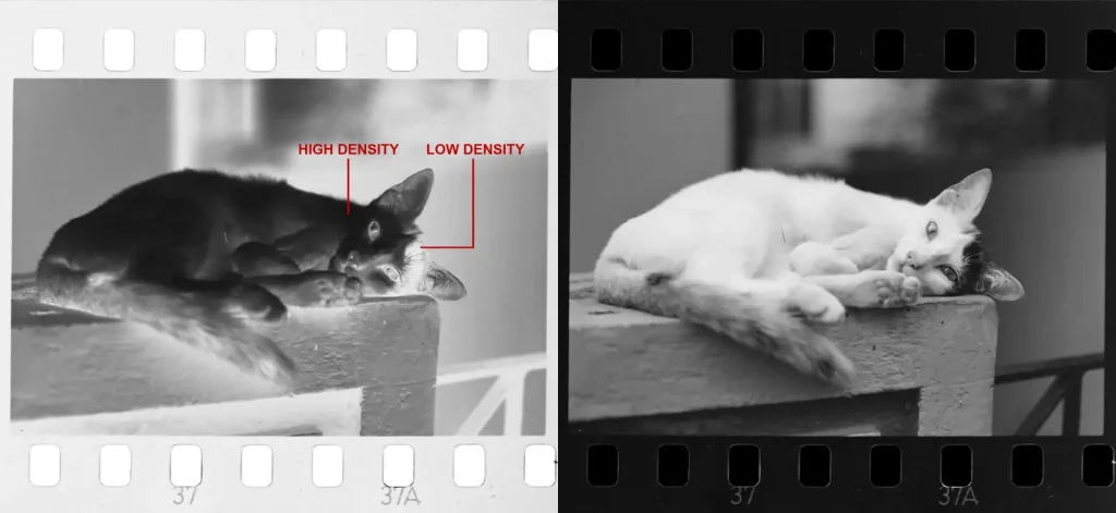
On both film and paper, exposure to light creates density. Areas which are exposed to more light turn out darker – more opaque in case of film, less reflective in case of paper – and are said to have high density. Areas which receive less light turn out lighter – more transparent in case of film, more reflective in case of paper – and are said to have low density.
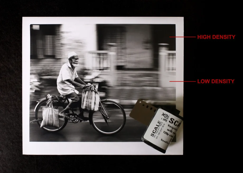
This idea – more light = more density = darker – might seem counterintuitive. But the reversal occurs twice. Brighter areas of a scene create more density on a negative, which block more light when printing, and are therefore rendered lighter on the print. Darker areas, on the contrary, look blacker. Two ‘wrongs’ make a right, and all’s well with the world.
Zone System 101
So far I’ve been talking in qualitative terms – more light or less light, more density or less density. The next step is to get a bit more precise, using quantitative concepts. For that, I’ll draw on the Zone System, formulated by Ansel Adams and Fred Archer. If you understand the Zone System already, feel free to skip to the next section. In any case, this is not a full-fledged exposition of the Zone System, about which whole books can be (and have been) written. Here, I’ll just focus on some core concepts which are useful for understanding characteristic curves.
Zones in theory
A real-world scene has a range of brightness values from dark to light. These can be represented as a continuous scale.

For simplicity, the values are divided up into discrete zones. In The Negative (1981), Ansel Adams identified 11 zones numbered from 0 to 10 (he used Roman numerals, but I’m using Arabic for simplicity). Each zone represents twice as much light as the previous zone. Another way to put it: each zone is one stop brighter than the previous zone. So if, say, a spot-meter reads Zone 5 as f/8 and 1/30 sec, it will read Zone 6 as f/8 and 1/60 sec.

The table below is adapted from Ansel Adams’ The Negative (1981):
| Zone 0 | Maximum black in print. |
| Zone 1 | Near-black; slight tonality but no texture. |
| Zone 2 | First hint of texture; darkest parts where some detail is recorded. |
| Zone 3 | Textured shadows; dark materials. |
| Zone 4 | Dark foliage; dark stone; shadow areas in landscape |
| Zone 5 | Middle grey; dark skin in sunlight, weathered wood |
| Zone 6 | Caucasian skin in sunlight; light stone; shadows on snow |
| Zone 7 | Very light skin; light grey objects |
| Zone 8 | Whites with texture; textured snow |
| Zone 9 | Whites without texture approaching pure white. |
| Zone 10 | Pure white of the paper-base. |
I will follow this system. Other sources may have more (or fewer) zones, or slightly different definitions, but minor variations are not important; the principle is the same. In any case, the descriptions are generic, representing ‘typical values’. Skin colour, for instance, is quite variable. Moreover, we may want to deviate from the typical values for artistic reasons. For instance, dark stone is typically around Zone 4, but in the print, we may choose to render it as near-black (Zone 1) or middle grey (Zone 5).
The Zone System does not prescribe tonalities for skin, foliage, snow or whatever else. On the contrary, it gives us freedom to visualise how we want the print to look, and the methods and knowhow to control how real-world tones will be translated to print tones.
Zones in real life
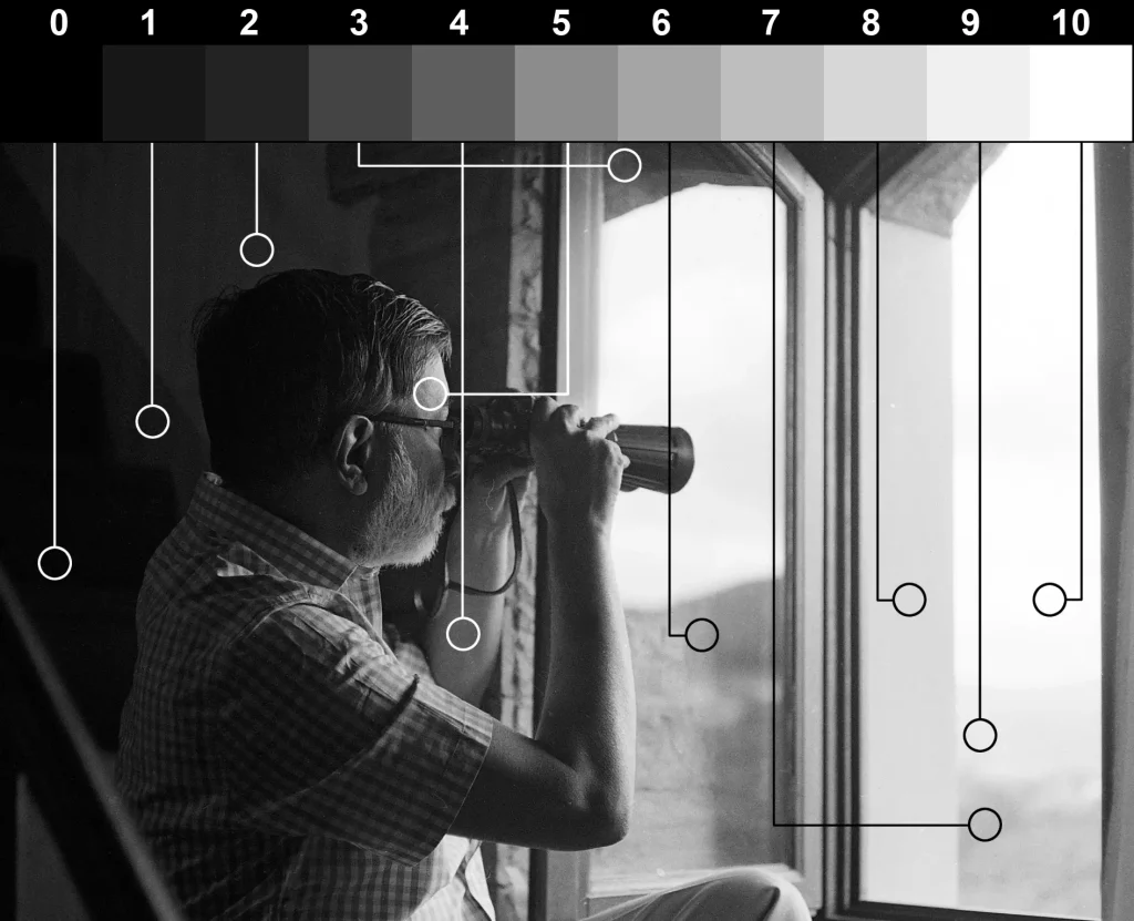
The photo below is a scan of a 35mm B&W negative. The original scene was high-contrast, with deep shadows inside the room and bright Tuscan sun outside the window. I didn’t take spot-meter readings – I almost never do – so I don’t know what the actual values were. The zone notations are therefore indicative, not exact. Nevertheless, they should give you a good idea of how zones, which I’ve so far only discussed only in theory, might look in ‘real life’.
Characteristic curves for film
As you may recall from the earlier section on light and density, the general rule is more light = more density. The characteristic curve shows this relationship in more detail. The curve is different for each film and paper, and also depends on how the film or paper is processed. Here, for example, is the characteristic curve for Ilford FP4 Plus film developed in Ilfotec HC:
Axes
So what does the graph tell us? The horizontal axis represents exposure, i.e. how much light falls on the film. The vertical axis represents density, which I explained already. Ilford’s graph follows the scientific/sensitometric convention of using logarithmic scales. This is explained in the ‘math note’ below. However, it’s not super important, because helpfully, light and density can also be measured in stops, which photographers are more familiar with. So for the remainder of this post, I am going to use stops along both axes. To convert log exposure and density to stops, simply divide by 0.3.
[Math note: On a logarithmic scale, one unit represents a 10× increase. On the other hand, 1 stop represents a 2× increase, and the value of log2 to the base 10 is ~0.3. So log units (along both axes) can be converted to stops, through simple division by 0.3. This article by Roger Hicks and Frances Schultz explains the theory in more detail.]
The graph below is essentially identical to Ilford’s, but I’ve converted both axes to stops as explained above.
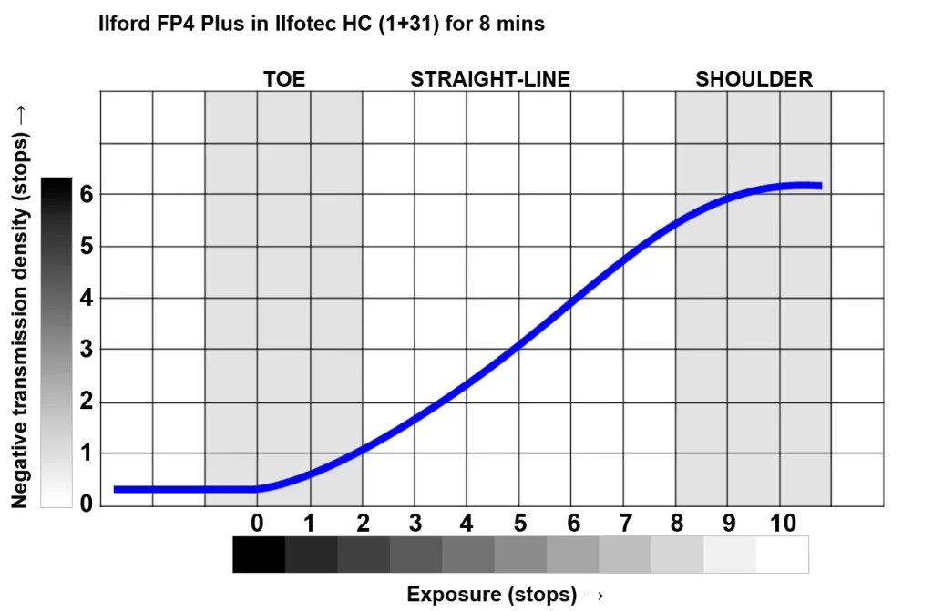
On the horizontal axis, as you go from left to right, each gridline represents a 1-stop increase in exposure (i.e. the amount of light hitting the film is doubled). On the vertical axis, as you go up, each gridline indicates a 1-stop increase in negative density (i.e. light transmission is halved).
FBF
At first, the curve is flat. This is because very low amounts of light don’t cause any changes in negative density. Note, however, that the curve ‘sits’ a little above zero. ‘Zero density’ would indicate a perfectly transparent film – and no film is perfectly transparent. Even unexposed film, after processing, has a small amount of density (the exact amount depends on the emulsion and how it was processed). This minimum density is called ‘film base plus fog’, or FBF for short.
The two negatives below, photographed side-by-side on a lightbox, are good examples of FBF:
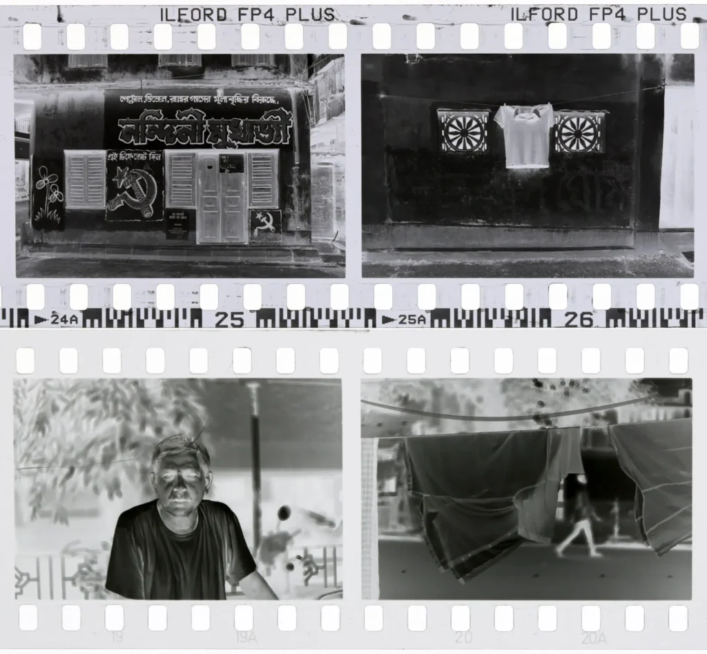
Observe the film edges, and the unexposed spaces between frames. Ilford FP4 Plus (above) has a slight magenta tint, and a ‘normal’ level of FBF. Argenti Scale-X – an unusual film which I reviewed for Casual Photophile – has one of the clearest bases (lowest FBF) that I have encountered. Still, as you can see, it’s not completely transparent.
Toe, straight-line and shoulder
Now let’s say you’re photographing a scene with a subject brightness range (SBR) of 10 stops. This means that the brightest part of the scene (Zone 10) emits 10 stops more light than the darkest part (Zone 0). So the 10-stop SBR translates to 11 Zones (numbered 0–10), which are represented on the graph by the horizontal ‘tonal scale’.
And let’s say your exposure settings – aperture and shutter speed – are such that Zone 0 (darkest parts of the scene) is ‘placed’ at the toe of the curve, just where it starts to take off. (Loosely speaking, you can do this by taking a spot-meter reading of the darkest part of the scene (which ‘places’ it on Zone 5) and underexposing by 5 stops (thus ‘placing’ it on Zone 0). A more detailed explanation is outside the scope of this post; we would be getting into the intricacies of zone system testing and light-meter behaviour.)
Of course, there are other exposure settings you could use. If you decrease (or increase) the exposure, less (or more) light will hit the film, and the tonal scale will shift to the left (or right). I will come to these scenarios later.
Here’s the same graph again, now with some annotations.
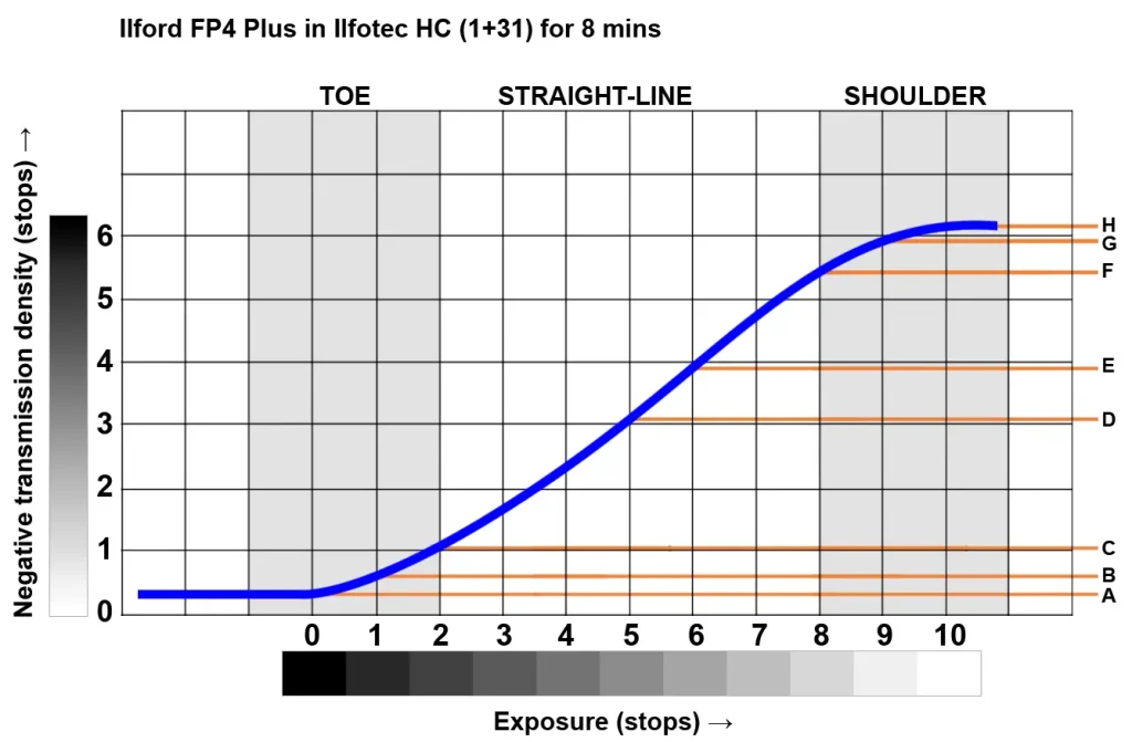
As you go from Zone 0 to 1 – that is, from the darkest parts of the scene to the slightly-less-dark parts – there is a 1-stop increase in exposure. But as you can see from the curve, there is only a small increase in negative density (A to B, less than half a stop). The same goes for Zone 1 to 2 – the increase in density (B to C) is a bit more than before, but still less than half a stop.
In these lower zones (shadow areas), the curve is flatter. This is known as the toe of the curve. More light translates to relatively small increases in density; therefore contrast is lower. (Recall my slope-based definition of contrast from Part 2: Flat curve → low contrast.)
In the midtones, the curve is steeper. This is the so-called straight-line portion of the curve. From Zone 5 to 6, the 1-stop increase in exposure translates to an almost 1-stop increase in density (D to E). The steeper curve translates to higher negative contrast.
In the higher zones which represent highlight areas, the curve is once again flatter. This is known as the shoulder of the curve. From Zone 8 to 9, density increases by around half a stop (F to G). From Zone 9 to 10, there’s barely any increase at all (G to H).
In short, where the curve is flat, contrast is low; where it’s steep, contrast is high – just like with software curves. In the Ilford FP4 curve shown here, contrast is lower in the shadows and highlights (the toe and shoulder) and higher in the midtones (the straight-line portion of the curve).
Low contrast in the shadows and highlights is not as bad as it sounds. For one, it’s similar to our real-world experience of how we see. In very dim or very bright light, our eyes are less sensitive; we struggle to see tonal gradations and other details which we can otherwise see quite clearly at ‘normal’ light levels.
Moreover, an 11-zone (or 10-stop) SBR, which I used in my example, is relatively rare. ‘Average outdoor scenes’ have an SBR of around 7 stops in middle latitudes, 8 stops in the tropics (Roger Hicks and Frances Schultz have a good article on the role of geography). If the tonal scale is shorter, we can more easily ‘fit it’ on the straight-line portion of the curve (if we choose to), thereby obtaining higher contrast throughout the range.
At the start of this section, I introduced the term subject brightness range (SBR). This is a good time to introduce another useful term: negative density range (NDR). NDR is the difference between the highest and lowest densities produced on a negative. In the graph above, the NDR is the difference between A and H, i.e. about 6 stops.
An important takeaway: NDR may be (and often is) different from SBR. For example, in the curve we just analysed, a 10-stop SBR resulted in a 6-stop NDR. If the SBR were lower (e.g. 7 stops, rather than 10), then – other things being equal – NDR would be lower too. But NDR also depends on the film itself and how it is developed, which I will come to in a subsequent section.
Under and overexposure
In the previous example, I assumed that Zone 0 (darkest parts of the scene) was at the toe of the curve. If you underexpose (or overexpose) by, say, 2 stops, each zone gets 2 stops less (or more) exposure than it did before. So the tonal scale shifts 2 stops to the left (or to the right).
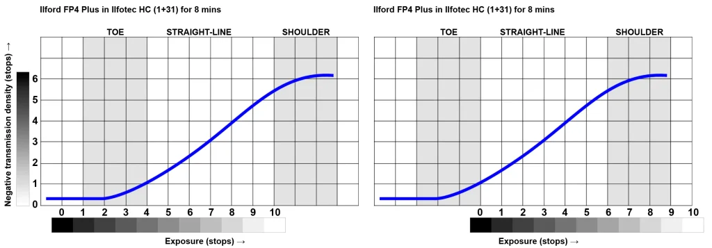
In the underexposure scenario (above left), Zones 0, 1 and 2 now have the same level of density (the minimum density, aka FBF). So in the deep shadows, the negative records no detail at all. Zones 3 and 4, which were previously on the straight-line portion, now fall on the toe. Detail is recorded, but with lower contrast than before.
But what you lose on the swings, you gain on the roundabouts. The higher zones, which were previously on the shoulder, now fall on the straight-line portion. Thus they have higher contrast and more detail.
Overexposure (above right) has the opposite effect: higher contrast (more detail) in the shadows, which now fall on the straight line portion; lower contrast (less detail) in the highlights, which fall on the shoulder or above.
In short, by underexposing, you generally get more separation in the highlights, but at the expense of shadow detail. Conversely, by overexposing, you generally get more separation in the shadows, but at the expense of highlight detail. Most photographers understand this intuitively. But with a characteristic curve, we can see how exactly it happens, and how different films respond to under and overexposure.
You can also see it in pictures. The two photos below were taken just seconds apart on Kentmere 400 film. In the first, I metered the wall, and in the second, the cobblestones (I added yellow squares to show roughly where I metered). As a result, the second photo got 3 stops more exposure.
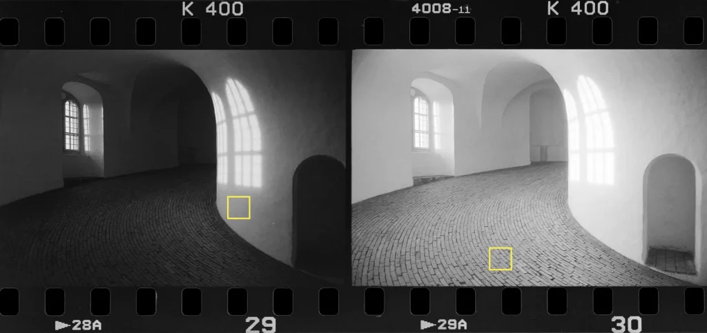
Notice the lack of separation in the shadow areas of the first photo, and in the highlight areas of the second. With some darkroom trickery, the second photo can be printed for deeper blacks and more highlight separation. But in the first photo, the loss of shadow detail is irretrievable. Detail which was never recorded on the negative can’t be ‘brought out’ in the print.
But that doesn’t mean the first exposure is ‘wrong’. It’s just a different mood or interpretation. In Part 1, I shared examples of famous photographs which have significant areas of ‘missing’ shadow or highlight detail.
Here’s a more extensive test with Argenti Nanotomic-X. The photos were taken in quick succession, scanned at the same settings, with identical (minor) edits in post.
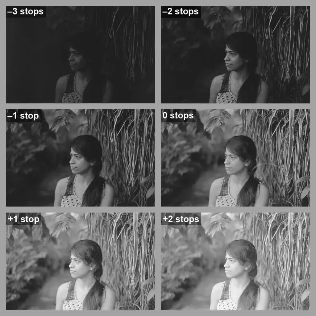
As before, you can see the loss of shadow detail when the photos are underexposed, and lower highlight separation when they are overexposed.
Development time
In the previous section I showed how under and overexposure move the tonal scale to the left or right. As a result, the zones fall on a different part of the film’s characteristic curve. On the other hand, changing the development time changes the shape of the curve itself. (Adjusting the temperature or agitation also does the trick, but it’s more common – and generally more precise – to adjust the time.)
Normal, N+ and N− development
Under the Zone System, ‘normal development’ for any film–developer combination is something which each photographer must test and determine for themselves. That’s outside the scope of this post; for now, let’s just say normal development is the recommended time according to the manufacturer’s datasheet.
Technically, over- and under-development refer to development errors. When film is deliberately developed for more or less time than normal, I will use the Zone System terminology of N+ and N− development.
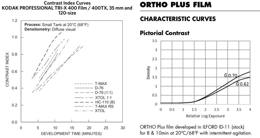
So how does a change in development time affect the image? As before, let’s look at an actual characteristic curve – a different film this time, just to mix things up. ‘Normal’ development for Kodak Tri-X 400 in T-Max developer is 6 minutes at 20°C. But helpfully, the datasheet also shows the curves for N+ development (7, 9 and 11 minutes).
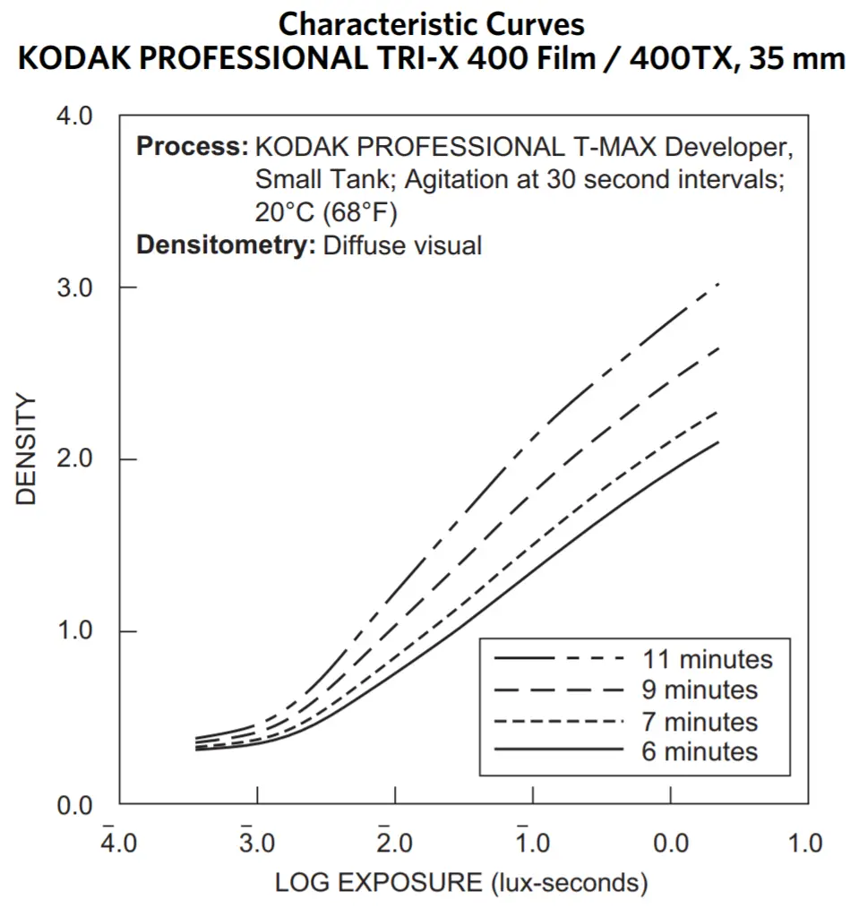
As you can see, a change in development time doesn’t simply move the curve up or down; it changes the steepness of the curve, also known as the slope. N+ development makes the curve steeper (increases contrast); it lifts the shadows only slightly (the toe portions of the curves are very close together) but significantly lifts the highlights. N− development, which is not shown on the Tri-X graph, makes the curve flatter (decreases contrast).
Push and pull
Push and pull are somewhat ambiguous terms. People use them to mean at least three different things:
- Shooting at a higher or lower ISO setting* than the manufacturer’s rating.
- N+ or N− development.
- A combination of (1) and (2).
* Technically, ISO is fixed. When we use a higher or lower setting, we’re using not a different ISO, but a different exposure index (EI).
I use push and pull in the third sense. That is, by push I mean using a higher EI (underexposing) followed by N+ development, and by pull I mean using a lower EI (overexposing) followed by N− development.
When I started out – and I think this is a misconception many beginners share – I used to think that pushing or pulling was similar to changing the ISO setting on my digital camera. That is, I thought you could shoot at a higher EI, compensate with N+ development, and end up with essentially the same image, just with a bit more grain.
But that’s not quite true. Pushing (as you will see from my next example) increases contrast, and pulling reduces it. In particular, pushing creates darker shadows and brighter highlights; pulling does the opposite. Midtones in both cases are relatively less affected.
Scenes with identical contrast
The graph below is adapted from the Kodak Tri-X 400 graph reproduced earlier, but I isolated the 6-minute (normal development) and 9-minute (N+ development) curves. As with the Ilford FP4 graph, I changed both axes to stops. The upper tonal scale (Normal) represents a scene with an SBR of 10 stops (11 zones), exposed and developed normally (6 mins). The lower tonal scale (Push) represents the same scene, except that it has been (a) underexposed by 2 stops; and (b) developed for 9 mins. (Kodak’s recommended developing time for a 2-stop push in T-Max developer is 8:45 mins. The datasheet only has the curve for 9 mins, but that’s close enough.)
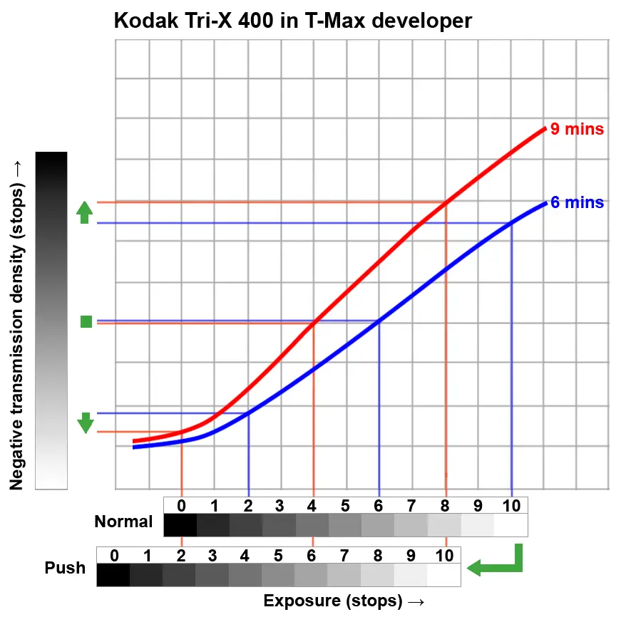
Due to the 2-stop underexposure, the Push scale is shifted 2 stops to the left (each part of the negative receives 2 stops less light than before). The blue and red horizontal lines show densities of Zones 2, 6 and 10 for the Normal and Push negatives respectively.
The effect of the push is shown by the green vertical arrows:
- Zone 2 has less density than before.
- Zone 6 has about the same density.
- Zone 10 has more density than before.
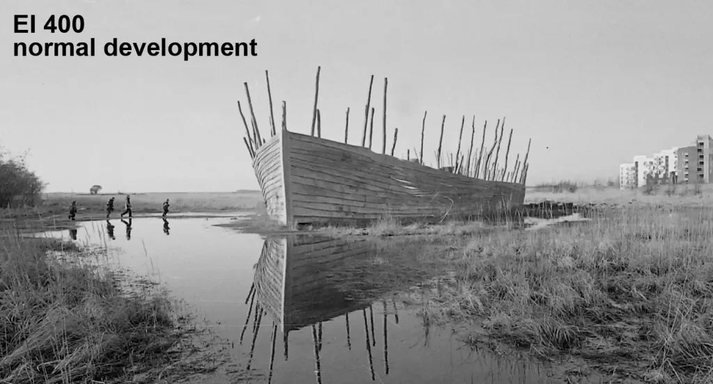
The graph simply illustrates what I wrote earlier. Pushing increases overall contrast; we get darker shadows and brighter highlights, while midtones are relatively unaffected. By pushing, a scene with the same SBR can thus be made to yield a higher NDR.
We can see this in photos too. I have not personally done a test with Tri-X and T-Max developer, but Kodak T-Max 400 film in Kodak D-76 developer shows similar behaviour:
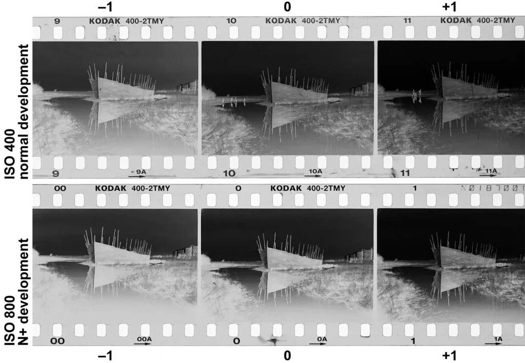
The negatives in the top row were rated at EI 400, with exposure compensation of −1, 0 and +1 stops respectively, and given normal development. The negatives in the bottom row were rated at EI 800, again with exposure compensation of −1, 0 and +1 stops respectively, and given N+ development. All six frames were shot with the same camera and lens, within minutes of each other.
Here’s a comparison between the middle negative of each row (scanned at the same settings, slightly cropped, with identical, minor edits in post).
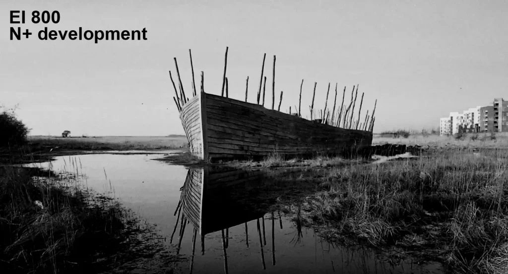
Scenes with different contrast
The previous section was about how the same subject (or same SBR) can produce negatives with different NDR. This section is about the opposite: how subjects with different SBR can produce negatives with similar NDR.
An extremely high-contrast scene may have an SBR of 10 stops or more, while a low-contrast scene may have an SBR of only 5-6 stops. Sometimes, the high-contrast or low-contrast look may be exactly what you’re going for (in Part 1, I shared examples of both types of photos). But by adjusting exposure and development, it’s also possible to get negatives with similar NDR.
Let’s say you have two scenes. Scene H (high contrast) has an SBR of 10 stops (or 11 zones) as before, while Scene L (low contrast) has an SBR of 6 stops (7 zones). I’m going to show what happens in the following two scenarios:
- Identical exposure and normal development for both H and L.
- L is pushed (less exposure, N+ development).
Identical exposure and development
In the graph below, I isolated the 6-minute curve (normal development). I also included two tonal scales: L (low contrast) and H (high contrast). Let’s assume that both scenes were exposed by taking an incident-meter reading (or equivalently, a reflected reading from a grey card). Zone 5 of the two scales are thus aligned. But since L has only 7 zones, it’s ‘missing’ two zones on either end.
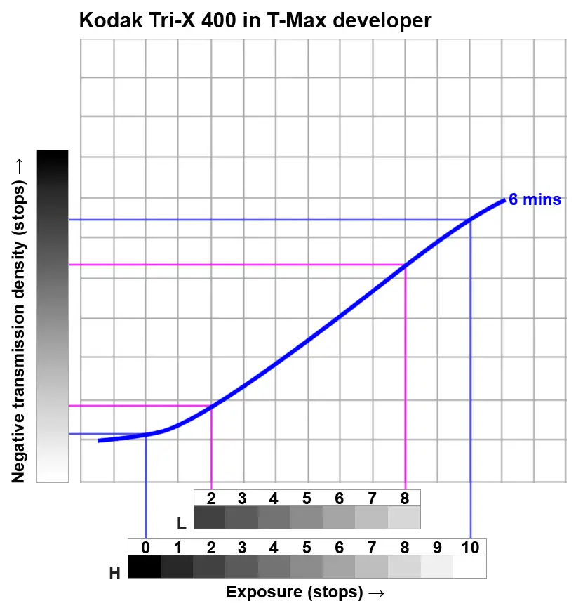
The blue and pink lines indicate the NDR produced by H and L respectively after normal development. H clearly produces higher NDR (the blue lines are further apart). Compared to L, H will have less density in the shadows and more density in the highlights. If the two negatives are printed on the same grade of paper, H will have higher contrast.
Pushing the low-contrast scene
In this next graph, L got 2 stops less exposure. Accordingly, the tonal scale is shifted two stops to the left. Furthermore, H was developed for 6 minutes (as before) and L for 11 minutes. The blue and green lines indicate the NDR produced by H and L respectively.
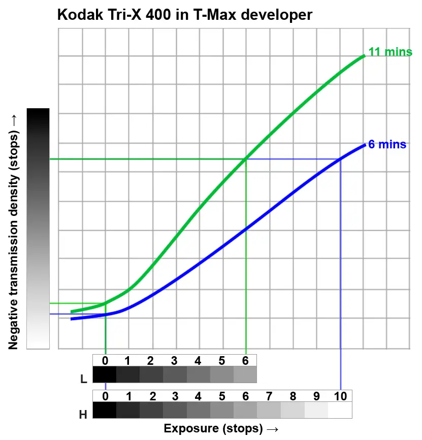
This time, the blue and green lines almost coincide at both ends. NDR will be similar. The two scenes, despite having vastly different SBR, can be printed on the same grade of paper, producing prints with very similar contrast.
In this example, L, the low-contrast scene, got 2 stops less exposure and 5 minutes more development than H. Conversely, a high-contrast scene can also be pulled (i.e. overexposed, followed by N− development) to reduce the NDR. A key contribution of the Zone System – albeit outside the scope of this particular post – is how to customise the exposure and development for each scene to achieve a ‘previsualised’ outcome in the print.
Pros and cons
To recap: in the first approach (identical exposure and development), NDR will depend primarily on the SBR of the original scene. In the second approach, NDR can be manipulated by ‘customising’ exposure and development for each scene.
The second approach is generally better suited for sheet-film and large-format photography. The metering is also more involved – you need multiple spot-meter readings to determine the SBR, which in turn inform how you expose and develop.
Since I mostly shoot roll-film, I tend to develop the whole roll in the same way. Like in the first scenario (identical exposure and development), some of my negatives have more contrast than others.

The photo above shows contact prints of two negatives from the same roll of 120 film (Ilford HP5 Plus). The first scene had normal contrast. The second scene, shot against the light on a hazy day, had lower contrast – and so does the negative. I tend to ‘fix’ this, if I need to, in the darkroom (or in case of scans, with software). Technically this is not optimal, but it is one of the compromises of shooting roll-film.
Film dynamic range and NDR
The characteristic curve also allows us to estimate the film’s dynamic range and contrast. Of course, these parameters – like the curve shape itself – depend on how the film is processed (bear that caveat in mind for anything I say below). Now here’s the FP4 graph from earlier, now with some annotations:
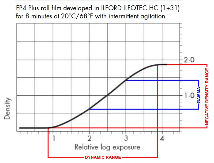
The graph shows a response from relative log exp. 0.9 to 3.9 (approx), or a range of 3.9−0.9=3 log exp. As I said earlier, log exposure can be converted to stops simply by dividing by 0.3. So the dynamic range of the film turns out to be 3/0.3=10 stops. Outside of this range, variations in exposure are not recorded by the film.
The graph also shows the maximum NDR. The highest and lowest negative densities are about 1.9 and 0.1 units respectively. This translates to an NDR of 1.9−0.1=1.8 log density, or 1.8/0.3=6 stops. In other words, the densest part of the negative will transmit 6 stops less light than the thinnest (unexposed) part of the negative. But that’s the maximum NDR. A low-contrast scene would produce a lower NDR, using only a portion of the curve.
Of course – and at the risk of repeating myself – the dynamic range and NDR will probably change if the film is developed differently.
NDR is a crude measure of negative contrast, because it only takes the extremities into account. Gamma (also represented by the Greek letter γ) is a more sophisticated measure. To calculate gamma, simply identify a 1 log unit exposure on the straight-line portion of the curve, and measure the corresponding density increase. For example, on the FP4 graph above, an exposure increase from 2 to 3 (chosen because they lie on the straight-line portion) causes a density increase of 0.6 to 1.4. So gamma = 1.4−0.6=0.8. Higher gamma indicates a steeper curve (more contrast).
As we know, adjusting the developing time affects the contrast, and therefore the value of gamma. Some film datasheets, like that of Eastman Double-X (also marketed as Silberra 52XX and CineStill BwXX), specify developing times for various target values of gamma.
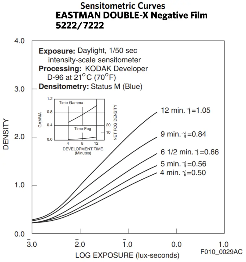
[Math note: Gamma is the slope of the straight-line portion, so it only takes into account the linear part of the curve. But films with similar gamma values can have different toe-shapes, and therefore different tonal characteristics. So various other measures have been proposed which take other parts of the curve into account. These measures are collectively known as average gradient systems. Two of the most widely-used average gradient systems are Contrast Index, favoured by Kodak, and G, (pronounced Gee-bar), favoured by Ilford. A detailed discussion of these measures is outside the scope of this post, but if you want to dig deeper, this article (‘Contrast Measurement of Black and White Negative Materials’, British Journal of Photography, 1967) compares Kodak’s Contrast Index and Ilford’s G. Kodak’s Basic Photographic Sensitometry Workbook has a nice practical method for calculating the Contrast Index from a curve.]
Choice of film stock
So far, we’ve been looking at one characteristic curve at a time, e.g. Ilford FP4 Plus or Kodak Tri-X. Now let’s compare the curves of two different film stocks, both by Ilford:
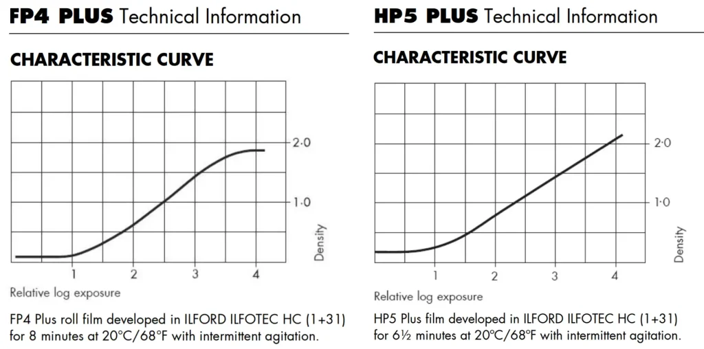
Note that the films were processed in the same developer – Ilfotec HC 1+31 – and in each case, for the recommended time when shot at box speed. Nevertheless, the curves look quite different. So what exactly are the differences, and what do they mean in practice?
Before we proceed, bear in mind that I am not making sweeping statements on FP4 versus HP5. The analysis only applies to the processing method used in Ilford’s tests, and the curves obtained thereby. If the films are processed differently, the curve shapes will change.
Film speed and FBF
One difference between the two films, which we know without even looking at the curves, is that HP5 (ISO 400) is faster – or more sensitive to light – than FP4 (ISO 125). So we would expect that the same amount of exposure would produce greater density on HP5 than on FP4. But the curves don’t really show that. For example, 3 units of relative log exposure produce about 1.5 units of density on both films. What gives?
The answer lies in the term relative log exposure. The units represent relative values. So in each individual graph, the units on the horizontal axis are in the correct proportion – that is, one unit represents a 10× exposure increase in the graphs above (or a 1-stop exposure increase in my graph below). But the units don’t represent absolute values of exposure. For example, on two different graphs, 1 unit does not necessarily represent the same amount of light hitting the film.
One difference which we can see from the above graphs is that the base of the FP4 curve (~0.1 units of density) is slightly lower than the HP5 curve (~0.2 units). This simply means that FP4 has slightly lower FBF (i.e. a clearer base).
Curve shape
The most prominent difference is in the shape of the curves itself. This is easier to analyse when the curves are overlaid.
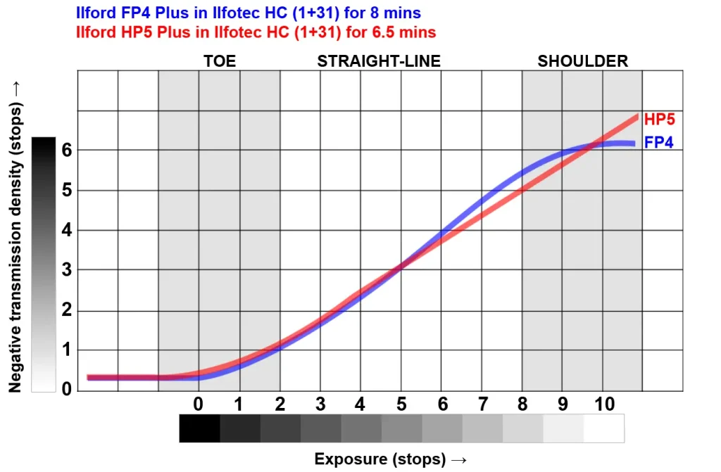
[Math note: In the graph above, I kept the scales of the axes constant, but shifted the HP5 curve (a) downwards (to match the FBF), and (b) to the right (so that the curves intersect at Zone 5). This is possible because the axes are relative, not absolute. The shifts eliminate some variables, giving us a level playing field for comparison. The downward shift equalises the FBF, so we are only comparing density produced by actual exposure (i.e. density-above-FBF). The rightward shift means that the films are exposed such that Zone 5 (middle grey) produces the same density-above-FBF on both films. HP5, being a faster film, would of course need less exposure than FP4.]
Below Zone 5, the curves practically coincide; the difference is negligible. Between Zones 4 and 7, the FP4 curve is steeper, indicating greater midtone contrast. But then FP4 starts to flatten out. From around Zone 8 onwards, HP5 is steeper, indicating greater highlight contrast. By Zone 10, the FP4 curve is practically horizontal, while the HP5 curve is still rising almost as steeply as before.
FP4’s steeper straight-line portion indicates greater midtone contrast, but its pronounced shoulder translates to lower highlight contrast. Thus, overexposing FP4 may result in important tonal values falling on the shoulder of the curve, where there is little or no separation.
HP5, on the other hand, is flatter (lower contrast) in the midtones, but more linear overall. Thus, highlights have about as much contrast as the midtones, and overexposed negatives will still have good separation. Such films are said to have more latitude for over-exposure.
Latitude
Latitude is the extent to which a film can be under- or overexposed, and still deliver acceptable results. (What is ‘acceptable’ is somewhat subjective, so the definition is not super precise. But for our purposes, it doesn’t need to be.)
How much latitude does HP5 have? In other words, how much overexposure can we get away with? The Ilford datasheet shows the film’s response from around 0.5–4.1 log exp. units – that is, 3.6 log exp. units or 12 stops. In that range, there is no sign of a shoulder; the curve is still rising in linear fashion.
A Norwegian film lab called Fotoimport has excellent sensitometry tests – the most detailed and rigorous comparisons I have ever seen. Their HP5 graph shows a response range of around 18 stops (one unit on the horizontal axis represents ½ stop of exposure). And at the end, the HP5 curve is still rising – though a bit less steeply than before. Even at that point, changes in exposure cause measurable changes in density. I was amazed when I first saw it.
This doesn’t necessarily mean that the whole range is usable. Even for films with a long straight-line portion, there are limits to overexposure. When negatives are too dense, they get quite grainy. Ansel Adams (The Negative, 1981) also says that in high-density negatives, light scattering within the emulsion causes a loss of acutance. I have not tested this myself, but it certainly sounds plausible.
And a shoulder is not always a bad thing. With a linear curve, highlights are sometimes too far up the curve (the NDR is too high). They are recorded on the negative, but to actually see them on a print, you may have to do a good deal of “burning in” (to see them in a scan, you may have to play around with curves and layer masks).
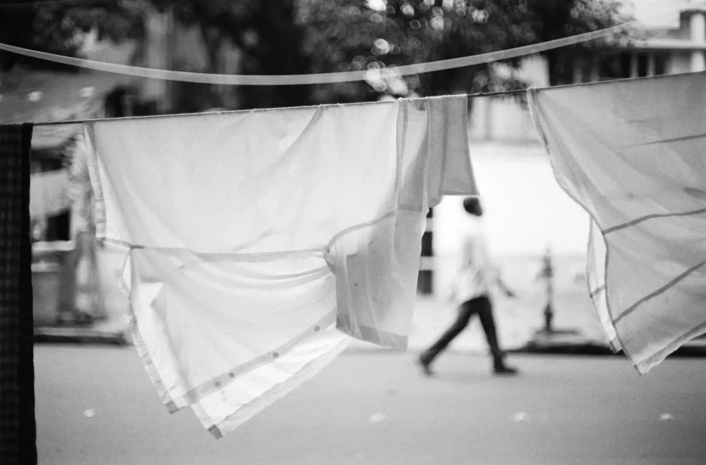
With a shouldered curve, if you get the exposure right, the highlights fall on the shoulder. So the detail is recorded, but at the same time, the NDR is more manageable with less need for burning or post-processing. And because the shoulder has inherently lower contrast, highlight details appear “delicate”, which can be a nice look.
Choice of developer
Development time affects the characteristic curve, but so does the developer itself. In the previous section, I showed the characteristic curves for two different films, processed in the same developer. Now here’s the opposite: the same film (Ilford Ortho Plus), processed in two different developers (ID-11 stock and PQU 1+9):
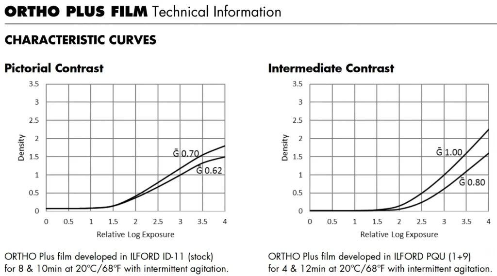
Ignore the upper curves and focus on the lower curves. In both graphs, they end at a similar density (~1.5), but the overall shape is very different. In ID-11 stock, Ilford Ortho Plus has a short toe, flatter straight-line portion and pronounced shoulder. In PQU 1+9, it has a long toe, steeper straight-line portion and no shoulder at all.
At the end of the day, the characteristic curves in a manufacturer’s datasheet are only really valid for the developer and process used in their tests. If you use some other developer, or even agitate differently, you might get different results (Fred Picker has an interesting anecdote about attending a workshop in a different state where, he thinks, the higher iron content in the water led to greater negative contrast!) If you really care about accuracy, you have to do your own tests and plot the curves yourself – something which is outside the scope of this post.
I find this stuff interesting, but in practice, l don’t choose films or developers based on curve shapes. I shoot a variety of B&W film – whatever catches my fancy. And I develop everything in Ilford ID-11 (or the functionally identical Kodak D76), diluted 1+1. If necessary, I fine tune contrast – including global contrast, local contrast and separation – at the printing stage. And that provides the perfect segue to the next topic.
Characteristic curves for paper
The most common method for controlling print contrast is to use contrast filters. (Other methods include pre-flashing, special low- or high-contrast developers, water-bath development and contrast masking, but these are outside the scope of this post.)
With multigrade paper, we can use filters to change print contrast. Each contrast grade has a different curve shape. (Much of this also applies to fixed-grade papers, but in this post I’ll focus on multigrade paper.) Here are the characteristic curves for the paper I use most, Ilford MG RC:
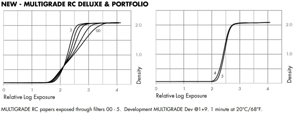
The first graph shows curves for Grades 00, 0, 1, 2 and 3. The second graph shows curves for Grades 4 and 5. Higher grades have more contrast, and are therefore steeper.
Paper curves are fundamentally similar to film curves: more light translates to more density. As you move up the curve, you get darker (shadow) tones – the opposite of negative or software curves, where higher up the curve we have highlights. At first, the curves are flat – very low amounts of exposure cause no changes in density, and the paper remains white. But like with film, the curves ‘sit’ a little above zero. ‘Zero density’ would indicate perfectly reflective paper – and no paper is perfectly reflective. Even unexposed paper has some slight density, known as Dmin (the equivalent of FBF for film).
Paper curves also have a toe, straight-line portion and shoulder. The maximum density is called Dmax – the deepest black achievable on a given paper. At this point, the curve plateaus out again. Further exposure has no significant effect. (A lot of additional exposure leads to solarisation, where the curve dips downwards – but that’s outside the scope of this post.)
Standard print time (SPT)
Standard print time or SPT is a very important concept for darkroom printing, and one which I will keep returning to. SPT is the minimum exposure needed to produce Dmax from an unexposed part of the negative. The exact time will obviously depend on the negative (films with higher FBF require more exposure), as well as the paper, enlarger aperture, contrast filtration (if any) and other factors. But keeping these other factors constant, SPT can be found by exposing the paper through an unexposed part of the negative (such as the film edge), and increasing the time in small increments until Dmax is reached – that is, until the point when further increases in exposure do not produce deeper blacks. In a previous post, I outlined two ways to find SPT when making contact prints; similar methods can be used to find SPT when making enlargements.

Exposing at SPT
The next graph is based on the graph for Ilford MG RC paper, but like with film curves, I converted log units to stops on both axes. On film curves, the vertical axis shows transmission density. On paper curves, it shows reflection density. A density increase of one stop means that the paper reflects half as much light. I also isolated the Grade 2 (normal contrast) curve to keep things simple.
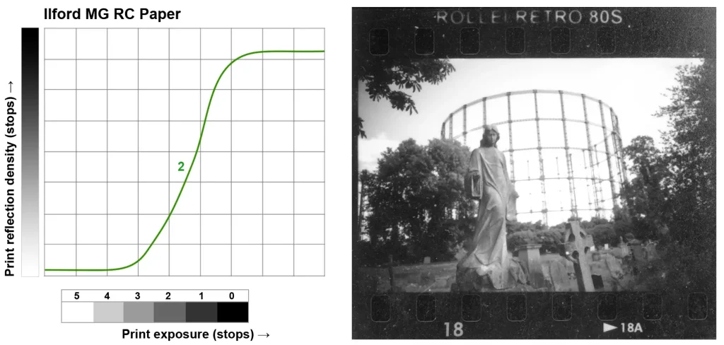
For this example, I deliberately picked a ‘bad’ negative – both underexposed and over-developed. The negative (Rollei Retro 80S) has an NDR of about 5 stops. In the graph (below left), the negative is represented by a tonal scale with 6 bands – a 5-stop range. From right to left, Band 0 has the minimum density (FBF); Band 1 is one stop denser, and so on. (Note that the bands here, which represent stops of negative density, are different from zones, which represent stops of subject brightness. For instance, in the section on film dynamic range, we saw how a 10-stop SBR created an NDR of only 6 stops.)
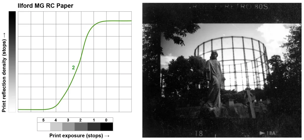
I contact-printed the Rollei negative at Grade 2. The exposure was at SPT, so by definition, Band 0 corresponds to Dmax, the point where the curve just reaches its plateau.
The graph (above left) shows what happens in theory, and the contact print (above right) shows the actual result. Bands 0 and 1 (shadows: trees and shrubs) fall on the shoulder of the curve; they print as black or very dark grey, with little separation. Bands 2 and 3 (midtones: the main statue) fall on the straight-line portion and have much more separation. Band 4 (highlights: the sky) falls on the toe of the curve, printing as light grey or near-white, with little separation. Band 5 (bright highlights: the clouds) is at the very bottom of the toe, and partly below. The densest parts of the negative transmit very small amounts of light, which are not enough to create density on the print.
Under and overexposure
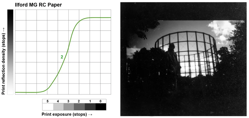
Next, I contact-printed the same negative at 1 stop less than SPT. As before, the graph (below left) shows what happens in theory, and the contact print (below right) shows the actual result.
Due to the 1-stop underexposure, the tonal scale is shifted 1 stop to the left. Band 0 is now a bit below Dmax, so there is no pure black in the print. As you can see, the unexposed film edges, which should be pure black at SPT, are lighter than the sprocket holes. Band 1 now falls on the straight-line portion and has much more separation; we see much more shadow detail on the ground. On the other hand, Band 4 is at the bottom of the toe, and Band 5 has fallen off the curve altogether. So the sky and clouds are mostly white, with little or no detail.
Finally, I contact-printed the negative at 1 stop more than SPT. Again, the graph (below left) shows what happens in theory, and the contact print (below right) shows the actual result.
Due to the 1-stop overexposure, the tonal scale is shifted 1 stop to the right, relative to the SPT print (2 stops to the right, relative to the previous print). Much more of the negative (Bands 0, 1 and 2) now fall on or above the shoulder, so large parts of the print are black or very dark grey. However, Band 5 now falls on the toe of the curve, so there is a bit of highlight detail in the clouds.
Here are the three contact prints side-by-side for comparison (all printed at Grade 2):

Contrast grades
So far, all contact prints were made at Grade 2. Next up I’ll show what happens when we print at lower and higher paper grades.
SPT is typically different for each contrast grade (from the Ilford graphs shown earlier, you can see how the curves reach Dmax at a different levels of log exposure). In the graph below, I’ve included the curves for Grade 1 (red) and Grade 2 (green). Both grades are exposed at SPT, so their Dmax points coincide (aligned with Band 0). Matching Dmax for different grades gives us a fixed point of comparison; we can then see how all the other tones change. [Math note: Compared to the Ilford graph (where Grades 00–3 received the same exposure), I shifted the Grade 1 curve ~½ stop to the left to match the Dmax points. That’s equivalent to giving the Grade 1 print ~½ stop more exposure (in order to reach SPT) than the Grade 2 print.]
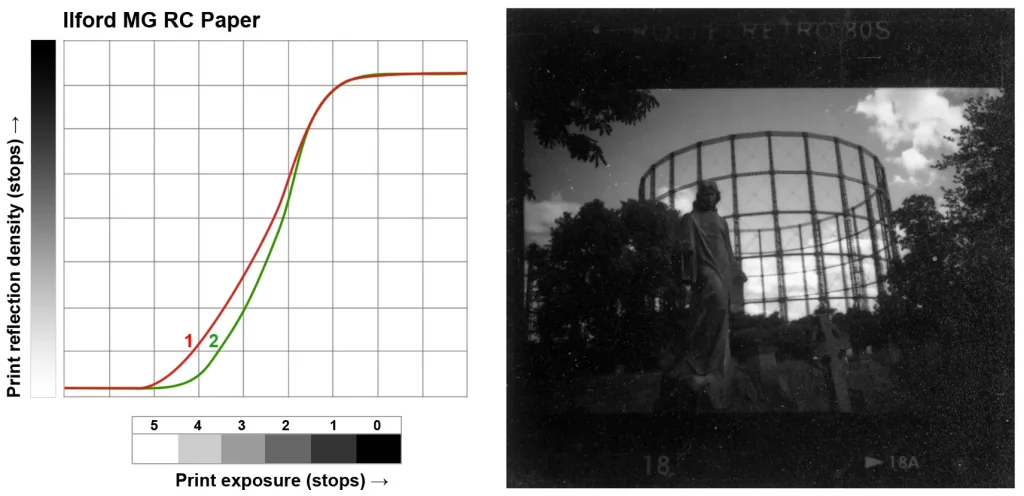
If we now compare the curves, we see that Bands 0 and 1 produce similar, deep black tones on both grades. At all other bands, the Grade 1 curve is higher, indicating darker tones than we got at Grade 2. We can see this in the contact print as well. The Grade 1 print (above right) is noticeably darker than the Grade 2 print shown earlier. Crucially, Bands 4 and 5, which fell on (and party below) the toe of Grade 2, now fall on the straight-line portion and toe of Grade 1. The Grade 1 print therefore has much more separation in the sky and clouds.
The next graph shows the curves for Grade 2 (green) and Grade 3 (blue). Again, both were exposed at SPT, so their Dmax coincides.
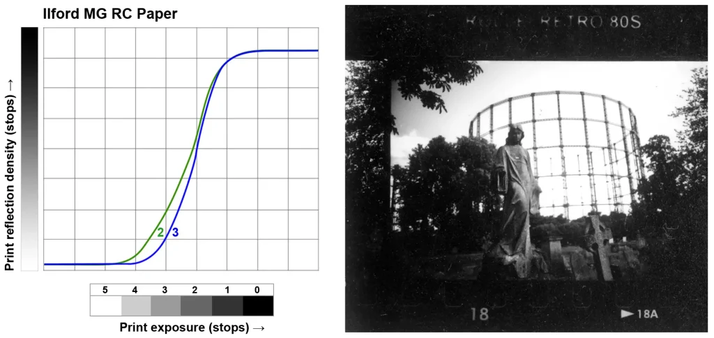
The Grade 3 curve is steeper, so there is more separation in the shadows and lower midtones. But Bands 4 and 5 now fall further down the toe. Compared to the Grade 2 print, Grade 3 (above right) has even less detail in the sky and clouds.
Here are the three contact prints side-by-side for comparison (all printed at SPT):

Matching paper contrast to the negative
In the previous section I printed the same negative at different contrast grades. That negative, as I mentioned, has an NDR of about 5 stops. But some negatives have a lower NDR (shorter tonal scale), and some have a higher NDR (longer tonal scale). By printing the former at higher grades and the latter at lower grades, we can make prints with similar density range. (This is the print equivalent of pushing a low-contrast scene or pulling a high-contrast scene to produce negatives with similar NDR, as discussed in an earlier section.)
The graph below shows two tonal scales, representing negatives with NDR of 4 stops (S) and 5 stops (L), along with the paper curves for Grade 1 (red) and Grade 3 (blue).
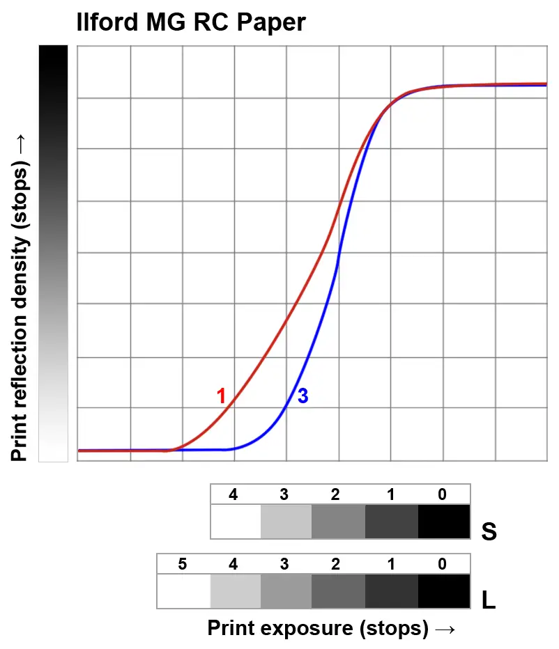
If S is printed at Grade 3 (SPT) and L is printed at Grade 1 (SPT), the prints will have approximately the same density range; the thinnest and densest areas of each negative will print at Dmax and Dmin respectively.
What if we did the opposite? If S were printed at Grade 1, the tonal scale would be too short for the paper curve; Band 4 would not be light grey, not white. And if L were printed at Grade 3, the tonal scale would be too long for the paper curve; Bands 4 and 5 would both be white, resulting in loss of highlight detail.
From the foregoing discussion, you might think that if we know the NDR, choosing the right paper grade is as simple as picking the right curve, such that the minimum and maximum negative densities correspond to Dmax (black) and Dmin (white) respectively. Unfortunately, it’s not quite so simple.
Look again at the contact prints I showed earlier. The Rollei negative, as I mentioned, has an NDR of about 5 stops. Printing it at Grade 1 (SPT) ensures that the tonal scale ‘fits’ the paper curve. Bands 0 and 5 correspond to Dmax and Dmin respectively; we have detail in both shadows and highlights. But since the negative is underexposed, some key areas – the statue and the gravestones around it – are dark and lacking separation. Printing the negative at Grade 3 (SPT) produces much more separation in the shadows. But since the tonal scale is too long to fit on this (much steeper) paper curve, there is significant loss of highlight detail.
The problem with this negative is twofold: high global contrast (due to overdevelopment), and low local contrast in the shadows (due to underexposure). Good darkroom technique can somewhat salvage such negatives (in subsequent posts, I’ll talk about my approach to printing various ‘problem negatives’). But in general, properly exposed and developed negatives make better prints – and take less time and effort, to boot.
Exposure compensation for contrast filters
Some paper datasheets say that no exposure compensation is required when switching between grades. For example, Ilford’s datasheet says, ‘The exposure time for filters 00–3½ is typically the same and filters 4–5 will require increased exposure time.’
The first thing to note is that this only applies to Ilford multigrade ‘speed-matched’ filters. If you use some other system of contrast control (e.g. a colour head, which is what I use), all bets are off.
But what if you’re using the right filters? Even then, things are not as straightforward as they may seem. Let’s say you print the same negative at Grades 00, 0, 1, 2 and 3, giving it the same exposure each time, and developing the prints identically.

As you can see from the graphs above, the curves for the first five grades (00–3) intersect at a specific point: 0.6 log units of reflection density. At that point, the same exposure on all five grades produces the same density. So that particular tone – a bit lighter than middle grey – will be the same on all five prints. But in the higher contrast prints, the shadows will be darker and the highlights will be brighter.
What does that look like in practice? The three prints below were made on Ilford MG RC paper, using the same negative and identical exposures, with Ilford filters of Grade 1, 2 and 3 (I don’t have Ilford filters, so my friend Joris made these prints at my request – huge thanks to him!)
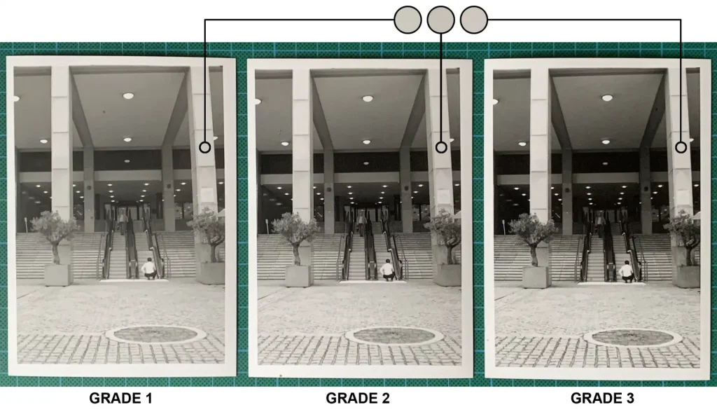
As you can see, the light grey tones (sampled from the pillar, for example) are nearly identical. But as you move up the grades, shadows become blacker, and highlights (like on the squatting figure’s shirt) become whiter. This system – keeping the light grey tone constant – is the basis for speed-matched filters, and it works surprisingly well as a starting point. But when switching grades, in order for the negative to look ‘right’, you may need to adjust the exposure one way or another. (I’m currently developing a system to calibrate exposure compensation for different contrast grades – but that will be the subject of a future post.)
Paper dynamic range
Just like film curves, the characteristic curves for paper allow us to estimate the paper’s dynamic range at different contrast grades. For example, in the Ilford MG RC paper graph shown above, the response range for the two extreme contrast grades – 00 and 5 – are 1.5–3.6 and 2–2.9 log exposure units respectively. Dividing these ranges by 0.3 gives us a dynamic range of 7 stops for Grade 00 and 3 stops for Grade 5.
Note that the dynamic range thus found represents the maximum NDR that can be printed on paper at a particular contrast grades. NDR is different from (typically lower than) the SBR. In the section on film dynamic range, we saw how a 10-stop SBR created an NDR of only 6 stops. The Ilford paper curves tell us that Grade 0 has a matching dynamic range of about 6 stops (1.5–3.3 log exp units). So if that negative were to be printed at Grade 0 (SPT), the thinnest and densest parts of the negative would print at Dmax and Dmin respectively, yielding a full range of tones from black to white.
Conclusion
It may seem like I covered a lot of things in this post, but the core ideas are simple:
- On both film and paper, more exposure creates more density. Both exposure and density can be measured in stops.
- The range of tones in a subject (or densities on a negative) can be thought of as a scale. Exposure in camera (or with an enlarger) determines where that scale is placed on the characteristic curve of the film (or paper). More exposure shifts the scale to the right, and less exposure shifts it to the left.
- A steeper curve means greater contrast. Development (for film) and contrast filters (for multigrade paper) are key factors which determine the shape of the curve.
- When exposing, developing and printing photos, we have a good deal of freedom to decide where on the curve to place the tonal scale, and what shape the curve should be. Therefore, we also have freedom to decide how the tones in a real-life scene should translate to tones on the negative or print.
For most of us, making good photographs is ultimately more important than knowing all about characteristic curves. As Grant Haist once said, “Fortunately, the practice of photography does not depend upon a complete understanding of how the photographic process works.” But if this understanding can help us make better photographs – or at least, better prints – that can only be a good thing.
Thanks for reading. I realise it’s a fairly long and complex post, so if you have questions, please leave a comment and I’ll do my best to answer (or maybe someone with more knowledge will jump in). I’d also like to thank Rob Gunby from the Facebook Darkroom group for his helpful comments on a draft of this post. For more nerdy content, feel free to check out my Instagram.
Share this post:




Comments
thorsten wulff on Contrast and Tonality Part 3: Characteristic Curves for Film and Paper – By Sroyon
Comment posted: 07/02/2022
Comment posted: 07/02/2022
Mike on Contrast and Tonality Part 3: Characteristic Curves for Film and Paper – By Sroyon
Comment posted: 07/02/2022
Comment posted: 07/02/2022
JAMES LANGMESSER on Contrast and Tonality Part 3: Characteristic Curves for Film and Paper – By Sroyon
Comment posted: 07/02/2022
Comment posted: 07/02/2022
Alexander Seidler on Contrast and Tonality Part 3: Characteristic Curves for Film and Paper – By Sroyon
Comment posted: 07/02/2022
Comment posted: 07/02/2022
Alex Vye on Contrast and Tonality Part 3: Characteristic Curves for Film and Paper – By Sroyon
Comment posted: 07/02/2022
Comment posted: 07/02/2022
Billy Sanford on Contrast and Tonality Part 3: Characteristic Curves for Film and Paper – By Sroyon
Comment posted: 08/02/2022
Comment posted: 08/02/2022
Patrick Medd on Contrast and Tonality Part 3: Characteristic Curves for Film and Paper – By Sroyon
Comment posted: 08/02/2022
Comment posted: 08/02/2022
Kevin Pritchard on Contrast and Tonality Part 3: Characteristic Curves for Film and Paper – By Sroyon
Comment posted: 09/02/2022
Comment posted: 09/02/2022
Sroyon on Contrast and Tonality Part 3: Characteristic Curves for Film and Paper – By Sroyon
Comment posted: 24/11/2023
Firstly the SBR (subject brightness range) which I explained in the post. If it's a low-contrast scene, then the highlights may still fit on the curve.
Secondly it depends on the film (see my comparison of FP4 and HP5) and also how it's developed (see my comparison of Ilford Ortho in different developers). These determine the shape of the curve. And some emulsions (or emulsion-developer combinations) have very high dynamic range, where even with significant over-exposure, the curve doesn't really flatten out. But there is a flip side to this, in that parts of the negative may become excessively dense, so even though the variation in highlight density is recorded, it can be hard to reproduce it in a print. And also very dense highlights sometimes means more grain or loss of acutance (I talked about this in my post, just search for