In accordance with my recent poll – which I later found out was rigged by a mate of mine with a “sense of humour” – Here is my review of the Konica AiBORG…
The Konica AiBORG is ugly. Not “only a face a mother could love” ugly – worse. But, that’s precisely what attracted me to it, I couldn’t not buy a camera that looked like this, I just had to find out more about it. After handing the chap in the charity shop I found it a crisp £5 note, I took it straight back to the office and sat it on my desk, proudly exclaiming “look at this thing!”. After some discussion around the office we came to the conclusion that it was best described as what would happen if Darth Vader and The Predator had a child together. Though after switching it on watching the lens protrude out of its mouth we decided that actually it must have been fathered by Darth, but it’s mother was more likely the daughter of The Predator and one of H.R.Giger’s Aliens… Of course the whole discussion fell apart when we looked closer still and realised the front of the camera is made of a slightly soft rubbery material on the cheeks/grips, with the rest is made of a sparkly blue plastic. It can’t have been the spawn of evil, as it’s likely none of the aforementioned nemeses would allow their child out the door with such terrible makeup on!
But, looks aren’t everything are they?! There’s absolutely no reason this thing shouldn’t produce good photos. And with all those buttons on the back, surely it’s capable of some useful functions too?
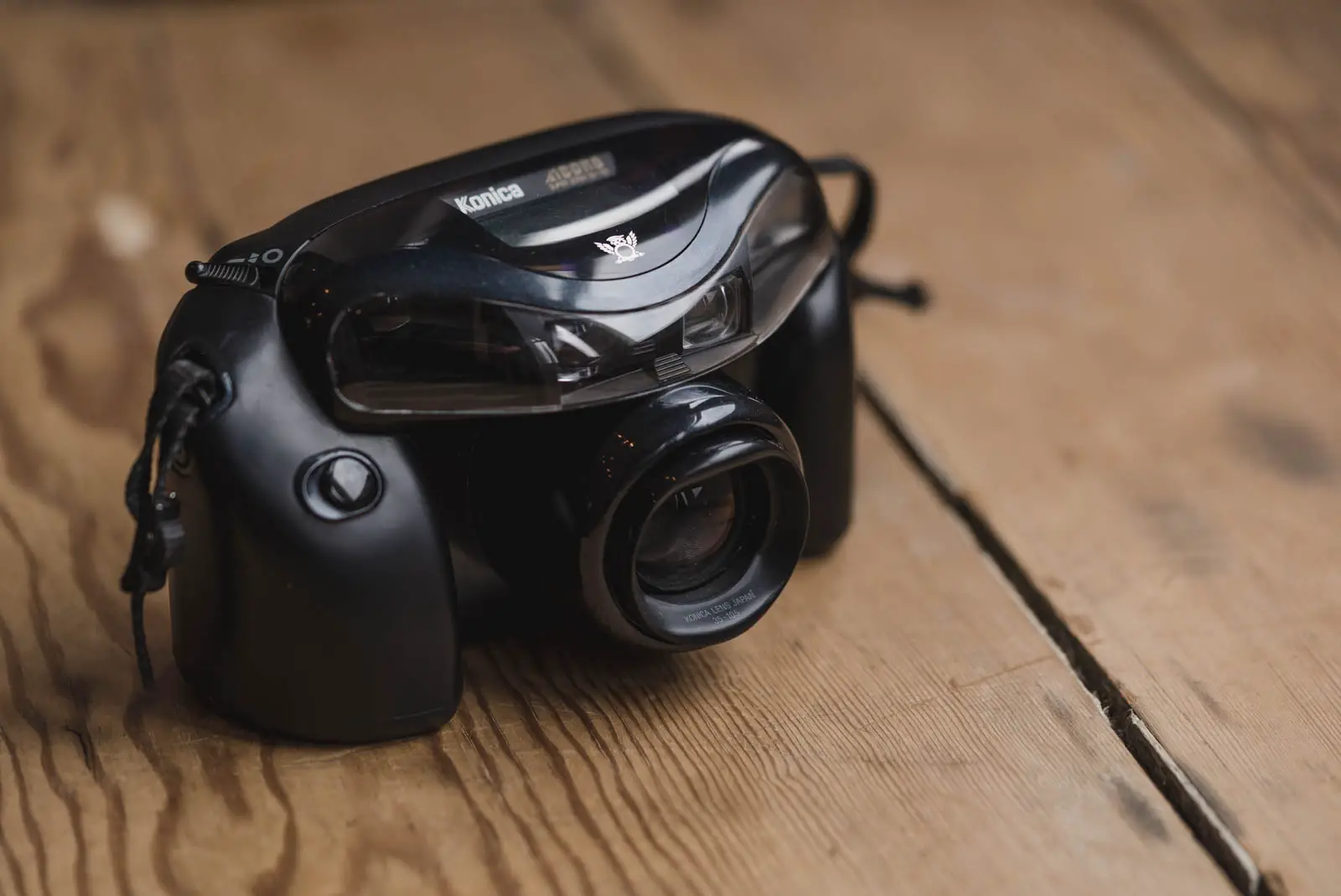
The Konica AiBORG in use.
It is no exaggeration to say, the Konica AiBORG handles extremely badly. So badly in fact that I was actually taken aback by how shit it felt to use. It fails summarily at the first hurdle with the position of the shutter button being so clearly wrong. You would think that with a camera of this size the shutter button would sit under your finger when you naturally grip the camera. It doesn’t, in fact so far I’ve had to look at the camera almost every time to find the button. It’s so far down the front the camera, when you do put your forefinger on it, the grip isn’t comfortable and the camera feels top heavy. Not satisfied with putting the shutter button in the wrong place, it seems they were also keen to make it a tactile nightmare. Half press is too far into the throw of the button, and full press too soon after – this makes the half press to focus process quite difficult. The zoom/mode control that’s supposed to but under your thumb – but is in fact quite far out of reach when you have your finger on the shutter – also feels rubbish . It’s a little like the sort of 4 way control you might find on one of those cheap 1990’s GameBoy knockoff toys. Then there’s the vast array of little buttons across the back, all countersunk and fiddly to press. To top it off, the whole thing creaks and feels bendy and flimsy in use. In summary, however bad it looks like in the pictures, it’s worse in the hand.
The viewfinder
A big camera like this, I had hopes that the viewfinder would redeem it somewhat. It doesn’t. Small, is probably the best word. Mine is also filled with dust and is basically blurred when zoomed in. I think the latter is because of the dust, so I can’t really hold this against it I suppose, it is quite old, but a viewfinder that obstructs the view has certainly not done it any favours. I should add though, all is not awful with the VF, It does have a focused distance indicator which is quite useful and is a feature I quite like in autofocus point & shoot cameras. It also let’s you know when the flash is going to be used, or if it thinks you should have it mounted on a tripod, but I’d probably forgo all of that stuff to actually just see clearly though the thing.
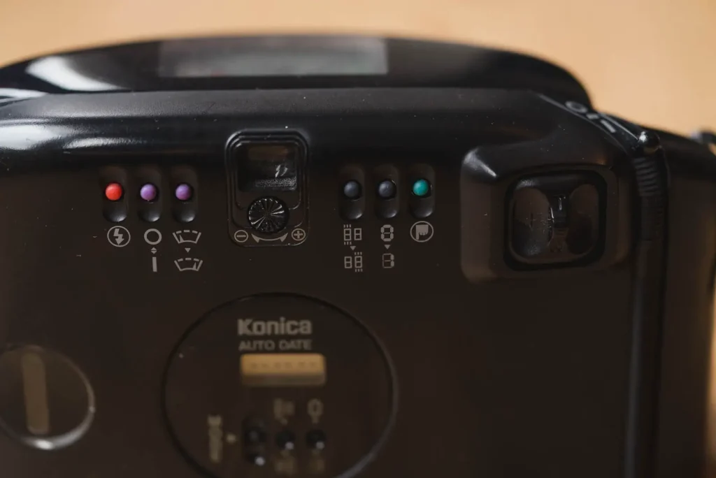
The other buttons, and their many functions
Unfortunately, not only is the AiBORG awful to hold and use, Konica also apparently saw fit to make the thing nigh on impossible to understand at first glance… and second glance, and possibly even 24th glance. It has a range of buttons across the back with a set of icons that look like the designer was trying to make them appeal to an 8 year old motorsport enthusiast. Once again, they bare similarity to the sort of thing you might find on a knockoff GameBoy, maybe one with a knockoff version of road rash installed on it.
Crap, but fun…?
I’m sure you get the impression by now that I think the Konica AiBORG is a hateful pile of crap? Well, I’m not going to deny it, I’m not its biggest fan! But, I have had fun using it. Not because of how it is to use, but for some of the fun things it does. The reason it has all those silly buttons on the back is simple, it does a lot of different things – some useful, some fun and some entirely pointless. All I can say really is welcome to the slightly odd world the AiBORG…
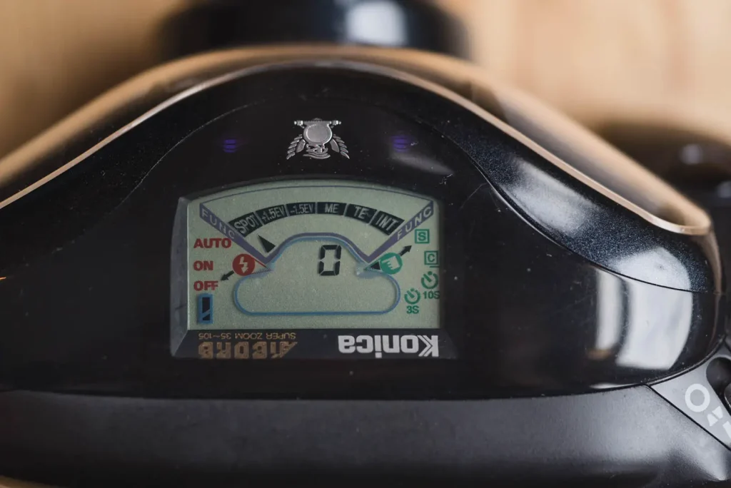
The Konica AiBORG’s modes
To make things simple, I’m going to start on the back of the camera reading left to right. This way at least should ease you in to this learning curve with something familiar…
Flash modes
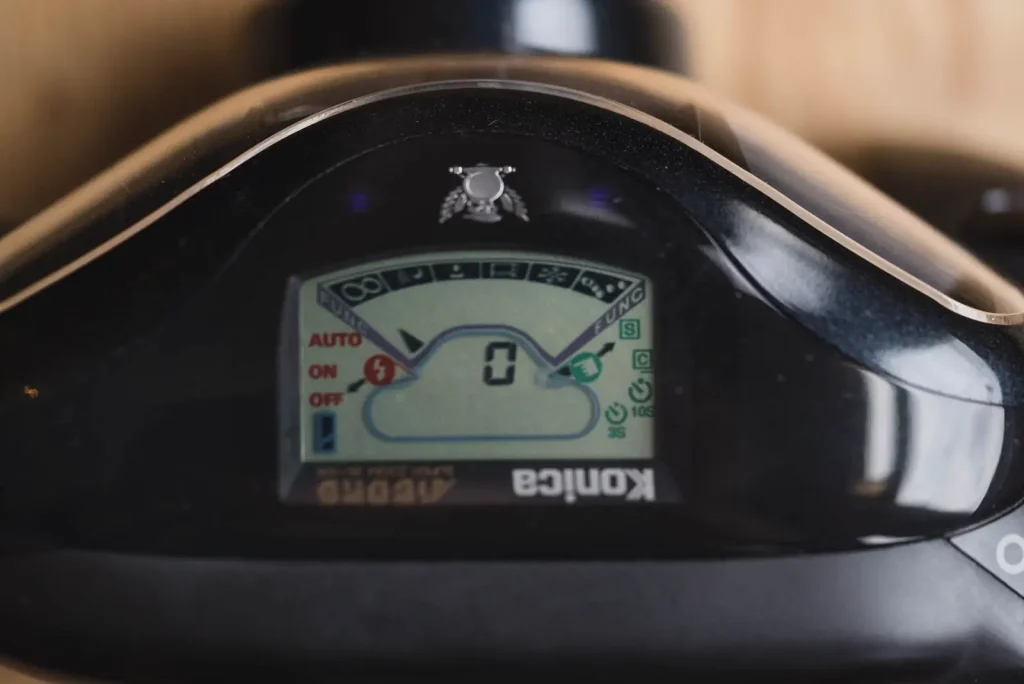
Operated by the red button on the far left of the back and indicated on the left hand side of the screen on the top. A simple auto, on and off are the modes available. These modes can be set independently of the rest of the following modes, some of which come with their own default flash setting that can then be changed.
Scene modes
The next two pink buttons are associated with controlling what I’m going to call scene modes. The first one switches the camera into its scene mode, the second button scrolls through the modes one-by-one.
Infinity mode
Quite simply, this mode sets the camera to focus to infinity, regardless of what the camera is pointed at.
Some sort of night mode
From what I can gather, this mode will allow the camera to use shutter speeds down to around 6 seconds if it feels necessary. It can also be used with the flash to balance the foreground an back lights.
Portrait mode
Though I didn’t use this with a film in the camera, it appears to automatically zoom the camera to a distance appropriate for a head and shoulders portrait. I guess this works by measuring the distance to the subject combined with an understanding of the average size of a person. Bluntly, this mode appears to me to be completely pointless, I’m perfectly capable of zooming the camera to an appropriate focal length for a portrait. Maybe folks needed help with this in the early 90’s?
TV mode
For taking photos of a TV screen without the scanning bars being visible in the end result. Pointless, especially in this day and age.
Bright scene mode
This will no doubt up the exposure slightly to counteract the effects of shooting a snowy or otherwise bright landscape. The camera also has a +1.5ev which I will get to in a second… Surely these modes amount to the same thing?
Bouncy ball mode
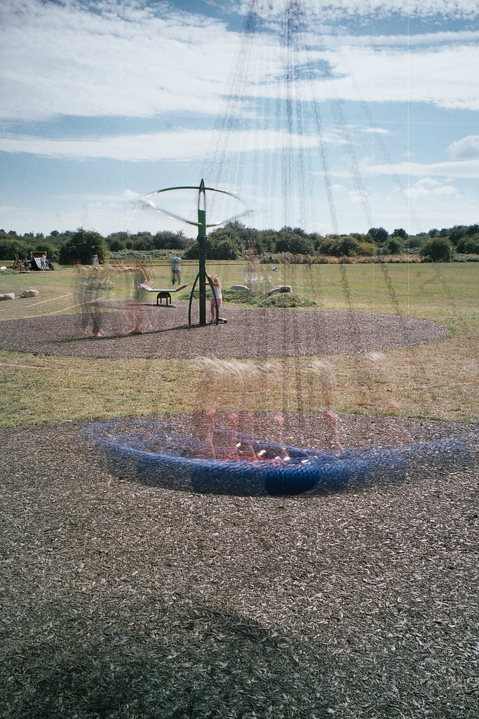
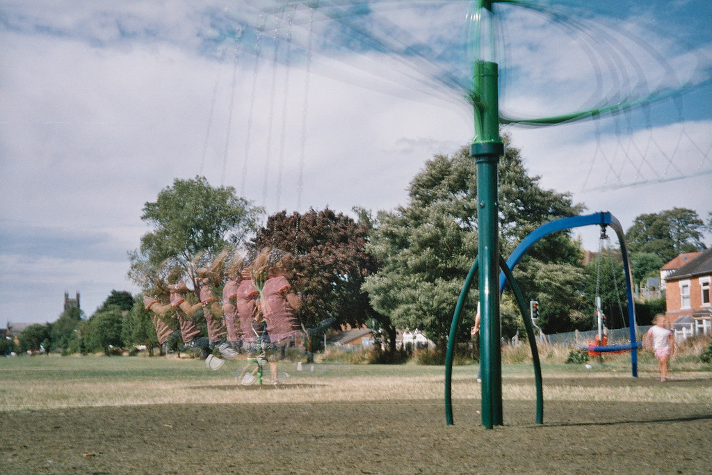
Im not sure what else to call this mode, it’s icon s a bouncing ball, so that’s what I’m going with. It is a bit of fun actually, though my results are not really the best. It takes six photos in quick succession on to the same frame. Its basically a multiple exposure mode for taking photos photos that capture movement. If you are in to sports photography, I guess this could be a bit of fun! One thing I didn’t try was using it either the flash, apparently it will flash on only the last frame. I can imagine with the right sort of image, this would look quite dramatic.
Spot
The next mode is the spot meter mode. I didn’t use it, but spot meter modes are always useful!
Exposure compensation modes
The next two modes +1.5ev and -1.5ev. Again, always useful to have. I shot exclusively Fuji 400 superior in the Konica AiBORG, a film that looks nice slightly over exposed and atrocious underexposed so I shot most of my “normal” photos with the camera set to +1.5ev. Unfortunately, these mode aren’t available to set in combination with any other modes. This is a big short fall of the design in my view.
Multiple Exposure
This mode allow you set the camera to take up to 39 photos on to the same frame. The number of frames is selected via the second purple button on the other side of the viewfinder. I didn’t take any multiple exposures, we all know what they look like. Definitely useful if you like that sort of thing.
Timed Exposure
Somewhat crazily, the Konica AiBORG allows single frames to be taken up to 99 hours, 59 minutes, 59 seconds long. I’m not sure what a 100 hour long frame might look like, though I know some folks do get a kick out of this sort of thing with pin hole cameras. Of course, this camera isn’t a pin hole camera, but I guess there might be some merit in some slightly shorter exposures? This all goes a little outside of the realms of my knowledge really, I don’t know how great the affect of reciprocity failure is at 100hrs, maybe something interesting can be taken with a non-pinhole camera? If anyone thinks it is possible, let me know and I’ll set something up.
Interval Exposure
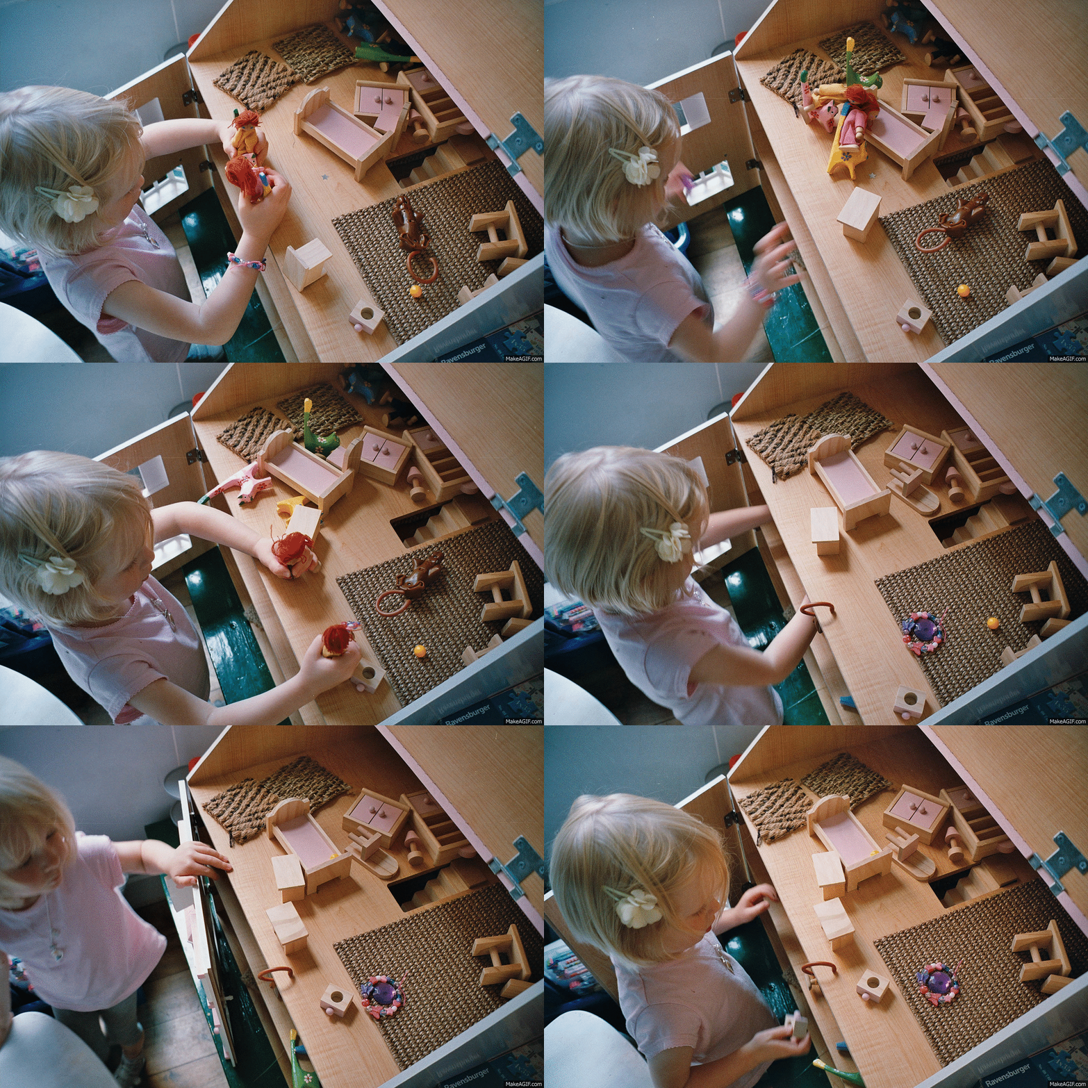
The last mode is the interval timer. Limited to 39 frames or the end of the film, whichever comes sooner. The camera can be set to take photos from 1 second intervals up to 99 hours, 59 minutes, 59 second intervals. Possibly one of the more compelling features of the Konica AiBORG, it allowed me to make this animated GIF. Still, largely a bit of fun rather than anything else.
The purple control buttons
These rather poorly labeled buttons are for controlling the setting of the interval timer, timed exposures and interval timer. Annoyingly, they only go in one direction so if you click past the mode or number you want, you have to go all the way through the numbers or modes again. This is only compounded by how frustrating the buttons are to press.
Shutter mode selector
The final button of the six little ones on the back, the green one to the far right, is the shutter mode selector. I think the icon on it is supposed to be a pointing index finger. Modes selectable are indicated on the right hand side of the LCD on the screen on the top. Single shot, continuous shooting and two self timer – 3 and 10 seconds – are available
Date modes
The Konica AiBORG also has date modes, though I never use these, they are there if you like to taint your images in a 90’s retro style.
The zoom/focus point selector
I’ve saved the worst for last – the little joystick that’s supposed to sit under your thumb, but doesn’t. As mentioned, this control is not only poorly positioned, it’s also horrible to use. It feels really flimsy and plasticy, and just sort of feels like it could drop off at any moment. But, it’s actually very useful. Not only does pushing it up and down zoom the camera in and out of its 3x (35-105mm) zoom range, but moving it from side to side also operates the focus point selection. What’s amusing about the camera is that rather than having 5 focus sensors for its 5 focus points (1 centre, 2 either side), it mechanically moves the single focus sensor from side to side. This definitely adds to the clunky feeling of the camera. I did actually find the multiple focus points useful though, not because they are something I frequently use on other cameras, but because on this camera – with its heinous half press – it made focusing on a subject off centre easier than half pressing and reframing.
What’s really nice, is that the camera has 3 little lights on the front of the camera to indicate to anyone in front of the camera which focus point you are selecting. A most useful addition… …!? It was in fact the playing with the focus point selector, watching those little lights change that made me realise something about the Konica AiBORG…
Complicated down? Or just a toy?
If you read my recent M6 post you will have read descriptions of what I call “complicated down” and “simple up”. Simple up being the definition of a design that feels like it only has the very few features it needs to function, and complicated down defining designs that feel like they are trying to solve everyone’s problems with lots of different features and functions. I started this post thinking how logical it would be to have talked about a “simple up” camera followed by a “complicated down” one, and how this would help define what I mean when I talk about these things. Unfortunately don’t feel like I can really use the definition “complicated down” for the Konica AiBORG as this would be giving it the credit of solving people’s real problems. In actuality, this camera has made me realise is that on top of my simple up and complicated down definitions there is a third design definition – one that isn’t essentially about solving the problems of the user at all.
I had initially confused this camera with a “complicated down” design, but when you get closer to it, you realise that the functions aren’t there just to solve people’s problems – to some extent, they are perhaps just there to entertain. As I mentioned earlier in the post, whilst the Konica AiBORG was horrible to use and in many of its functions basically useless, I’d actually had fun using it. Throughout the process of writing this post I’ve been trying to think of other products that feel like this, products that give that same sense of feeling slightly useless, but are actually a lot of fun. For a while I struggled to think of anything to use as a comparison. Then – whilst watching Connie play with her toys – it dawned on me and I realised the answer had been staring me in the face all along – I’d already referred to it as being like a knockoff GameBoy. What the Konica AiBORG shares most attributes with is not a normal functional product, it has more in common with the one type of product that is there just to entertain – a toy.
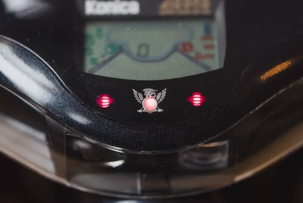
The little lights on the front that illuminate for a moment when it’s switched on, and then again as the focus point is changed were the biggest giveaway. But seeing it as a toy, all of a sudden so much more of it makes sense. The silly body shape and the glittery blue front panel, the whacky icons, the over the top screen, the joy stick control and daft feature set; they all make sense as part of a product that is designed to be more of a toy than a camera.
But of course, it is still a camera, and it still takes photos. And whilst many of the things it does and the way it looks are toy like, unlike many of the cameras that people call “Toy cameras”, the Konica AiBORG performs quite well when it comes to taking a photo. This is because of two very good core features…
The lens and autoexposure
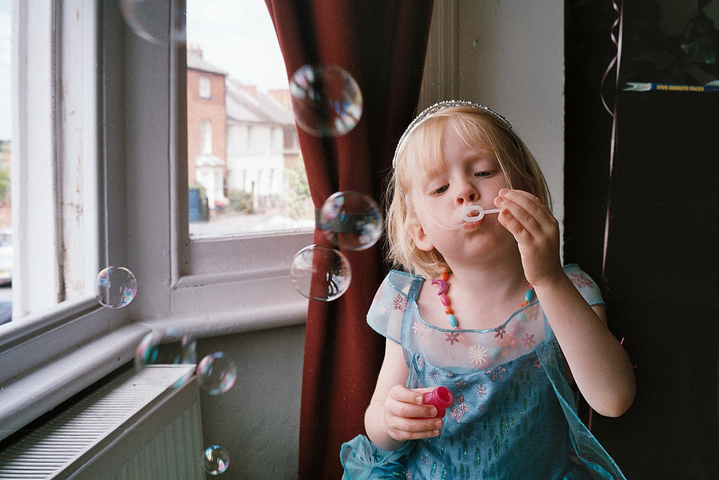
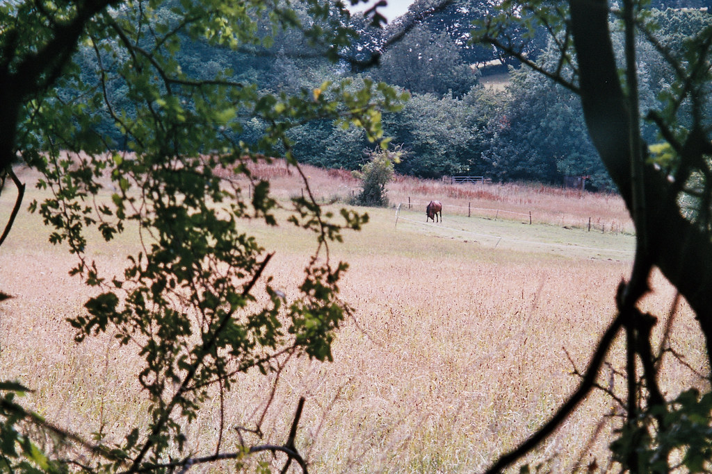
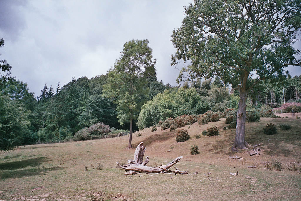
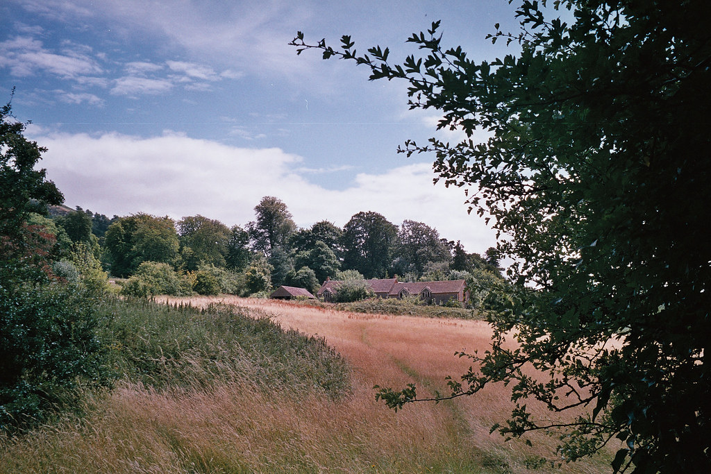
The lens is excellent. It almost pains me to say it, but I can find little fault with it, at least at the price I paid for it. As a 35-105/f3.5-f8.5 lens, it is a very useful range. The 35mm f3.5 at the wide end means it’s perfectly useable with 400iso film in most “normal” shooting conditions. Add to that the fact that the long end of the zoom is f8.5 and you have what amounts to a quite fast zoom lens, at least by comparison with other 35mm zoom cameras. It’s also fairly contrasty, especially at the wide end where I’ve found myself surprised at the quality and subjective sharpness of the photos. The long end of the zoom is probably slightly softer, but actually not that much really.
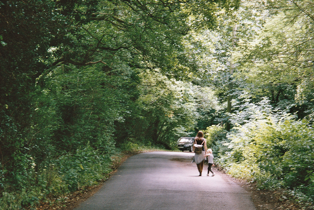
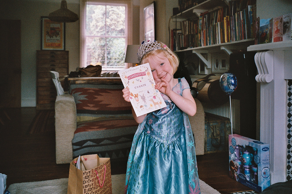
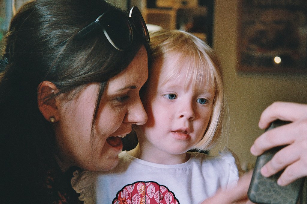
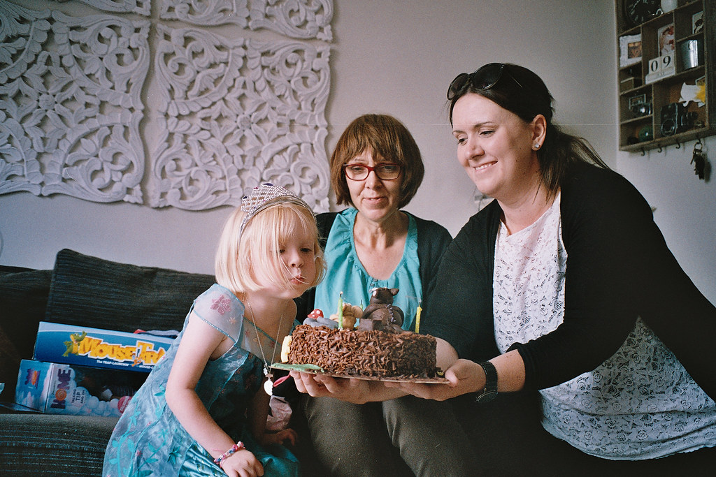
Its autoexposure is brilliant too. I was expecting it to fall over in lower light and give me a bunch of motion blurred shots. But I didn’t have many, even at the longer end of the zoom it did an admirable job. This next photo was the only shot I got at the long end that didn’t turn out, and I felt myself move when I took it – I was rushing to catch them in the light
What many of these 35mm compact cameras inherently do is favour using a longer shutter speed over opening the aperture. This can be said of many compacts I’ve tried and is ultimately the thing that makes me stop using them. The Fuji compacts are known for it in my world. This Konica on the other hand seems to do its damnedest to give you a sharp photo. It seems to favour using as wide an aperture as it can before electing to use a slower shutter speed. This sort of autoexposure programming gives me a lot of trust in a camera in use as it feels like it’s making the same decisions I would if I did have manual controls.

My Concluding thoughts on the Konica AiBORG
Of course, the reality is, despite it taking good photos, it is still otherwise a nightmare to use as a day to day choice of camera. There are just too many other cameras out there that take good photos to recommend this one for that quality alone. The crazy thing is though, because it does take these good photos, and because it does things that I don’t know of any other camera doing all in one (ugly) box; my disgust of it – and I would go that far – doesn’t exclude it from my recommendation list. If someone said to me “I want a cheap camera with a good lens that does interval shooting” I’d recommend it. The same can be said of that bouncy ball mode, I just don’t know of any cameras that can be had so cheaply with such functionality and such a good lens. Maybe someone can point me in the right direction for an alternative…? Please!
Ultimately if I had to pin the Konica AiBORG to one demographic, it would have to be early 1990’s boys up to the age of about 11. I think I’d have thought it was cool when I was that age in that era, all those buttons, silly icons and things that it does, even its alien design would have appealed to me as a young boy. But as an adult, who probably takes his photography a little too seriously I can’t help but see the Konica AiBORG as a rather daft toy – a daft toy that just happens to take surprisingly good photos.
More:
Some more of my photos on Flickr
Another helpful post
Share this post:




Comments
ehpem on Konica AiBORG Review – Big/ugly/horrible… Good lens
Comment posted: 07/08/2015
If I see one for a fiver (Canadian) I will pick it up and see if I can avoid a brain aneurism while using it.
Comment posted: 07/08/2015
jeremy north on Konica AiBORG Review – Big/ugly/horrible… Good lens
Comment posted: 12/08/2015
I did like Konica film back then though
Comment posted: 12/08/2015
Charles on Konica AiBORG Review – Big/ugly/horrible… Good lens
Comment posted: 04/11/2015
Comment posted: 04/11/2015
Comment posted: 04/11/2015
Comment posted: 04/11/2015
Comment posted: 04/11/2015
A compendium of the wacky and weird: 10 strange camera designs that history has forgotten | Amazon Discounts on Konica AiBORG Review – Big/ugly/horrible… Good lens
Comment posted: 03/05/2016
Konica AiBORG (1991) - mike eckman dot com on Konica AiBORG Review – Big/ugly/horrible… Good lens
Comment posted: 13/04/2017
Brian Davis on Konica AiBORG Review – Big/ugly/horrible… Good lens
Comment posted: 20/09/2017
Comment posted: 20/09/2017
Mike Butkus on Konica AiBORG Review – Big/ugly/horrible… Good lens
Comment posted: 07/12/2017
http://butkus.org/chinon/konica/konica_aiborg/konica_aiborg.htm
Carmen Miranda on Konica AiBORG Review – Big/ugly/horrible… Good lens
Comment posted: 20/04/2018
Comment posted: 20/04/2018
John Trwoga on Konica AiBORG Review – Big/ugly/horrible… Good lens
Comment posted: 09/09/2020
Ten of the quirkiest compact film cameras - Kosmo Foto on Konica AiBORG Review – Big/ugly/horrible… Good lens
Comment posted: 01/04/2022