Recently, I was chatting with the manager of VSSOutlet, a mostly online used camera gear shop, but which also happens to be located near me. He showed me a weird sliding large format 8×10 reducing back (for a larger studio ULF camera) that he had just come across and wondered if I knew what it was. It was weird because it had a space for a ground glass, and then two spaces for film holders. In one holder slot there was a green filter, and in the other there was a red filter. We were both baffled by what this would be for. We agreed that if there was a 3rd spot with a blue filter, it would obviously be for making trichromes. But since it was red-green, that seemed less likely? We wondered if maybe it was for doing 3d anaglyph images. I had no answers.
But then I kept thinking about it, and reading about early color processes, and asked #BelieveInFilm friends what they thought. And discovered a whole rabbit hole of earlier color processes that I hadnt known anything about. It turns out there were a whole bunch of early color processes utilizing 2 color channels, rather than 3, often using red and green filters rather than red, green, and blue! There is an excellent website, talking about many of these early processes, though more focused on movies than photography, here. So that probably explained the 8×10 sliding back.
But, I have also been shooting a lot of trichrome photography over the last 2 years, and that got me thinking…
As so many other people have been, I was originally turned on to the process of making color photos, from black and white film, by the awesome work of Andrew Keedle (check out that link and be sure to scroll all the way down to admire the amazing ULF trichrome at the bottom!). And since then I have been enjoying the trichrome work of several #BelieveInFilm friends, often posting under the #TrichromeParty or #TrichromeEverything hashtags, like Bill Thoo, and Neal Hinkle, and Maureen Bond. Also, I was thrilled to discover that an author I’ve always enjoyed, Jasper Fforde, has also done some amazing trichrome photography!
And because I like to explore processes, I’ve gotten interested in shooting trichromes in interesting and novel ways, for instance shooting trichromes with paper negatives, using panchromatic paper, and using Solarfast, a light sensitive dye similar to Cyanotype (but which comes in many colors) to print trichrome images.
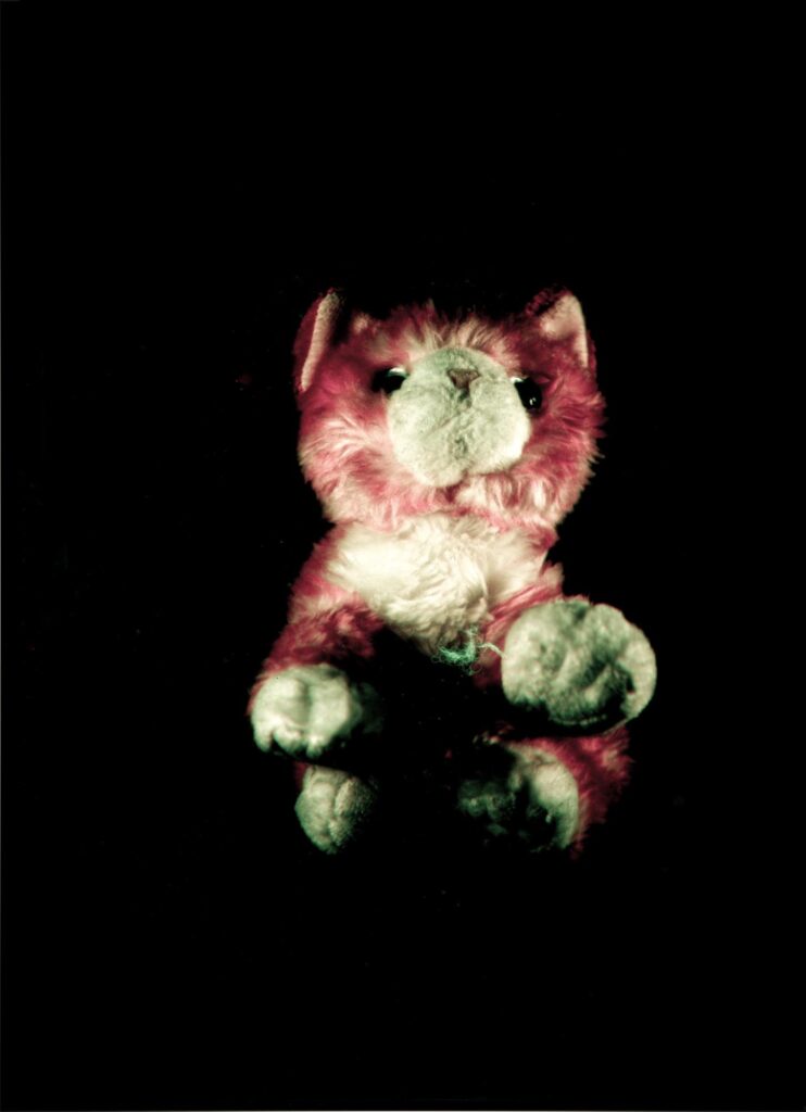
So, having seen this old hardware for early color images, I thought this would be an interesting avenue to explore: making color images with LESS than an R, G, and B filtered exposures. I had already recently done this inadvertently. I have been shooting a series of images I had been titling “Beloved Stuffies” photographing my daughters favorite stuffed animals as a way to document this stage in her life (she is 8) in which stuffed animals are so important to her. I tried to make a trichrome paper negative image of one of her stuffies, using the panchromatic ilfospeed RC digital paper (re-packaged by Ultrafine). But I messed up the blue exposure and ended up with a bichrome image combining just red and green. It looked pretty good!
And then, the final piece of the puzzle for this new experiment: I read this amazing blog post by Kelly-Shane Fuller in which he explores making Bi-Pack bichrome images! These are images in which you expose the two color channels in your bichrome image at the same time! This process was used briefly in still photography, as a method for recording color photos, but was quickly supplanted by other processes. Remarkably, the first Kodak film given the name “Kodachrome” was this sort of early bi-pack color process that Kelly-Shane was exploring. This process also survived much longer in the realm of movie making!
What wizardry is this???!?
So the way it works is amazing: You load two films at the same time in the same holder, and get two color channels. The first film, at the front of the “pack”, is orthochromatic and does not have a filter in front of it. That records the B/G light coming into the camera. But the light also passes through the ortho film. Behind the ortho film is a red filter, and behind the red filter is a panchromatic film that is sensitive to red light. So the panchromatic film records the Red channel! What is even more incredible is that Kelly-Shane reversal processed his examples of this process and then dyed them Red and Green so that they make a color slide in real life rather than having to be combined as a digital post-process! Wild. Seriously, go check out the post, it’s amazing.
Giving it a try
The concept of getting a color image from black and white films exposed at the same time in a single exposure seemed awesome. I wanted to try it. The idea percolated around in my head for a bit until I realized I already had all the things I needed, on hand, to give it a shot!:
- Orthochromatic film – I had a barely used pack of Arista Ortho-Litho in 5×7. Ortho-litho can be processed for continuous tone images, but it’s notoriously difficult. I had gotten a pack of ortho-litho because it is so cheap, and I wanted something to experiment with my tailboard camera with, but I found it frustrating to expose or process correctly, so I gave up and had a bunch left!
- Red filter material – I had previously purchased some big sheets of red, green, and blue filter material (for flashes, not for optical use!) to make my own custom sized budget trichrome filters. This came in a big sheet that it was easy to cut to the same size as a 5×7 holder
- Panchromatic film – I have a partially used box of Foma 100, also for use originally in my tailboard camera (technically this film is 13×18.
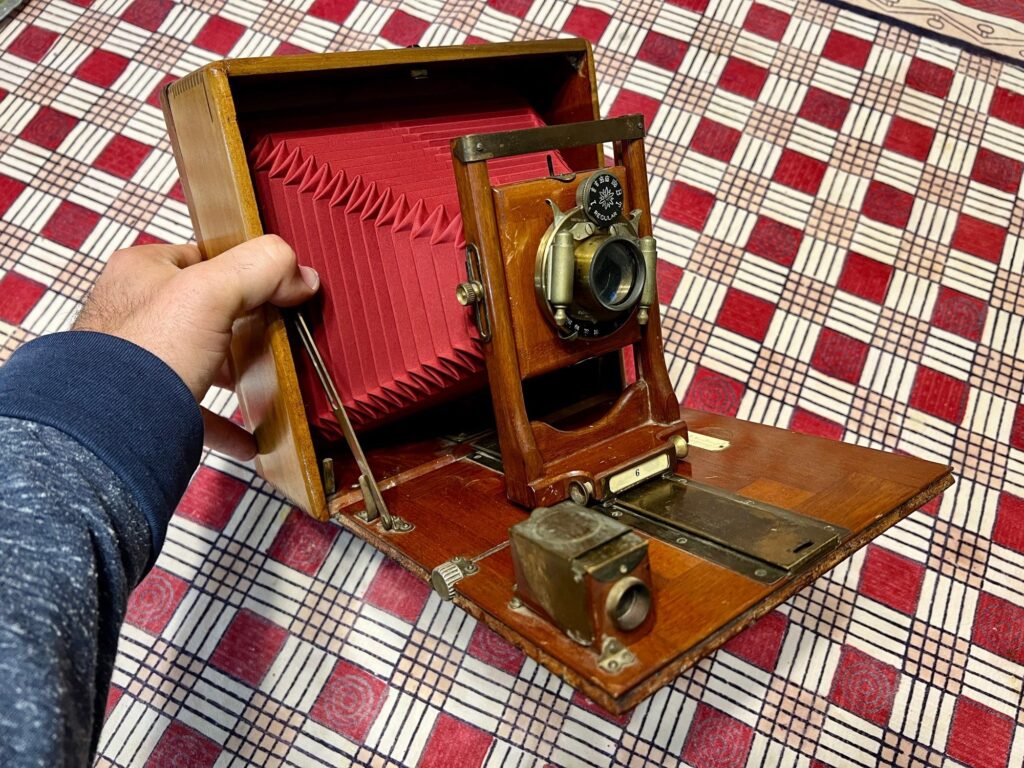
- A 5×7 camera – I recently restored this Seneca 6 5×7 camera that was in terrible shape from goodwill. The hardware was all fine, but the leather exterior was rotting, and the bellows were in tatters. So I sanded down and refinished the exterior to expose the beautiful wood, and then replaced the bellows!
One of the problems Kelly-Shane had with his bi-pack setup was the ratio between the iso of the ortho and pan films. He was using an Ortho film with 80iso and a pan film with 100iso. So the pan film was only slightly faster than the ortho film. But a LOT of light is lost passing through the ortho film and then the red filter. Kelly-Shane estimated he was losing 3 stops, so the pan film became, effectively rated as iso 12 and he had to resort to some pushing and pulling to balance exposure. But it occurred to me that the ortho-litho is a better balance to a normal ~100iso pan film. Depending on how it is exposed and processed, Ortho-litho can be rated between ~1 and 25! So you could potentially have a close match between the sensitivity of the ortho-litho, and the sensitivity of the pan 100 after the light loss!
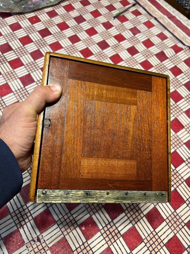
It all seemed so straightforward, so I thought Id give it a quick try. I loaded up a bichrome sandwich in a 5×7 holder (Ortho-Litho, Rosco red filter material cut to size, and Foma 100). The ortho-litho and filter material are so thin that it was not a problem to slide all 3 sheets into a film holder insert for my antique dry plate holders. Though I did have to do quite a bit of trimming with my paper cutter: The Foma 100 I have happens to be 13×18 film, not real 5×7 film, so it needs to be trimmed to fit in a standard film holder. I also had to cut the red filter to size (from the big sheet) and then the ortho-litho is actually 5×7, not the slightly smaller size of 5×7 film! So that had to get trimmed too! But it only took a moment to trim all 3 and load them into a single side of a double dark slide and head out to shoot!
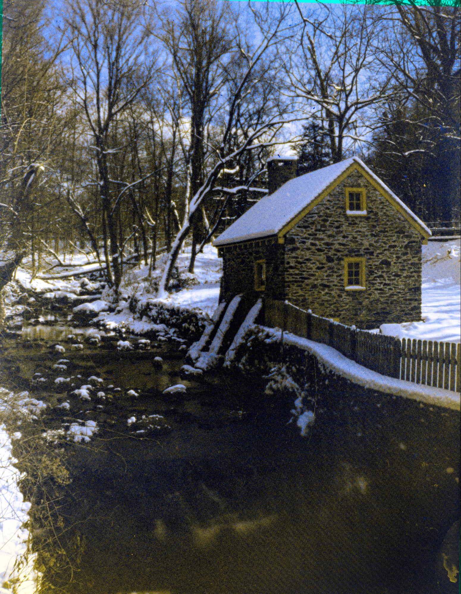
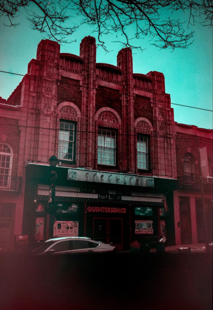
It was a grim day, but all I wanted to do was test the concept. So I headed to the local high street and set up to take a photo, in the snow, of the beautiful art-deco Sedgewick Theater in NW Philadelphia. one of the last of a series of cool Philly movie theaters from the 20s. This one is currently home to a theater company as it tries to raise funds for renovation and preservation. I set my camera up on the sidewalk across the street and was grateful to only be doing a single exposure in the cold, rather than the much slower trichrome process! I got focus and framing set, under my dark cloth, and then spot metered off the building with the pack rated at 12.
This was intended only as an experiment, so I was thrilled to get a useable result. I processed both negatives in dd-x 1:9, doing the ortho-litho by inspection in red-light, and the Foma 100 in the dark using the times from the massive dev list. Both negs were thin, but I was able to scan and combine them for a colorful bichrome!
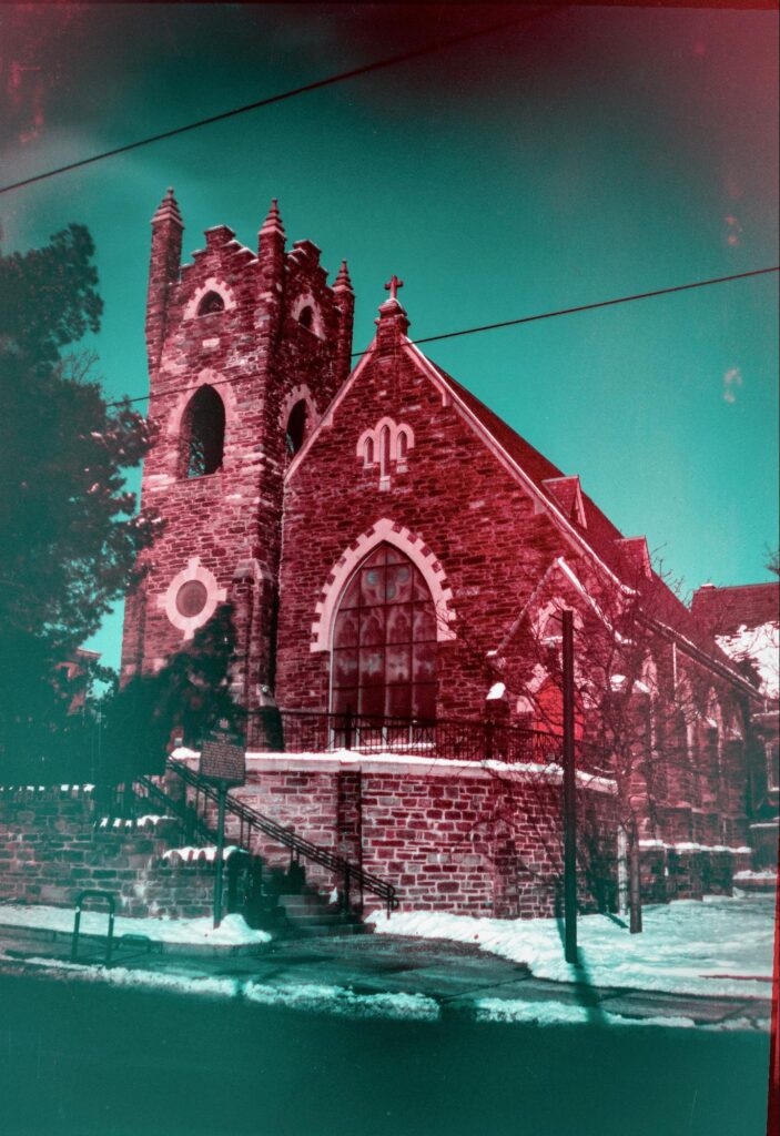
In my next attempt, I rated the pack a little slower, at iso 6, and got less thin negatives, though still pretty thin on the red channel. This time I developed the ortho-litho in dd-x 1:9 and the Foma in 1:19.
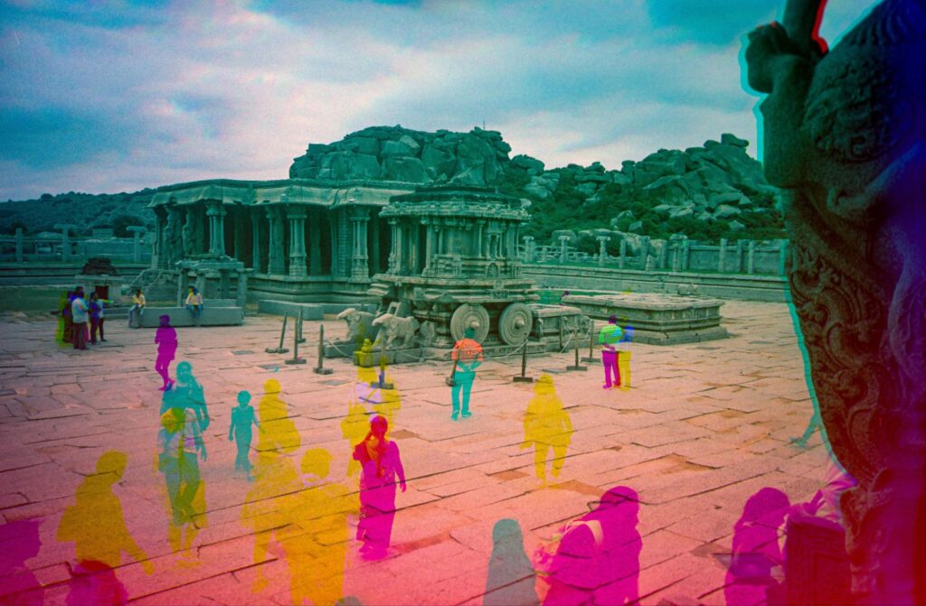
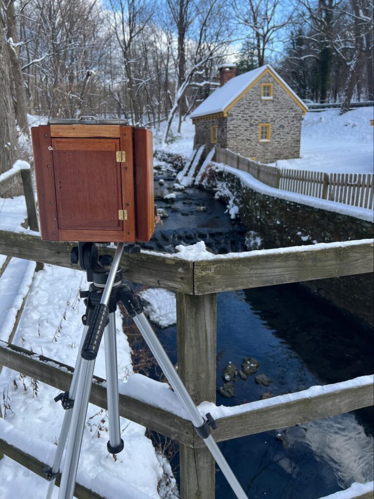
For my next test, I shot and developed the pack the same as the Schaeffer-ashmead Chapel above, but experimented with combining the channels differently. At one of my regular photo shooting spots, the historic Rittenhouse Town in Philadelphia, I shot a photo of the bakehouse (c. 1725). For the processing, I scanned the negatives, adjusted the curves and inverted them, brought them both into photoshop and then “Auto-aligned” them. Finally, as with trichromes, I went to “Blending” for each layer and just selected the corresponding color channel. But, since there are only two channels, you can decide how to combine them. For all the previous examples, I selected “red” for the red filtered negative, and “Green” and “Blue” for the orthochromatic image. This tends to create the red and blue shifted images as above. But, alternatively, you can choose “Red” and “Green” for the red filtered negative, and just “Blue” for the orthochromatic image, and you get a more yellow shifted image. In the case of the photo at Rittenhouse Town, this alternate combination gave a result that was VERY close to real life.

Further refinements
I have yet to get another picture that I am as happy with as the photo of the Bake House. Though mostly I have only tried a few more exposures, testing some refinements of the processing. One important thing I have been experimenting with is alternative processing methods for Ortho-Litho film to improve control over the contrast. As has been well discussed online, Arista Ortho-Litho is cheap, but difficult to control for continuous tone development. Recently, though, I read this blog post by Tom Maszerowski, in which he wrote about getting great continuous tone negatives from Ortho-Litho using the included low-contrast directions for the Arista Premium Liquid Film Developer. His results with this developer look great, and it did provide more mid tones in my initial tests with it, when rated at 6iso. This also means a good 4 stop separation between the ortho layer and the red layer (rated at 100).
Conclusions
This is a fascinating way to take an old timey color photo, it’s not exactly straighforward, or easy to get right, but it is a neat trick and has been an enjoyable exploration of the limits of color imagery from black and white film!
I am not sure how many more of these Ill do once my supply of 5×7 ortho-litho runs out, but I may try loading up a bipack of 35mm since I have some ortho-litho in that format, too!
Share this post:


Comments
Thomas Wolstenholme on Bi-Pack Bi-Chromes: or How I learned to love making color pictures on black and white film in a single exposure
Comment posted: 09/07/2024
Gary Smith on Bi-Pack Bi-Chromes: or How I learned to love making color pictures on black and white film in a single exposure
Comment posted: 09/07/2024
Comment posted: 09/07/2024
Tony Warren on Bi-Pack Bi-Chromes: or How I learned to love making color pictures on black and white film in a single exposure
Comment posted: 09/07/2024
Graham Orbell on Bi-Pack Bi-Chromes: or How I learned to love making color pictures on black and white film in a single exposure
Comment posted: 09/07/2024
Comment posted: 09/07/2024
Jim Skelton on Bi-Pack Bi-Chromes: or How I learned to love making color pictures on black and white film in a single exposure
Comment posted: 10/07/2024
Great article--you've piqued my interest!
Darren Nelson on Bi-Pack Bi-Chromes: or How I learned to love making color pictures on black and white film in a single exposure
Comment posted: 10/07/2024
Paul Quellin on Bi-Pack Bi-Chromes: or How I learned to love making color pictures on black and white film in a single exposure
Comment posted: 11/07/2024