Introduction and Background: Wikimedia Commons
Sometime around the year 2012, I started documenting the buildings and places in my home town, Hannover (Germany). This article deals with the way I came from there to here. I am talking about inspiration, motivation, and, last but least, beauty. And you are going to see some of my recent imagery.
During the first years, I exclusively took photographs to upload them to Wikimedia Commons. If you are not familiar with this institution: Wikimedia Commons is the media repository from which Wikipedia and related projects source images and videos. I pretty much liked the idea that volunteers donate their work and thus help spreading free knowledge. Part of the deal: everybody can use your creations and alter them, for example, re-work your post-processing. The content’s perpetual improvement belongs to the self-understanding of all Wikipedia projects.
As long as I shot my images digitally, this was okay for me. When I switched back to film, I not only invested a considerable amount of time into my photographs, but also money. Since then I felt more connected to my work, so I didn’t want anybody else to touch my images. The final result should only arise out of my creative vision. And I wanted to take black-and-white photographs. As an encyclopedia, Wikipedia seeks for neutrality. Accordingly, a color image depicts any given subject more realistically than a monochrome representation. A color image is thus strongly preferred in this context.
You can find all my contributions to Wikimedia here.

Recent Inspiration: Sting’s Englishman
The music video of Sting’s Englishman in New York, directed by no other than David Fincher, turned out tremendously inspirational. It’s not that I just love this song. The clip is also an outstanding portrait of the city. New York presents itself as a cold and lonely environment. Shot entirely in black and white, the clip features some fast-paced street scenes. For me, the imagery acts here as perfect match for Sting’s thoughtful lyrics.
One thing I particularly like about Sting’s video is how snow covers the city. If you see snow, you will immediately know the temperatures have fallen into the sub-zero region. Howsoever, photographers can’t create their preferred weather. We have to be patient and wait for it. Since my return to film photography in December of 2016, I can’t remember a winter in Hannover with snow existent for more than a few hours. So I will wait … and wait … and wait …
When photographing Hannover, l I find my subjects normally by just looking around. I keep my eyes open whenever I’m on board a train, tram or bus. If I’m walking through a neighborhood, I’m constantly scanning my surroundings. As I don’t carry the camera with me just in case, I have to collect my ideas for later field trips. Therefore, I add interesting findings to a list. Important is my watch list of buildings that are going to be demolished sooner or later. In addition to that, I also monitor some development areas.
On Motivation for Documenting Hannover
Back then, when I was collecting images for the Wikipedia projects, finding motivation was fairly was easy. I simply looked out for encyclopedia entries on Hannover-related topics. If they lacked an (necessary) image of an architectural structure, my task was set. This also worked the other way around: if I had photographed an interesting building without any entry related to it, I would go to library, research and create the entry.
Wherein lies my motivation today? I don’t have the – surely never reachable – goal to photograph every single building in Hannover. (I generously pass this job to: Google…) The photographer’s task is, so I think, to depict what’s special and what’s exemplary for the ordinary. She or he has to make choices, reduce and distill the infinite number of visual expressions. I consider my efforts as an ongoing project: as long as I am in the mood, I continue shooting houses.
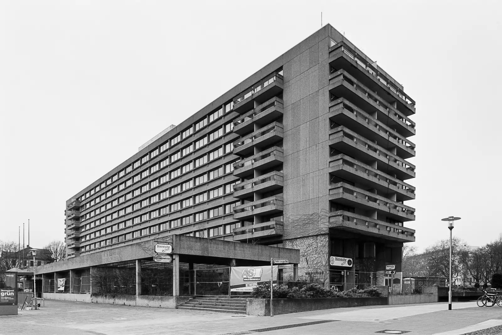
For my part, I choose the subjects that I find appealing. These subjects don’t have to be famous buildings like churches or medieval half-timbered houses – but they can. Sometimes, a perfectly boring house is all I’m looking for. Even the entire lack of specialties can make something special. Hamish already expressed the fascination for “ugly” structures in his article about Unremarkable Architecture. (Check it out, it is very worth reading.) To honor the brutalist architecture, I chose the former Maritim Grand Hotel for the opening picture. Ironically, this concrete monolith from 1965 stands face-to-face with one of Hannover’s most famous sights, the pompous New Town Hall. I can’t imagine a contrast between two buildings to be more pronounced.
Societal Changes and Architecture
One of the strongest motifs in photography has been the desire to preserve a current state by documenting it, I think. Changes happen all around us at any time. Neither can we stop these nor can we delay them. So we need photographs to help us remembering. Remembering the day of our graduation at university, our vacation at that beautiful beach or our kids’ birthdays. We grow older and our life situation changes. Society as a whole changes, too.
In a way, architecture reflects societal changes. Around the turn of the century, people were seeking for pompous, ornamental houses. Buildings had to reveal the pride of their owners. In later times, especially after World War II, this style was considered as lavishness and thus frowned upon. The post-war era entailed a lot of architecture that I would label as modest and functional at best. Often times, crappy and cheap seem to be the right terms. This also lead to the brutalist architecture mentioned above.
Though I would describe my work as unpolitical, I feel the increasing urge to drive it forward. With the fascists re-emerging to a threatening extent, Germany faces an uncertain future.
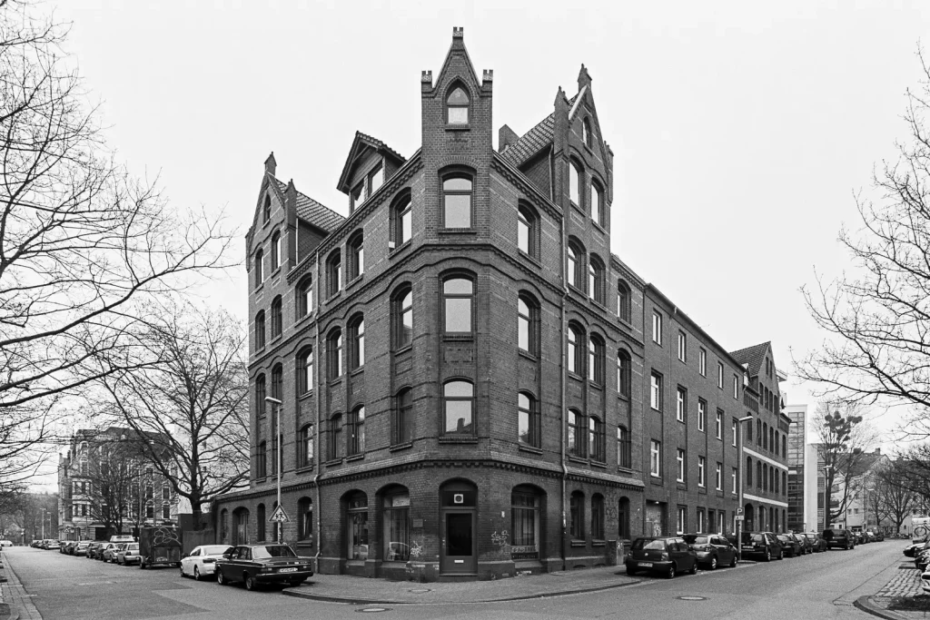
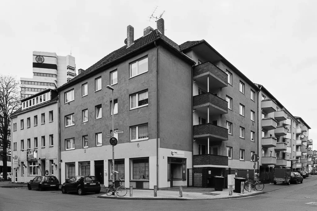
Style: No Style
Once I read an interview with the Bechers, the artist couple who photographed myriads of industrial structures throughout the 20th century. They stated to always strive for a “no-style style”. The Bechers intention was to avoid any personal traits in their photography – meaning the artist shouldn’t leave any kind of signature in her/his work. To achieve this, they exclusively shot on black-and-white film and depicted their subjects in the most “sober” manner possible. Thus, they didn’t use any dramatic angles or perspectives, strictly avoided converging lines and preferably took the images under a dull, overcast sky. Of course, the Bechers’ body of work became so unique that their “no-style style” is now characteristic for them.
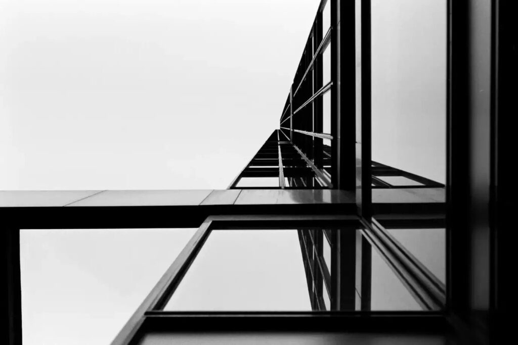
Well, I find the Bechers’ approach very impressive – and to some extent directional for my own photography. But I see a problem there: if you stick to a set of strict rules, many subjects won’t work. Example? Imagine a tall building in a densely populated area, without the possibility to step back. So you have to make concessions in terms perspective – or you have to just omit this photo. In such a scenario, I would tend to rather take image than not. Even if that happens at the expense of the consistency in my work.
What’s the fun in photographing architecture? For me, I suppose, it’s to play with the lines. To align edges, to create parallels, to work with symmetry. If I succeed in that, I will be rewarded with an interesting representation of a building.
Technicalities: Film and Format Choices
To document Hannover, I shot the photographs with my Canon gear on either Fuji Acros or Kodak Tmax 100 film. With their high sharpness and resolving power, these films predestine themselves for detailed subjects. The monochrome nature gives the images a classic, timeless feel more than color film would do. Furthermore, there are hardly colors to miss. The prevailing materials in architecture are either bricks (dark-red / reddish brown), concrete (dark to middle grey) or plaster (light grey to white).
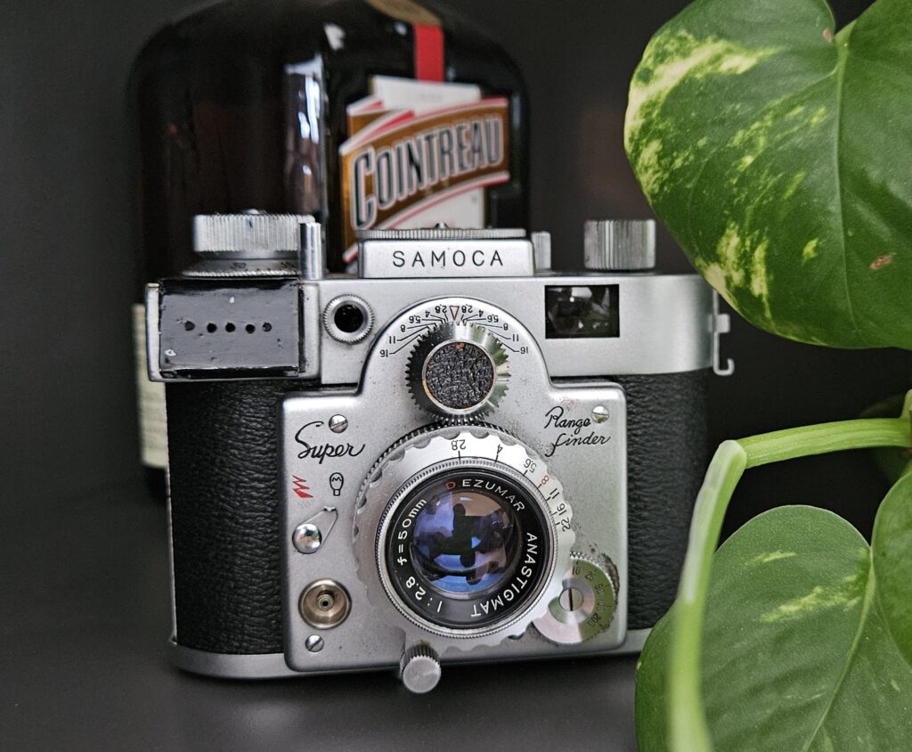
If you want to know more about the camera, please switch over to my peace about night photography. In the section “My trusty Canon SLR”, I have written more in detail about it. Though I really lust for large format, I will probably stick with 35mm. The small format just offers to many advantages: it is cheap (36 exposures cost me round about 30 Euros for film, development and scanning), and it is flexible. Given the right conditions, I can finish one roll in roughly one to two hours. Now that’s a throughput! Camera and lenses don’t weigh so much that I won’t carry them all day around. (Of course, my gear doesn’t play in the same league as Point & Shoot cameras in this regard.)
December Opportunities
“It’s the most wonderful time in the year”. What Andy Williams sang about Christmas is true for architectural photography, too. During December, I encounter favorable weather conditions more often than during other months. For me, ideal weather is a homogeneously overcast sky and low temperatures (but not freezing cold). The trees have lost their leaves entirely and thus don’t obscure the buildings anymore. As another plus of December, Christmas vacation means lots of spare time.
Normally, Sunday mornings deliver the most prolific circumstances as the people are still at home and only a few cars drive around, even on the main roads. Winter also means that cafes and restaurants have abandoned their outdoor seats. The number of drunken – and thus rather annoying – people has fallen to almost zero. (Quote: “Hey-ya, uu! Duude, whazz up, what r uuu doin’ there?! Take-a pic-tcha of uzz! Comm-on, duuude!”)
Further Images
Residential Houses
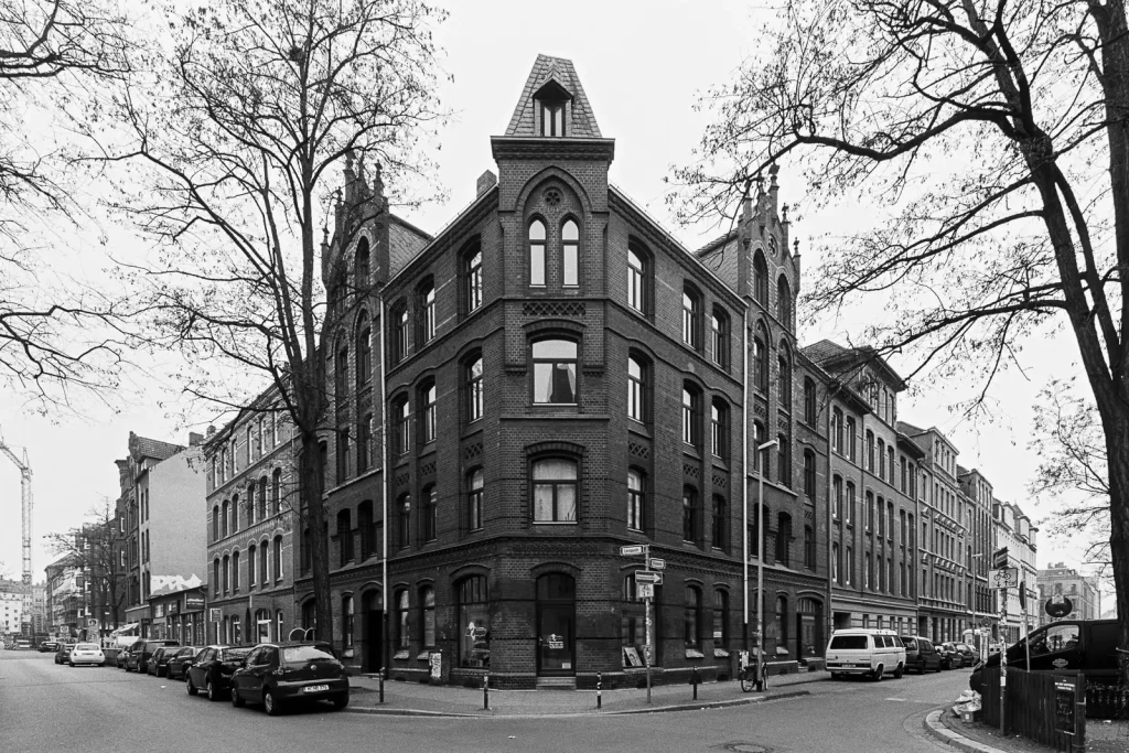
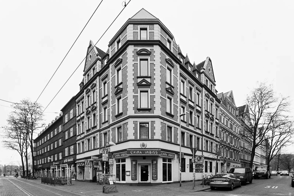
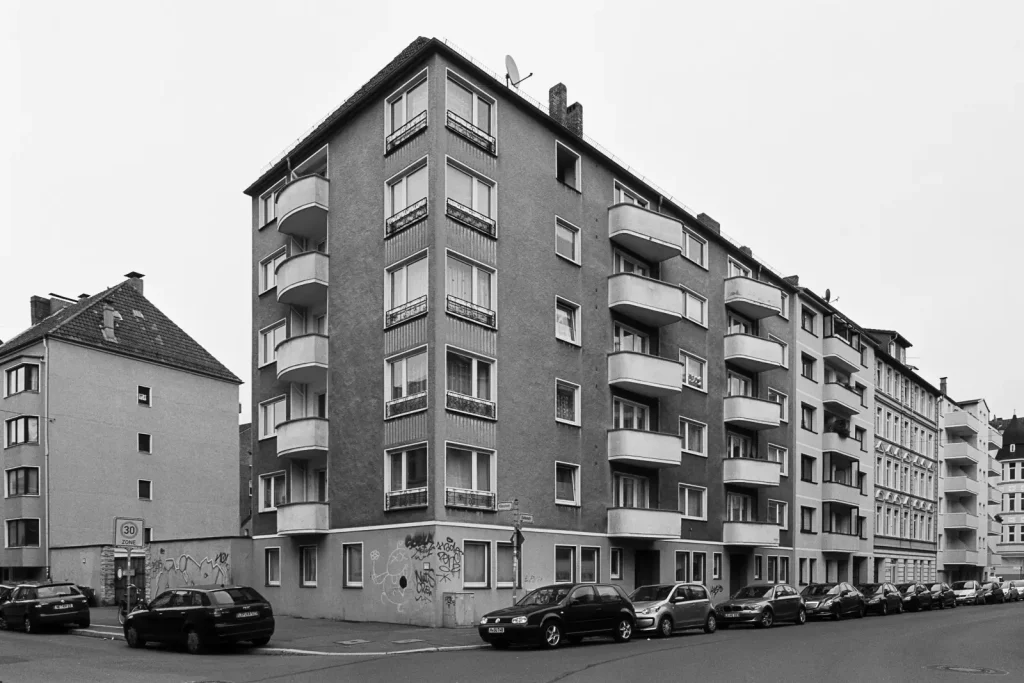
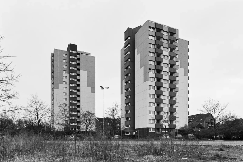
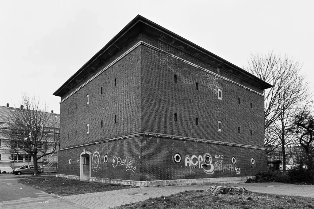
Most of the buildings in town serve as people’s homes. My collection of images reflects that, residential houses contribute the greater part to it. For this article, I made a selection. I tried to find examples from different time periods and style. The houses also vary in size: some accommodate only a few families, others provide room for hundreds.
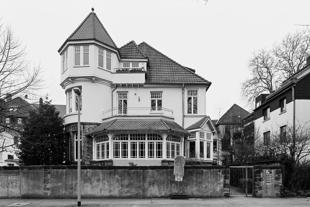
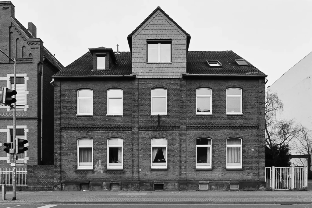
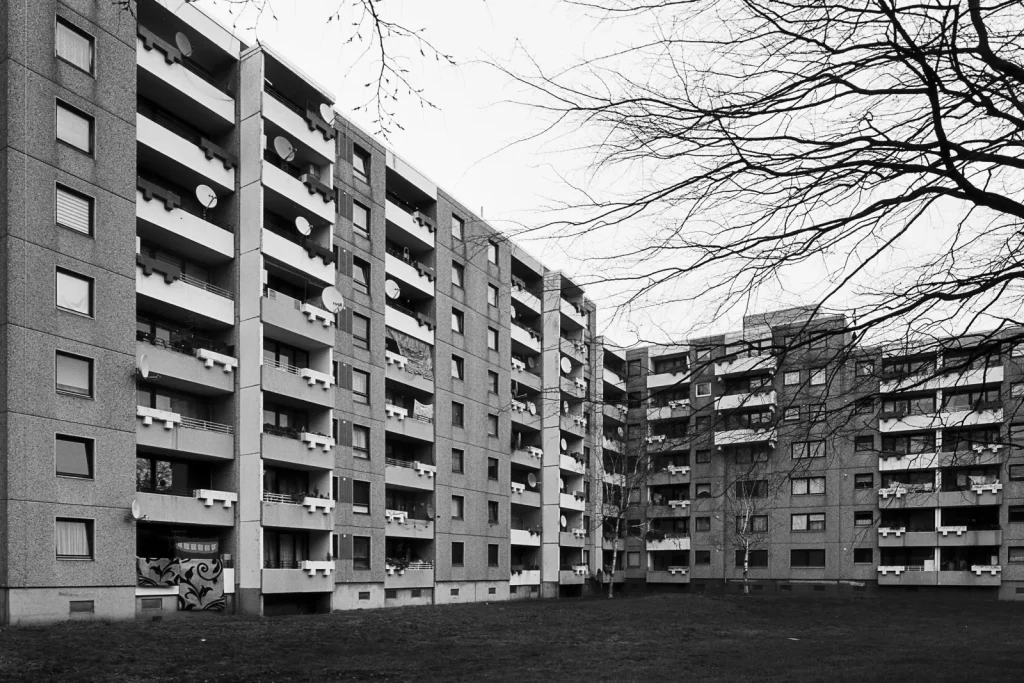
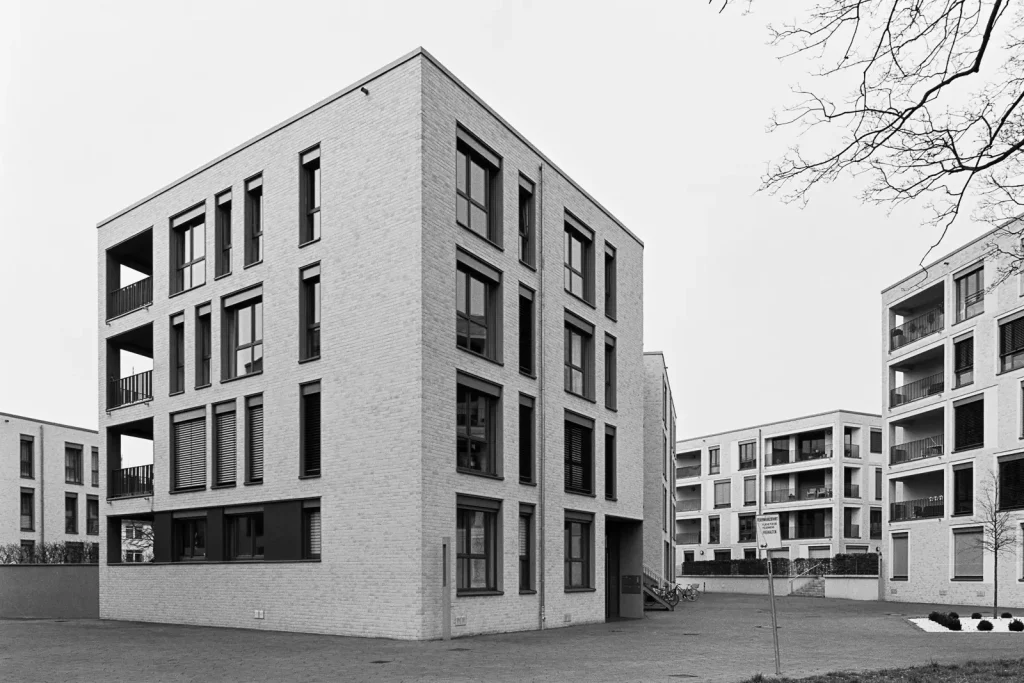
Industrial Buildings
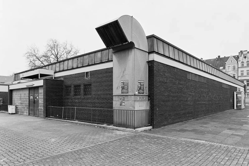
The fascination for industrial buildings lead me to architectural photography in the first place. In earlier days, a lot of heavy industries existed in Hannover. These included machine factories, vehicle and battery production plants, weaving mills and cement processing companies. During the decades after World War II, a structural transformation took place and most of the factories vanished. Call it bad luck, I was simply born too late to witness them.
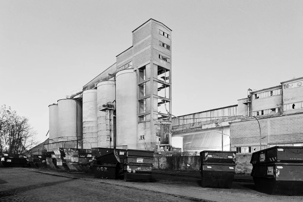
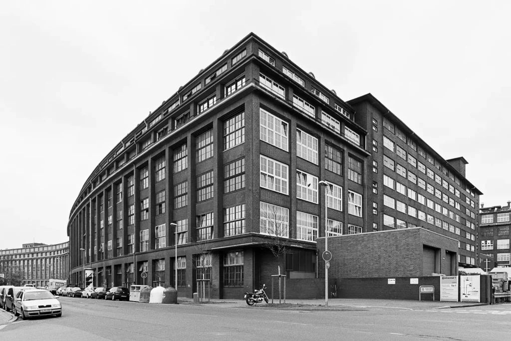
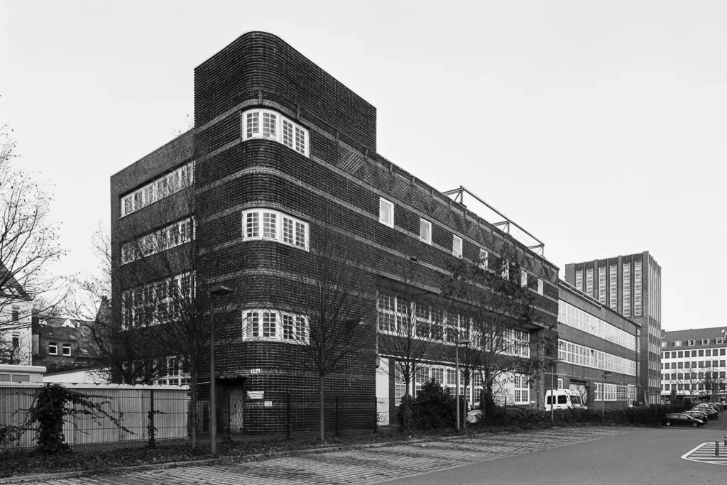
Unfortunately, the administration of the Hannover region plans to the demolish the workshop. An office building will soon replace it. At least, the workshop’s facade is protected by preservation order. Therefore, the outer walls should be integrated into the new building.
Office Buildings
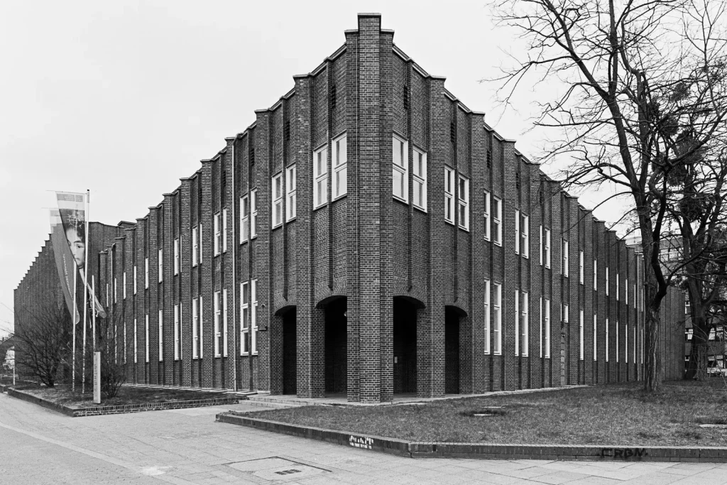
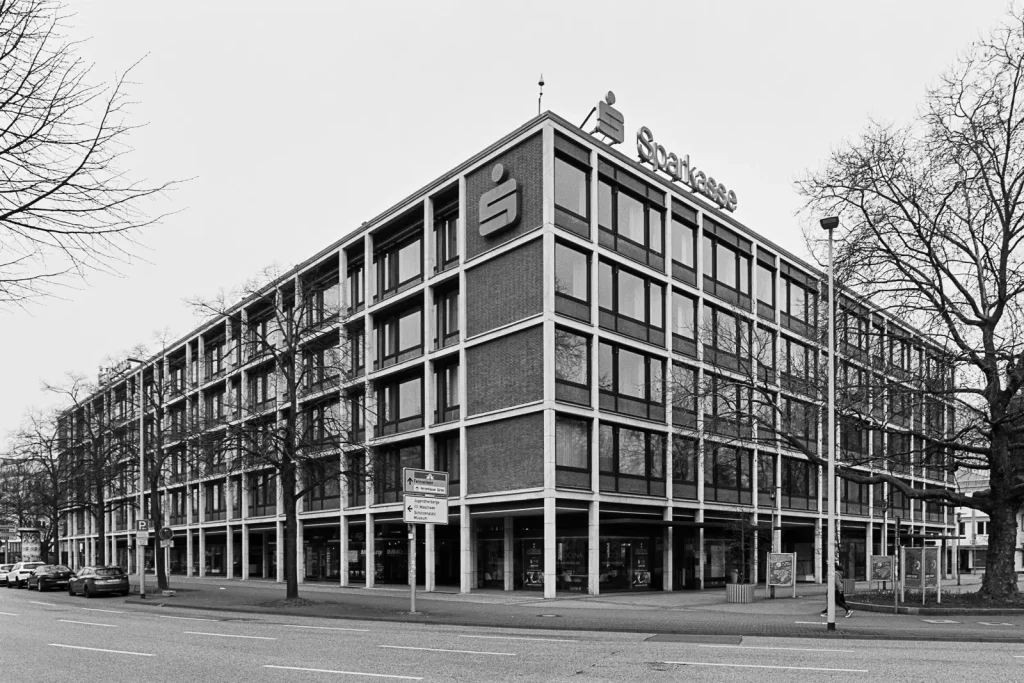
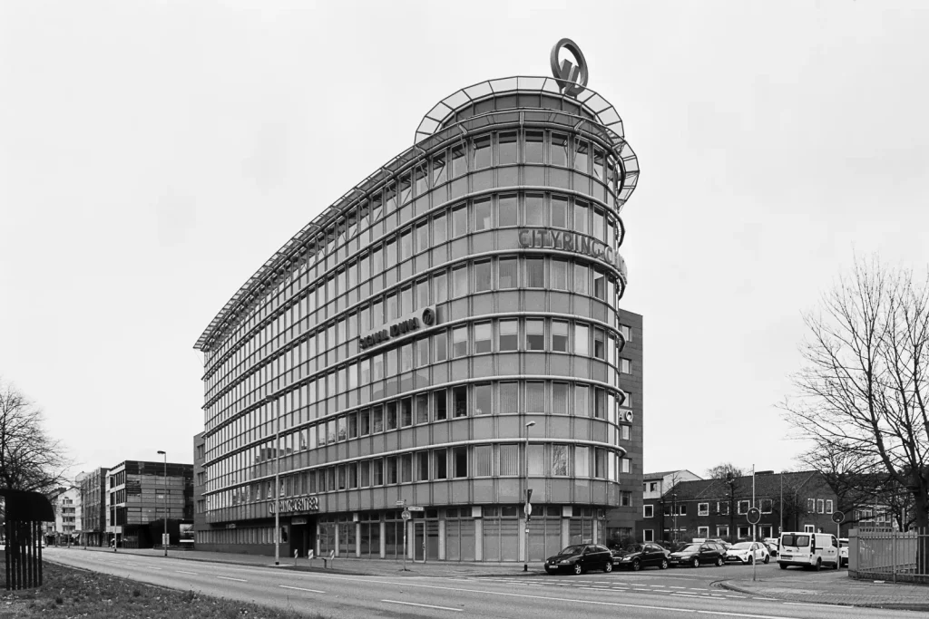
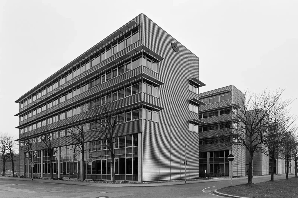
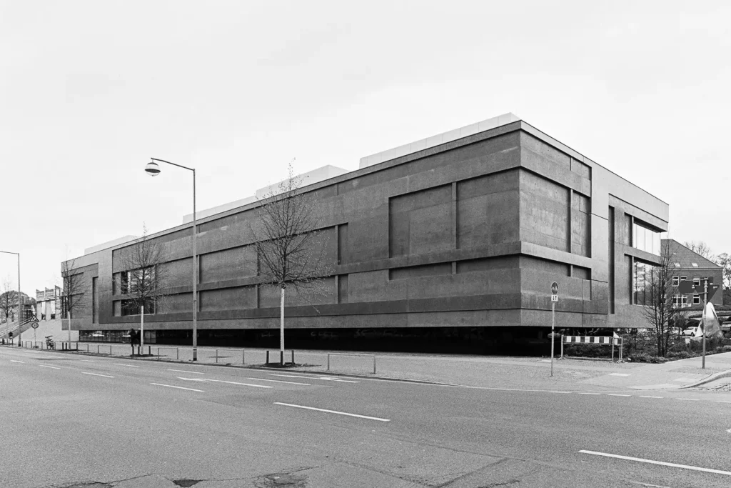
Office buildings – I would describe them as functional boxes. If not a prestigious company owns them, these buildings were built cost-effectively and thus look un-exciting. With my images, I don’t want to glamorize them. (Think of the companies’ glossy brochures and annual reports with images of impressive headquarters glowing in the golden hour.) However, I do want my photographs to give these buildings a certain pride.
Sacral Buildings
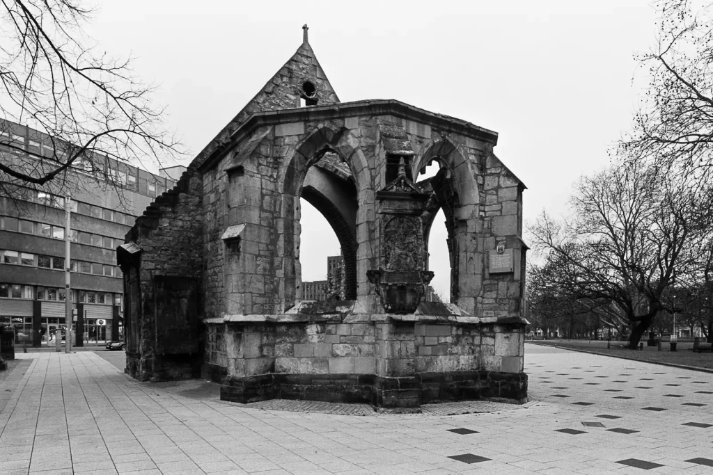
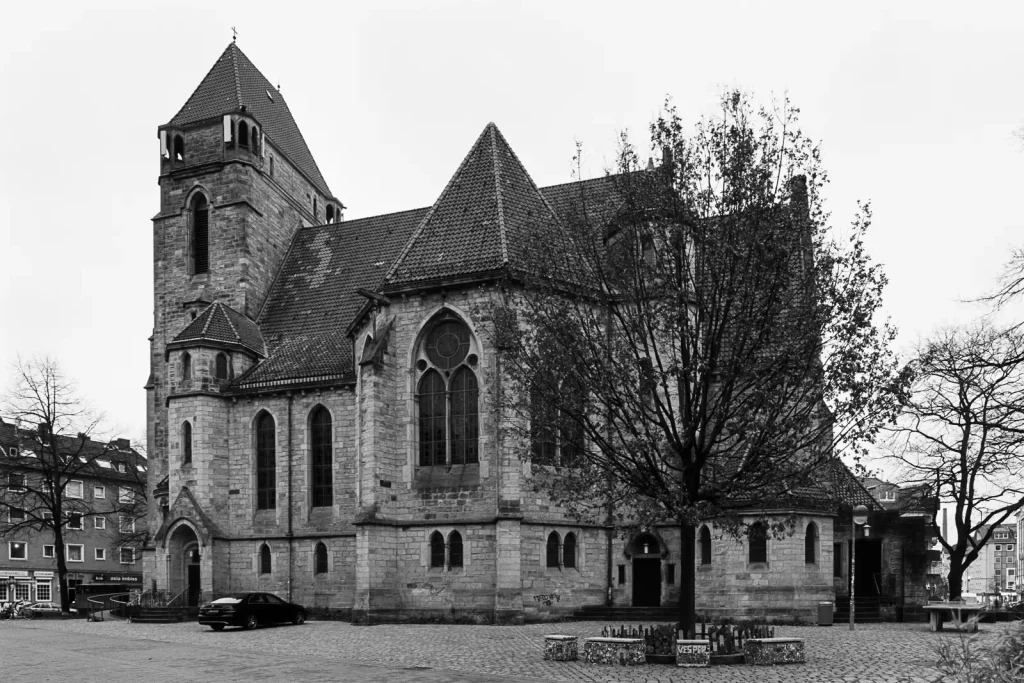
I consider most of the older churches as demanding subjects. Why? Churches show a “problematic” layout, as a large main body is combined with a high steeple. The sheer size forces me to take my image from the distance. As churches have acted as the center of the community, they always stand amidst a densely populated area. So I can guarantee that something will block my view.
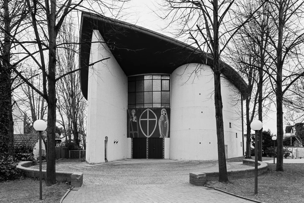
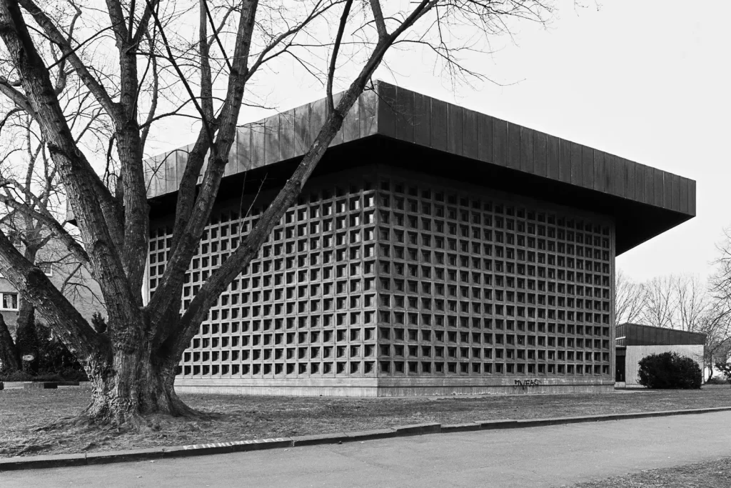
Other Buildings
There are some more buildings in my collection I wanted to present. As these structures do not fit into the categories I’ve used above, I’m listing them here. But you shouldn’t expect anything too special. We don’t have a Colosseum, Eiffel Tower or Tower Bridge.
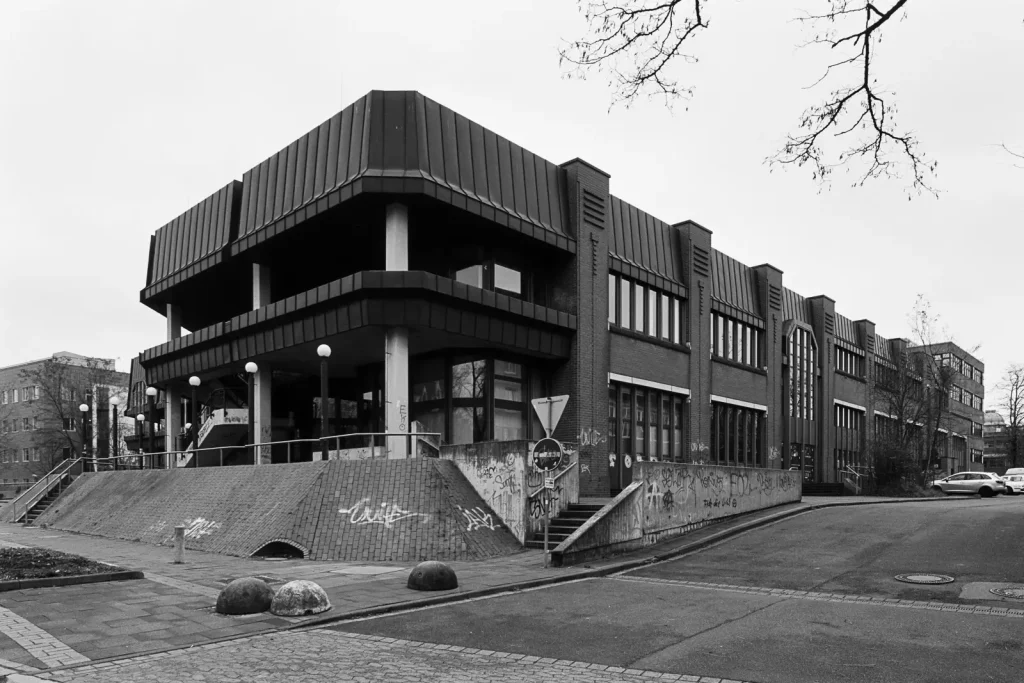
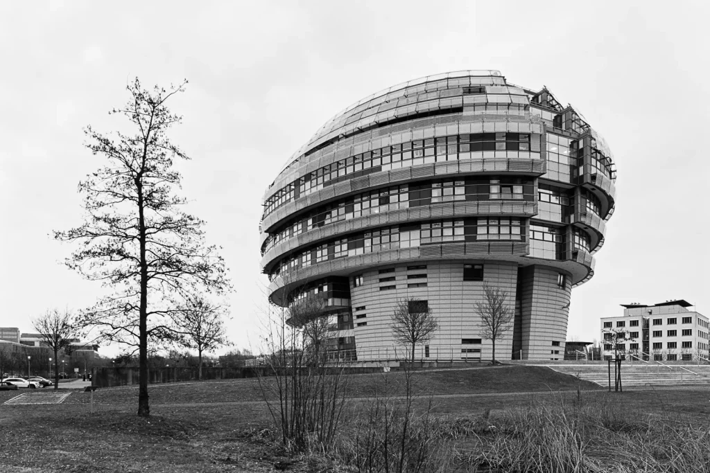
Outlook: Printing and Zine Project
Recently, I started to print a few of my Hannover images on large sheets of baryta paper. Oh boy, they look fabulous! Baryta paper provides a very appealing texture and brings out the different shades of grey nicely. Thick as cardboard, the paper doesn’t bend if you hold it in your hands – even in large formats. Of course, this comes at a price: I paid 12 Euro for a single print (30cm x 45cm).
While looking at the baryta prints, the idea of creating my own zine formed inside my head. Maybe, I should even venture to publish a book? That’s not a new plan for me, I think about it every now and then. However, I’ve been too lazy (too worried) to execute the zine project. Sure, I had my excuses: “I really have to collect material first.” or “It’s an ongoing project. I can’t start printing as long as I’m not done with it.”. As I’m writing this paragraph, the January still hasn’t ended yet. With the new year being this young, it’s not too late to set myself a creative goal for it. (Okay, okay. There should never be a wrong point in time for setting a creative goal.)
Epilogue: On Beauty
After I had written most lines of this article, I visited the Museum for Art and Design in Hamburg. I saw there an exhibition titled “Beauty”. Its creators, Sagmeister & Walsh, stated that during the 20th century, most of the beauty in art, design and architecture got lost. Artists who had faced the atrocities of the World War I could never return to anything “beautiful”. That’s because beauty had been considered as moral value. Looking back to this human catastrophe, beauty just seemed inappropriate.
Now, most of us would live in monotonous boxes. Boring, uniform cities would affect our health – in a negative way. That exhibition made me think. Hannover is ugly in many ways, and I often feel drawn to its ugly sides. Do I glorify ugliness? Do I avoid beauty? Or do I try to find beauty within the ugliness? Does this matter at all? I don’t know.
My favorite quotes from the exhibition:
“The most important features for visual attraction are symmetry, simplicity, balance, clarity, contrast and proportion.”
“The whole 19th century was obsessed by beauty. Artists like Anselm Feuerbach dedicated all their creativity to it.”
“Non-places are urban spaces that were never designed or even recognized. Created by development or construction activities without an architect’s participation, they are multiplying themselves uninhibitedly in and around our villages and towns.”
I can highly recommend the Beauty exhibition. So if you have the opportunity, go there! (It is open until April 26.) For those who don’t, watch this video made by the creators: BEAUTY – in a nutshell
I hope you’ve enjoyed this portrait of my home town’s architecture. Thanks for reading!
Share this post:

Comments
Duncan G on Photographing Buildings and Places in Hannover – by Christian Schroeder
Comment posted: 17/03/2020
Comment posted: 17/03/2020
Rock on Photographing Buildings and Places in Hannover – by Christian Schroeder
Comment posted: 17/03/2020
Comment posted: 17/03/2020
Chris Pattison on Photographing Buildings and Places in Hannover – by Christian Schroeder
Comment posted: 17/03/2020
Comment posted: 17/03/2020
John Grzinich on Photographing Buildings and Places in Hannover – by Christian Schroeder
Comment posted: 17/03/2020
Comment posted: 17/03/2020
James Evidon on Photographing Buildings and Places in Hannover – by Christian Schroeder
Comment posted: 17/03/2020
Comment posted: 17/03/2020
Charles Morgan on Photographing Buildings and Places in Hannover – by Christian Schroeder
Comment posted: 17/03/2020
Comment posted: 17/03/2020
Sergio Palazzi on Photographing Buildings and Places in Hannover – by Christian Schroeder
Comment posted: 17/03/2020
Comment posted: 17/03/2020
Chris Rampitsch on Photographing Buildings and Places in Hannover – by Christian Schroeder
Comment posted: 17/03/2020
Have you ever considered a Rolleiflex SL66, which has tilt... expensive though. Considering your throughput (and lens investment) I suspect you're in the right place with 35 mm.
Comment posted: 17/03/2020
Clive W on Photographing Buildings and Places in Hannover – by Christian Schroeder
Comment posted: 18/03/2020
There’s so much here — history, philosophy, politics (because politics is life, even where we think we can avoid it) as well as art and architecture — that it’s too much to take in at one sitting. I’m going to take the liberty of printing it and reading it like a magazine article. Might need to make a big pot of coffee first.
Comment posted: 18/03/2020
Andrew Craig on Photographing Buildings and Places in Hannover – by Christian Schroeder
Comment posted: 18/03/2020
Your work, and your description of Sunday mornings, reminds me of the year I spent in Stuttgart, in 2001-2! I remember Sundays, especially in Baden-Wuerttemburg: If one hadn't already a plan for the day before one awoke, the day would drift by. It certain didn't seem the thing to casually call up someone unannounced. It was remeniscent of my childhood in England, when shops and businesses were closed for Sunday and the day could have a dreamy feel spoilt by the knowledge that one would be at school the following day (Later, in the '80s, in pursuit of mamon, 'Sunday opening' was allowed and Sunday became like every other day of the week.). I took the habit of planning ahead, a city to visit in a borrowed test car - Konstanz, Tuebingen, the Atonkeller in Haigerloch, or pre-arranged day with a friend.
The buildings are familiar too; my company had an appartment block in the suburb of Weilimdorf where us visting foreign Mitarbeiters were placed, with the result that the default language there was English and still today my German is bad. The slightly drab 20th century domestic architecture contrasted with that typical of Britain, so often a pastische comprising cardboard elements from styles of the past in combinations never seen it times past - regency columns supporting tacked on tudor beams... I wasn't sure was worse until I wrote that!
At its best, Germany manages to artfully mix the contemporary with the historic in a way that does not happen in Britain, though pictures of such tend to be not so atmosphere.
Thank you for your work, both the photrographs I would never imagine to take and the accompanying write-ups. I always enjoy and admire how you make the mundane interesting.
Comment posted: 18/03/2020
Tom on Photographing Buildings and Places in Hannover – by Christian Schroeder
Comment posted: 19/03/2020
Comment posted: 19/03/2020
Kodachromeguy on Photographing Buildings and Places in Hannover – by Christian Schroeder
Comment posted: 23/03/2020
Comment posted: 23/03/2020
Comment posted: 23/03/2020
Comment posted: 23/03/2020
CheyenneMorrison on Photographing Buildings and Places in Hannover – by Christian Schroeder
Comment posted: 23/07/2020
“Köln 5Uhr30” (“Cologne at five thirty”) project by Chargesheimer
https://www.albedomedia.com/clasico/coleccionismo/refotografiar-dos-proyectos-notables/
A Review of Chargesheimer, Im Ruhrgebiet
http://www.robertjonesphoto.com/chargesheimer.html
https://galeriejuliansander.de/chargesheimer-the-boundaries-of-his-work/
https://www.albedomedia.com/clasico/coleccionismo/refotografiar-dos-proyectos-notables/
Comment posted: 23/07/2020