During a brief period of unemployment more than 20 years ago, I offered my untrained photographic services to my sister-in-law Nancy. She was a leading realtor in Coldwell-Banker’s local office, and it was the beginning of a decades-long relationship that only ended when Covid seriously impacted home sales.
A Favorite Shot
Over those decades, I shot hundreds of homes– including one artist’s richly painted condex unit, many New England Capes, some cool mid-century ranches, a “mini-castle” with towering octagonal rooms, and an Arts-and-Crafts lakeside mansion with hand-crafted Moravian tiles in its stone walls and hand-painted, embossed, leather “wallpaper” in its entryway.
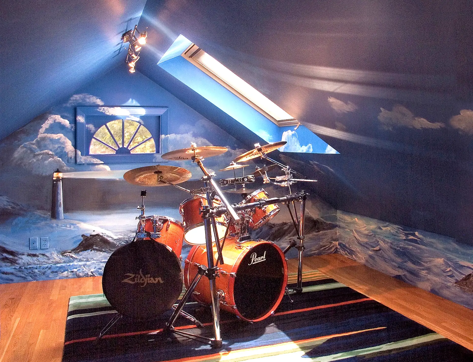
But the above photo is perhaps my favorite shot from all of them. The house was a small brick Cape owned by a local policeman. His muralist mother had painted ALL of its interior walls with seascapes. And all but the above mural were rendered in wispy “dry-brush” blue, brown and beige… through which one could see lots of white wall. I wasn’t a fan of the look, but couldn’t keep them out of my shots.
I knew they’d probably limit the field of prospective buyers. And in the end, most of those photos didn’t appear on the house’s Multiple Listing Service (MLS) webpage.
Showing, Not Telling
But the above image was a different matter. It literally showed how much enjoyment an otherwise dinky, unpopular space could bring to an owner… if imagination and creativity are applied. Nancy and the seller loved the photo, and it occupied the first spot after the house exteriors in the MLS listing. (Living rooms often got that position because they’re what people usually saw when they first walked through the front door.)
In fact, the photo was so popular that when I later visited Nancy’s office to meet its managers and staff, it was displayed on every PC… and remained there for a month.
A Valuable Lesson
The photo also taught this inexperienced real-estate photographer an important lesson (one that many realtors who shoot their own photos still seem to miss). It is that it’s a mistake to treat real-estate photos as just documentation.
I shudder to remember how often that point of view still populates MLS listings with images of toilets in front of tubs and shower curtains. Or images of empty bedrooms that show nothing more than the room’s corner and two adjacent windows.
NEWS FLASH: One can assume that most modern homes have toilets, tubs, showers and shower curtains or doors! Of course, beautiful bathrooms must be photographed. But not dismal (or even ordinary) ones that offer nothing special to inspire people to come see. Same goes for photos of empty bedroom corners. Or (except in unusual circumstances) pictures of circuit-breaker panels, furnaces and water heaters.
Instead, Shoot Dreams
What really sells houses are prospective buyers’ dreams about what their new home is or could be! Of course, customers themselves are the only ones who know these. But photographers and realtors can try to anticipate, photograph and describe properties with such dreams in mind. For example:
- If an old Victorian ark has unique fireplaces, lovely moldings, crystal chandeliers, and a beautiful grand staircase, capture them from their best angles. Yes, some visitors (and even realtors) will say that these old things “must go.” But serious buyers may come to showings because they dream of living with such things.
- If a property has high cathedral ceilings, back as far as possible into a corner (or an adjacent room) to fit that spaciousness into the picture. Too often, I’ve seen horizontal shots– which many realtors prefer– that crop out most of those lofty spaces. So back up to fit more in.
- If something appeals to you for reasons you can’t quite pin down, shoot it. It may appeal to others too. And if it can justifiably be in an MLS listing, include the shot with your submissions. More than once, home owners told me that something I liked and shot was their favorite part of the property. And open-house visitors have said those images were why they came.
A good example of this was the artist’s painted condex unit mentioned earlier. Its old kitchen cupboards were the seller’s favorite canvases, and I loved what she did with them. And sure enough, several prospective buyers– including the people who eventually bought the place– came to the showings because of those photos (which probably kept others away). In gratitude for my helping make the sale, the artist later handed Nancy two lovely paintings “for the photographer.” - And again, my drum-room shot showed what a little creativity (OK… a lot of creativity) can do with a cramped attic space.
Tips for Prospective R-E Shooters
I loved it when Nancy introduced me to sellers as “the photographer who sells houses.” The two of us had an excellent track record… and I eventually shot for clients in other agencies as well. So if you’re interested in getting into real-estate photography at any level and for any reason, these little tips might help:
- Because my clients wanted good images fast, I worked alone and with a single camera. It allowed me to move quickly, and shoot both exteriors and interiors in 30 to 120 minutes (depending on the property).
- I never used flash (which seems to flatten things). Instead, I turned on interior and exterior lights… for a warmer 3D ambience.
- Before shooting, I’d tour properties (inside and out) looking for things that might fulfill buyers’ dreams.
- If sellers were present, I’d ask about their favorite parts of the house and grounds. It was a great way to learn a property’s best features from people who knew.
- I always submitted photos to realtors in emails that detailed unusual features and facts. It helped them write more interesting listings.
- To keep photos as honest as possible, I resisted requests to digitally “repaint” walls or clone digital grass into bare patches of lawn! But I did not consider it deceptive to clone out unsightly tangles of computer and lamp wires under desks, tables and beds. They’d distract viewers’ attention from the rooms themselves.
- Unless you’re shooting high-res photos for Architectural Digest, almost any modern camera will do. When I shot for Coldwell-Banker, they wanted only 640 x 480 images for MLS. Yes… VGA! But a quick check of online realty sites indicates that up to 1280 x 960 is apparently OK now. And for that, my “old” Fuji X-Pro1 (or even my older Olympus C-8080 WZ) would be more than enough for online listings.
- And again… Try to capture dreams!
Final Notes
I shot this article’s photo with a Konica-Minolta A1 that was prone to high-ISO noise. So until I switched to the X-Pro1, the A1 was always on a tripod, so that I could shoot longer exposures at low ISOs in dim interior lighting.
The tripod proved especially useful for the above photo because I had to manually merge three images– exposed for the scene’s shadows, midtones and highlights. This was necessary because the skylight flared badly on the A1, while at the same time, parts of the ceiling and the small lower-right wall were so dark one couldn’t see their murals.
And according to Nancy, the house’s new owner left the drum-room art untouched. But the other wispy murals were all painted over.
–Dave Powell is a Westford, Mass., writer and avid amateur photographer.
Share this post:




Comments
Sam Forrest on The Drum Room (a One-Shot Story)
Comment posted: 19/07/2023
Dave Powell on The Drum Room (a One-Shot Story)
Comment posted: 20/07/2023
Thank you Sam!
Dave
Geoff Chaplin on The Drum Room (a One-Shot Story)
Comment posted: 20/07/2023
Comment posted: 20/07/2023
Ibraar Hussain on The Drum Room (a One-Shot Story)
Comment posted: 21/07/2023
Comment posted: 21/07/2023