The Lumu Power is without any doubt the most full featured light meter I have ever owned. It’s tiny, it weighs hardly anything, it manages to offer a feature set that expands way beyond what most will ever need from such a device – certainly beyond what I need – yet it does all this for apparently significantly less cash than any other device (or combination of devices) on the market. So how does it do it, and what’s the catch?
The catch is obvious; it’s the very nature of how it offers the features it does. It works through a symbiotic relationship with an iPhone. It expands the function of an iPhone, but it can’t function without one. This of course brings pros and cons, the primary con being a strong sense of built in obsolescence. With the built in obsolescence comes questions of just how good the Lumu power is, and if it’s worth what it costs considering the value it will inevitably loose?
This isn’t the first review I’ve written about a Lumu light meter. The first was about the original Lumu, this review is about the later model, the Lumu Power. I mention this, as rather than this being a standalone review of the later model, this almost feels like a part two to the first review. This is largely speaking because I wrote quite a lot about the back story of why such a bit of kit works so well for me. It’s also been a fair amount of time since I wrote that review so I now have the benefit of having spent a fair amount of time using the Lumu products. Also, since then, I’ve chatted to the guys at Lumu via email a fair amount, I’ve been involved in the beta testing of the newer app, and have first hand experience of ethos of the brand to reflect on as part of this review… All of this is relevant to what I have to say, but first I want to tackle the obsolescence elephant…
Compatibility & Obsolescence
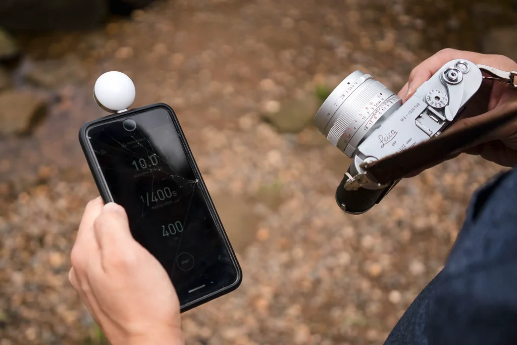
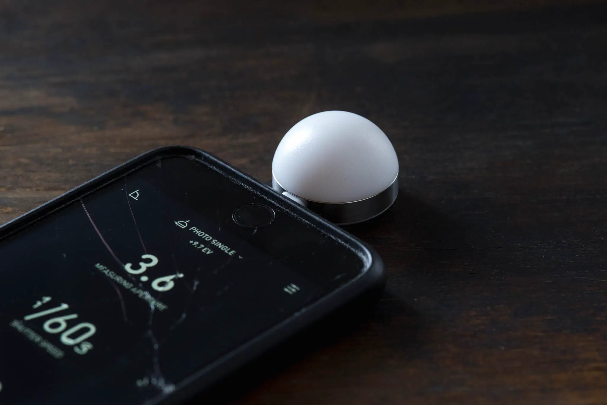
Looking back at my review of the original Lumu, the first thing I want to touch on is the compatibility of the original device. As feared by many Apple dropped the earphone socket thus making the original Lumu slightly less compatible with the current iPhone models. This was remedied slightly by the inclusion of a little adapter that came in the iPhone box. Moving to an iPhone without a earphone socket I was initially relieved by this adapter, but unfortunately soon found it to be a less than ideal solution to the problem. The issue is, the cable lets the light meter flop which means it becomes a two handed job to use it. This isn’t the end of the world, but it did make it feel less useful to me.
Of course, this does add to the fear of future compatibility of the current Lumu Power and it’s apple-proprietary Lightning connector. After posting a picture of it on social media someone commented that they were waiting to see if Apple’s next iPhone went down the USB-C road like the latest macs and google phone (for e.g.). Having done a bit of research and asked a couple of people I know who work in that industry, I would be very surprised if they did switch connections on the next generation. I’ve even heard that they might stick with the lightning port until they eventually ditch any kind of cable connection in favour of a completely wireless device maybe 3 generations from now.
Not knowing for certain must be frustrating for Lumu, but for all this is speculation, the reality is, no one knows what apple will do until they do it, and you can wish your life away waiting for the inevitable progression of tech. The Lumu is a high tech modern device in a high tech modern world where most of the tech we buy looses considerable value as it’s made “obsolete” by the next product that comes along.
Depreciation vs. Return
This is far from ideal! I’m not happy about the fact that my £1000 iPhone is worth £300 after 18 months (less with its cracked screen). I’m not happy about the fact that I’ll be lucky to get £1200 for my now quite tatty looking £3000 Sony A7rii when the Sony A7riii comes out. But in both these cases I try to console myself with two simple thought processes.
The first is that this is simply the way of the world we live in. In this largely disposable world we have made for ourselves, most of the things we spend money on loose conciderable value the moment we walk out of the shop. The second is the conciliation gained from working out the cost of the depreciation verses return I get from my investment in the things I buy.
It’s doing the sums around the second point that almost completely validate the Lumu Power in my opinion. Yes the concerns about its potentially inevitable obsolescence play on my mind, but as I will come to, it’s so good at what it is and how it does it, that the losses I would make on the purchase of such a thing are actually quite easy to swallow. Especially when compared to how much I will lose on the financial value of some of the other tech my photography career imposes on to me.
The only thing that left me with a slightly funny taste in my mouth was the potential for 100% depreciation. I can just about live with buying something and it loosing a bit or even a lot of its value, but the idea of something becoming completely obsolete (when Apple change or drop the port on the iPhone), and thus me having to throw it in the bin, just made me feel a bit uncomfortable…
The Lumu view
I asked Marko from Lumu what he thought about all of this. Having spoken to him a fair bit lately, I found myself not all that surprised to find him sounding quite positive – he always seems chirpy, at least via email. In this instance, his positivity seems to revolve around the fact that he has a plan – an interesting one too. I bluntly asked him what he will do if Apple go wireless thus making the Lumu power all but entirely obsolete. His response was to say that he will launch a Bluetooth connected device, and offer a good buy-back / upgrade scheme for those who wish to trade up from their lightning device. He said that since they offer a successful buy-back on the previous jack connection model, this would definitely be something they would continue to do with future products.
He then went on to tell me about how important customer satisfaction is to him, and that as a company they practice a lifetime warranty on their products (despite it saying 12 months on their website) and as such have repaired what Lumu devices that have failed, regardless of their age. I guess an element of this comes down to the fact that the products are limited in their lifetime anyway, but it’s impressive nonetheless – and says a lot about the ethos of the company I think.
Actually, neither of my Lumu devices have had any issues, but I have asked Lumu lots of questions about the products, and have ways had very useful and positive responses. As someone who writes about these things, perhaps a slightly inflated sense of self importance did make me wonder if I’m only getting these sort of responses so as I’ll keep advocating the products. But actually, chatting to Marko, especially over the last few weeks, I get the impression he’s a positive chap with everyone. His attitude toward his product and its users just seems to come from the right place – and given the nature of his product and its lifespan, I do think this is important. Of course, this would all be irrelevant if the Lumu Power wasn’t any good… but the fact is, it is good! Very good in fact!
So just how good is the Lumu Power?
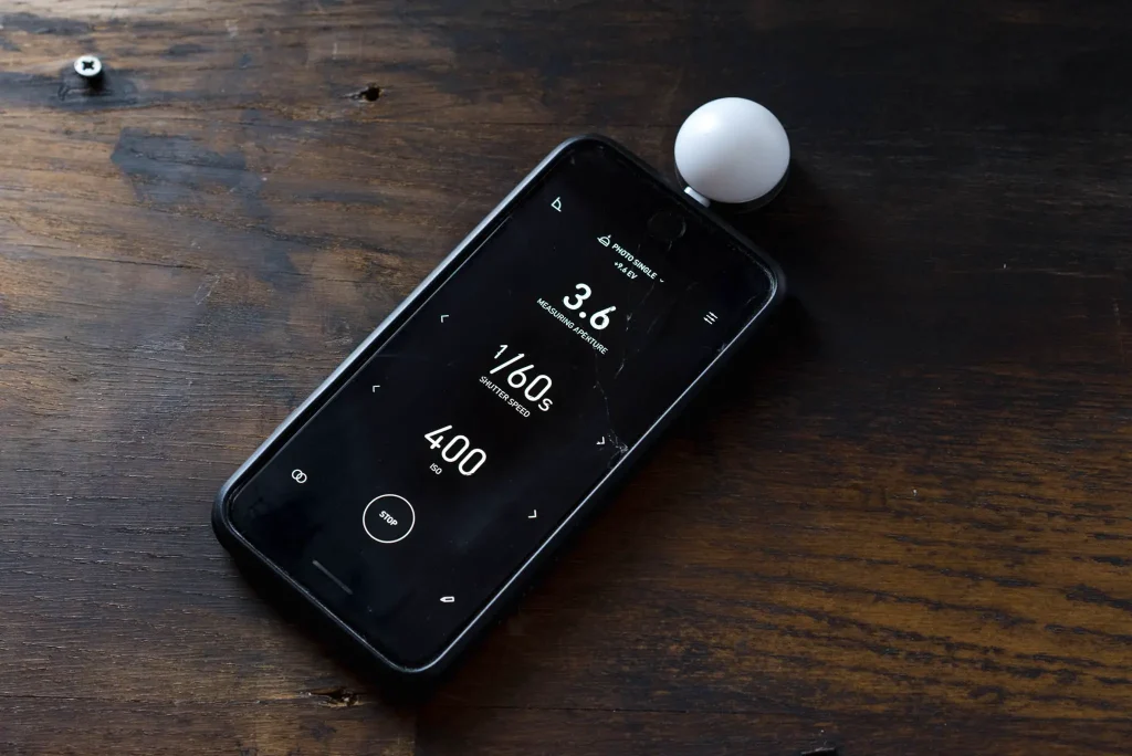
For a start off, I want to talk about the design of the app. The first version had a sort of blurred background photo thing going on – it was a simple enough design, that worked really well, but it wasn’t on the same level as the new version. This version feels like it’s taken a leaf straight out of the Dieter Rams design handbook. The phrase “as little design as possible” feels about as evident as it possibly could. For some this will no doubt feel stark, but for me, its bang on the money. Regular readers will know how much I waffle on about simple design, good user experience and interface design. The new Lumu app works for me in all three of these areas, with perhaps the only slight shortcoming being some of the icons being a little abstract, but you get used to those quite quickly.
User interface
As I say, the first Lumu app was had a fairly nice design, it was simple and easy to understand. With the second version there was a lot more of a chance that they could balls up the interface, just through the shear volume of additional features. Thankfully, if anything the second app is even better.
Hiding modes you don’t use
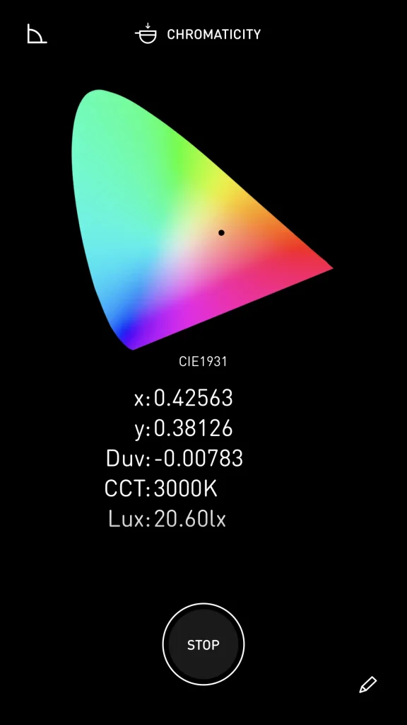
I should first point out that I don’t use all functions or features that this Lumu power provides. “Chromacity” is a new word to me, I can open the function on the phone and appreciate the fact that I’m looking at a colour gamut, but I have no idea what purpose this feature has.
Same goes for luminance – I’m sure to someone this is useful. As far as I’m concerned the reading it gives me means absolutely sod all.
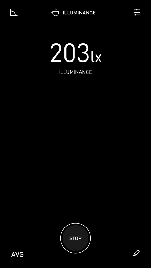
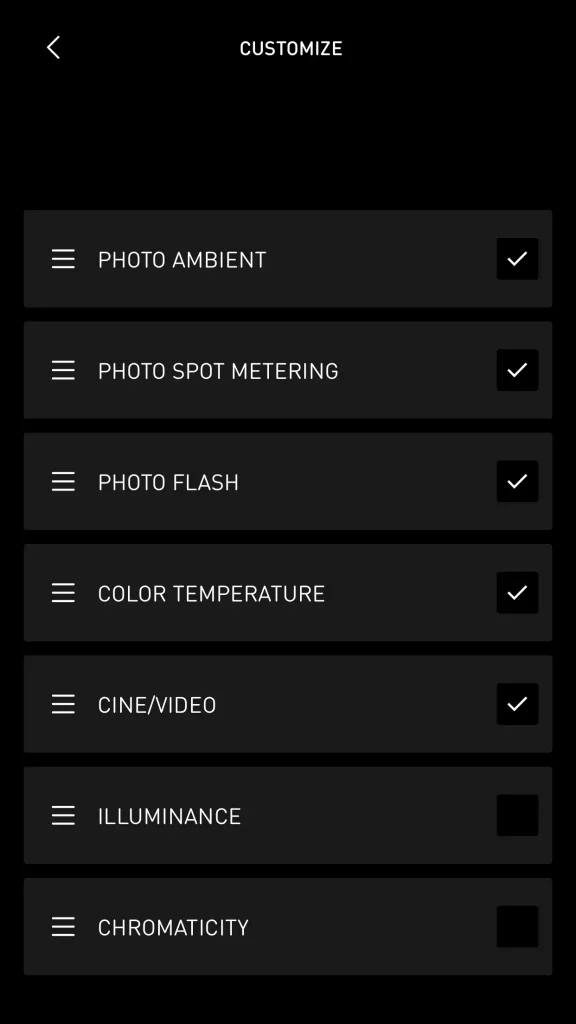
Quite often with user interface design, if there are features I don’t use, I can find them a distraction, or at least that they muddle or interfere with my experience. One of the most elegant features of the new Lumu app is that if you don’t use some of the functions, you can just go into general settings and remove them from the menu. This works very well for me. It’s also possible reorder the menu so it sits in the order that most suits requirements – this is the order I have mine.
Auto on
The general settings menu brings other neat features to the table too. Since the Lumu power uses the lighting connection, the iPhone can detect its presence. This means that when you plug it in, there’s no hunting for the app as there was with the previous version – the iPhone detects it’s there and asks you if you want to open the app.
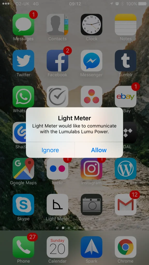
This is brilliant on its own, as it saves so much of the sense of faffing that the original Lumu caused. But better still, there is another option in the general setting to open the app in the mode you were in previously. This means that when you plug the device in, with one tap of the screen you can instantly be in ambient light metering mode (or whatever mode you were last in).
For me, this answers one of the biggest concerns many had about how the original Lumu functioned. It was often accused of being faffy to use when compared to a normal light meter. It’s so quick to function now that it doesn’t really feel much slower than a normal light meter – in fact, thanks to the simplicity of the interface, to me it feels quicker and easier to use than many other fuller featured meters I have used.
Main features and functions
I’m going to ignore luminance and chromacity, so sorry if you’re here looking for wisdom about these features. If you do use these features and fancy adding a few words in the comments section, please feel free!
Reflected metering
As I say in my original post, the reflected meter is so good it pretty much makes most other iPhone meters redundant alone. To my mind, that’s even more true of this version. What’s better about this version is that when you switch the mode in general settings to reopen the app where you left off, it opens in the reflected meter very quickly indeed. One of the really clever thing about the way iOS works is that it doesn’t close apps when you aren’t using them, instead it freezes them in the background. This means that you can effectively leave the app running, so when you reopen it, it reopens instantly. Whilst it was quite clever of the original app to try and up-sell you the device every time you open it, with it now opening in the right mode instantly, it really feels like a very responsive bit of kit.
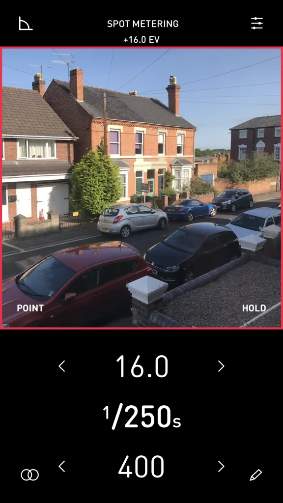
Aside from that, the reflected meter now features as much as I can think of as needing from such a meter with the only thing possibly missing being a true narrow-degree spot meter. But even then it does include a “point” reading which allows you to focus the meter reading to a smaller area. This isn’t quite a spot meter as it seems to just focus the average weight toward the point, but it’s not far off as useful as a true spot.
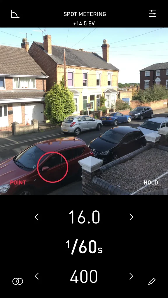
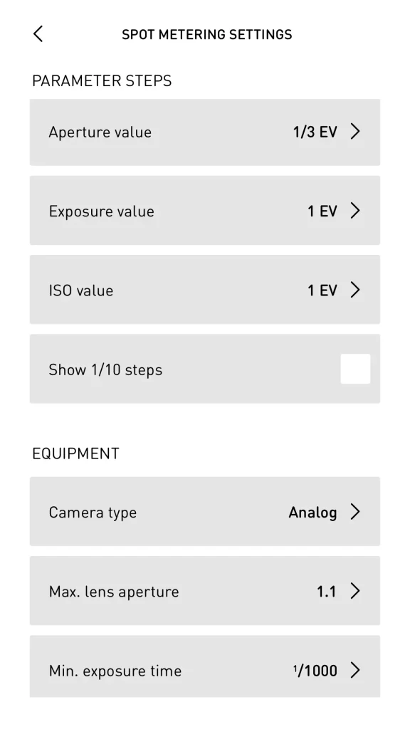
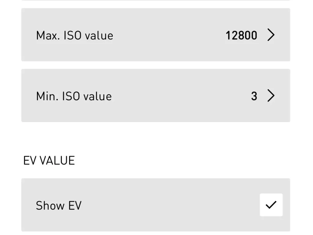
Additionally, it also lets you set exposure compensation, allow for filters, make notes based on readings and freeze frame the readings. There is also a whole series parameters for matching the readouts to your camera gear. You can choose to display an EV readout (which I find very useful). In short, for what amounts to a free light meter app, its pretty damned feature packed!
Ambient Light meter
The ambient meter was of course the primary function of the first version of the device. It does all the same things that I talk about in my first review, including the phenomenal low light measuring down to -4ev. It also allows you to set exposure compensation, filters, notes and all the camera parameters that the reflected meter does – again making for a meter that feels like it does as much as I could possibly want.
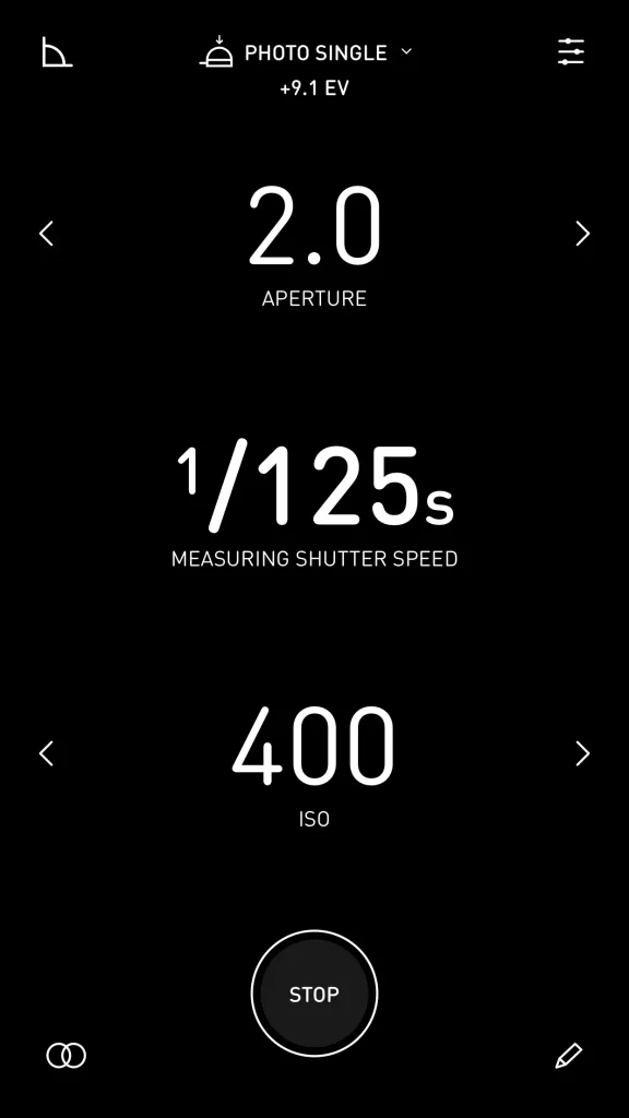
What’s really nice is that compared to the first version of the app, there is also the option to switch on the EV readout. This was something I mentioned as lacking in my first review. In fact, it was also something I mentioned during the beta testing of the newer app. I’m sure other people must have mentioned it as being a feature they wanted too, but it’s really nice to feel like I was listened to, as well as being a really useful feature to have.
Just as a side note here – I have been meaning to write a post about exposure values, and how useful the system can be once you start to get an idea of what level of light some of the numbers represent. The reason I’ve never finished that post is that I just feel like I’m never going to be able to write anything even nearly as useful or insightful as what Fred Parker writes here. When you are finished reading this review, make the next thing you do go and read that article – it really is very useful to anyone looking to better understand light.
Pinhole mode
Also included in the feature set of the ambient meter modes is the ability to take multiple readings and combine them. I don’t really use the multiple readings feature, but did want to quickly comment on the other option within this menu, the pinhole mode.
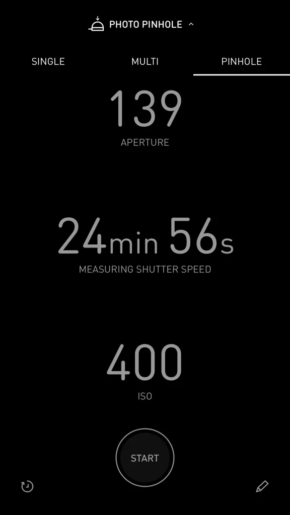
I’m not really a big pinhole photographer, in fact I only partake in such activities once in a blue moon. One of the things you have to learn about when getting into pinhole photography is reciprocity failure. I’m not going to get into the details here, but I’m very simple terms reciprocity failure means that when shooting film with very small apertures, exposure times need to be longer than the normal laws of reciprocity would suggest.
To take reciprocity failure into account, the new Lumu app has a mode within the ambient meter settings to switch between digital and analogue. Switch it to analogue and use the pinhole mode and you will see the exposure times are much longer. This is pretty good, unfortunately it doesn’t take into account the variance in reciprocity failure from one film to the next. As such, if you’re really into pinhole photography, you might want to get yourself the pinhole assist app. If not, and you just want a rough guide, it seems the Lumu app does a pretty good job that errors on the side of caution.
Video/Cine meter
The settings and features are are of course based on those within the ambient light meter. The difference being, the layout is geared around setting you aperture and ISO based on a fixed shutter speed.
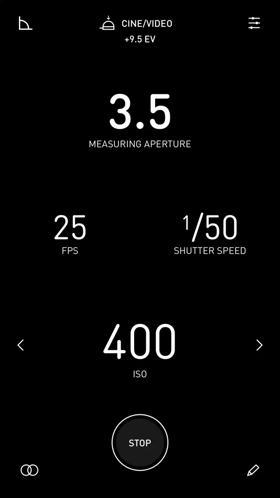
The parameters menu contains much fewer options, though one nice extra is that it does allow you to change your shutter speed to shutter angle. With this set to shutter speed, when using the app the frame rate display effectively acts as a little more than a reference. But, set it to shutter angle, and change the frame rate and the meter uses the set shutter angle relative to the frame rate to calculate the reading. I must admit, I have no idea if cine cameras with rotary shutters are still in use, or indeed if some modern cameras use the rotary shutter system (I guess there must be?) but it goes to show just how much this app and device has to offer.

Flash meter
Prior to owning the Lumu Power I used a Sekonic 308. To use the Sekonic in the studio I would take the flash trigger off the top of the camera, connect it to the meter with a little wire, hold the meter and the trigger by my subject, fire the trigger and take a reading.
The Lumu Power offers a very similar experience, but for the fact that there is no wire. You activate the flash meter, fire the flash and it maps the light intensity and duration and gives you a reading based on that. It’s very clever, as it also gives you a percentage of flash light to ambient light for if you are shooting with a fill flash.
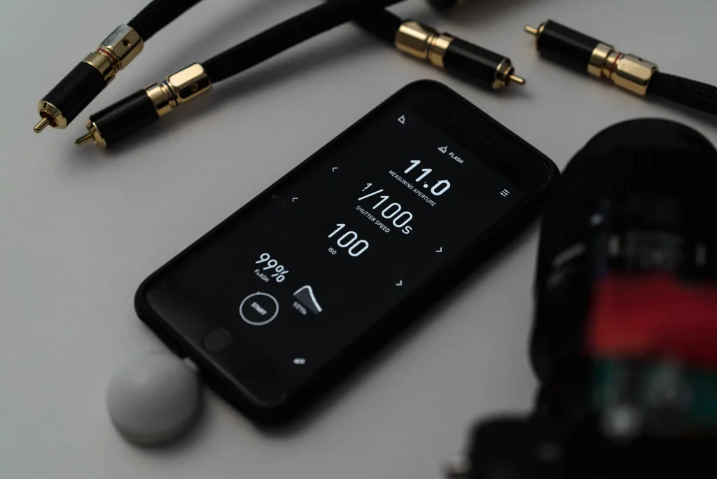
Functionally, the Lumu feels less of a fiddle than my Sekonic. The fact that I don’t need a wire pleases me. I also find the readout it give easier to understand than my Sekonic, and actually it seems a lot more reliable/consistent. The only feature that’s missing is that is that it only allows 3D readings, and not 2D. I’ve never used a flat diffuser on a light meter, so I don’t find this an issue. If you do, you might, as the flat side of the Lumu Power doesn’t offer this as a feature.
White balance meter
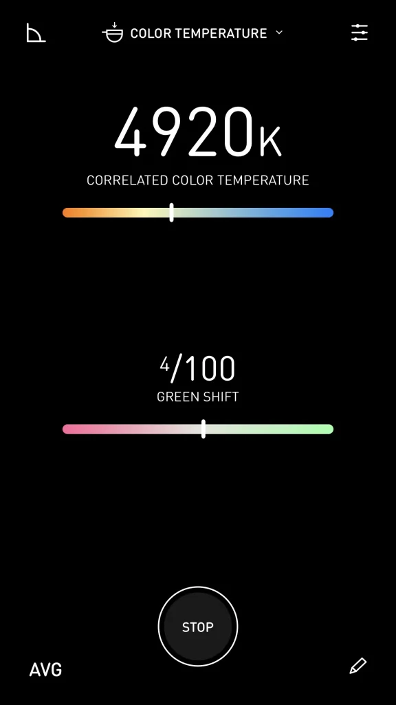
The white balance meter has been most useful to me measuring for video. When shooting video at work we don’t shoot uncompressed, so having a more accurate idea about white balance is pretty useful. In fact, we usually set the two or three cameras we shoot with to one of about 4 or 5 settings, but what we’ve found is that the Lumu Power has been able to provide us with a bit of a sense check where the lighting might be a bit less easy to decide upon.
Since I shoot RAW when I’m shooting my digital cameras, I haven’t found that much need to use the colour meter in my photography – if you shoot jpeg, this feature could really help with your colour balance! I guess if you use filters with your film photography it might be useful too, but I don’t so I’ve not tried.
A missing feature
One area within my digital work where I still find white balance issues is in the studio. When shooting products, correct white balance is absolutely vital. I don’t know the exact output of my lights, and I’m never sure just how much the surroundings are impacting on the colour balance in my images. As such, I always just set my camera to “flash” in the white balance menu, then just tweak as needed in the computer after. The exact white balance I need to set seems to vary, but since I don’t have the experience, or indeed quality of environment or equipment I’ve never worked out exactly how to avoid the frustrations of white balance issues per shoot. As such, I asked Marko if there was a way that the Lumu Power could measure flash colour balance. His answer was basically “I can’t promise anything, but we are working on it”.
Free upgrades
Ongoing upgrades aren’t something I knew about, or had even thought about until I asked Marko about the possibility of flash colour balance. In his reply, he also mentioned some tweaks they were making to the accuracy of the EV readout and that they would be pushed in an app update coming soon. I hadn’t noticed that the EV readout was inaccurate, but a couple of days later, low and behold, when I opened the app it did a little update procedure. I can’t say I’ve noticed any difference in the EV readouts, but it’s good to know that there is constant improvements happening in the background.
The really nice thing about these improvements is that they seem to happen automatically. I have recently found out that my Sony A7rii has had loads of firmware updates available, apparently some of which fix a few of my issues with it. I didn’t know about this, so I’ve never done the updates. If I do choose to update it, I will no doubt have to download the firmware and go through – knowing Sony – some sort of convoluted update process. The automatic updates that happen to the Lumu suit me a lot better.
Who’s it for?
Ok, so I’ve talked about all the ways I’ve found myself using the Lumu Power, and even a bit about the ways I don’t. One thing that has struck me through the process of writing all this is that how and when and for what I use it is really quite varied. It is true that I do use it as part of my hobby, but as a multidisciplinary professional working within the fields of photography and video, in and out of the studio, I have found myself using this device a lot more than I ever did the first version. A few of the folks at work also now have the app downloaded onto their phone and borrow it when I’m not involved in shoots. The Sekonic studio meter has found its way to the rarely-used-kit box (that’s an actual thing).
Of course not everyone who owns a Lumu power will be a professional within the fields I work, nor will all have a team of other people also using it. So does this mean it’s just for the pro? I got thinking about this whilst comparing the size of the two devices the one evening. The original is a lot smaller – not that it makes much odds in the grand scheme of things, they are both tiny – but it did make me wonder about the user who doesn’t need all the extra features beyond the ambient meter?
Again, I got in touch with Marko to ask. I asked if he’d ever thought to make a Lumu “basic” a model a bit like the first version, but with a lightning connector. He told me he had, he then went in on to tell me he’d also thought about a version that just offered the colour metering too. He went on to say that he takes all new and existing customers wishes very seriously – it was those wishes that pushed him to create the Lumu power in the first place. So if he gets enough demand for a simple and cheaper device, he will make it – he just hasn’t had that demand.
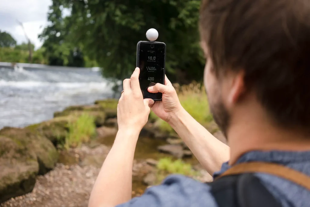
This went some way to remind me that in this world in internet connected toasters, I’m quite outside of the average in my desires for products that only do the set of things I need them to do. It’s now quite common to own things that have many superfluous and overlapping features. To be fair, I’m far from immune to the desire for this sort of product too – I’m typing this on my camera-smart-phone-computer-device… Perhaps the target audience for the Lumu Power is much expanded because people like to have the extra features, just in case they need them…? Regardless, Marko hasn’t had that demand for a more simple product. But, again thanks to the sort of company ethos he apparently takes pride in, if a more basic, lower cost Lumu is what you’d like in your life, let Marko know – if enough of you do, he might just make one!
Skip to the end
Let me start my concluding thoughts by saying that whilst I completely understand the concerns folks have about the potentially short life span of the Lumu power – as I’ve already laboured – to my mind it’s not that hard at all to rationalise the purchase of one when comparing the potential depreciation with a lot of other modern tech. This is especially true given the buy-back / upgrade offer that will be on the table from Lumu when the necessity for a new version arises.
I must also say that I’ve found the review a little difficult to write. This is down to a growing sense of bias due to what feels like a strong customer loyalty – I feel a little like I have found a home in the Lumuverse. I’ve now owned and reviewed both Lumu devices, have been involved in the beta testing of the second app, were I felt my ideas were listened to and actioned within the apps features. I also feel like Silvo, and now Marko who I’ve chatted to at Lumu over the last few years have gone out of their way to provide a level of customer service that feels like it’s practically unheard of – and I don’t think my experience is in anyway unusual.
I also feel like I’m faced with a product that fits in my personal little universe. This goes way beyond me not being able to find many flaws as I actually find the experience of using the Lumu Power such a strongly positive one that I find it difficult to remain balanced and objective in my writing about it. These guys clearly have a sense and appreciation for design and user experience that is very closely aligned with my own. I would almost guarantee there is a Dieter Rams book or two kicking about in Marko’s office.
This latter point feels particularly impressive given the fact that I’m ordinarily really quite picky about these things, especially with products that offer me more features than I need. Elegant solutions to problems of superfluous features like being able to remove them from the primary interface are stokes of usability genius. And that’s before I even get to how easy, logical and fluent the rest of the interface feels given the amount of features on offer – that is at least once you’ve remembered what’s behind a couple of the slightly more abstract icons.
So yeah… if you’ve got an iPhone, you’re looking for a feature packed light meter, and can get your head around the fact that like most modern tech this too will depreciate over the time you own it, you might like join me in the lumuverse. As not only am I very happy to give the Lumu Power device and app my full seal of approval, I’m also entirely impressed with Marko and his companies ethos!
Share this post:



Comments
StephenJ on Lumu Power review – the tiny full featured light meter
Comment posted: 20/08/2017
Mostly, I liked it but I stopped using it following a couple of annoyances which became unacceptable, plus I learned something massive from you which gave me confidence. The annoyances have now been fixed, so I would still consider one.
First problem was encountered when I wanted to use the M2 with a pinhole body cap to make a picture for World Pinhole Day, I soon discovered that I first needed the meter and app, then the calculator app to calculate shutter speed and finally the clock to time that shot, not easy. As you say, the latest version has a "pinhole" setting, which I assume solves those problems. The second problem was that the phone did not ring with the Lumu in the earphone socket, which sort of negates the primary purpose of the phone.
What I learned from you was that film has far more latitude than I would ever have guessed :) ... as such I found that an iPhone app was good enough for film, and I highly doubt there is a digital camera out there without a built in light meter.
I no longer have the M2, but I do have an Ondu Pinhole camera and a Hasselblad SWC (The Superwide) and I am happy enough with a couple of iPhone apps.
But the question that comes to my mind is: "Shouldn't I be using a battery free light meter with my battery free cameras?"
It is true that one could be out and the iPhone battery could drain, as such I have been thinking about the Sekonic.
http://www.sekonic.com/united-kingdom/products/l-398a/overview.aspx
Have you any experience with this?
Comment posted: 20/08/2017
Comment posted: 20/08/2017
Comment posted: 20/08/2017
Comment posted: 20/08/2017
Comment posted: 20/08/2017
Comment posted: 20/08/2017
Comment posted: 20/08/2017
Rick on Lumu Power review – the tiny full featured light meter
Comment posted: 20/08/2017
Comment posted: 20/08/2017
StephenJ on Lumu Power review – the tiny full featured light meter
Comment posted: 21/08/2017
As I say, it was a passing thought, in the meantime I will carry on with my specific iPhone based apps.
JR Smith on Lumu Power review – the tiny full featured light meter
Comment posted: 23/08/2017
Comment posted: 23/08/2017
Koen de Wit on Lumu Power review – the tiny full featured light meter
Comment posted: 26/08/2017
Comment posted: 26/08/2017
pentermezzo on Lumu Power review – the tiny full featured light meter
Comment posted: 19/11/2017
Just kidding, I know the answer is never.
Comment posted: 19/11/2017
Steve Rosenblum on Lumu Power review – the tiny full featured light meter
Comment posted: 15/04/2020
Comment posted: 15/04/2020
Gary Smith on Lumu Power review – the tiny full featured light meter
Comment posted: 12/04/2024