I’ve been part of the 35mmc team for the past year or so; some of you may have come across my articles, but behind the scenes, I also try and look for contributors who can share their stories, photos and knowledge.
This is how I “met” Tokyo-based photographer Kiichi Kitahara, who kindly agreed to write an article for 35mmc about his ongoing photo project, The Other Side of Tokyo, Japan. The article was (deservedly) popular with readers, many of whom commented how his photos show a side of the city which you don’t necessarily get to see in guidebooks or travel shows. I couldn’t agree more; I lived and worked in Tokyo for a while, and as someone who spent most weekends exploring the city on foot and bicycle, the scenes in Kiichi’s photographs were instantly familiar to me – exposed air-conditioning ducts, beer crates outside restaurants, bicycles. Seemingly ordinary subjects – but the light, composition and textures make them extra-ordinary.
Anyhow, since then I follow Kiichi on Instagram, and I always enjoy seeing his distinctive photos on my feed. And over time, I started thinking about doing a similar series in my own hometown, Kolkata.
Kiichi’s series has three categories: Wall, Alley and Façade. I only focused on façades, and in fact, all twelve photos in this post were taken in the course of a longish (about 45-minute) walk to my grandmother’s place on a Friday afternoon.
In his article Kiichi listed some of the precepts he has adopted for his project. Precept 3 is:
Take a photo ‘like a photo’. ‘Photo-like’ to me means making a picture-like photo.
This sounds a bit tautological, but somehow, I know exactly what he means. This picture fits the bill, I think.
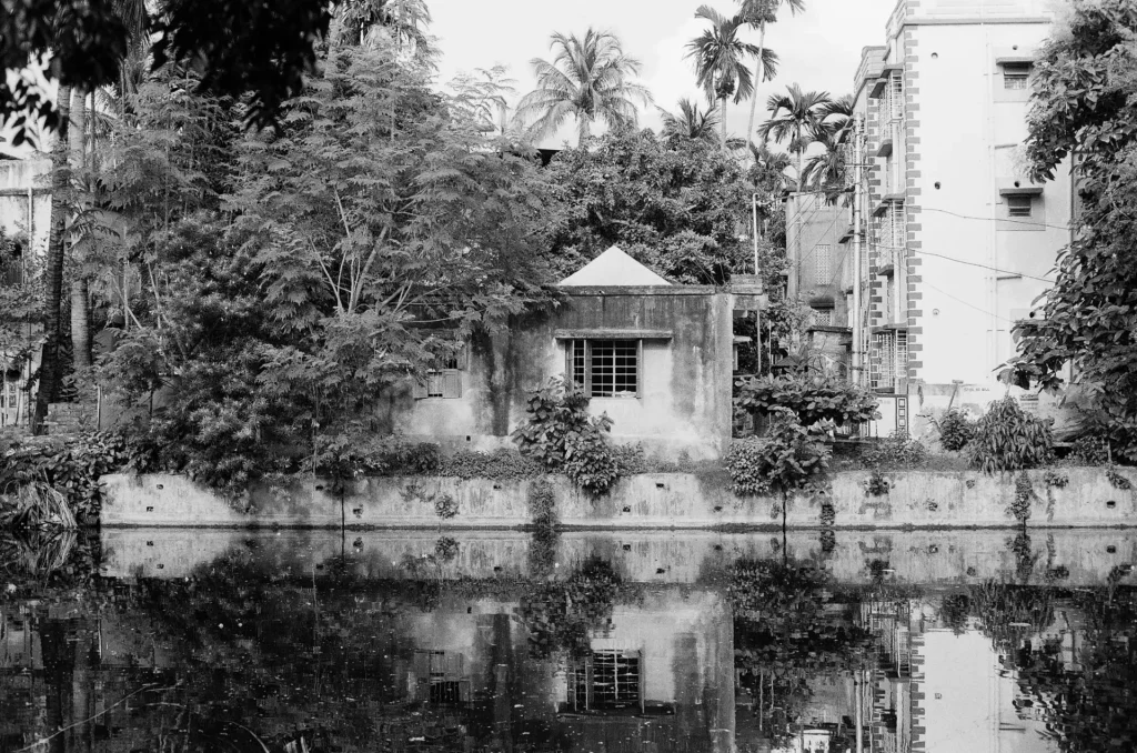
In fact, it may be the most picture-like photo in the series. But even so – and when you see the other photos, I think you’ll agree – it doesn’t quite fit in. It’s a “scene” rather than a “vignette”, if that makes sense? It shows more of the surroundings – the trees and the pond – while the other shots are more tightly composed. I also used a different lens, a Minolta MD-Rokkor 50mm f/1.4 (the camera was a Minolta X-370s, which I reviewed for Casual Photophile), while the rest are all with an MD 28mm f/2.8. But to use the wide-angle lens I would have to get closer, and the pond was in the way.
As for film, Kiichi uses Rollei Retro 80S developed in a modified PMK Pyro developer. That’s one of my favourite films too, but for these photos, I used Ilford FP4 Plus, simply because that’s what I had in my camera. I developed it in Ilford ID-11 1+1, which is what I always use (or Kodak D-76, which is functionally identical). I rated the film at the recommended speed (ISO 125) and developed it for the recommended time. Boring, I know – but that’s how I roll 🙂
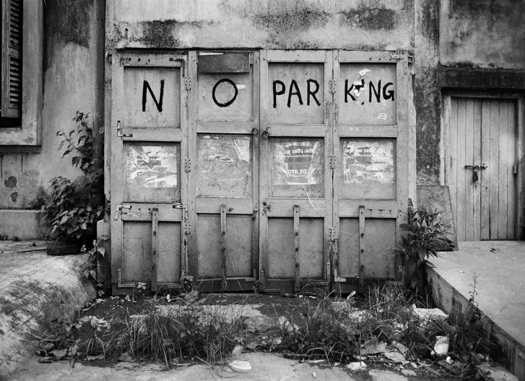
I was not as disciplined as Kiichi, who works within a set of self-imposed constraints. For example, his photos are all uncropped, showing the negative border, while I cropped if I felt it would improve the picture. And he uses a spot meter, whereas I just relied on my camera’s built-in averaging meter. But I compensated as necessary; in the next photo, for example, the gate was painted black. I underexposed by 1 stop to reproduce the correct tone, or else it would end up looking grey instead of black.
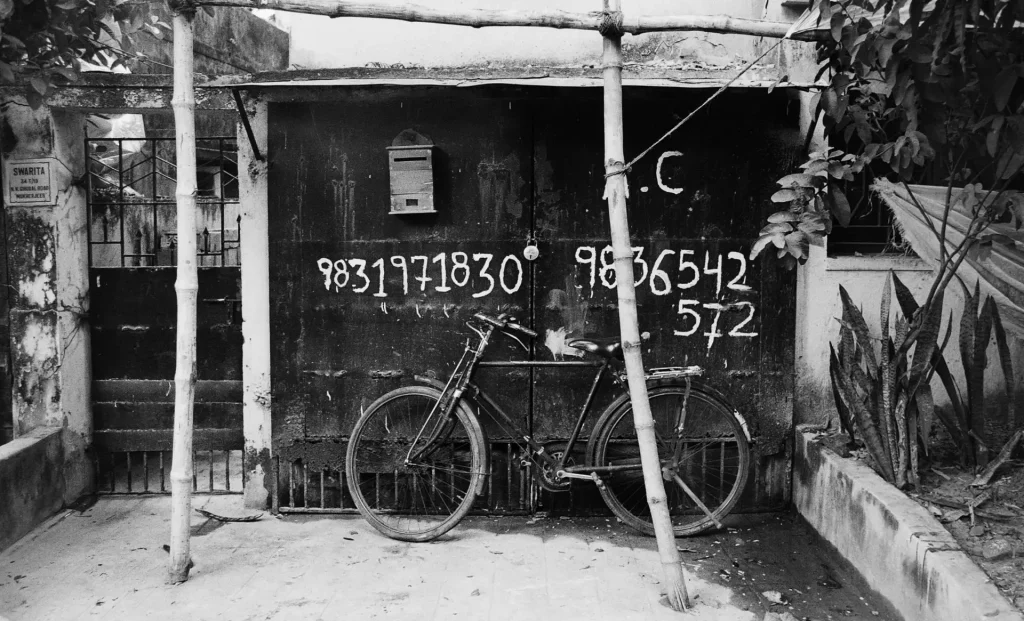
For photos like these, composition is key (you might almost say, composition is everything). But I find that having a bicycle in the frame instantly improves almost any composition. It is practically cheating. And the same goes for rickshaws.
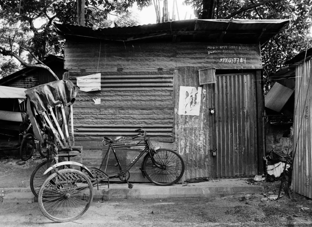
A typical street photography trick is to find an interesting composition and wait for a passerby to walk into the frame. I love photographing people, and let me tell you, it was hard – hard – to resist that instinct. In a densely-populated city like Kolkata, you actually have to wait – not for someone to walk into the scene, but for the scene to be devoid of people. But I held firm. What would Kiichi Kitahara do?
Or for that matter, what would Lewis Baltz do? Kiichi and I were recently chatting about architecture photography, and about influences and inspiration more generally. He mentioned the American photographer Lewis Baltz, and there’s an interesting interview where Baltz explained his interest in pictures without people:
if you have a human subject, the person is in the picture. Right? And an uninhabited picture has the possibility of the viewer projecting him or herself into the picture.
Right, no humans then! But cats are allowed.
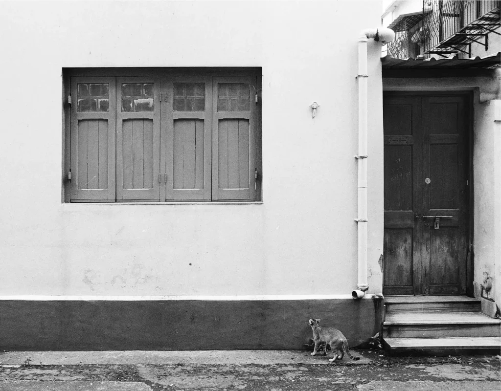
OK so I lied: I snuck in a human into one of the photos. Or rather, the reflection of a human. Forget Lewis Baltz. What would Vivian Maier do?
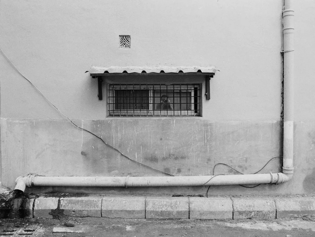
Another topic which came up in the same interview was flatness. The interviewer says to Baltz:
you create compositions that are very nearly flat… Not all of them… But the work that really stands out, if I may argue that, is of walls, and it’s of piping on walls.
Baltz responds that photographs – the physical objects, that is – are themselves flat, and he likes to play with the idea of “a plane that echoes the picture plane”. But he also reminds us that the actual scenes are not truly flat. That is, they are not planes, but “very shallow space … more like the space of a bas-relief.”
Bas-relief! I like that analogy. The two previous photos are among the flattest in my series – “walls, and piping on walls”. The next house is different though. It’s almost round, and as such it doesn’t quite fit. But I thought it was too interesting not to include.
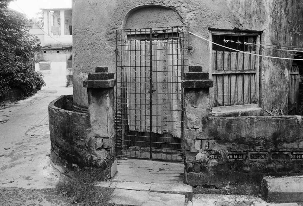
Composition is all very well, but what else can such photographs offer us? There’s an interesting article by Stephan Guttinger where he asks how “minimalist photography can also work on more levels than pure aesthetics”. Now I’m not sure if my photos work on “more levels than pure aesthetics” (or for that matter, if they even work on the level of pure aesthetics) and I’m not sure what those other levels might be. But here are a couple of ideas.
The first, most obvious, one is a form of documentation of the built environment. The seminal New Topographics exhibition of 1975, of which Lewis Baltz was a prominent part, was in part a reaction against traditional landscape photography in the style of Ansel Adams. Instead of showing sublime, unspoilt vistas, the New Topographics school – as Baltz and his peers came to be known – depicted seemingly banal subjects in a detached, almost clinical style.
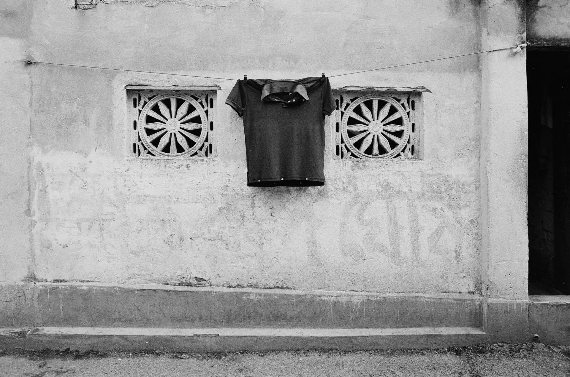
The New Topographics exhibition was subtitled Photographs of a Man-altered Landscape, and I think such images serve as a visual record of the ways in which we inhabit and alter the landscape, often beyond recognition. The photos themselves are often devoid of humans, but our imprints are everywhere – in the buildings themselves, and in clotheslines, parked bicycles, scrawled telephone numbers, and buckets of water, waiting to be filled.
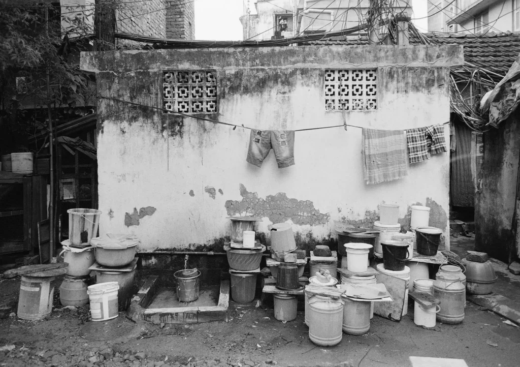
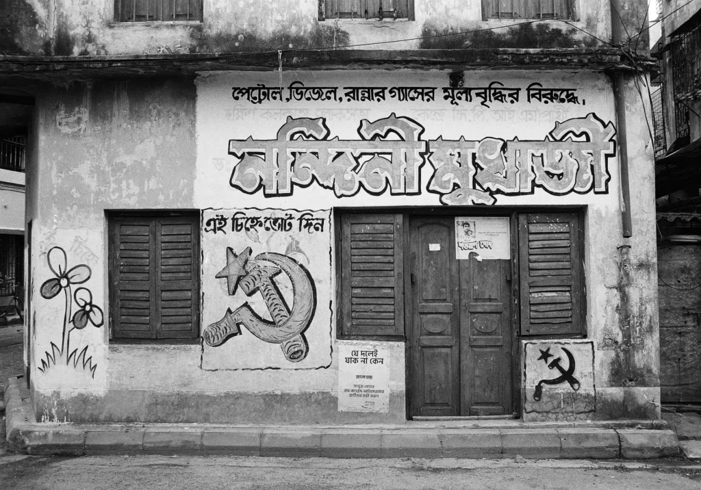
Some of the buildings bear more specific human imprints in the form of political graffiti – a holdover from the West Bengal legislative assembly elections of Spring 2021. The building below has the hammer-and-sickle of the Communist Party of India (Marxist). The Left Front ruled West Bengal from 1977 to 2011, before being ousted by the Trinamool Congress (literally: “Grassroots Congress”) whose flower symbol is on the left.
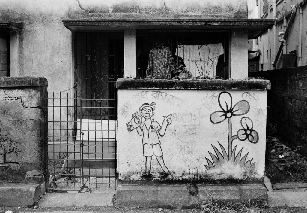
The Trinamool Congress logo is also on the next building, along with a slogan lampooning the rival Bharatiya Janata Party (BJP) for prioritising religion over the common person’s needs. The BJP, for those who don’t follow Indian politics, is the right-wing, Hindu-nationalist party which currently forms the central government. But they have never won in my state, West Bengal – and I hope it stays that way.
The political graffiti, of course, is transient. It will be effaced with the next round of whitewashing, and eventually replaced with graffiti for the next election. The buildings themselves are more durable, but they won’t last forever either. But then, nor will my pictures.
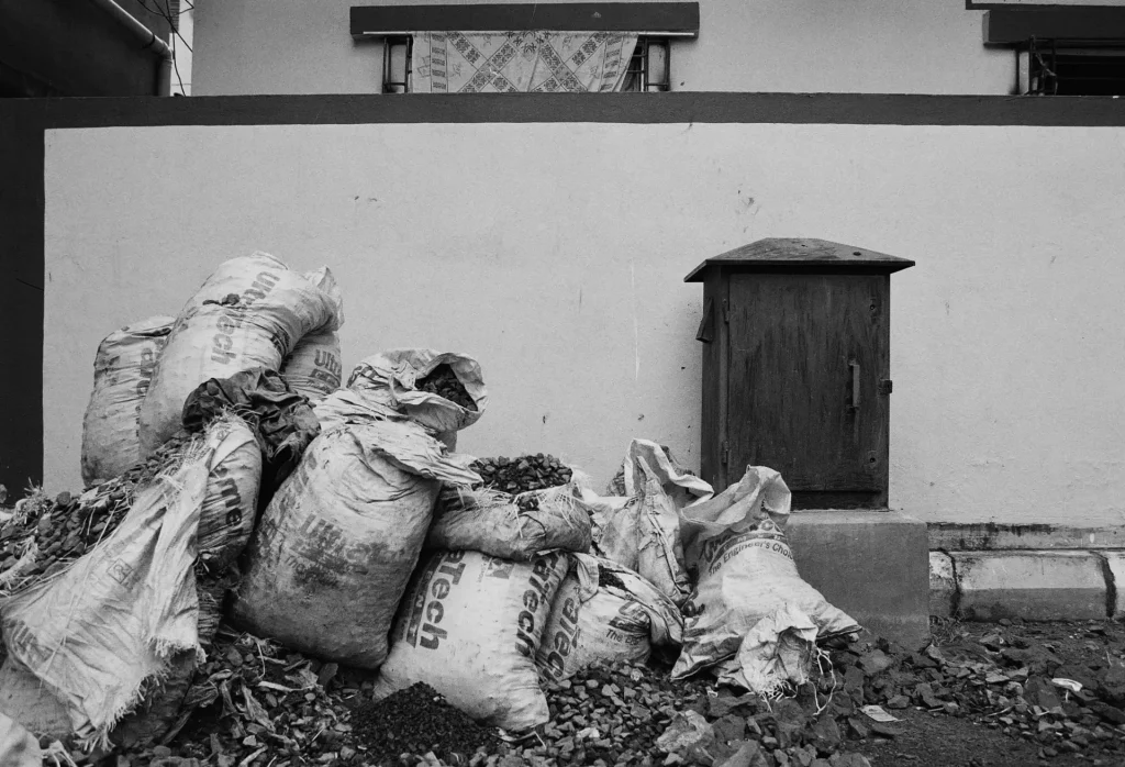
Finally, I mentioned how these photographs – and the photographs which inspired it – depict seemingly banal subjects. But I also hope they can prompt us to look again at what we often think of as mundane scenes. Mountains and waterfalls always make for good pictures, but even in unremarkable, urban middle-class neighbourhoods, shapes, forms and textures can come together in interesting, even beautiful ways. The way these sacks are piled reminded me of an iconic (and very different) photograph: Raising the Flag on Iwo Jima.
Anyhow, whether the pictures work or not, working on this series had an interesting effect on a personal level: I found myself looking at these backstreets and façades with fresh eyes. They became more than just a backdrop which I am wont to ignore while hunting for more “interesting” pictures. Now I look at buildings and walls a little more attentively, and as a result, I enjoy my walks that bit more. “The camera is an instrument that teaches people how to see without a camera,” said Dorothea Lange, one of my all-time favourite photographers.
Thanks for reading, and thanks also to Kiichi for providing the inspiration for this project. I plan to take more such photos on my walks, and if you like, you can follow my experiments on Instagram.
Share this post:

Comments
Ralph Turner on Façades of Kolkata, and the Value of “Boring” Projects – by Sroyon
Comment posted: 23/08/2021
I like the Dorothea Lange, it reminds me of a similar sentiment from David Hockney, though his observation was aimed more at the natural world (elements within it that are so easily overlooked or taken for granted.
Thanks for sharing ????
Comment posted: 23/08/2021
Comment posted: 23/08/2021
Comment posted: 23/08/2021
Rich on Façades of Kolkata, and the Value of “Boring” Projects – by Sroyon
Comment posted: 23/08/2021
A very good article.
--Rich
Comment posted: 23/08/2021
Arthur Gottschalk on Façades of Kolkata, and the Value of “Boring” Projects – by Sroyon
Comment posted: 23/08/2021
Comment posted: 23/08/2021
Kodachromeguy on Façades of Kolkata, and the Value of “Boring” Projects – by Sroyon
Comment posted: 23/08/2021
P.S., I have been to Calcutta around 1959, when I was a child. I have not found any photos that my dad might have taken.
Comment posted: 23/08/2021
Khürt L Williams on Façades of Kolkata, and the Value of “Boring” Projects – by Sroyon
Comment posted: 24/08/2021
I’ve always called that landscape photography. ????
Comment posted: 24/08/2021
Jamie on Façades of Kolkata, and the Value of “Boring” Projects – by Sroyon
Comment posted: 25/08/2021
Comment posted: 25/08/2021
Robin Gray on Façades of Kolkata, and the Value of “Boring” Projects – by Sroyon
Comment posted: 25/08/2021
Comment posted: 25/08/2021
Gergana on Façades of Kolkata, and the Value of “Boring” Projects – by Sroyon
Comment posted: 06/09/2021
However there's something I can't understand: what's the difference between facade and wall? I'm looking the Kiichi's photos, and I can't guess which is which.
Comment posted: 06/09/2021