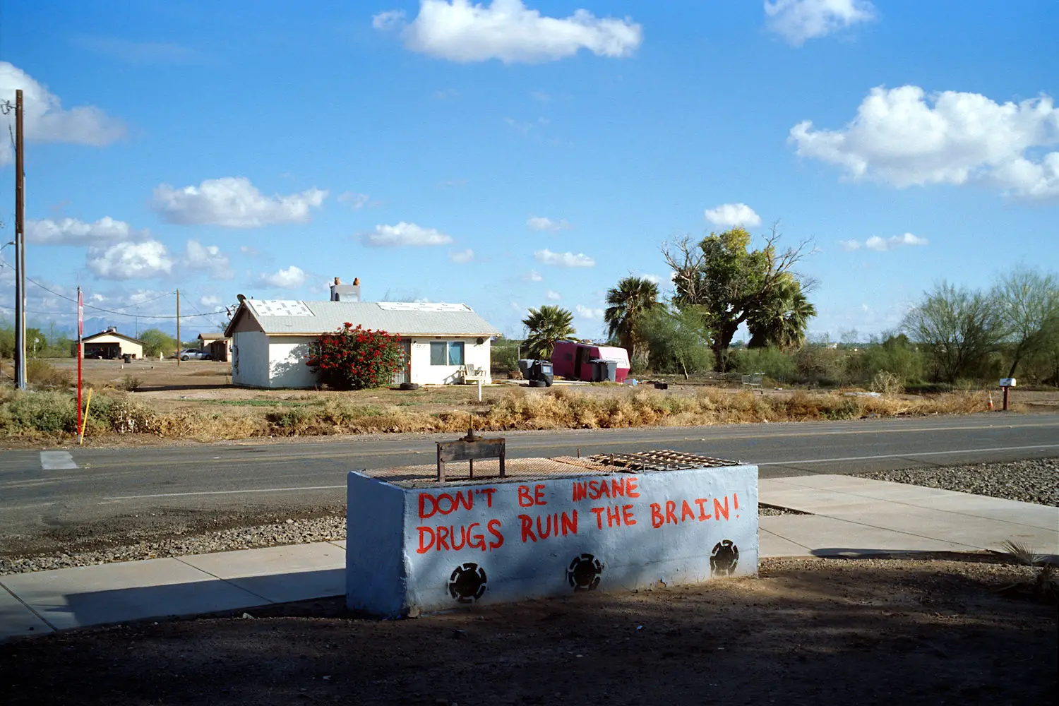
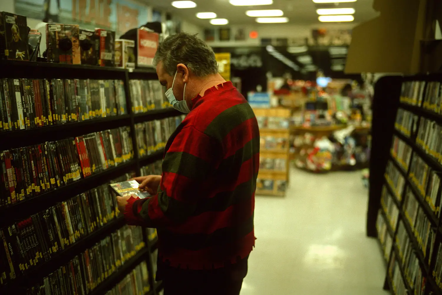
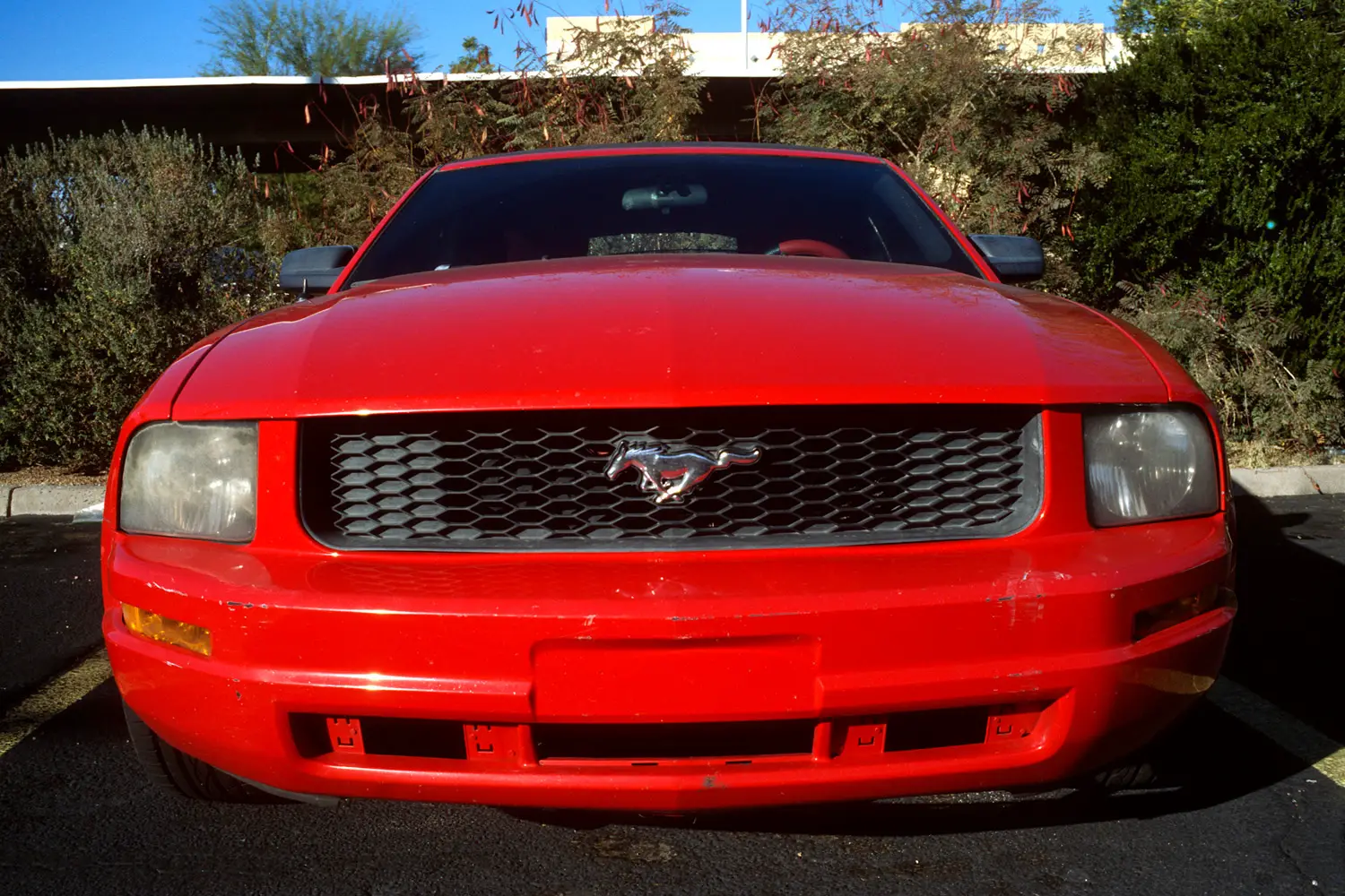
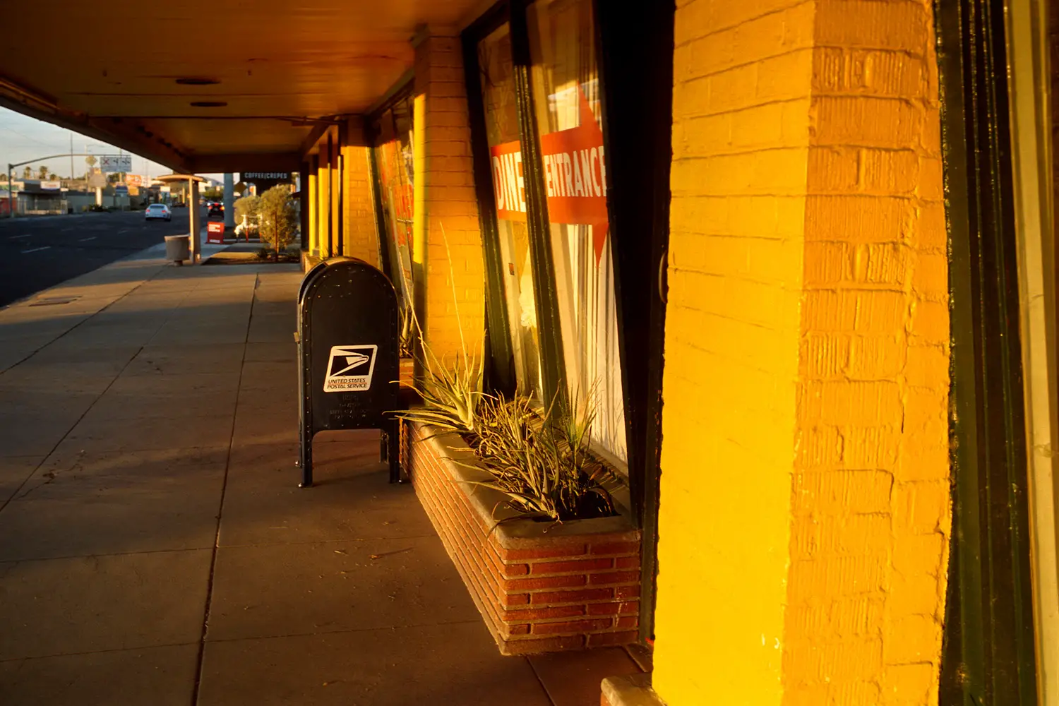
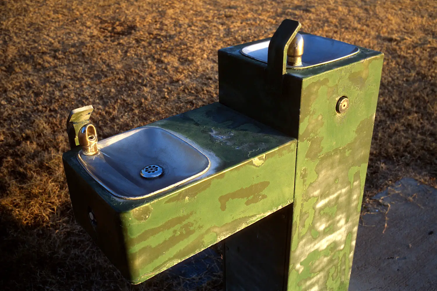
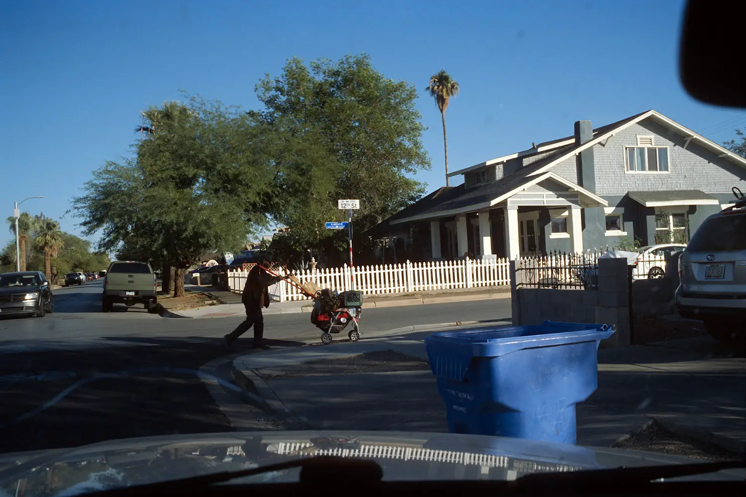
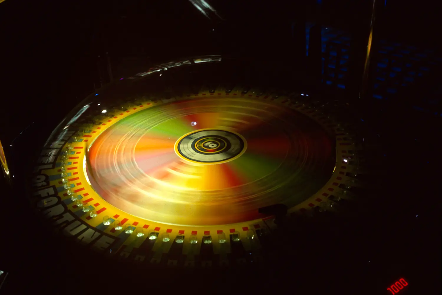
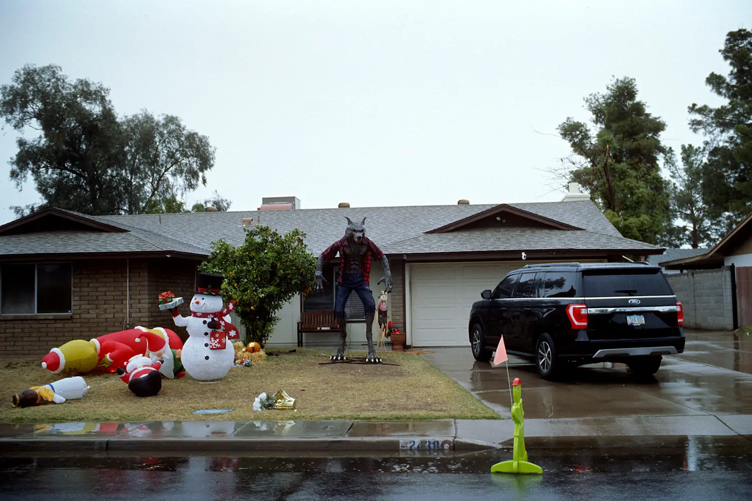
Within one month in Arizona and one week in Florida, I spent my free time photographing everyday surroundings in an increasingly directed manner—strategically targeting specific subjects such as houses, lawns, grocery stores, fast food restaurants, playgrounds, recreational areas, etc. I had no goal—no ambition like with other projects—no intent to create groundbreaking work—but to let loose and have fun. I had a chance to see what I could do with the plainest of things among the ordinary, to photograph not simply the ordinary but the most extremely ordinary among the ordinary—things so boring, common, or ever-present that nobody would bother to really notice nor look at in detail—to the point it becomes unnoticeable or rather hidden in plain sight—such that when described in vivid detail with maximum clarity—it becomes the unexpected. This is another take on the philosophy that anything is photographable.
Finding a project and philosophy
Back in November, I stumbled upon a bookstore copy of William Eggleston’s Guide and brought it home; after talking with a friend, I bought another book called Los Alamos and began analyzing both seriously. It was interesting how Eggleston photographed not just the ordinary but the most ordinary things of all—with the utmost care and precision.
I wanted to craft my own take on this type of photography. Many people think the same, but they underestimate the difficulty. They underestimate Eggleston; he’s in the same vein as Garry Winogrand. Both have a clairvoyant eye capable of seeing frames in every corner—seeing frames with their own eyes before even touching the camera or peering through a viewfinder—accurately pre-positioning their bodies such that the frame is already perfect when the camera reaches their face and the viewfinder meets their eyes. Both can and will photograph anything. Both are specific about which subjects they choose to photograph in a given area—in every picture they choose what to include or exclude from the frame—what life to show in the frame—what the content of the picture should be—what it should say. Both have complete understanding of a photograph’s meaning; they create pictures which not only look beautiful but describe a given subject or slice of life in extreme detail—combining form and content to create a photograph which says something in the most eloquent way possible—regardless of how relevant or irrelevant what the picture says is in the scheme of humanity or the world itself. It’s impossible to compete with either master without successfully applying these concepts.
I wanted to create pictures which maximize beauty through color and light, while vividly describing the ordinary specific to a particular place and lifestyle. I call these “complete photographs” which simultaneously maximize color, form, and content. This is slightly different from Eggleston; his form and beauty increases when his content decreases and vice versa. The Guide photographs are more descriptive about a particular life within The South, but they are not as pretty due to lesser form. The Los Alamos photographs are more pretty due to better form—more colorful with closer perspectives that give the impression of heightened clarity and visual detail—but the photographs are less descriptive about any specific place and look more similar regardless of where they were shot—from the south of Tennessee, the barren towns and deserts of New Mexico, glamorous Las Vegas, to near the western coast of California. I was unsatisfied with either type of photograph and wanted to make my type of “complete photographs”.
Shooting process
Now armed with a clear goal and philosophy, I was ready to have fun shooting. From Thanksgiving to Christmas, I’d go out mostly every weekend and photograph a place chosen from a list. The choice was decided either by a whim, the weather, or where I felt had more light or opportunity at the given time. The list contained places where people carried out their daily lives specific to a particular lifestyle—the most ordinary places among the ordinary. I’d drive and walk the suburbs they live in, the churches they attend every Sunday in the hood, the rundown decaying parks where they walk and play ball, the grocery stores they shop at, the restaurants they eat their tacos or burgers or pizzas or wings at, the repair shops their cars get fixed at, the used car dealerships they buy their cars from (many couldn’t afford a new car), the high schools teenagers attend, the arcade and record stores in shopping malls where teenagers hang out, etc.
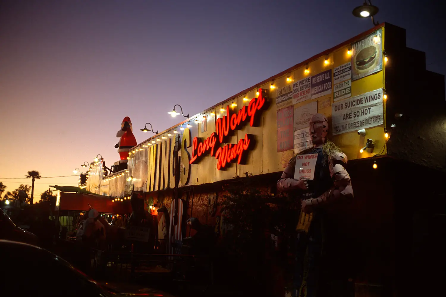
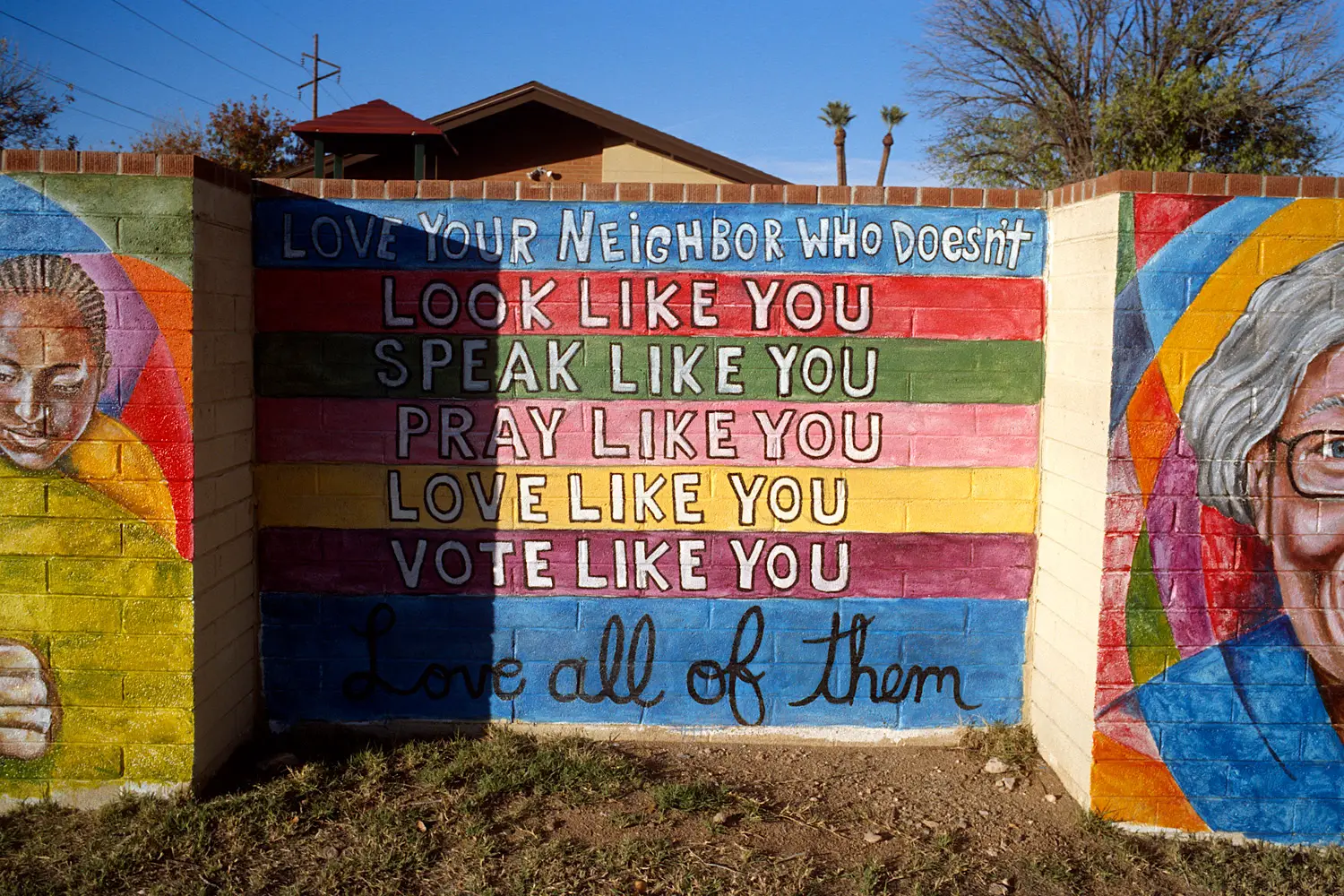
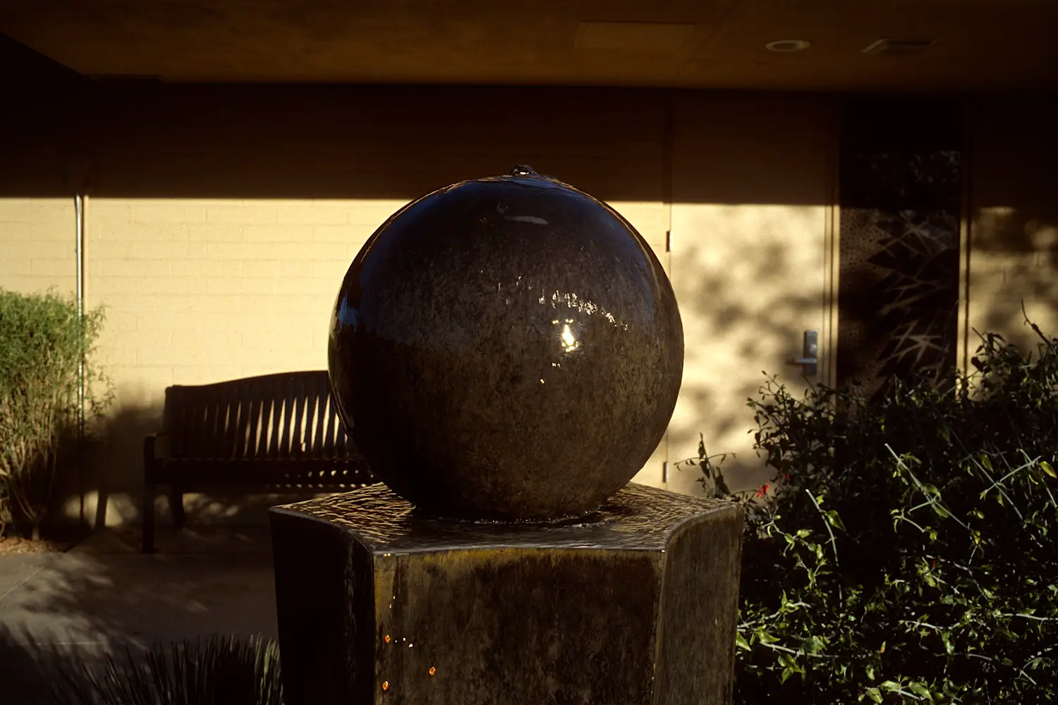
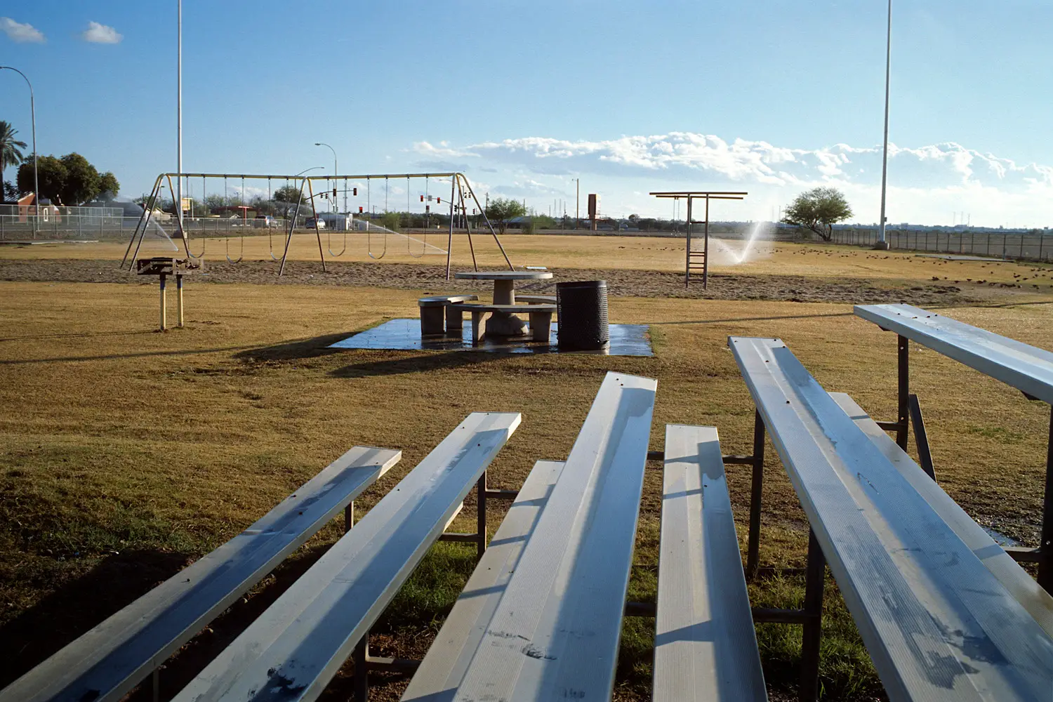
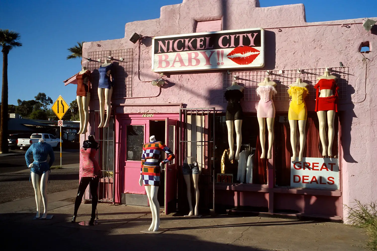
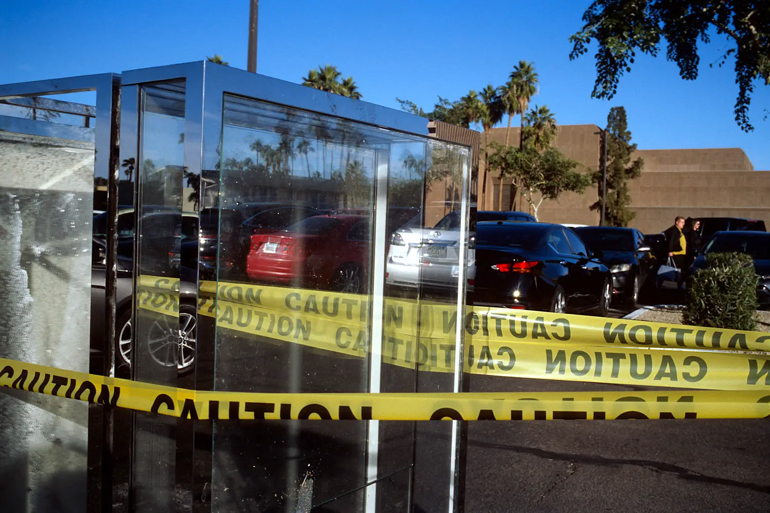
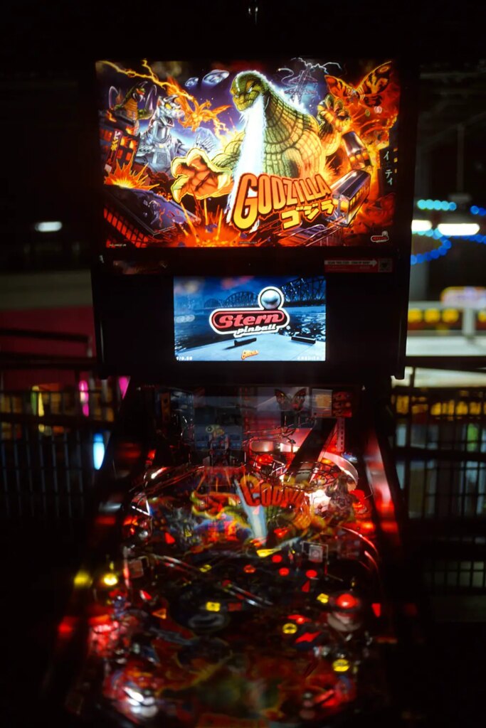
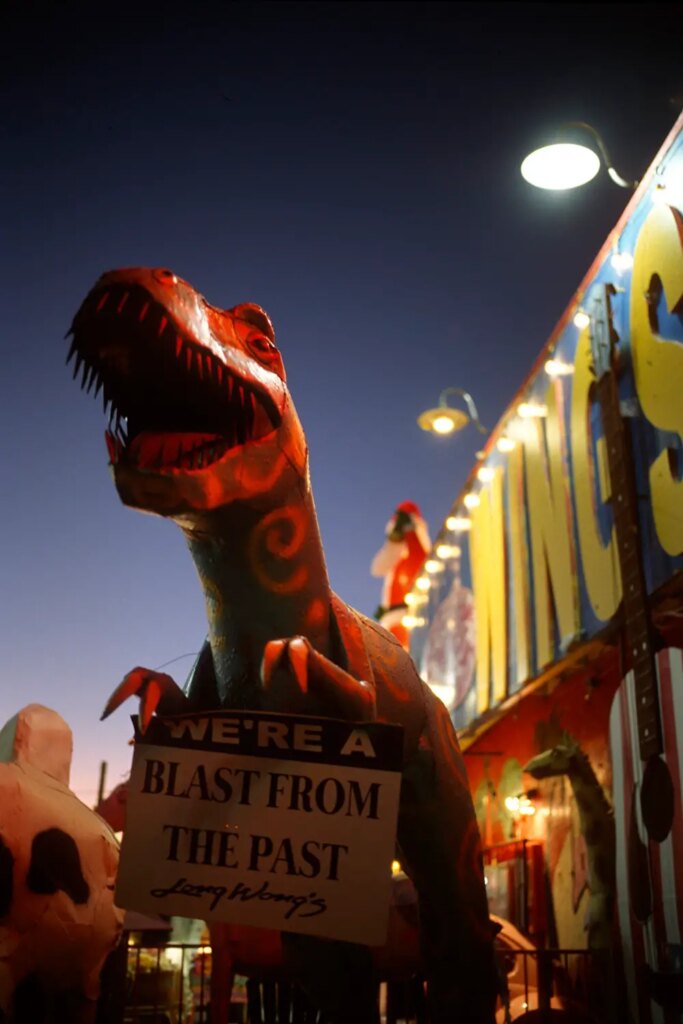
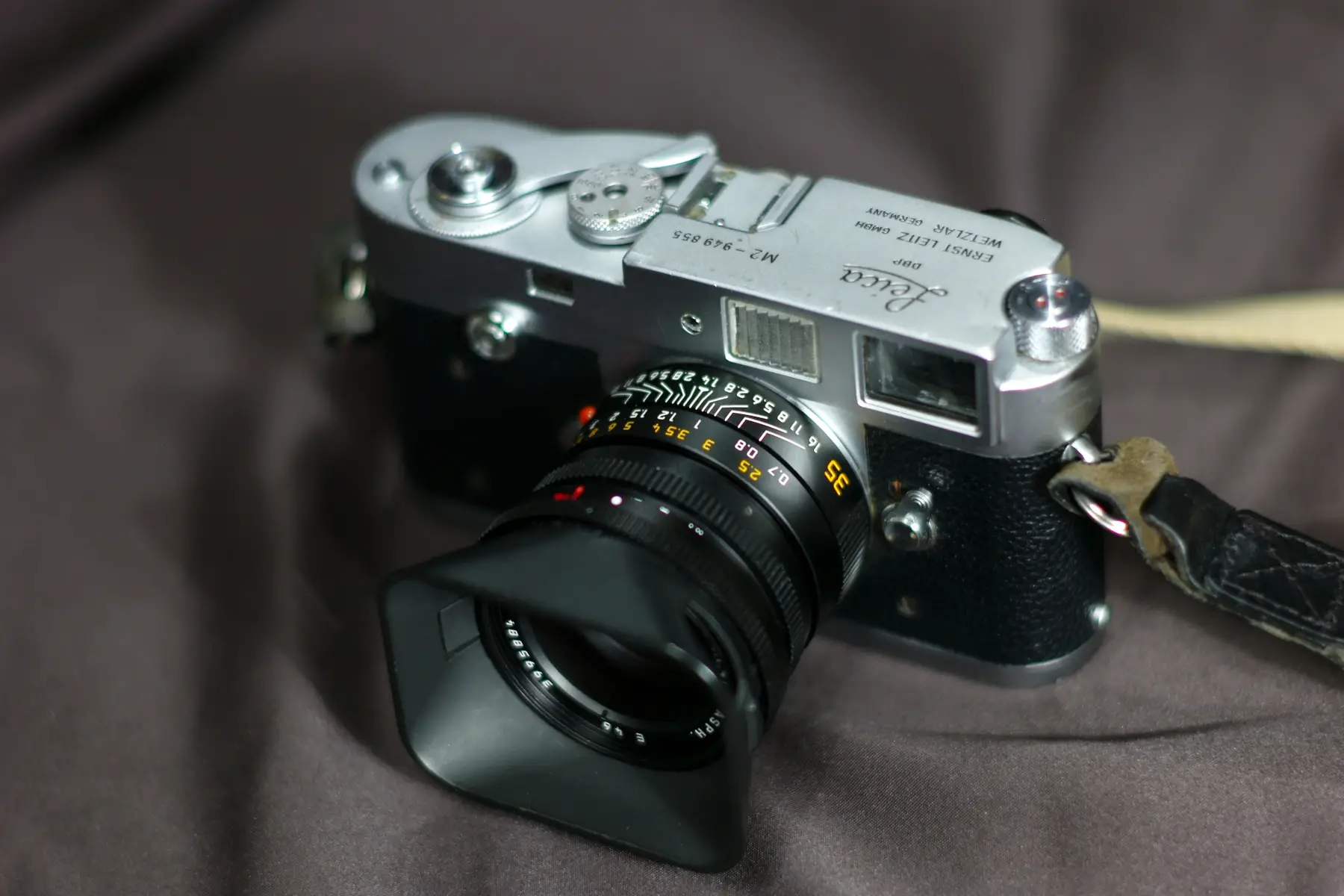
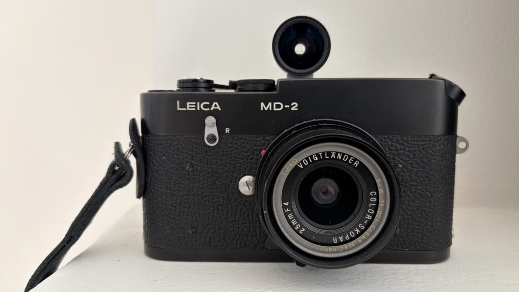
I use a Leica M2: the only 35mm film camera I own which works perfectly with my style. As mentioned before, I don’t think of taking pictures and focus instead on what subject I want to photograph—what I want to include in the frame—what I want to exclude from the frame. I’m more curious about what I find interesting within the life in front of me—what in front of me I should focus on—to capture it and the feeling of how interesting I find it—less curious about taking good pictures. When I’m out shooting, I look at life in a frame—not at photographs. The M2 embodies this; it’s the simplest camera with a barebones viewfinder which literally shows life surrounded by a single, plain, rectangular frame. I’m seeing a frame around my own eyes—not looking through a screen or the eyes of a camera lens in a SLR.
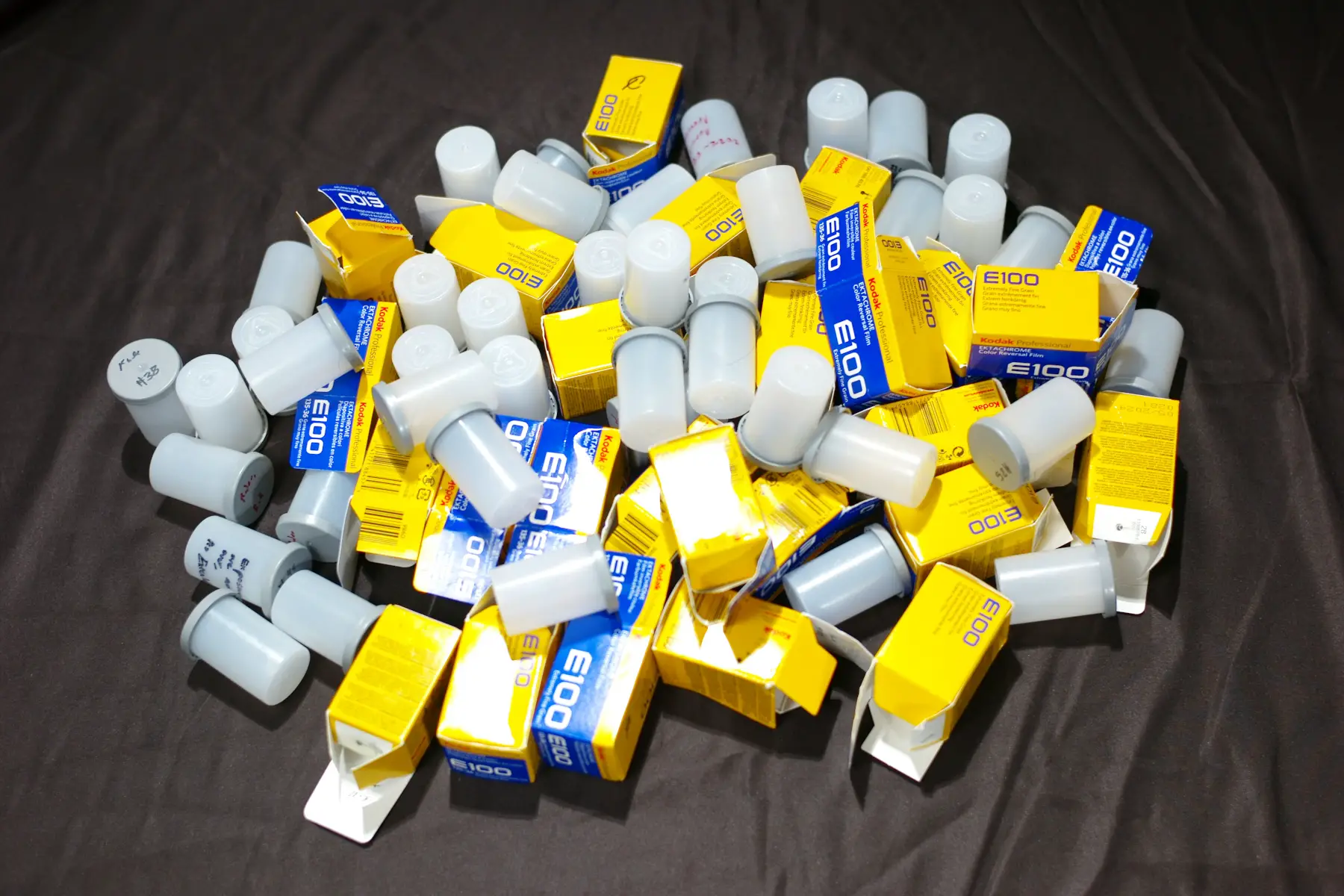
My choice of film: Kodak Ektachrome. I wanted the final photographs to have maximum detail and vivid color—to achieve what I call maximum visual clarity. Nothing beats slide film in this. I didn’t want something too high contrast nor colors too overblown. I also wanted a film which gracefully handled any lighting condition such as indoor tungsten, outdoor LEDs, rain and heavy overcast, sunshine, etc. This is why I chose Ektachrome; it’s the single slide film I can shoot anywhere of anything at anytime—my kind of film.
When framing, I’d rank the objects I wish to include by which were more or less important to me. I’d change angles to control the size of objects relative to each other. The object I wanted to focus on more should be larger and more prevalent in the frame. Less important objects should be smaller and less noticeable in the frame; some placed in the center of the frame; others subtly pushed to the edge. I’d try to get as close as possible to give the perceived sense of having more detail. I’d expose my slides between over or under by half a stop if I wanted to prioritize shadow detail or color saturation or the middle ground in between.
All of this is of course instinct. I don’t think about these things much while I’m in the field. Thinking about taking good pictures or “style” will only lead to worse pictures. It’s better to think instead about what exactly you want to photograph. Stop trying to take good pictures and start immersing yourself in the world around you. Try to sync with your surroundings and find what in it connects with you or speaks to you on a deeper level—then point your camera and click.
That’s the secret: to take good pictures you have to stop trying to take good pictures. Just do, there is no try.
Practicing this nonstop will naturally lead to the development of your own style—your own photographic voice or identity. If you feel nervous when out shooting, start in a place where you feel comfortable and slowly get into the things you’re not comfortable with. You’ll get used to it in no time.
Reflecting on the shooting process and the past before this project
I say all that, but I trained myself in relatively uncomfortable areas. During the whole year, I shot 70 rolls of slides—eventually trimmed down to 270 images—for my first street photography project called The Chronicles of America. I shot the streets of Las Vegas and San Francisco—from gamblers at slot machines and poker tables in casinos at The Strip—homeless surrounded by burned RVs, trash, broken glass, and all manner of debris near the hood of Oakland—sex addicts, drug junkies, and perverts celebrating in public surrounded by borderline pornographic scenery in the sex and kink festival—groups of families and gays hugging, cheering, and waving rainbow flags in a pride parade—to grandpas and grandmas waving American flags on the highway—protestors in front of Washington D.C. being met with giant black fences—to the patriots openly chatting and waving the biggest American flags in a stadium with miles of people at a Trump rally—cause my camera’s rated “E” for everybody—no bias nor exceptions. After working in these depressing and “on edge” environments, I developed methods of photographing people without them noticing, framing in a split-second, and exposing films in any conditions even if it meant guessing when there’s no time to meter. There wasn’t any other choice. I got used to it: photographing a tense life with suffering.
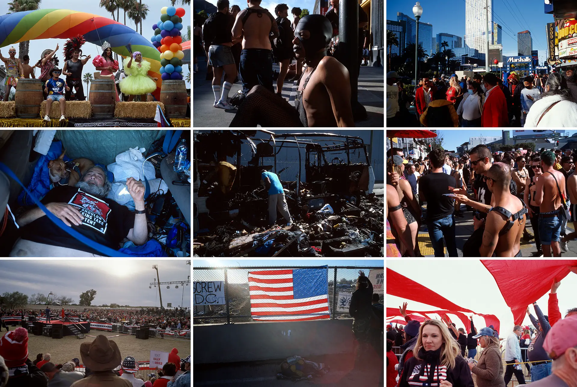
This is how I learned street photography and 35mm photography: photographing on the edge for a year—people at the edge of society—while operating at the edge of my own physical ability with a camera. A leisurely stroll around my neighborhood and appreciation of the ordinary was relaxing and refreshing in comparison. It was the change of pace I needed; it’s so easy-going.
I truly enjoyed myself when photographing this ordinary project. I really appreciated the peace and quiet after seeing endless shit—hence why I called the project Peaceful Days. People really have it lucky, you know; too bad they always take it for granted. I didn’t want to take it for granted. I’d cherish whatever I could whenever I could. These are elements any successful project needs regardless of a photographer’s skill or talent: joy, appreciation, self-fulfillment, and personal purpose. Projects which come from the heart are always the best, and they’re the only projects worth going the extra mile for—the only projects I’d bother to start my whole life.
Processing, storing, scanning, and examining photographs
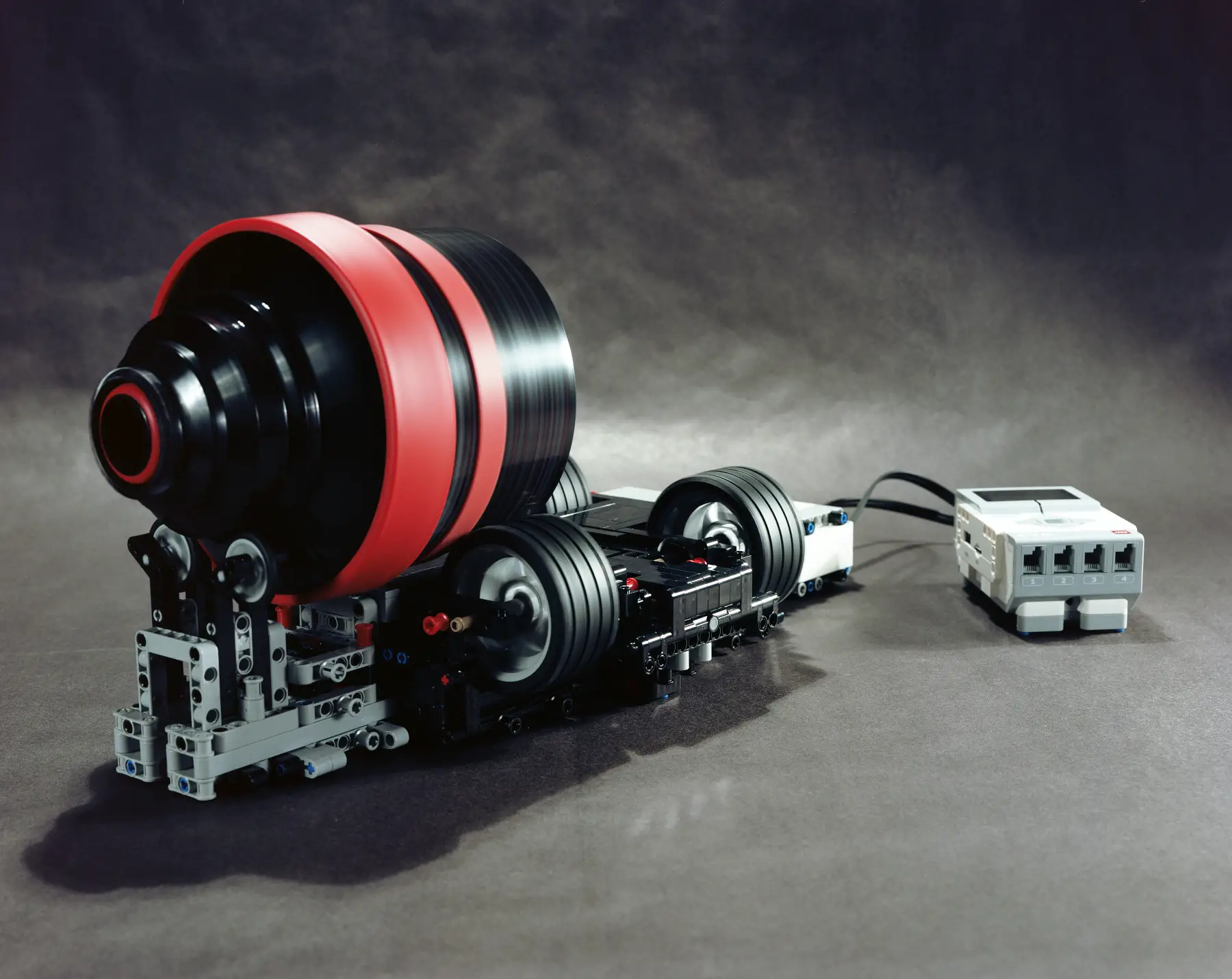
Throughout the course of shooting, I’d develop and view my films to figure out what could’ve been done better—what subjects I’d shot more of or less of—what subjects I needed to shoot next. Every Sunday at midnight, I’d develop up to 5 rolls of Ektachrome at a time using the film processor which I’d designed. I’d cut the films, place them in high quality Wess slide mounts which don’t really crop the frame, store them in Vue-All binders, and finally scan films through a Nikon Coolscan 4000 bought on a discount.
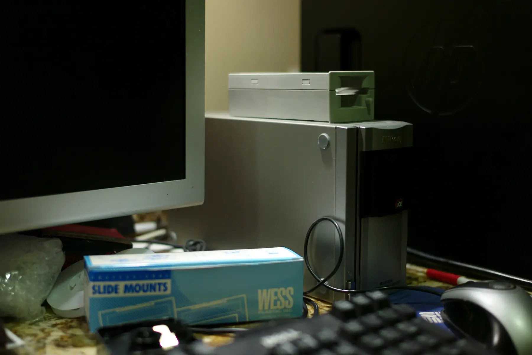
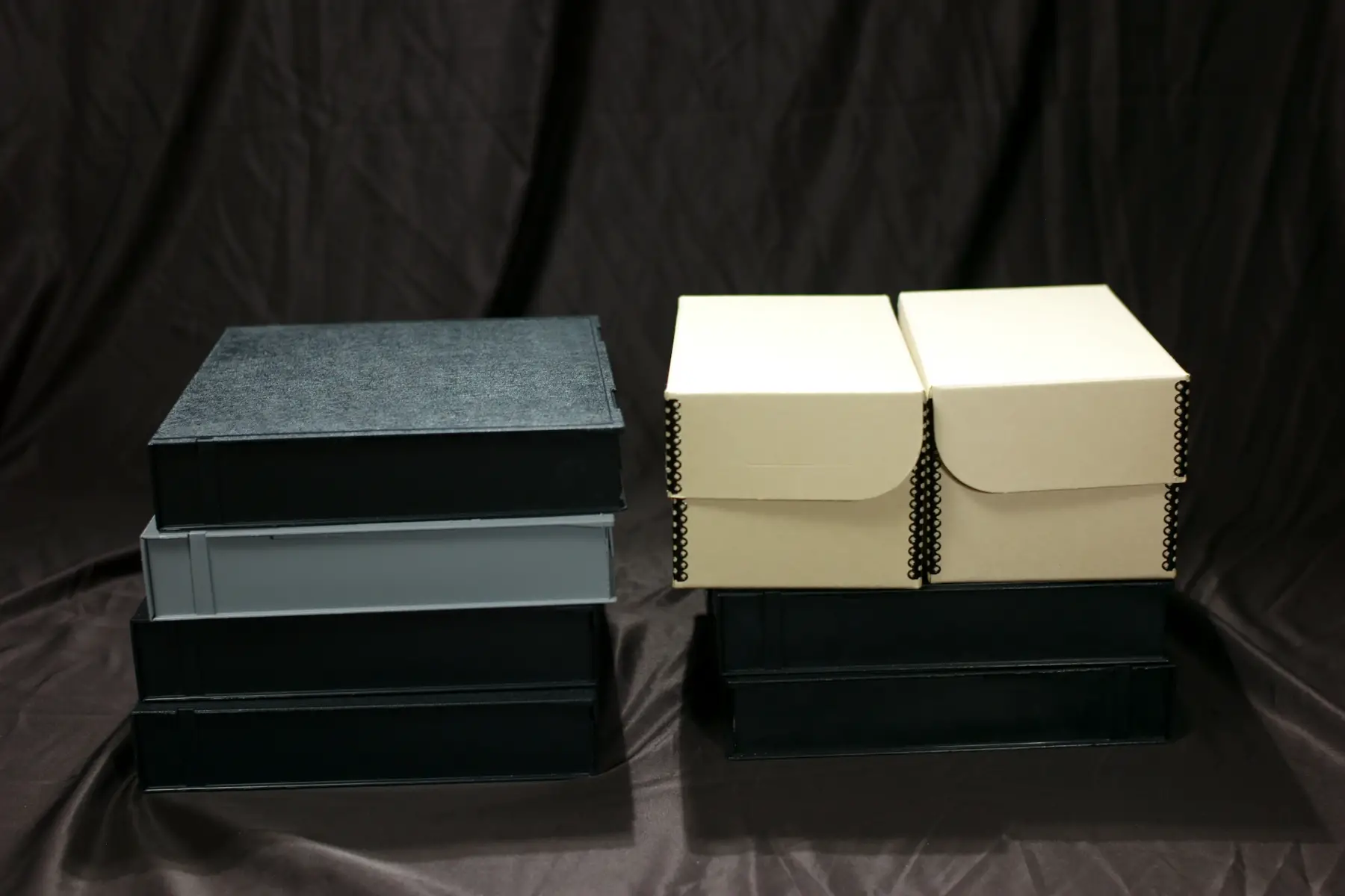
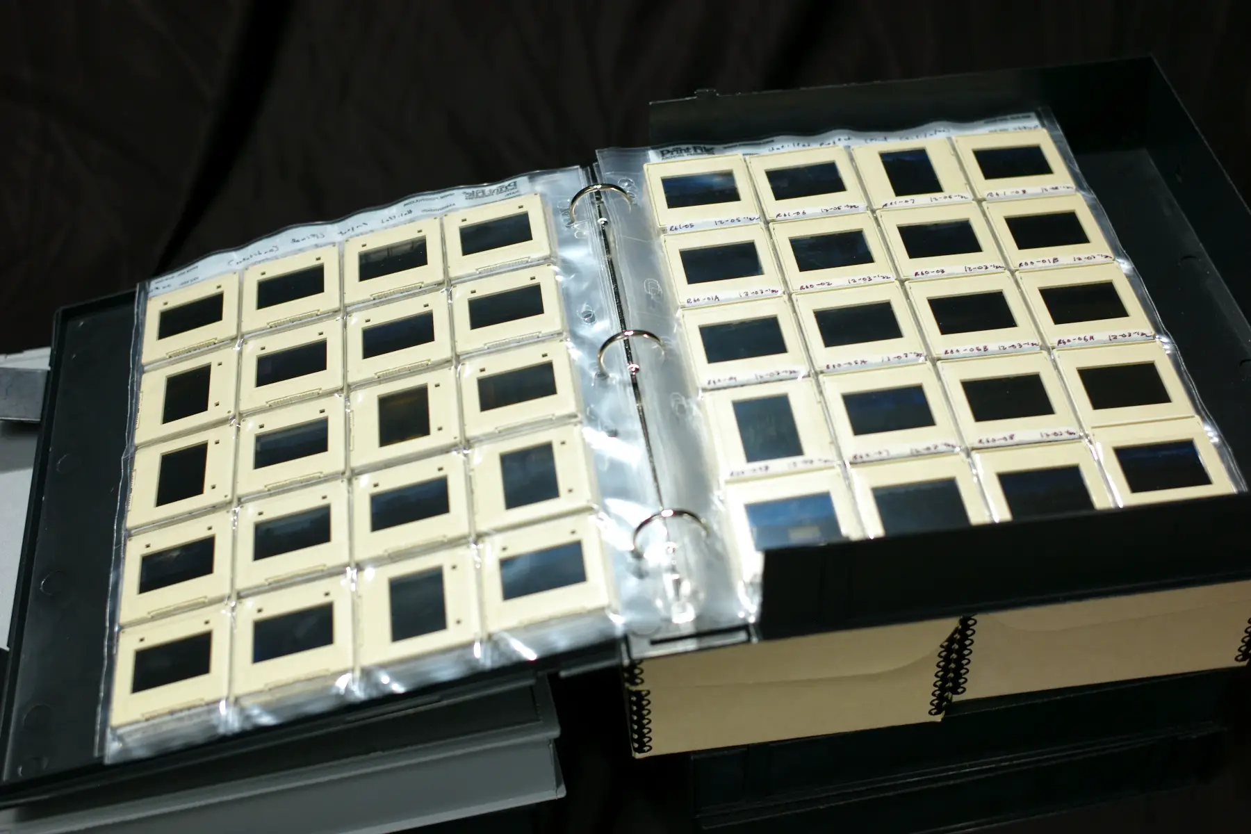
I decided the project was complete after Christmas. It took some time to fully examine the 20 rolls shot over the month. I kept looking at the pictures again and again until I found the ones I never got bored with. I also looked at some pictures I shot in a similar vein during one week in Florida. I eventually collected a total of 130+ images to make the final cut.
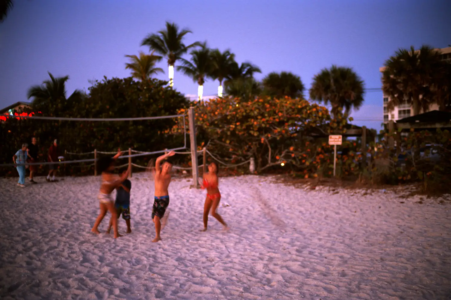
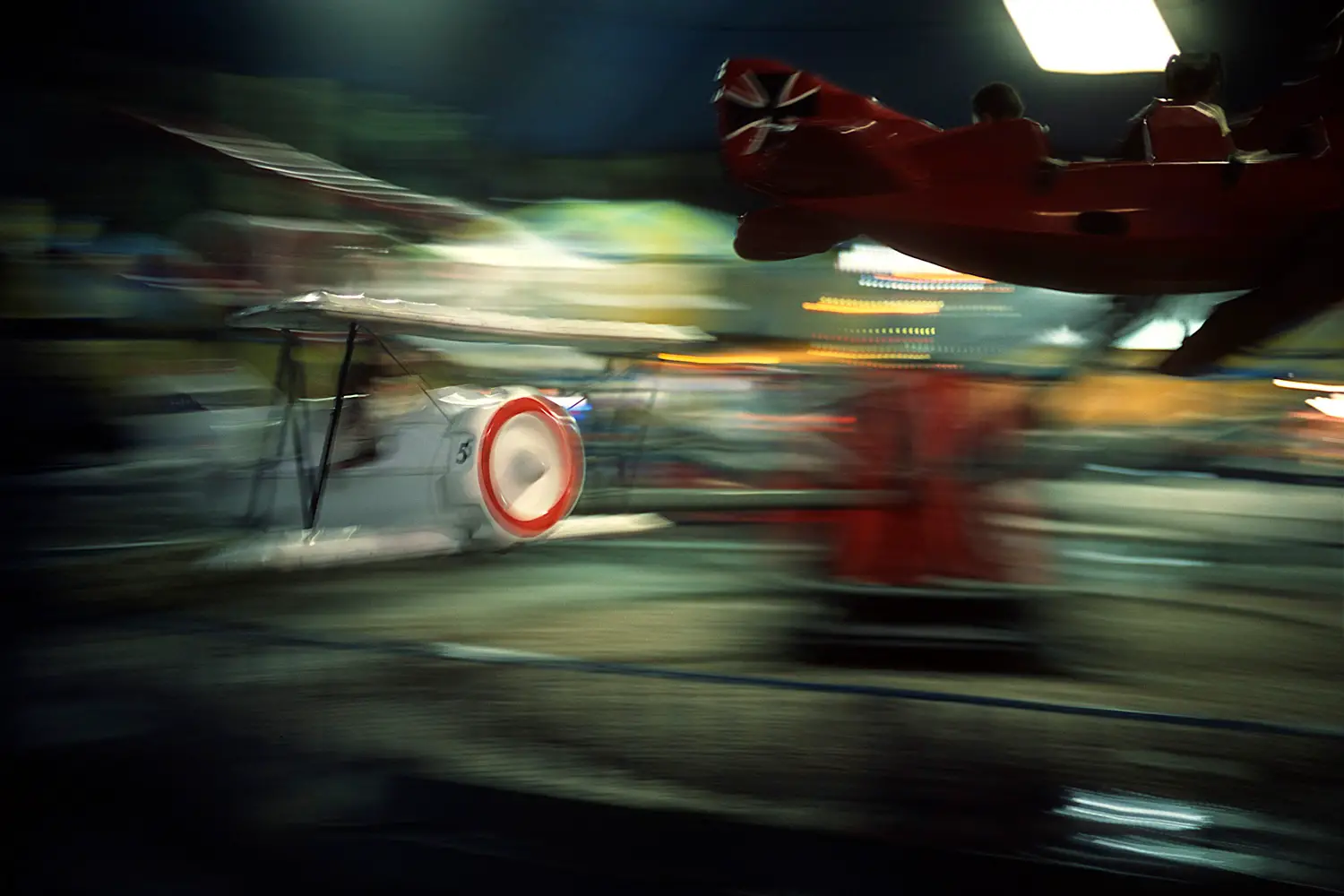
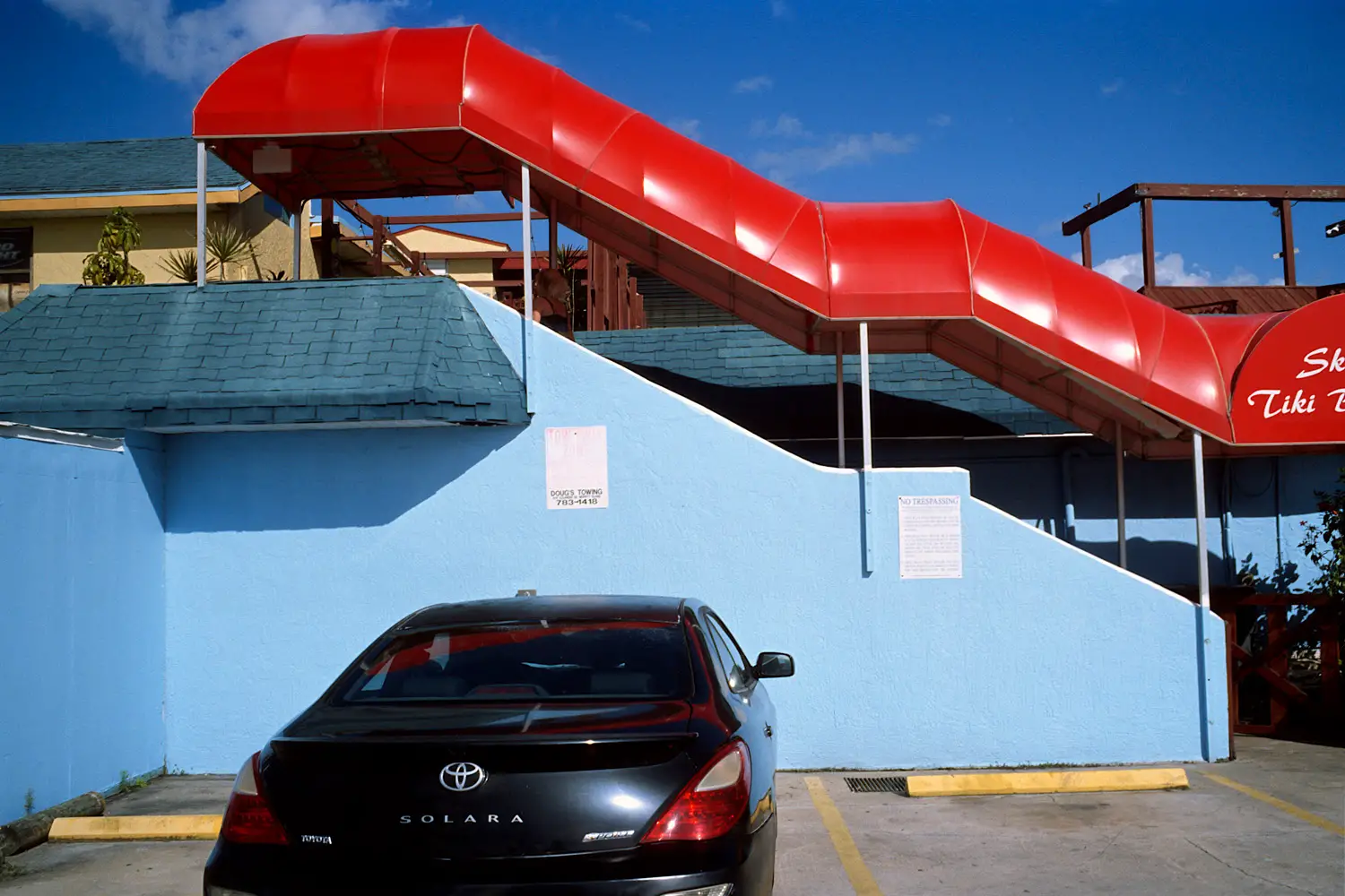
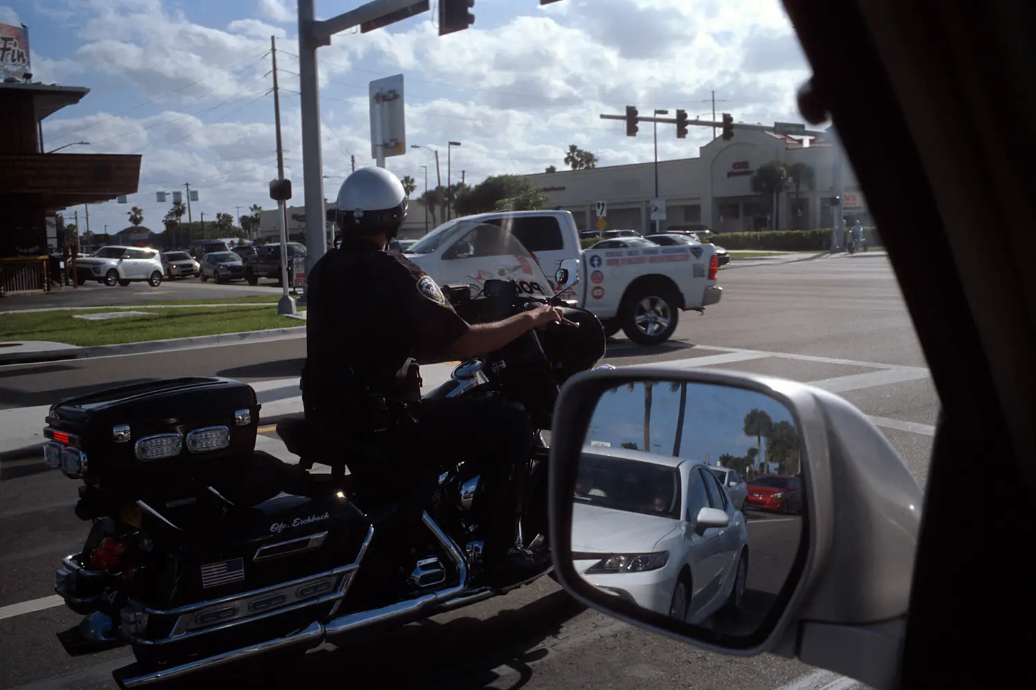
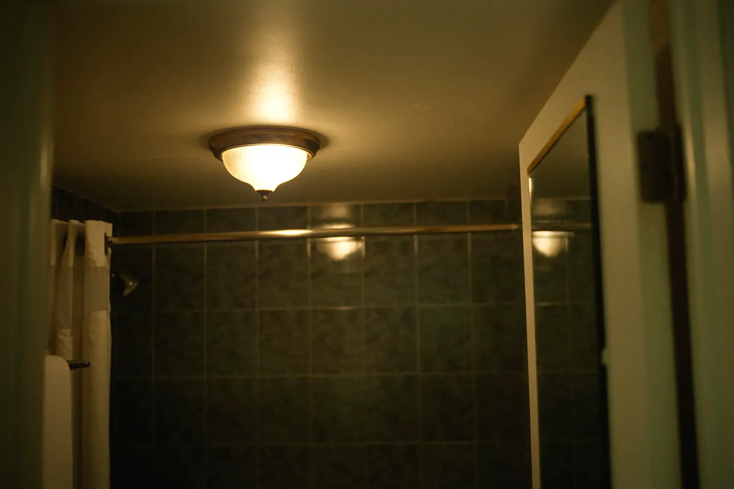
Image sequencing and book design
I decided to design a book and thus began the tedious process of determining in what order photographs should be presented to the viewer. Every photograph has a particular color palette, shape & framing, and describes a specific subject—a combination of color, form, and content. Therefore, I decided to sequence my “complete photographs” based on color, form, and content at the same time. What color did I want to show first or next? What shape did I want to show first or next? What subject matter did I want to describe first or next? I asked these questions everytime I made a decision to place one photograph before or after another.

With the sequence completed, I began to devise a book layout which presented the sequence in the most appealing way possible within the scope of the project. I intended the photographs to be viewed one at a time. The right page would show the image, and the left page would be blank except for a title or caption. My pictures had more focus on content and subject matter, so captions and titles which state or identify the subject matter seemed appropriate.
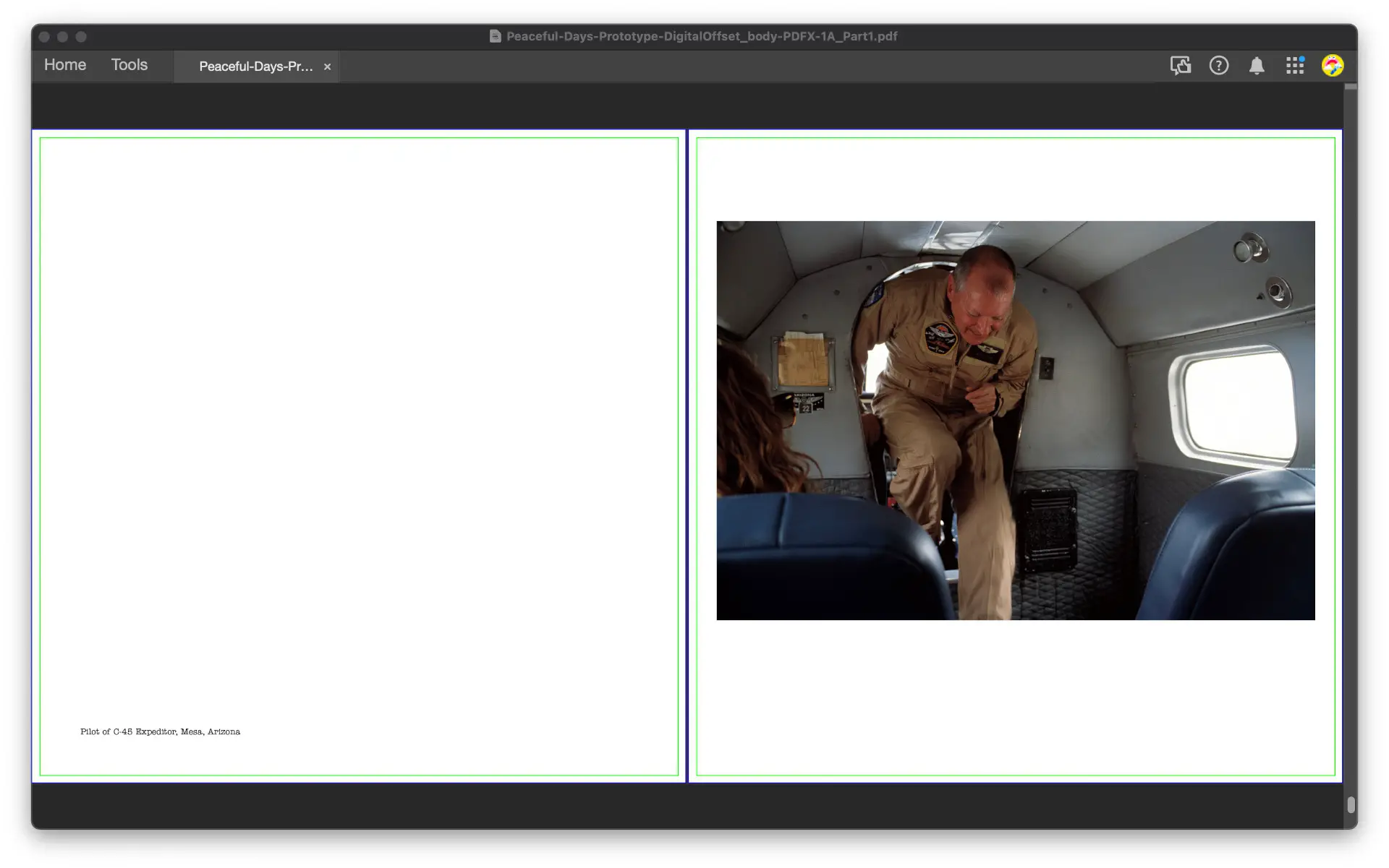
I opted to make the book square—measuring 9.625″x9.625″—so portrait and landscape pictures fit at the same size on the same page with images sized 6″x9″ or 9″x6″. I decided to use thinner borders to maximize image size in a compact and affordable package. Images were positioned above center to make the layout more visually pleasing. This design is a nod to Walker Evan’s American Photographs—a significant influence to this book.
I wanted a book font which matched the personality of the pictures themselves—clear and legible but not particularly formal nor serious. Sans fonts are too clean, straight, and formal. Serif fonts are less straight, more readable, but still too formal. Slab-serif fonts are more readable but less formal and more off-kilter; I eventually went with the slab-serif called “ITC American Typewriter”.
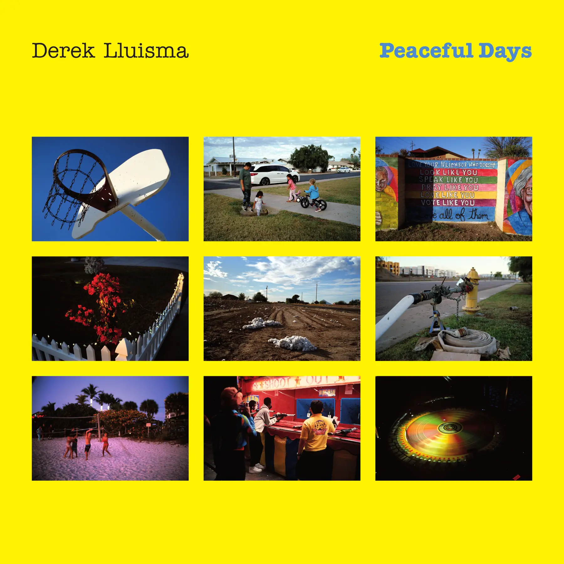
I opted to display a 3×3 grid of 2.5″ wide images on the cover—a nod to the Instagram-ableness of these pictures. The cover is colored yellow and the title is colored blue; this matched the yellow and blue tones predominantly visible in my film: Kodak Ektachrome. The author name and title placement was borrowed from the album cover of Billy Joel’s The Stranger.
I generated some PDFs using my own custom-made software–along with CMYK image reproductions which satisfy a 300% total ink limit; this entire design and development process spanned a total of 15 days. I then submitted my files to a printer; the book arrived a little over 2 weeks later. You can view it in the video below.
Final Remarks
This project was a nice change of pace. It was fun and refreshing even if it was more work than expected. Got a new book just like that with 131 pictures and 272 pages; I’m still figuring out what to do with it. But I’m satisfied with how things turned out.
I’m unable to judge my own pictures objectively, so I can’t accurately tell whether I succeeded or not in making my vision of complete photographs. I’ll leave that to the people and time; time reveals all.
I hope you had fun reading this article; I’d be honored if you find any of the information useful. Thank you for having me. I’ll do my best to answer any comments directed to me, but be warned: I’m lousy at logging into the internet and response time could be slow. I have the rare compulsion to avoid the internet rather than stick with it.
You can follow me on Instagram (which I barely use): @derek_lluisma
If you want to see more videos, subscribe to Youtube: @dereklluisma
If you want to see more pictures, checkout the website at: dereklluisma.com
Share this post:
Comments
Hamish Gill on Seeing the unexpected in the ordinary – a day in the life with my newest project: Peaceful Days – By Derek Lluisma
Comment posted: 24/03/2023
Martin Siegel on Seeing the unexpected in the ordinary – a day in the life with my newest project: Peaceful Days – By Derek Lluisma
Comment posted: 24/03/2023
Wishing you peaceful days and best regards
Martin in Austria
Comment posted: 24/03/2023
Michael Krause on Seeing the unexpected in the ordinary – a day in the life with my newest project: Peaceful Days – By Derek Lluisma
Comment posted: 24/03/2023
I find your description of the approach and implementation very helpful and a nice suggestion. Thanks for that.
Translated with www.DeepL.com/Translator (free version)
Comment posted: 24/03/2023
Dave Powell on Seeing the unexpected in the ordinary – a day in the life with my newest project: Peaceful Days – By Derek Lluisma
Comment posted: 28/03/2023
Comment posted: 28/03/2023