Many people used shoot analog photography may have already come across an ISO 12 violet/blue film that stores usually offer. This film, which can also be developed with chemicals for black and white photography, is Kodak Vision Color Print.
Vision Color Print is a film for cinema, but not for filming. It is used for positive copies for projection. But what does this mean?
When a cinema film is shot using the famous Eastman Vision 3 500T, 250D, etc., a strip of negative film is generated. It is not possible to project this film strip and watch a negative film. That’s where Color Print comes in. It is exposed with the strip of negative film in front of it, with light passing through the negative and creating a negative of a negative. In other words, a positive! The base of this film is completely transparent precisely for projection purposes.
But can I shoot with it in my photographic camera like normal negative film?
You can, but with some caveats. Because it is designed for film copying and to be exposed to light passing through the amber-orange color of the negative film base, Vision Color Print has a much greater sensitivity in its blue layer to compensate for the color of the base and generate balanced positive colors. This means that if you shoot without any filter on the lens like you do with other photographic film, it will turn completely blue. Some people like this effect, but it is impractical.
That’s how I decided to test a reel of 36 poses rewound in different conditions. Originally, this film has ISO 6, a very low sensitivity, requiring slow shutter speeds and large apertures. For use with filters, in the various research I did, it is recommended to use ISO 3.
To emulate the base color of a negative film on the front of the lens and generate more realistic colors, I tested three filters:
– 85B filter, used for temperature correction of tungsten balanced films, with a smoother curve in the permeability of the color spectrum.
– Orange Filter (YA2), used in black and white photography, with a more aggressive curve, basically allowing only colors above orange in the color spectrum to pass through.
– Sepia filter, used to give an “old” tone to photographs, closer to brown than orange, also with a more aggressive curve.
The 85B filter “steals” one stop of light when used, that is, ISO 3 becomes ISO 1.5. The Orange filter “steals” two stops, so you should shoot at ISO 0.75. And the Sepia filter “steals” three stops of light, meaning you should shoot at ISO 0.4. This means that at midday, in the bright sun of a summer day at the beach, you’ll need to use a tripod so your photo doesn’t come out blurry.
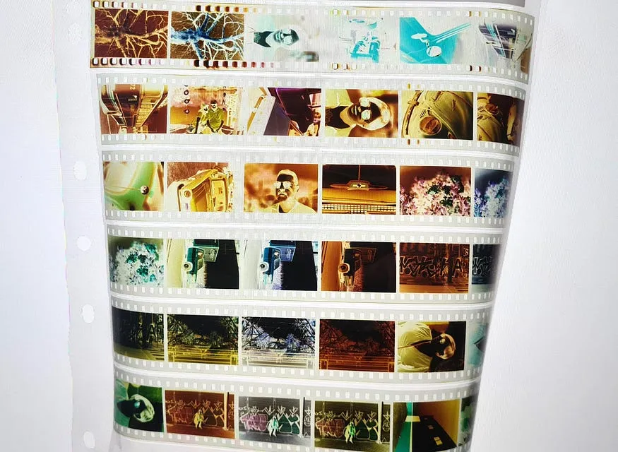
The process was to test at several different ISOs, repeating the same scene three times, once with each filter. Kodak Vision Color Print is originally processed in a process called ECP-2E, which I have no idea about. However, it can be developed in C41, presenting results very close to the native process, with the advantage of having a greater tolerance for underexposed films.
All photos were taken with a Minolta X-700 camera, with a Rokkor MC 58mm lens, always at f/1.4. And here is the result:
I confess that I exaggerated the exposure of these frames, expecting a behavior similar to color negatives that tolerate overexposure well. However, to my surprise, it has terrible latitude! But this is not a defect. If well exposed, its contrast gives a really cool atmosphere to the scene.
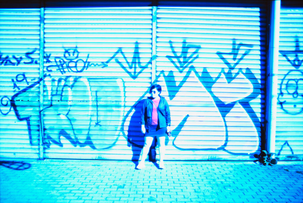
In this photo we clearly see the behavior of the film when used with a temperature correction filter, 85B. Despite being an orange filter, it allows much of the rest of the light spectrum to pass through, which makes the layer sensitive to blue light stand out from the others.
Here the sepia filter helped and held back the blues a little, but not enough, and the other colors started to appear. However, magenta also appears more pronounced. The effect is interesting, but it is still far from natural.
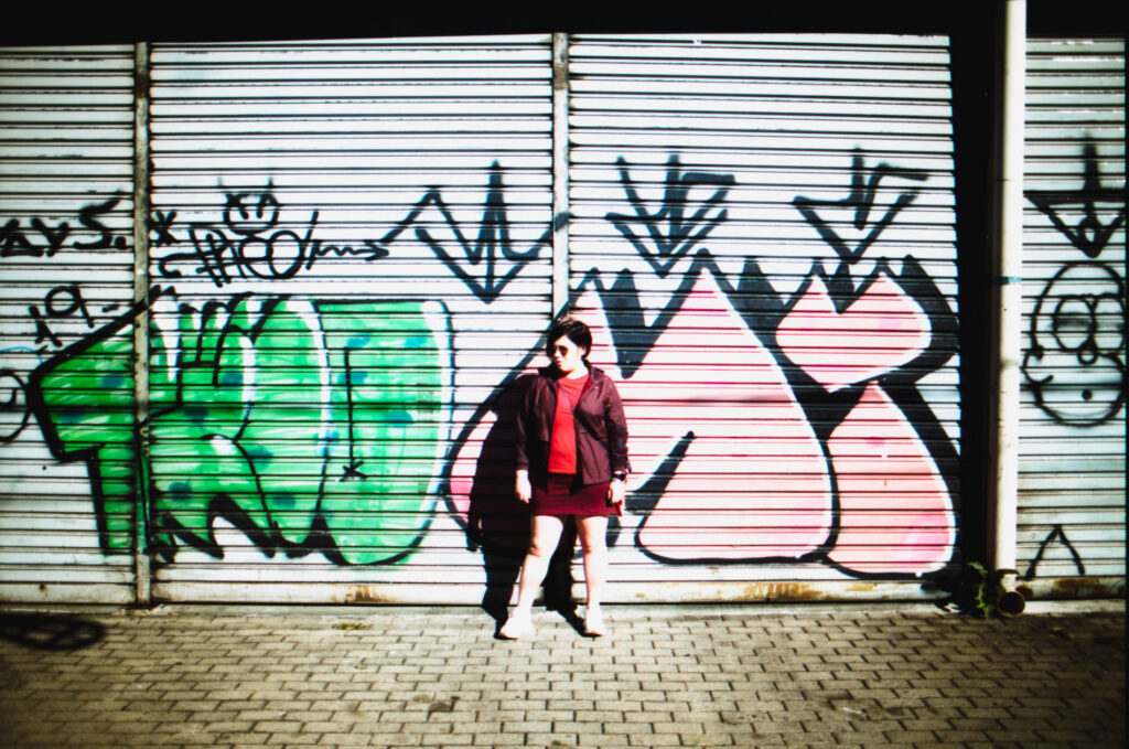
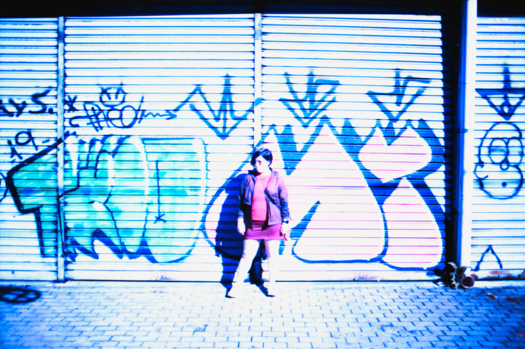
Finally, colors! Incredibly, the filter that I had the least hope of bringing good results was the one that best balanced the colors and was closest to natural colors. The blue has been “tamed” and the contrast is very high, with a very reduced dynamic range (it retains few details between light and shadow, “popping” both in highlights and in shadows).
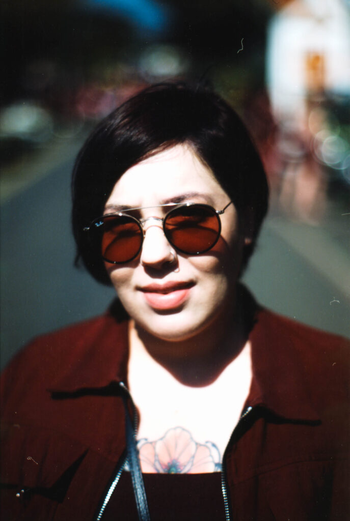
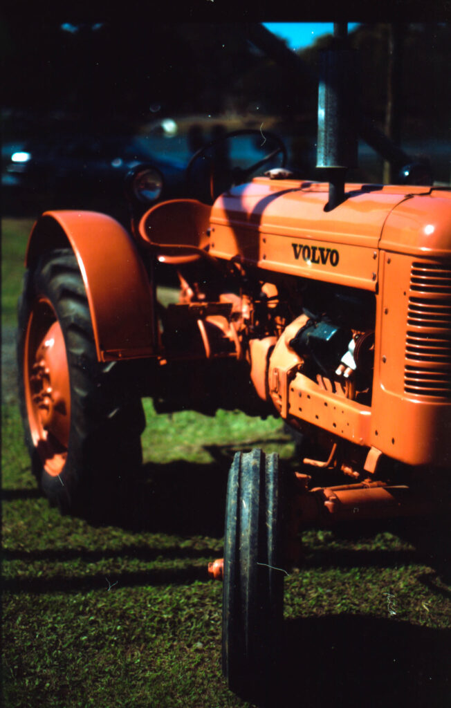
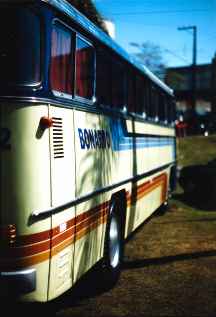
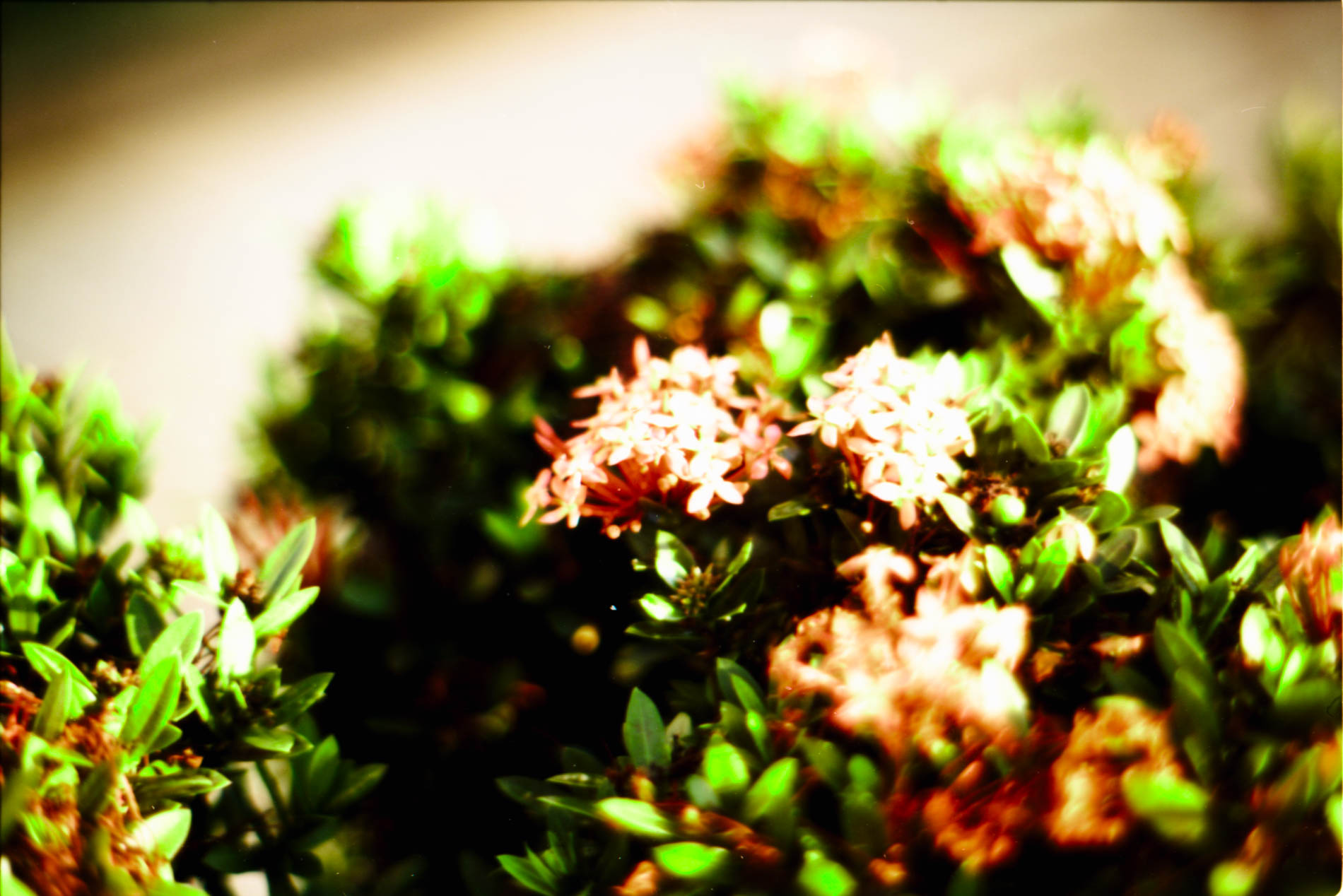
In these 3 examples we can see that the saturation is high, presenting very vibrant colors. Colors below orange in the light spectrum become darker, like shades of green, due to the characteristics of the orange filter and. The ones next to or above (yellow, red, orange, etc.) are overexposed, becoming brighter.
Conclusion
The best result was exposing at ISO 3, with the Orange filter (YA2), with a tolerance of up to ISO 2. I believe that these were the frames that came out with the most realistic colors and with an interesting effect of cooler faded and warmer colors pronounced and high contrast. The 85B filter was unable to dominate the sensitivity of the blue layer, resulting in the least aesthetic result. The sepia filter was interesting, with colors pulled towards magenta, which, depending on the use and artistic vision, could be something in its favor.
Attention! If your camera does not have exposure measurement through the lens or does not allow you to set ISO 3, you must compensate for the filter by calculating the correct ISO to be used, using the camera’s photometer as a base or an external photometer, such as a photometer app on your cell phone.
Good photos!
Share this post:


Comments
Alexander Seidler on How to shoot Kodak Vision Color Print (2383) in colors
Comment posted: 25/09/2024