It’s not too often I’m able to directly compare the technical results of my photography to someone else’s, but it can make for an interesting academic analysis when I do. By direct comparison I don’t mean a side by side of different images made in different conditions, I mean “the same” image made in the same conditions, with different parameters altered.
The photographs here were made during a photowalk arranged by “londoncameraproject” which started at the Gentleman Baristas Marble Arch location and took attendees through Central London as a nice social way to share film photography as a hobby. Andrew Blowers was the guest speaker for the day, and I joined mainly to heckle and demoralise him.
As the group passed by Berkeley Square Andrew and I both made an image from behind the fencing, the directional light being the main draw, with figures fitting nicely into the scene. Initially we both saw the people sat on the further benches, but then moved to incorporate a foreground layer into the scene.
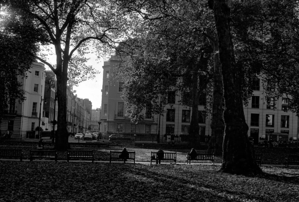
Our first frame was essentially identical, as above, but it was the following one where I think the differences in our style become clear.
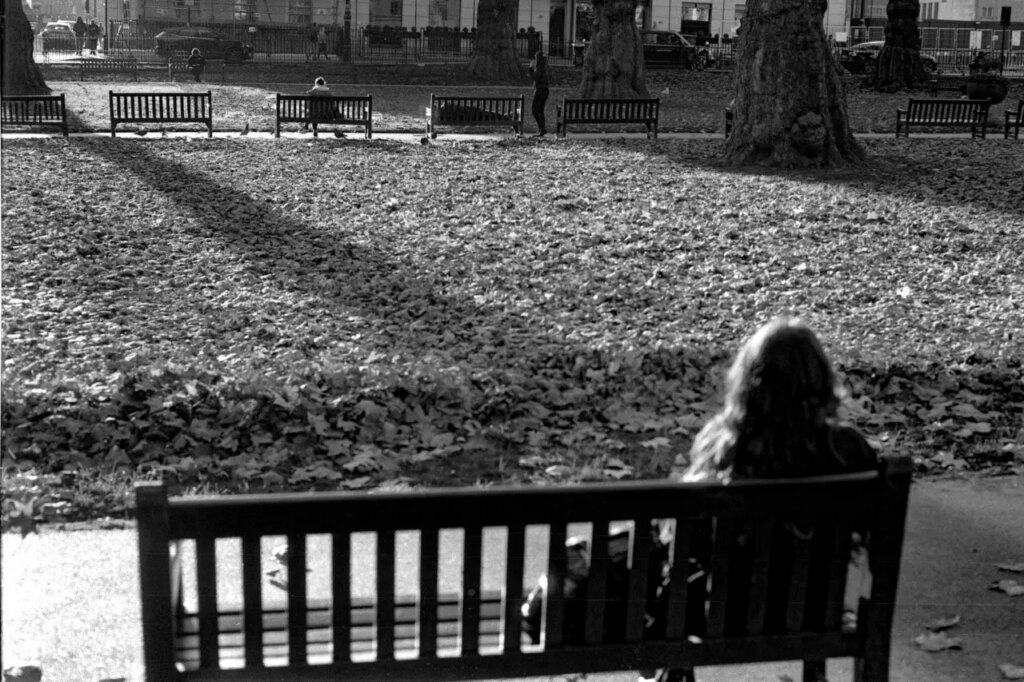
Andrew was working with Ilford FP4+ by way of a 50mm v4 Summicron, exposing at EI250. He developed in Rodinal at 1+25 for 12 minutes 30seconds at 20°c. He exposed for the shadows, which had the effect of a lighter overall frame with a lot of detail throughout.
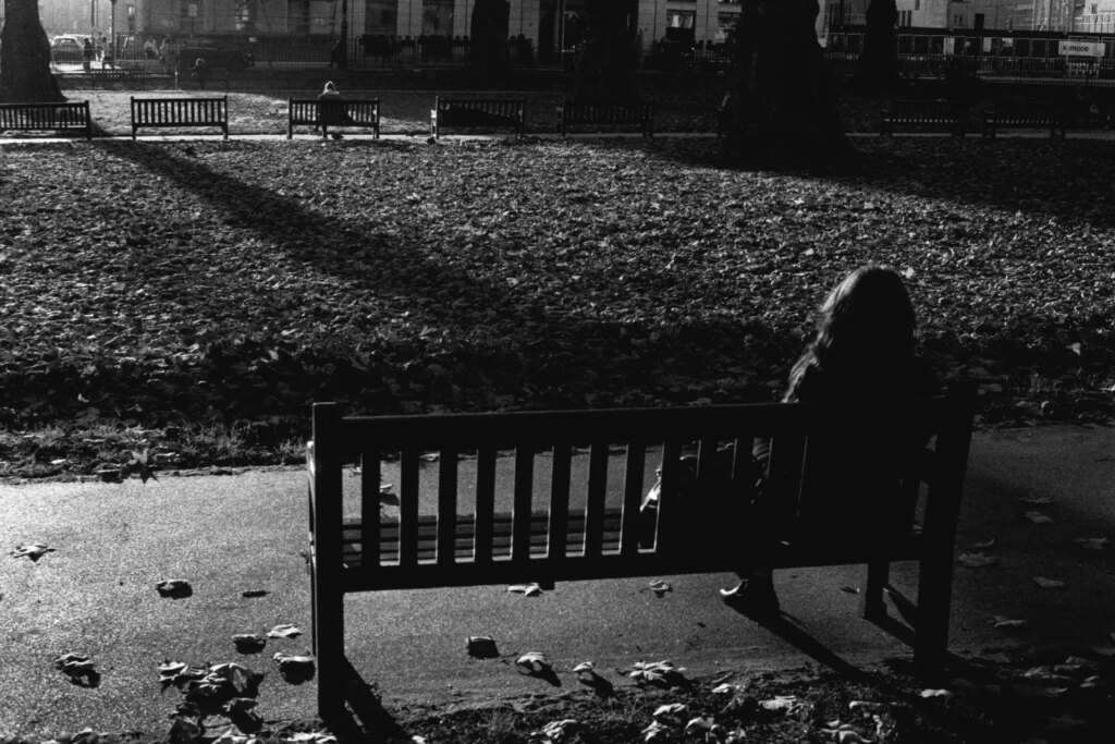
I was using Ilford HP5+ at box speed, EI400, and my Zeiss Planar 50/2. I exposed for the highlights meaning a darker exposure even with the extra dynamic range and ISO of the film characteristics compared with the FP4+. I developed alongside another box roll of HP5+ in a two reel tank, with 600ml cold water (no precise measurement, just whatever the cold tap gave me at the time), 8ml rodinal, and a semi-stand agitation method.
You can see just how much difference there is in our final results. I think that our exposure decisions (highlights/shadows) have the greatest impact on the feel of the image, Andrew’s feels airy, open, and autumnal whereas mine feels a little more compressed, with bolder contrast between the highlights on the edges of the people which define them against the darker background. The extra detail in Andrew’s image make it easier to see the man laying on the bench on the right, but in mine he is more obscured, lost a little to the shadows (although recoverable via digital and darkroom manipulation).
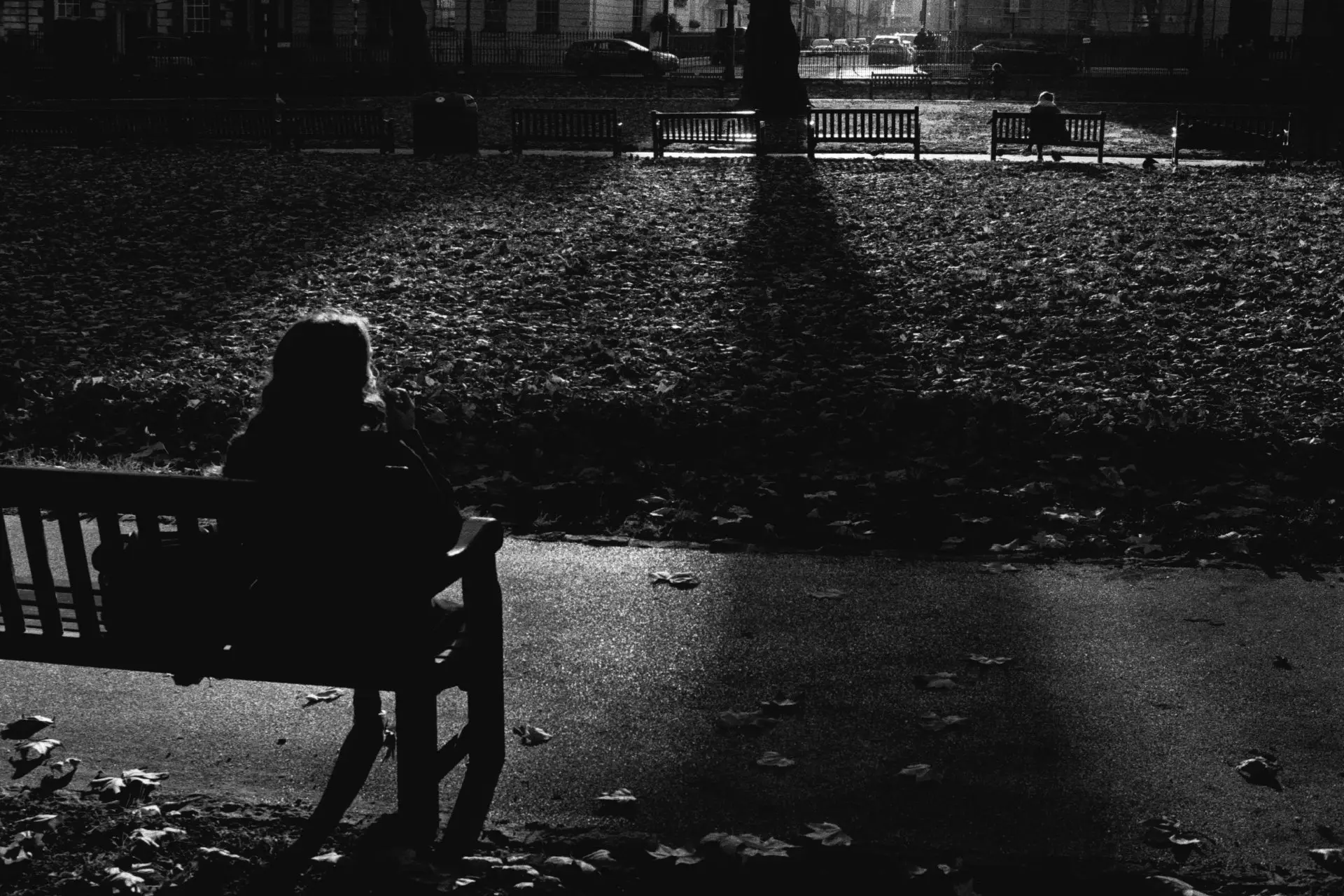
I actually made another frame as I was unsatisfied with the composition of this one. The leading shadow works, but I moved a little further along to the right and shot the image used as the header photograph for this article. In this one there is a clear five segment divide, black-white-black-white-black, with the people sat on the benches each in their own segment, which I think accentuates the visual relationship between them. They have better figure-to-ground definition against their brighter lit background, and less distraction from the buildings they are both facing.
Share this post:

Comments
Alessandro Bellafiore on Development Notes: Ilford HP5+ & FP4+ in Rodinal – By Simon King
Comment posted: 27/01/2023
Comment posted: 27/01/2023
David Griffen on Development Notes: Ilford HP5+ & FP4+ in Rodinal – By Simon King
Comment posted: 05/02/2023
600ml cold water (no precise measurement, just whatever the cold tap gave me at the time)
Comment posted: 05/02/2023