“Your post-production ends when you press the shutter.” I like that sentence.
I used to shoot little portraits for a wine magazine in the 90s. They were shot on transparency because that’s what the magazine wanted, and I’d just hand my selects over to the editor. Mostly 35mm, sometimes 120 if it was a cover or something important.
Usually they were chefs or wine industry people, which was good because restaurants and wineries have nice interiors. I’d aim to get them in the quiet time between lunch and dinner service.
I was paid per gig, and I covered my own film and processing, so I’d aim to get three jobs on a roll – 12 exposures per job. If it went well, 12 exposures was enough for four portrait frames each on two setups, and then another four frames for some interiors to add colour to the story.
Thinking back, the technical constraints of shooting tranny probably made for better photos. It’s moot whether we could ever go back to film today for editorial work. I think not; it would take an editor who really wanted it to happen, and then if you had one story that looked different from the others in the magazine it could cause problems etc. etc. Recently I did sneak one film shot in to a travel story, but I didn’t tell anyone I did it.
Thinking about it today I realise that only a very small proportion of the process of making the portrait relates directly to film and camera. Most of it is about getting a non-professional model to be comfortable in front of a camera and thus allow you to see their personality, about getting in and out of their working day quickly and being a minimal disruption. The people were generally helpful, but it’s pretty rare that someone actually enjoys having their photo taken.
So what is the tech stuff? To list it, it’s light. More specifically, it’s light, light, and light. It’s obvious, but shooting tranny really brings this home. Like I said – there was NOTHING you could do in post. White balance? Nup. Bring up the shadows? What? Take half a stop off the exposure? You jest, sir.
So the first thing I’d do when walking in to a gig was scope it out for light. Was there enough, and what was the quality? I couldn’t tell you what the DR was in stops – I never went as far as zone metering. I just used to walk around holding my hand up in front of me, seeing how the light fell on it, guessing what the modelling would be like, and hoping there would be enough to make a frame.
I had to shoot 100 ASA film for the fine grain, and if I could get 1/60s at f2.8 I’d be fine. I could hand hold to 1/4s if needed, but people move. If the light was really good I could use my 105mm f/2.5. Usually though, I used my 35mm f/2.8 because it was less demanding. I didn’t own a 50 at first, and by the time I bought one I’d gotten comfortable with the 35 and generally stuck with that. Tripods were out – too slow.
I’d normally have five or ten minutes with the subject. I found it best not to bore them, just a quick chat, get them comfortable, get them into position and then get the shot before they had time to get self-conscious. They were at work after all, and they needed to get back to it.
I think I’ve written too many words already: I’ll pop up a few frames and talk about the thought processes behind each one.
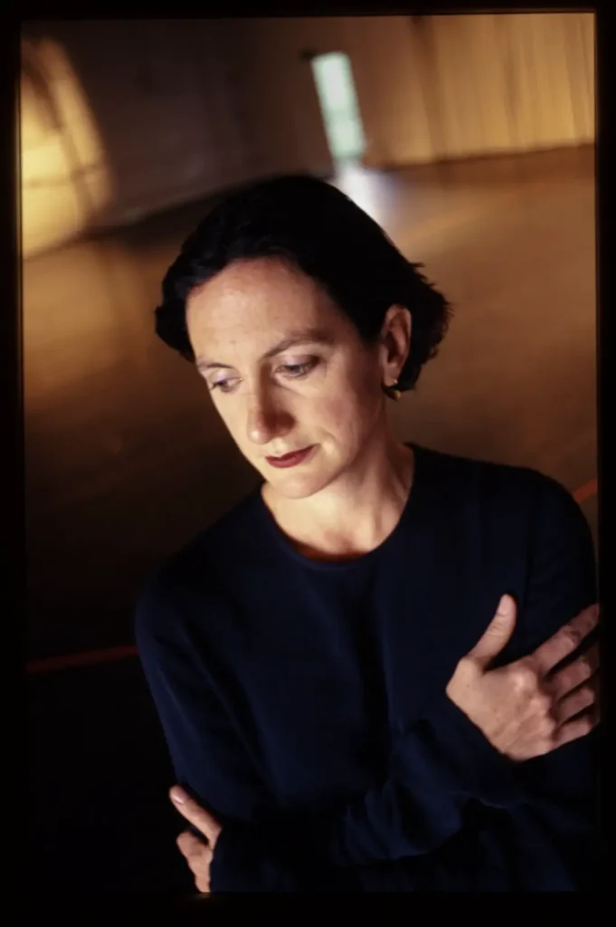
This is window light. I stood on a chair to get the angle and use the reflected light off the floor to frame her head. This woman (Meryl Tankard) was a famous dancer and director, so she was used to posing, which was a rare treat. I only had a couple of minutes with her before she had to go. She walked in, I told her where to stand and asked her to look down and act wistful, and we were done.
Metering? Move in and meter (centre weighted average for my FM2N) for the face and give it half a stop. It’s worth mentioning that my Nkon FN2N was fully manual, and the speeds were full stops. I’d pretty much always be wide open, so that meant I’d choose the closest to a little bit over and hope for the best. Lens is the 35mm f/2.8.
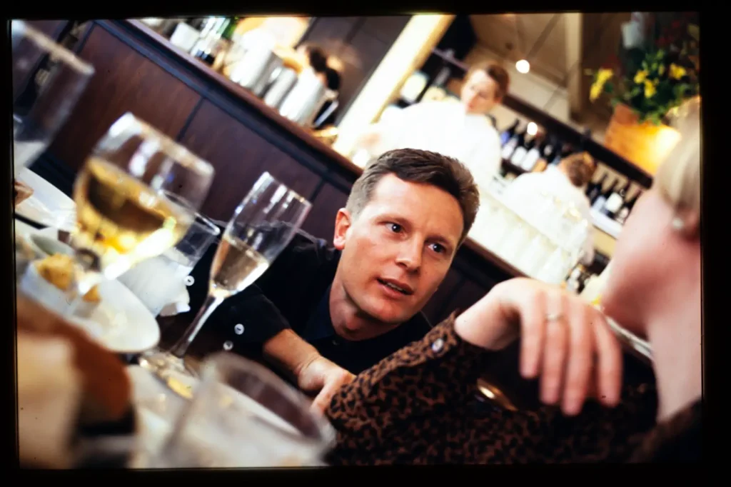
This is a much more common scenario. I got the chef to kneel and talk to a diner (she is a plant; I’d brought her with me) Chefs are good at talking to people about their food, so it looks natural, and she’s in the frame so you can see who he’s engaging with.
Again – the light is good. You can see the highlights on his forehead and ear are a bit blown, but I think it’s okay. You can see that even with this diffuse window light (this was well away from the window) his shirt is still completey blocked up. I like the blown highlights in the glasses and you can see lots is blown in the background but as long as his face is okay we’re all good. If you look closely you’ll see that by digital standards his face is not that sharp. I don’t think it matters – but if I shot this today on dig some extra sharpness would give better separation between his head and the background.
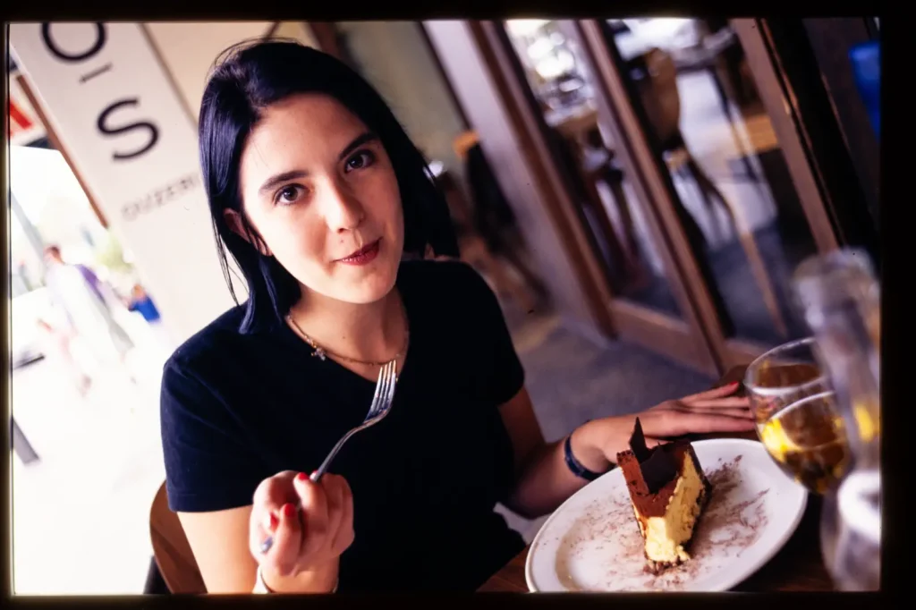
This is not a great shot by any means. If I only put the best ones in it would look like I was showing off. It’s a cliche and not technically good either, but this is commercial photography and the editor was happy and used it. It’s open shade, but even so half of her face is blown and her black tshirt is blocked up. Any less exposure though, and the other half of her face would be too dark. See how the colour temp on the unlit side of her face is a bit warm? Probably all the wood inside the restaurant. The point of the shot though, is to show the waitress (who is doubling as a model here) enjoying the light and breezy al fresco atmosphere of the restaurant. 35mm f/2.8 wide open.
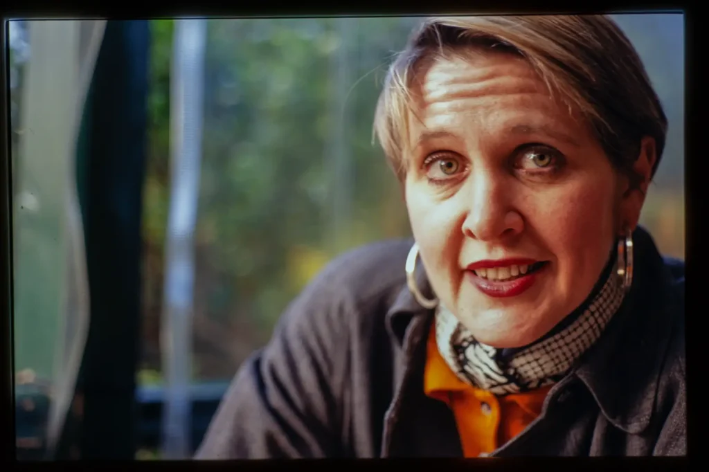
Here I got to choose the venue – I invited Jane (a wine educator) to the pub on a wintry day and used the light through the plastic blinds. Because there was enough light I could use my 105mm f/2.5. Notice again that the skin around her right eye is blown, but that was no problem in print. Only her left eye is actually sharp, but I used to think that one sharp eye was all you needed. By the way – that lens will out-resolve film, but put it on a modern digital body and it falls apart. I recently tried it on a Z7 and it was not nice, whereas I think it’s a great lens for film, and it had a good reputation back in the day. Again – because the camera is manual exposure I framed up her face, got the best speed wide open and then could refocus and compose while chatting with her to keep her engaged with the lens.
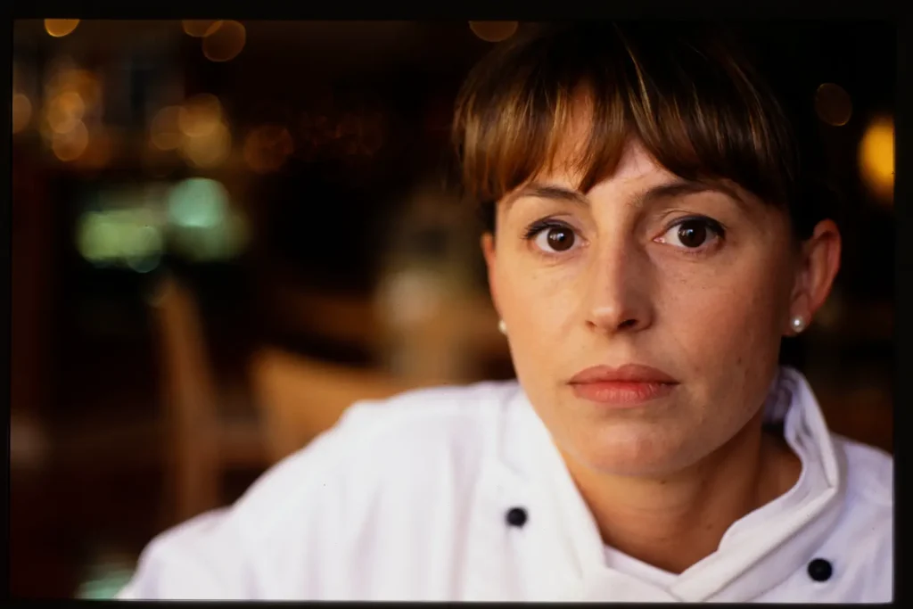
I love this shot. I only just found it again after 20 years. The light bouncing around that wooden interior matches Natalie’s hair and eyes. Notice again that only her left eye is sharp. The 105 again of course. Her white chef jacket is good because it has bounced a bit of light back up in to her chin and given definition to her jawline. It has also framed her face a bit. You don’t get to choose that stuff but it’s nice when you can use it.
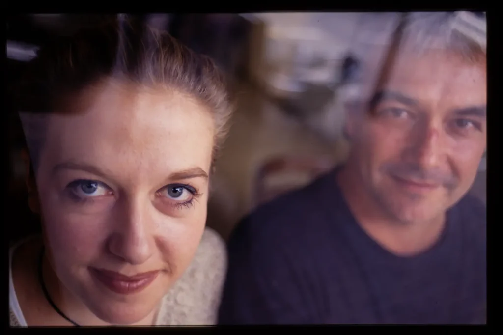
So here we have a wine bar that was really cramped and dingy – too dark for a shot – so I went outside and shot them through the window while they were sitting at the bench. (makes it hard to talk to them though) The light and the metering is easy here, the glass of the window knocks down the contrast and the reflections make it a more interesting shot. (One sharp eye on Sarah again)
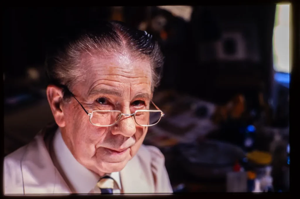
This guy, Wytt, was an old-school wine label designer and here he’s in his studio that had a skylight over the drafting table. It seemed the obvious place to shoot him. I just shot him with the 35mm from slightly above, so that his features would not get too distorted and the light would work. I knew the background would block up – notice that we’ve lost half his hair even, but that doesn’t matter. All that matters is the eyes over the tops of his glasses. It would have been better with a catchlight in both his eyes, and maybe I could have grabbed a piece of card or something from his desk and used that as a reflector, but if I started mucking about with his workspace I think he would have become a bit edgy.
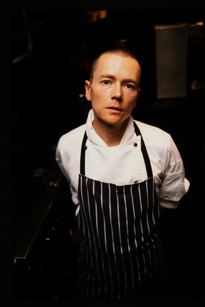
So what do you do when the light is so shit you can’t use it? Simon was in the middle of a huge hotel (the Adelaide Hilton) under flouro lights, in a horrid commercial kitchen. I rarely, rarely used flash, and here I decided to make it count. So I stood on a chair to get the angle and bounce the flash of the (white, luckily) ceiling. I used a fast enough speed so that the kitchen would dissappear and it would all be about his eyes. Simon was a pretty intense, passionate chef and I wanted to show that. My flash was very basic, but it had a thyristor on it so I could use that to quench it and get auto reflected exposure; There was no TTL flash metering on this camera and there is no way I could have done manual calculation for bounce flash. I got him to lean in with arms behind his back to up the intensity and used the white chef top so he wouln’t just be a floating head. Again, the light bouncing up off the shirt fills the bottom of his face so he doesn’t look like a ghoul.
Gear and Tech
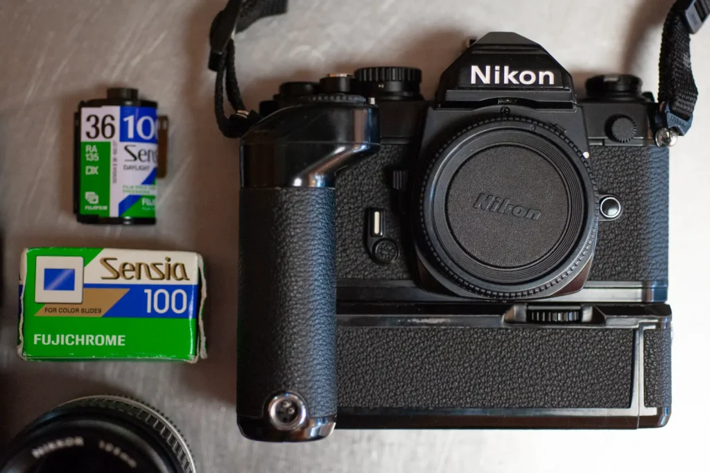
So here’s the gear and tech section. I still have the same gear – I sold most of my film stuff but kept the Nikons and lenses (they were worth bugger-all then anyway).
The camera is an FM2N, which I got new on insurance when my FE (I think?) was stolen. So I went from AE to full manual, but I didn’t mind that at all. I never liked looking at that needle swinging around in the FE viewfinder but I loved the little LEDs in the FM2. As I said, I’d get in close in and meter on a face and aim for the middle and top lights to be lit – meaning you were about half a stop over. Bear in mind though that adjustments – aperture or speed – were only in full stops. By the way – if you’ve not used one of these cameras the viewfinder is about 0.8 or something. It’s HUGE and has a split prism screen. Again, my fave. Even with an AF camera I like the reassurance of a split prism.
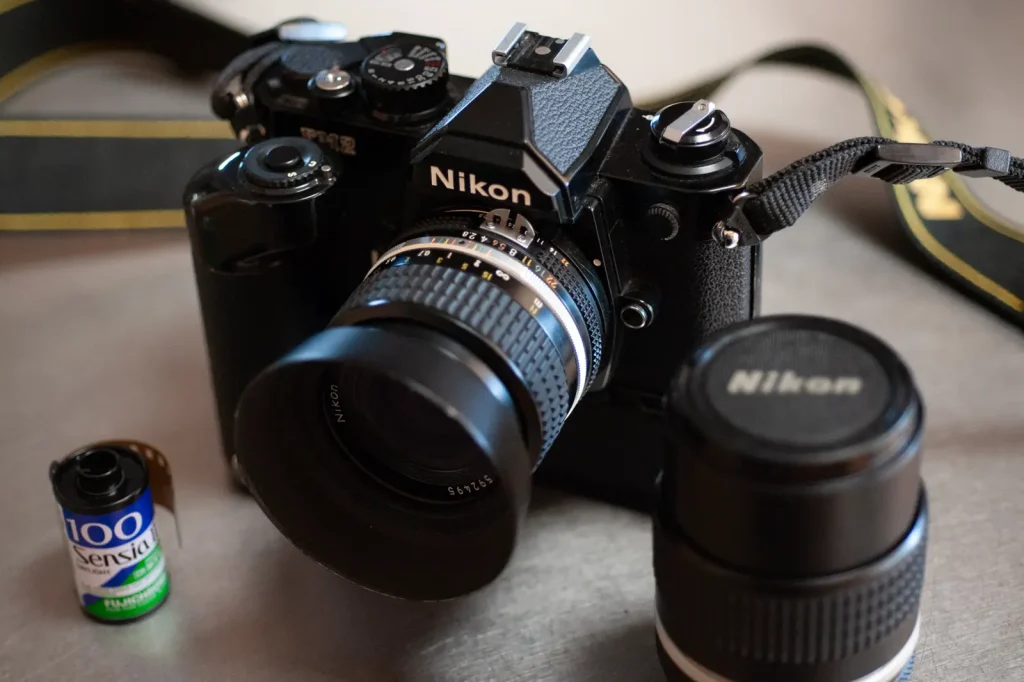
I used an MD12 – the motor drive for those compact Nikons. There were a few reasons, the main two are firstly that you didn’t need to take the camera away from your eye. I’m left handed and left-eye dominant, so winding with a lever has me poking myself in the eye. Secondly, the ergonomics were better with the MD12 attached and the camera had more mass, which combined to allow me to hand-hold much slower. I would hold to 1/4 at a pinch and was pretty confident at 1/8. This really helps when you’re shooting interiors in low light on 100ASA.
I used a lens hood on the 35mm lens – not so much for shade, but because it gave a nice place for your fingers to sit, again making the ergonomics better with a small lens. One great thing about that 35 is that the focus throw is pretty short, making it quick. Much nicer than the 50 f/1.4 in that regard. The 105 is just lovely by the way, but I didn’t really get to use it all that much.
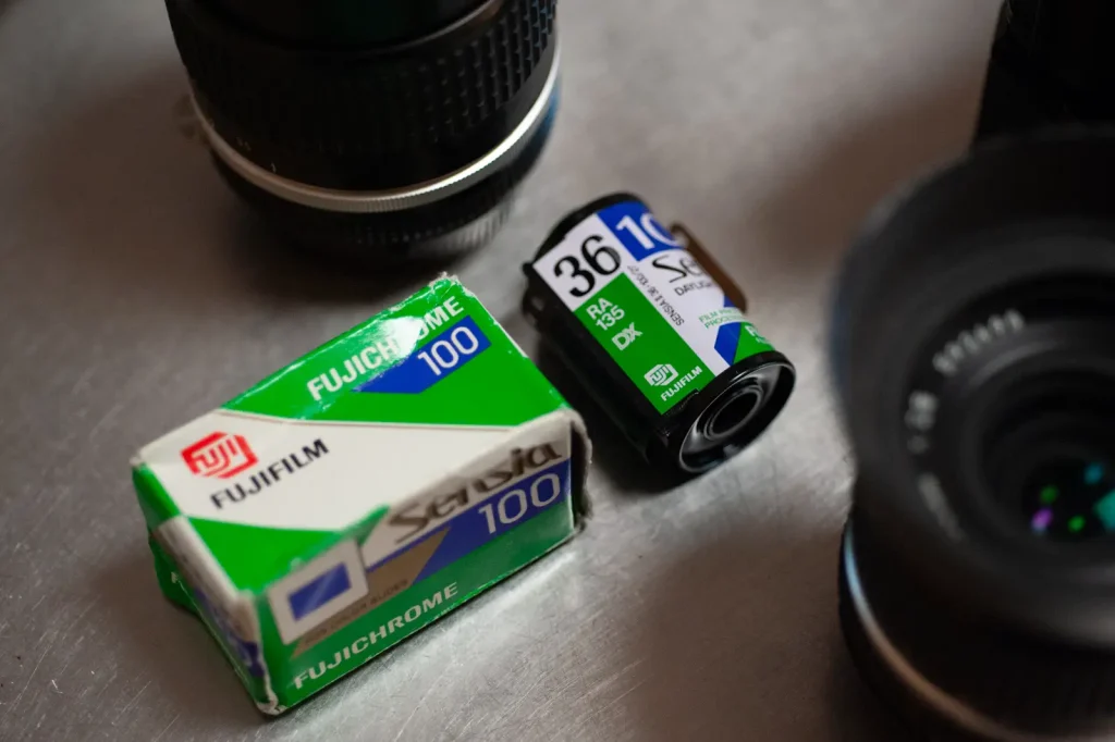
I think that’s enough for this piece. I still have two rolls of Sensia that I never shot, both expired in 2004. I liked Sensia because you could shoot open shade with it and it didn’t get too blue in the shadows. Of course there was no white balance adjustment, and it’s best if people don’t look too blue. I’m not really excited about using these last rolls though; nostalgia ain’t what it used to be. Now that Fuji has bumped its prices I think I’ll see what the new Ektachrome is like instead.
Share this post:

Comments
thorsten wulff on Environmental Portraits on E6 – shooting transparency with available light – By David Hume
Comment posted: 26/07/2019
Trevor Nicholson Christie on Environmental Portraits on E6 – shooting transparency with available light – By David Hume
Comment posted: 26/07/2019
Gil Aegerter on Environmental Portraits on E6 – shooting transparency with available light – By David Hume
Comment posted: 26/07/2019
Comment posted: 26/07/2019
Murray on Environmental Portraits on E6 – shooting transparency with available light – By David Hume
Comment posted: 26/07/2019
Especially apt for those of an age unfamiliar with the specific demands of film and now embracing analog for the first time. Once moved to digital, I never parted with an FM2-T bought new in the mid-90's and a tiny coven of lenses I thought unique enough or irreplaceable (8/2.8, 16/3.5, NOCT). I had my Titanium-clad friend CLA'd recently after an extended dormancy and started using it again. Even added a 2nd hand CV 2/40 SLI & Zeiss 2,8/25. Glad to discover that my metering-muscle-memory from anti-deluvian analog days hasn't left me and the first roll of Ektar was exposed spot-on. A skill every serious shooter should master even if they spend the remainder of their days auto-everything.
Bil Flanagan on Environmental Portraits on E6 – shooting transparency with available light – By David Hume
Comment posted: 26/07/2019
Comment posted: 26/07/2019
Ted Ostrowski on Environmental Portraits on E6 – shooting transparency with available light – By David Hume
Comment posted: 26/07/2019
Comment posted: 26/07/2019
Huss Hardan on Environmental Portraits on E6 – shooting transparency with available light – By David Hume
Comment posted: 26/07/2019
I'm curious as to the process of ownership of your images. As you shot on film, and handed the film to the editors of the publications that commissioned the shoot, did they give you the film/images back when they were done?
Or did you make duplicates of the film using a slide copier and that is what we are looking at?
Kind regards
Huss
Comment posted: 26/07/2019
Josh Ryan on Environmental Portraits on E6 – shooting transparency with available light – By David Hume
Comment posted: 27/07/2019
Thanks!
Comment posted: 27/07/2019
Michael Segner on Environmental Portraits on E6 – shooting transparency with available light – By David Hume
Comment posted: 27/07/2019
I am an old rat in photography. Started taking photos back in 1972 with a Pentax Spotmatic (I loved that camera!) so it is a looong time ago, and I have shot thousands of pix ever since. Mostly I would take B&W for serious work and slide color film when I was on vacation (Kodachrome - brilliant and very sharp!). I travelled a lot with my cameras then, always looking for a great image - yes, "image" because that is what it is when it has that something that you cannon explain - but always feel. Anyway, nowadays I am using analog AND digital. I think digital has a lot of advantages but I also still enjoy working in analog old-school style if I have a certain idea with a picture. It is fun to fumble with these vintage bellows/boxes, but not easy at all... Sorry, I got carried away, what I really wanted was to write about your very fine photos! Normally I am very picky when it comes to praising pictures, I think it is some kind of habit you get when you have seen so many pictures over the years, but yours really made me look with a lot of interest. They are great portraits with that intensity you see so very seldom nowadays. You write that you did not take a long time photographing them, but when I watch these faces it is really like I know something about them and their lives - and that is a great portrait! The picture of Natalie is the very best, but I do like all of them. You also write that on some of the pix half of the face is blown in the highlights. But that is just fine! It gives a lot of shape and impact and many great photographers did it like that. Finally I will mention that the colors of that Fuji-film gives a lot of atmosphere and ambience to your work. I have seen some your other pictures too and I do think that you are very competent and wide-ranging. Thanks!
Greetings from Denmark
Michael Segner
Comment posted: 27/07/2019
Theo Panagopoulos on Environmental Portraits on E6 – shooting transparency with available light – By David Hume
Comment posted: 27/07/2019
Peter Christensen on Environmental Portraits on E6 – shooting transparency with available light – By David Hume
Comment posted: 28/07/2019
I sold my FM2n in 2000, but after going through my slide collection this spring, I bought a new old stock FM2n from a collector , and I could still smell the camera oil when I unboxed it.
Later I bought the same lenses from my youth, the 24 mm f 2.8, the 50 mm 1.8, the micro 105 mm f 2.8, and the 200 mm f4.
Dan Coman on Environmental Portraits on E6 – shooting transparency with available light – By David Hume
Comment posted: 01/08/2019
As someone who has shot more film in the past couple of years than I have throughout the rest of my life, I often think of how much knowledge about the process of shooting film we must have lost in the switch to digital. Thanks for sharing these photos and breaking down how you took them.
Jordi P. on Environmental Portraits on E6 – shooting transparency with available light – By David Hume
Comment posted: 02/08/2019
The article infact brings me back to last decade, when I was getting into photography with an OM-1 and casually caught the end of Kodachrome. Used some of it to try to document my environment as a teenager, and do portraits with some variable success but think I did alright. Dan Bayer's "Kodachrome Project" and of course, Steve McCurry, as inspiration.
Interesting that you used the 35mm. I recall reading a cinematography/video article arguing for the 40mm (24x34 35mm) lens as standard. My Medium format is a GW690 with that equivalent FL and fantastic for environmental portraits.
Leo Tam on Environmental Portraits on E6 – shooting transparency with available light – By David Hume
Comment posted: 15/08/2019
Igal on Environmental Portraits on E6 – shooting transparency with available light – By David Hume
Comment posted: 12/04/2020
I myself started loving the e6 recently, and you made me excited to try portraits on my films.
Thank you for this, David!
Comment posted: 12/04/2020