(Warning : some photos in this article are NSFW, showing some male and female nipples.)
So a few weeks ago, I shared an article on my process doing textured double-exposure portraits with my XPAN film camera. This is a series that I call Human Nature. Thank to all of you who commented and shared that article. It was the first time I had widespread feedback on the process and results, and it comforted me in the idea that it was an avenue worth exploring.
Meanwhile, I also had a fascinating conversation with an art critic and photographer in Hong Kong – where I live – about visual density. He liked the photos I had produced so far but, he argued, they would likely not attract attention for a Hong Kong public because they were too sparse. Lots of negative space, imposed by the format of shooting on a white background. What was (I felt) the deciding factor in making the approach effective was also, in his view, forcing me into a certain style of photography that wasn’t necessarily to everyone’s taste. People in Hong-Kong, he argued, and more broadly in Asia, were used to a lot of visual density and uncomfortable with negative space. This, he suggested, was why Wong Kar Wai was hailed as a genius in Europe and unknown in his home town.
That got me thinking, not because I desperately want to please everybody with this project – that’s an unattainable goal, and my own son’s dislike of the series keeps me humble – but because I wondered intellectually how you might achieve something interesting with the textured double exposure approach while creating visual density. And then it hit me: you could theoretically invert the approach and shoot on a dark background. The texture would be near ubiquitous, and the subject would “emerge” from the texture where lit. It was worth a try.
The goals of the new sessions
Time to organise a new set of sessions.
The photos I shared in the original article were from two sessions, one outdoor and one in the studio, respectively in July and October of last year. In early March this year I managed to set up two more studio sessions a week before Europe went into lockdown (stay home, stay safe, people).
Compared to the previous session in October, I made three major changes to the process:
1. Instead of shooting the textures haphazardly, I shot series of the same texture (usually 8 or 10), and I shot them at f/11 on a tripod whenever possible to minimize shallow depth of field or camera shake.
2. Instead of shooting one model for 10 or 15 shots in succession, I shot each model in turn. This allowed me to have one or two shots of each model/texture combination before moving to another model/texture combination.
3. Instead of booking 3 hours with 11 models like I’d done in October (it was exhausting and I felt I never had any time to think about anything other than the pose) I booked 2 hour slots with 4-6 models.
In terms of goals, what I wanted to test was the following :
a. Does shooting on a dark background deliver something interesting ? Is the texture / skin combination gradual enough ? Is it aesthetically pleasing ?
b. When shooting on a white background, can I explore new lighting setups that would deliver something different ? I decided to try two new approaches (in addition to a classic side lighting and a upper center lighting) :
– a double side light which would (hopefully) deliver limited texture on the sides of the body and lots of texture in the (unlit) center.
– an inversion of the above with black reflectors on the sides and a vertical strip light in the center, delivering lots of texture on the sides and a well lit subject in the center.
c. As a variation of the initial approach, I wanted to try branch textures rather than leaves, and also try an inverted treetop idea, so that the sky would blow up the film at the bottom of the subject and body would morph into the shape of the treetop.
I also decided to try a variety of different films to see if I spotted significant differences and developed preferences. Finally I decided to shoot two rolls of colour to see if it was worth pursuing further. Both of these decisions turned out to be mistakes, but I’ll tell you more about it below.
Some promising results
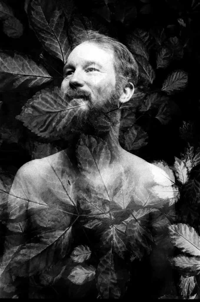
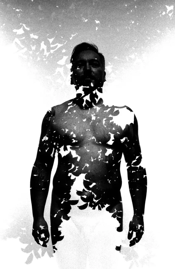
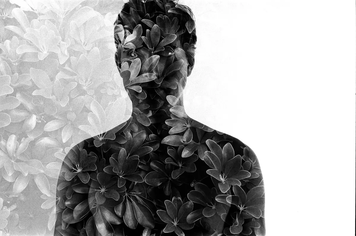
Concerning the dark background attempts, they clearly show promise, I think. The results obviously have a very different feel to the white background approach, which delivers (when successful) crisp photos. This is messier, but also more evocative, I feel, with an ethereal quality that I did not expect.
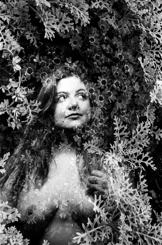
In some of the photos there’s a paint quality to the texture as well which I really like.
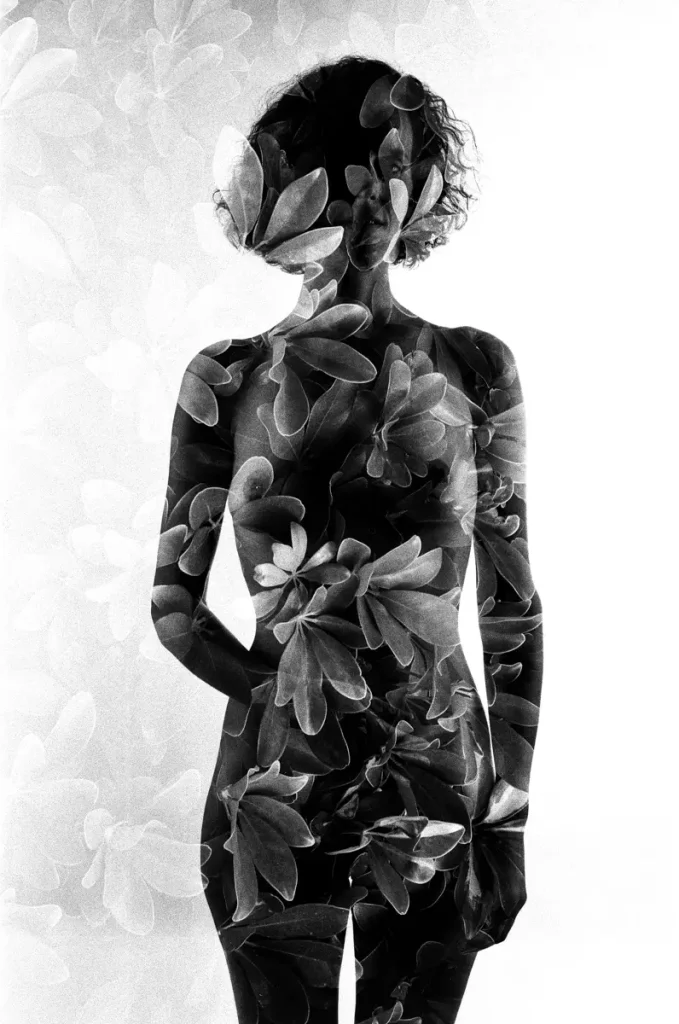
The new lighting setups for the white background attempts delivered mixed results. The side light approach does show some promise although I need to find ways to dose the light very carefully to avoid blowing up the sides of the subject. Still, it reinforces the texture very starkly in the midsection of the body, something I think is very interesting but needs a bit more care and work to deliver the best possible result. One example is the LEAF ELF at the top of this article. With female models there’s an added graphic element as the sides of the breasts catch the lateral light and deepen the shadows in the midsection.
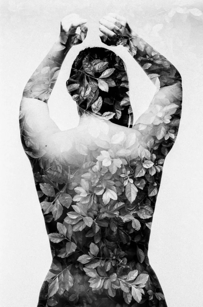
The inverted approach (central lighting + black reflectors on both sides) did not deliver anything discernibly different from a central lighting alone. I suspect I will need to find a way of generating a much narrower beam of vertical light for this to even have a chance of working. Only one shot came out convincing, and even then the lighting is more vertical than lateral.
As for the experiments with branches and treetops, they also show promise although I had some issues: that roll of FP4+ turned out super grainy. It could be a freak accident or it could be that despite underexposing the branch textures, the overall shot was way overexposed because of abundant light on both shots?
Still, some of the images show interesting potential. The branches clearly create some kind of dynamic in the image that I’m keen to explore further.
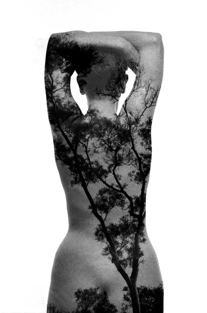
And finally, my inverted treetop thing kind of worked. Turns out the shape of the treetops did not come out on any of the photos (I could have been shooting the wrong ones) but it created an interesting break down of the figure at the bottom of the image nonetheless. Definitely one to work on further.
Lessons going forward
So as mentioned above, I did have some issues. Most were my fault, some were unexpected (or maybe down to unpreparedness). In a nutshell:
i. My new process gives good results and less repetitiveness in the shots, but it’s even more time consuming than the old one. 3 rolls with 4-6 models in 2 hours is the most I can expect, and I should probably aim for 2 rolls to be on the safe side.
ii. The damn manual ISO does not reset on the XPAN when a roll is done. As a consequence, I shot the first 4 rolls of 7 at ISO 100 because the last texture rolls I shot were PAN F underexposed 1 stop. Stupid rookie mistake. Thankfully, most of the rolls I shot were either 100 ISO, 125 or 160. I only noticed this when I shot… the RPX 25.
iii. I used a lot of low sensitivity film for this session because I wanted to have as little grain as possible. I went too low though, so my backgrounds were rarely blown. I need to stick to FP4+ from now on, I think.
iv. I did not anticipate that my double lateral lighting scheme would require 4 light sources (two on the subject, two to blow the back). As a consequence some of the shots have more texture than I would have wanted on one side.
v. As mentioned above, one roll came out super grainy. Unless/until that is reproduced in subsequent sessions, I’m not sure I know why.
Going forward, this is what this new series of sessions has taught me and where I’ll be focusing my efforts :
The dark background offers potential, very different feel and results but equally interesting I think if perhaps less visually striking. Definitely keen on doing more of that, but from now on I’m either shooting a white background session or a dark background session. Changing midways is too time consuming.
The side lighting also offers some interesting potential but I need to be much more careful with my lighting, and either bring an extra light with me or make sure the studio has 4 light sources available.
The central lighting may deliver interesting results, but I’m not going to pursue that just now. Too many issues in finding a really narrow light source which then restrains where I’m standing, etc.
Colour gives pretty results, but the results just don’t move me the way the black and white does. I think that’s because it’s no longer primarily about texture. I’ll be putting that aside as well for the time being.
I was hoping to be able to do a couple more sessions before the summer, but obviously with all that’s going on right now, that’s unlikely. My mid-term goal is to really understand the lighting and the interaction between lighting and texture so that I can shift this over to large format at some point in the future. So in the meantime, I’ll be focused on learning how to do large format portraiture, with or without textures!
I can’t promise when I’ll have more to share, but I promise there will be!
If you’re interested in the “Human Nature” series or my photography more broadly, please follow me on Instagram: @benfelten
Share this post:
Comments
Steven Bleistein on Delving Deeper into Textured Double-Exposure – By Benoît Felten
Comment posted: 29/04/2020
Comment posted: 29/04/2020
Aivaras on Delving Deeper into Textured Double-Exposure – By Benoît Felten
Comment posted: 29/04/2020
Comment posted: 29/04/2020
Huss on Delving Deeper into Textured Double-Exposure – By Benoît Felten
Comment posted: 29/04/2020
Thanks for the follow up article, looking forward to seeing more!
Comment posted: 29/04/2020
About the value of my (and your?) photography - By Benoît Felten - 35mmc on Delving Deeper into Textured Double-Exposure – By Benoît Felten
Comment posted: 21/07/2020