‘Holga’ by Michael Kenna – A Mini Book Review – By Holly Gilman

By Holly Gilman

I’m sure the majority of those reading 35mmc need no introduction to Michael Kenna, his work is not only superb but well known. In the introduction a quote from Kenna is shared:

“I’ve always considered the make and format of a camera to be ultimately low on the priority scale when it comes to making pictures, I think personal vision is far more important.” Frances Malcolm, Holga

This collection of Kenna’s images taken on a Holga camera really do show his power of composition and I honestly don’t know what else to say about them. It seems too obvious to say that but it is a beautiful collection of images.

In the Photography Books and Theory Facebook group we often find ourselves drawn into discussions of the definition of art. Of course we’ve never come to a definitive conclusion but these discussions have given me much food for thought and I find myself trying to consider these images as if I didn’t know their context (i.e. being a collection of images shot on a toy camera).

Would each image stand on its own merits? This question is purely subjective and the images I feel work without context are simply to my taste and others may well disagree. I’m sharing a couple of my favourites and one that I think only works within its context.
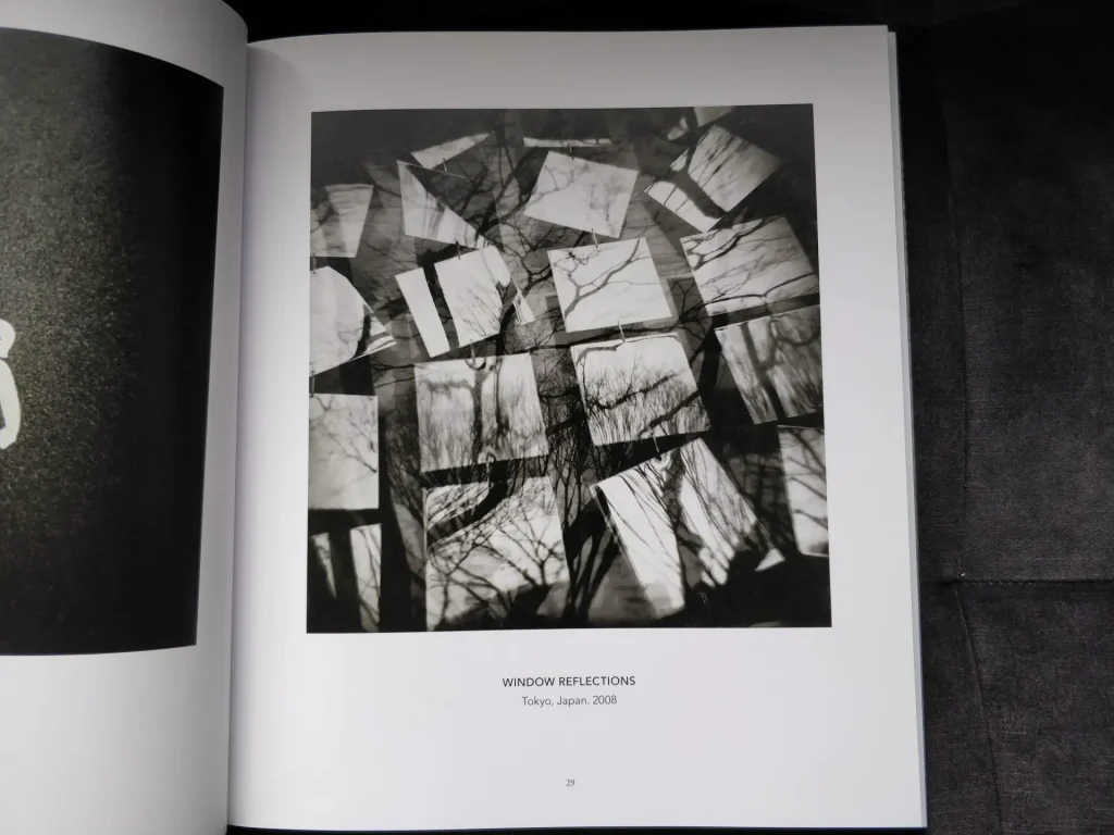
Holga

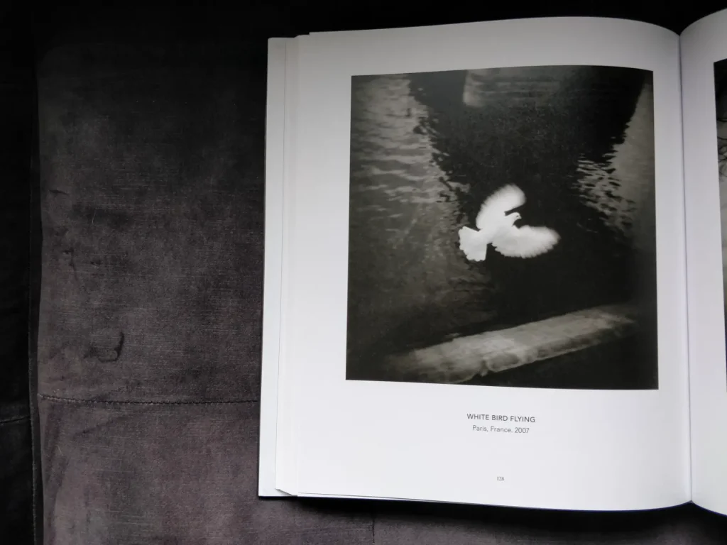
This example leapt out at me. It falls into the category of abstract, which I am a big fan of. I love the use of reflections, you have to take a moment to determine what you are really looking at.
Holga

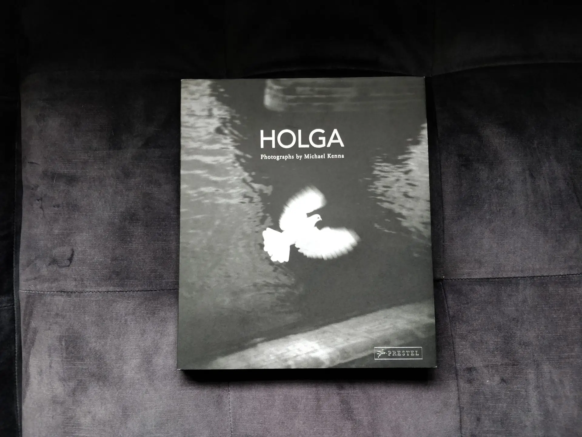
This image is clearly well loved as it was chosen as the cover image for the book. I think it’s magnificent, the fact that given the limitations of the camera, Kenna was able to capture the wings in motion whilst freezing the body and head in focus. I think this image is beautiful regardless of the equipment used to capture it.
Holga Holga

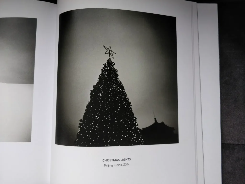
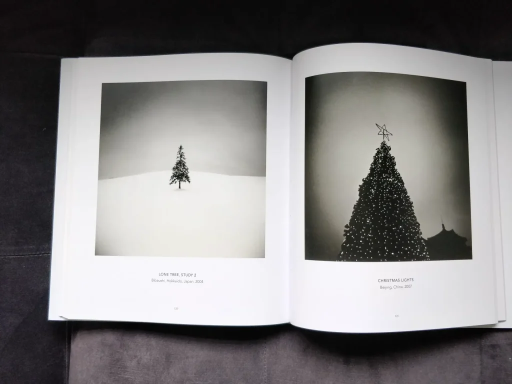
And now for one I’m less fond of. To me this image stands nicely next to the image on the facing page but on it’s own it’s neither here nor there for me. Perhaps it’s relying too heavily on the classic vignetting of the Holga to give it character. Or perhaps, as I’ve said before, it’s just not my cup of tea.

Conclusion

I personally love to see text alongside images, for me it brings a whole new meaning to the image. I can re-examine it with fresh eyes, find clues from the text in the image and see new layers. But not everyone agrees with me, our very own Sroyon has told me that he prefers the images alone, to draw his own conclusions on the meaning of the image.

I’d love to hear your opinion this, if you’d like to you can join us in the facebook group or you can see my work on Instagram.

Share this post:
Find more similar content on 35mmc

Use the tags below to search for more posts on related topics:

Contribute to 35mmc for an ad-free experience.

There are two ways to contribute to 35mmc and experience it without the adverts:

Paid Subscription – £2.99 per month and you’ll never see an advert again! (Free 3-day trial).

Subscribe here.

Content contributor – become a part of the world’s biggest film and alternative photography community blog. All our Contributors have an ad-free experience for life.

Sign up here.

About The Author

By Holly Gilman
I am exploring, experimenting and working out what sort of photographer I am. I am on a learning journey and you can follow that journey on instagram and on my learning log.
View Profile

Comments

Floyd Takeuchi on ‘Holga’ by Michael Kenna – A Mini Book Review – By Holly Gilman

Comment posted: 29/04/2021

I've had Michael Kenna's Holga for some time, and find in it inspiration even as I know I'll never approach his level of photographic genius. The inspiration I get from Holga is much the same inspiration that I get from shooting film cameras, which is now a fairly large percentage of the time I shoot. And that is the power of limitations. Kenna's Holga is a reminder that limitations can often lead us to dig deeper to problem solve a photo shoot or find an answer that works when nothing conventional will do. And a PS -- I'm afraid I disagree with you about including more text in photographic books. Kenna's Holga reminds us why -- his strong compositions would gain nothing by having explanatory text. If anything, the images in this book are made stronger by his lack of text, making these images a consistent narrative with his other images, all aspects of his zen approach to composition.
Reply

Leave a Reply

Your email address will not be published. Required fields are marked *

Holly Gilman replied:

Comment posted: 29/04/2021

Very interesting take on it. I think I agree with you that in this particular case the images wouldn’t benefit from additional text. In general though I tend to prefer images that are accompanied by an essay or some sort of story/narrative. It’s interesting how everyone has a different opinion, I know that Sroyon prefers images alone to those with accompanying text. It’s all relative to the person.

Reply

Leave a Reply

Your email address will not be published. Required fields are marked *

Dave on ‘Holga’ by Michael Kenna – A Mini Book Review – By Holly Gilman

Comment posted: 29/04/2021

I also have this excellent book and it goes to prove you don’t need 50megapixels to create great images. Your Instagram and Facebook links don’t seem to work.
Good review.
Reply

Leave a Reply

Your email address will not be published. Required fields are marked *

Holly Gilman replied:

Comment posted: 29/04/2021

Oh! Thanks for letting me know, I will double check those!

Reply

Leave a Reply

Your email address will not be published. Required fields are marked *

Leave a Comment

Leave a Reply

Your email address will not be published. Required fields are marked *