“Everything is blooming most recklessly; if it were voices instead of colors, there would be an unbelievable shrieking into the heart of the night.”
— Rainer Maria Rilke
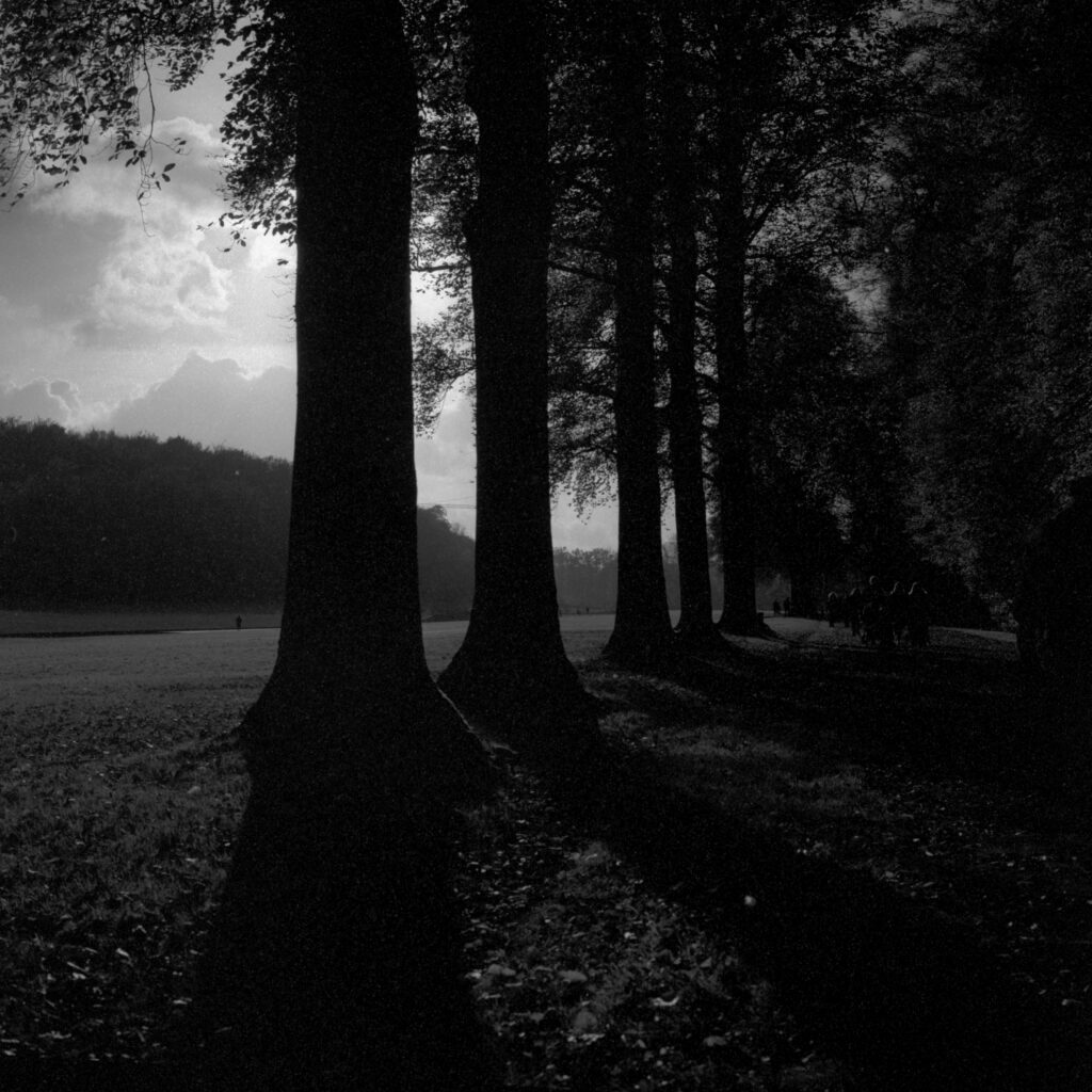
I just can’t click with colour film. I’ve tried to channel my inner van Gogh. I’ve listened to Paul Simon’s classic Kodachrome on repeat. I’ve even bought books by colour photographer extraordinaire Saul Leiter. But whether it is Ektar 100, Portra 800 or, God forbid, Harman Phoenix, I always feel that the resulting photos would look better in black and white.
Maybe it speaks to my ability (or lack thereof) in that black and white film masks my mistakes, like extra salt and butter on some humdrum mashed potatoes. I find this particularly true with portraitures. In monochrome they can appear dark, moody, and romantic whereas in colour they look like elevated passport photos.
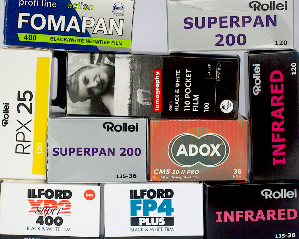
When I talk to the crew at my local film studio, I’m in the minority. “Colour is cool,” they say. “It’s what all the young, hip kids are buying.” Apparently, they sell and process way more colour film than black and white, which, when given the cost of a 5-pack of Portra, must not be bad for business. No wonder they roll their eyes when I reach for the HP5 instead of the Ektar.
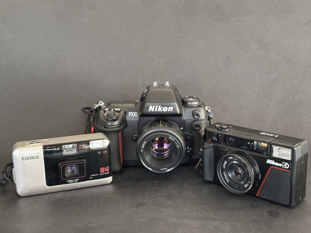
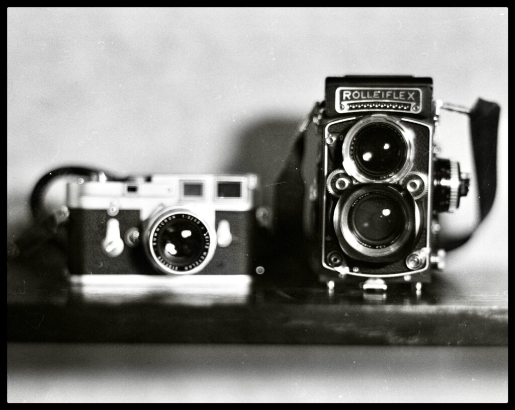
I know some photographers who carry one camera with black and white film and another with colour, ready for that dark-alley, trench-coated stranger shot or the sun-drenched lady carrying birthday balloons. Given my predilection for heavy brass Leicas and pretentious chrome lenses, that’s just too much weight and value to drench across my rickety back and crackling shoulders. I’m a one-gun shooter and my bullets are black and white.
But when I force my wife to admire my most recent pics, she always looks at me in dismay. “Honey, why do Kipling and I always look like we are living in the Dust Bowl of the Great Depression? Can’t you add a little colour to our cheeks?” “I’m an artist,” I reply. “TMax is my canvas, and you are my monochrome muse.” “Well, darling, this muse is asking you to paint with a different brush.”
And so, every now and then I walk into my local film studio looking extra cool, open the fridge door, and reach for that canister of colour film. The owner smiles, my wife smiles, my son smiles, everyone smiles but me. I frown, because I know the world looks better in black and white. What you see below are this curmudgeon’s best efforts at the colour game. Keep in mind that when I took these photos, my heart was somewhere else, somewhere darker with deeper contrast, where the rainbows and sunsets are in greyscale.
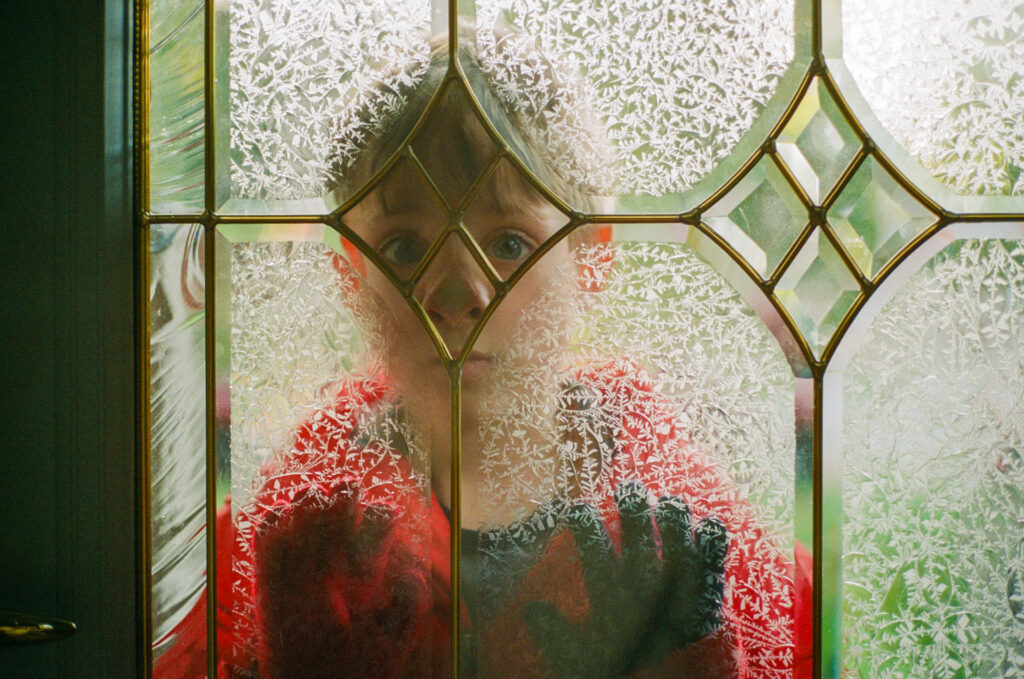


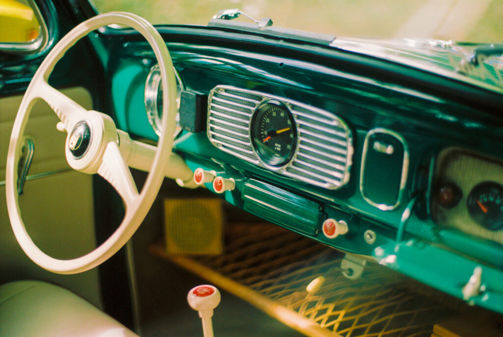






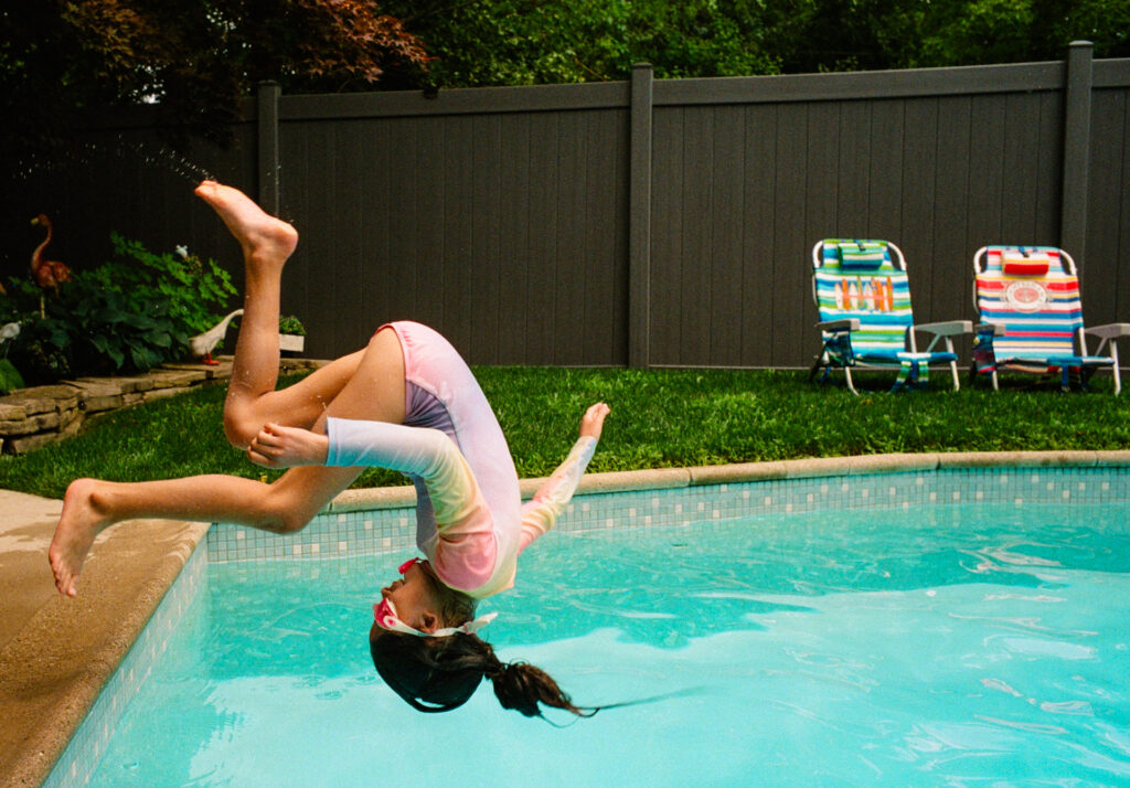

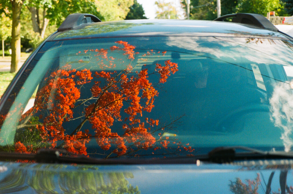
If you liked these pictures, please consider following me on Instagram. You can find more of my photos at Leica Fotografie International and Lomography.
Share this post:

Comments
Rich on A Complicated Relationship With Colour Film
Comment posted: 29/12/2024
Comment posted: 29/12/2024
Thomas Wolstenholme on A Complicated Relationship With Colour Film
Comment posted: 29/12/2024
Comment posted: 29/12/2024
Peter Kay on A Complicated Relationship With Colour Film
Comment posted: 29/12/2024
BTW, your images are superb. you have such a good eye, and the piece was a really good read. thanks for posting :)
Comment posted: 29/12/2024
Andrew Thompson on A Complicated Relationship With Colour Film
Comment posted: 29/12/2024
Comment posted: 29/12/2024
Stuart Marcus (rankest of amateurs) on A Complicated Relationship With Colour Film
Comment posted: 29/12/2024
On the other hand, perhaps the reason you feel uncomfortable in that colorful zone is because you tend to have a depressed outlook on the world, and monochrome suits your internal view best.
In any case, Bravo for the colour efforts!!
Comment posted: 29/12/2024
Simon Foale on A Complicated Relationship With Colour Film
Comment posted: 29/12/2024
Comment posted: 29/12/2024
Jonathan Leavitt on A Complicated Relationship With Colour Film
Comment posted: 29/12/2024
Comment posted: 29/12/2024
Comment posted: 29/12/2024
Bill Brown on A Complicated Relationship With Colour Film
Comment posted: 29/12/2024
Comment posted: 29/12/2024
Comment posted: 29/12/2024
Phil Snaps on A Complicated Relationship With Colour Film
Comment posted: 29/12/2024
This is the answer. You seem to still see the world in b&w when you shoot colour, but colour has to be the main ingredient.
I'm the opposite, I'm a colour guy, I still see the world through colour when I shoot b&w so my pictures lack contrast and drama. I still shoot some b&w but mainly with pinhole and toy cameras.
Some of your pictures work well, with a complementary palette. Some not so much, like red faces on red background where the face is drowned in a sea of similar tones.
Photographers famous for their colours come to mind: Stephen Shore, Harry Gruyaert, Holly Andres, Fred Herzog… So many ways to approach colour! I hope you can find one that sparks your creativity.
Comment posted: 29/12/2024
Alexander Seidler on A Complicated Relationship With Colour Film
Comment posted: 29/12/2024
i would not have shot some of your examples, because of an overdrive of to many strong colors.
What you write in your title is, i think, also true for color shooters :-)
Thanks Jonathan for the picture of the "good painter".
Comment posted: 29/12/2024
Philip on A Complicated Relationship With Colour Film
Comment posted: 29/12/2024
Comment posted: 29/12/2024
Russ Rosener on A Complicated Relationship With Colour Film
Comment posted: 29/12/2024
Comment posted: 29/12/2024
Comment posted: 29/12/2024
Jeffery Luhn on A Complicated Relationship With Colour Film
Comment posted: 29/12/2024
Nice photos and writing! I too have a preference for B&W. Probably because I like the darkroom process. It goes beyond that, though, because I could do color at school. We have the gear.
I think of color as a digital expression and monochrome as a film thing.
The shot of Kipling at the window was my fav, and it's good in color. You agree, right?
Comment posted: 29/12/2024
Daniel Castelli on A Complicated Relationship With Colour Film
Comment posted: 29/12/2024
A nice article. Thanks.
I don’t shoot color or landscapes. Our daughter (a real artist) goes to Japan, and produces a book of stunning photos with a red theme. All shot on her iPhone. I don’t see that way. I see shapes, textures, etc. I’m also a bit of a (photo) control freak, I can process & print my B&W film in my darkroom. I greatly admire color shooters. Your shot of the guy against the wall is great. But it’s essentially a red monochrome photo. But that’s why I like it. Don’t sell yourself short; your color work is nice.
Comment posted: 29/12/2024
Geoff Chaplin on A Complicated Relationship With Colour Film
Comment posted: 29/12/2024
You can do what you want to do and be free, or you can do what others want and be a slave.
Comment posted: 29/12/2024
Comment posted: 29/12/2024
Leon on A Complicated Relationship With Colour Film
Comment posted: 30/12/2024
Comment posted: 30/12/2024
Jenoris on A Complicated Relationship With Colour Film
Comment posted: 31/12/2024
My mentor in my early 20s shot B&W almost exclusively, also on a Leica, and he told me I had a really strong sense of color. I always want to take up B&W but I’m always afraid my eye is too trained in color to make B&W work. While yes, all photography is (literally, by nomenclature) painting with light, black & white and color paint so differently and require different ways of seeing.
If you really want to try, I would recommend getting a point and shoot and just taking snapshots on color. Low-stakes, no need to turn any dials (unless you’re using a zone focusing p&s). You just see something where you like how the colors are working together with the available light and click away.
But if you don’t want to try again, no harm no foul.
Comment posted: 31/12/2024
Paul Quellin on A Complicated Relationship With Colour Film
Comment posted: 01/01/2025
Comment posted: 01/01/2025
Dogman on A Complicated Relationship With Colour Film
Comment posted: 03/01/2025
B&W on the other hand is interesting. I has depth. It's involving. It is reductive yet enhancing. Looking at a well done B&W image is like reading a great novel compared to a color image being just another comic book.
Not that color photos cannot be done well. Artists such as Eggleston, Leiter, Haas, and two or three others can make color interesting. But many--not all--of their photos would still be great even if in B&W.
Thank you, David. A fine article.
Comment posted: 03/01/2025