A black and white photograph “translates” the colours of the original scene into shades of grey. This “translation” or conversion is done by the film (in film photography), or by the sensor and software (in digital).
Some colour-to-B&W conversions seem simple enough. If a real-world scene has blacks, greys and whites, in a B&W photograph we would expect them to be rendered as blacks, greys and whites respectively. Likewise, a dark green would generally be rendered as dark grey, and a light green as light grey.
What about a dark green and a dark red? That’s where things get more complicated. Sure, they will both be rendered as shades of grey. But the same shade of grey, or will one be darker than the other? The answer depends not just on the original shades of green and red, but also on the conversion process.
So how does this conversion process work? How can we control it? Why would we even want to? This is the first of two posts in which I try to answer some of these questions.
I’ll keep the science simple: all we need is middle-school optics, which I will briefly recap, for good measure. And I’ll share some visual examples and comparisons which I’ve compiled over the years. These will hopefully illustrate how colour theory can be applied in practice, and how we can use it for creative visualisation and image-making in black and white. If you’re not into the technical stuff, I still recommend checking out the B&W filter gallery near the end of this post, where I showcase ten wonderful images made with the use of filters, by some very talented photographers.
Preliminaries
Two-part series
This post (Part 1) is for anyone who is into B&W photography, whether using digital or film. I’ll cover:
- Digital conversions of colour to B&W (whether using camera settings at the time of capture, or post-processing with software)
- Analogue filters for B&W film photography (also applicable to digital cameras which only “see” in B&W).
In a subsequent post (Part 2), I’ll cover spectral sensitivity of B&W films, that is, how various B&W film stocks respond to different colours of light, and how that impacts our images.
An introductory example
I could go on at length about colour theory, but sometimes a picture gets the point across much more easily. Four pictures in this case: a colour photo and three different B&W conversions.
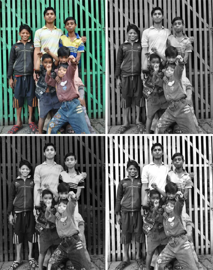
I took the colour photo (top-left) with a digital camera some years ago in my hometown, Kolkata. The top-right image is a straight desaturation in Photoshop (by the way, I’ll often use Photoshop as shorthand, but all the edits I talk about in this post can also be done with other image-editing software, including GIMP which is free, open source and highly recommended).
In the bottom-left and bottom-right images, I applied the software equivalent of a red filter and a green filter respectively. I’ll come to what that means, and how to do it, a little later; what’s important for now is that they result in B&W images which are noticeably different from each other, and also from the straight desaturation. There are a few things to take away from this example.
First, what you see are three different B&W interpretations of the colour image. The differences stem not from simple brightness or contrast adjustments, but from the use of different colour-to-B&W conversion algorithms. This is especially evident in the tonal relationships between the figures and the background. With a red filter, the background is significantly darker than the figures, while with a green filter, it is lighter. The tonal relationship has been inverted. This is something you simply can’t achieve through global adjustments to brightness or contrast.
Second, I don’t believe there’s a right or wrong way to convert to B&W. A straight desaturation is not necessarily more “authentic” than other conversions. Some conversions do look more “natural” than others (though even that is somewhat subjective). But if it’s your photograph, ultimately it’s up to you to decide how you want to interpret colours into black and white.
There are three main ways to control that interpretation: (a) camera settings and software for digital images; (b) analogue filters; and (c) film characteristics. I will cover (a) and (b) in this post, and (c) in Part 2 of this series.
Colour theory
But first, some basic physics. There are just two things you need to know.
Visible light spectrum
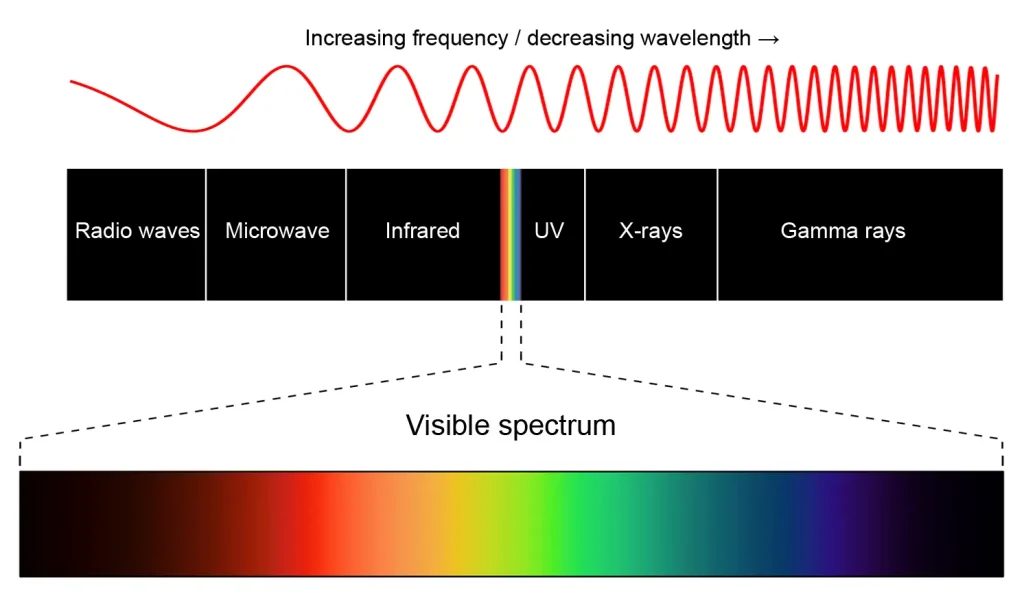
First, visible light consists of different wavelengths. Red light has a long wavelength, and violet light has a short wavelength. Other colours of light are in-between.
RGB colour mixing
Second, under the RGB colour model, which is what I’ll use in this post, the primary colours are red, green and blue (R, G and B for short). These three colours can be combined in different proportions to produce a whole gamut of colours. For example, red and green produce yellow, as you can see from the colour wheel below (light mixing works different from paint mixing). Red, green and blue together produce white – and conversely, white light can be split by a prism to reproduce the whole spectrum. Black is the absence of colour – no light at all.
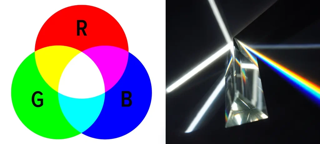
This is a good time to introduce a term which will come up a few more times: complementary colours are colour pairs which are opposite to each other on the wheel, such as red/cyan, green/magenta, and blue/yellow.
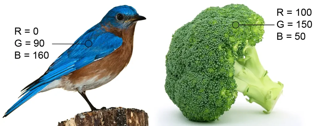
Any colour in the “RGB colour space” can be represented as some combination of red, green and blue. Software applications like Photoshop use values from 0–255, where 0 represents absence of a colour, and 255 represents its maximum intensity.

Pure red, for example, is (255, 0, 0): maximum red, no green or blue. Pure yellow is (255, 255, 0): maximum red and green, no blue. Pure white is (255, 255, 255): all three colours at maximum intensity. Pure black is (0, 0. 0): the absence of colour.
Pure greys – especially relevant for B&W photographers – have equal R, G and B values, with higher numbers representing lighter greys. For example, (200, 200, 200) is a light grey (closer to white) and (50, 50, 50) is a dark grey (closer to black). If you want to play around, this website lets you enter any combination of RGB values and see the resulting colours in real time.
In most photographs, few colours (if any) are pure. The marked spot on the bluebird’s wing, as measured by the Eyedropper tool in Photoshop, is a mix of green and blue (though blue predominates). The marked spot on the broccoli has all three colours (green predominates).
Digital B&W conversions
This section is about digital conversions to B&W. Analogue filters are covered in the next section, but if you’re a film photographer, I still recommend skimming this section because the basic principles also apply to film. And of course, you can use these principles and techniques if you digitally convert a colour film scan to B&W.
As a digital photographer, if you want a B&W image as the end result, there are two main ways to go about it:
- Capture a B&W image “in camera” (Monochrome mode); or
- Capture a colour image and convert it to B&W “in post” (i.e. post-processing software).
I will cover these in reverse order.
One-click conversions
A digital colour image can be converted to B&W in software. There are two “one-click” ways to do this in Photoshop, and also some more sophisticated ways.
One easy (and common) way to convert to B&W in Photoshop is with the Desaturate command (Colors>Desaturate or Ctrl+Shift+U). However, Desaturate is a “naïve” tool, which often produces a suboptimal result.
Consider the band of colours below. This is somewhat subjective, but to my eyes, the yellow band, for example, looks lighter than the dark blue band. Yet, using Photoshop’s default desaturation, they are all converted to the same shade of grey (see the next graphic… or download it, desaturate and see for yourself!)

A second option in Photoshop is to use Image>Mode>Grayscale. This produces a different conversion (caution: it also discards all the colour information in the file, so be sure to save a backup copy first). As you can see from the comparison below, Desaturate and Grayscale, applied to the same band of colours, yield dramatically different results.

So is Grayscale more “natural” than Desaturate? Is it a better choice for conversion? That’s a matter of taste, and partly depends on the original image.
Instead of Photoshop, you can also use GIMP – a fantastic open source image editor, which also happens to be free. My version of GIMP (2.10.24) offers five Desaturate options. The Lightness option is identical to Photoshop’s Desaturate; the other options, if you’re interested, are documented here.
The takeaway point is that colour-to-B&W conversions are all different. Depending on what software and desaturation method you use, they produce very different results. Sometimes, you might get a satisfactory result just by using a simple one-click conversion. But if you want complete control over colour-to-B&W conversion, there are other options you can explore.
Channel Mixer
For more sophisticated colour-to-B&W conversions, I tend to use the the Channel Mixer tool (Image>Channel Mixer in Photoshop; Colors>Components>Mono Mixer in GIMP). Simply check the “Monochrome” box to see a B&W preview of the colour image that you’re editing, and play with the sliders until you get a B&W look that you like.
The guiding principle, and perhaps the most important takeaway from this post, is this: Like colours are lightened.
Increasing the red channel lightens reds, similar to using a red filter in analogue photography. The same goes for other channels too. To simulate a yellow filter, increase the red and green channels simultaneously (red + green = yellow, as you can see from the colour wheel above). In the context of digital editing, I sometimes refer to increasing a colour channel as applying a “filter” of that colour; this is not strictly accurate, but it’s less cumbersome than referring each time to a “digital filter simulation”. True analogue filters are discussed in more detail in the next section.
For any RGB image, you can also see the individual R, G and B channels rendered in greyscale – check the Channels window in Photoshop, or Colors>Components>Decompose in GIMP. I find this is often a useful starting point for deciding how I want the final image to look.
Sample conversions
So much for the tools – how can we use them in practice?
In this section, I’ll present a few sample conversions, mostly using the aforementioned Channel Mixer tool. This is not really an editing tutorial, so I won’t go into the nuts and bolts of the conversion process (for that, see the Other online resources section at the end). Rather, my main objective is to try and give a sense of the creative possibilities which software can offer, when it comes to interpreting colour photos in B&W. The samples are organised into two categories, representing two classic genres of B&W photography: portraits and landscapes.
Portraits and skin tones
There are not many in-depth tutorials about colour-to-B&W conversion, and the ones which do exist often use Caucasian skin tones as examples. Of course, there is enormous variation in skin tones (even within specific skin types) and it’s impossible to cover all scenarios, but I’ve tried to make my samples slightly more diverse. I’ll discuss the first conversion in more detail, and deal with the rest more cursorily.
The colour image is a digital photo of my girlfriend which I took in Venice. The top row shows two “one-click conversions” in Photoshop. In this instance, Photoshop’s basic Desaturate and Grayscale conversion produce largely similar results.
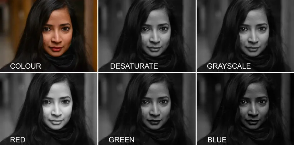
The bottom row shows the red, green and blue channels. Red produces a sort of ethereal glow. It lightens her lips as well as her eyes (you can see the iris, which is darker in the other conversions). The lips are lightened to a similar shade as her skin: almost a nude lipstick effect. This is because her lips and skin contain similar amounts of red – perhaps a surprising fact if you’re not used to working in RGB (her skin is lighter overall because it has more of the other two colours). The bottom-left conversion (above) uses only the red channel, so we end up with the lips and skin being similar shades of grey.
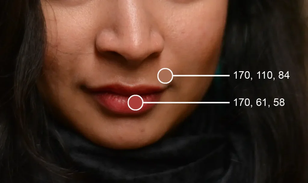
In the green channel, the lips are more prominent than in the red channel or the “one-click conversions”. Compared to red, green has lower contrast overall, but it has more local contrast on her face. Blue has the least information in this particular image. With portraits, the blue channel is generally less flattering, mainly due to the harsher contrast.
So which conversion is the best? If it’s your photo, that decision is up to you. Also remember that you’re not limited to choosing either red, green or blue. You can choose any combination of the three – for example, 50% red, 40% green and 10% blue – which produces yet another look. I think playing with the channel sliders and studying the effects is really the best way to learn.
You can get even more creative, and combine elements from different mixes. Both Photoshop and GIMP have layer masks, which is an extremely powerful tool for combining different layers seamlessly. However, this is a more involved process, so I only do it for a handful of images when I think the extra effort will be worth it.
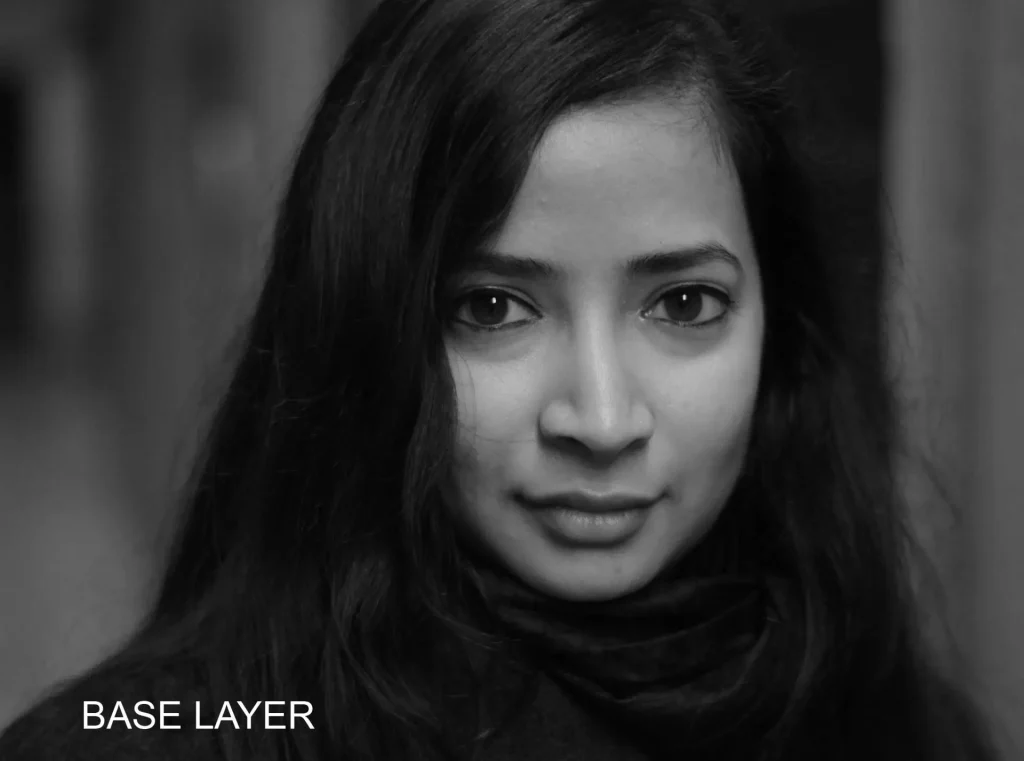
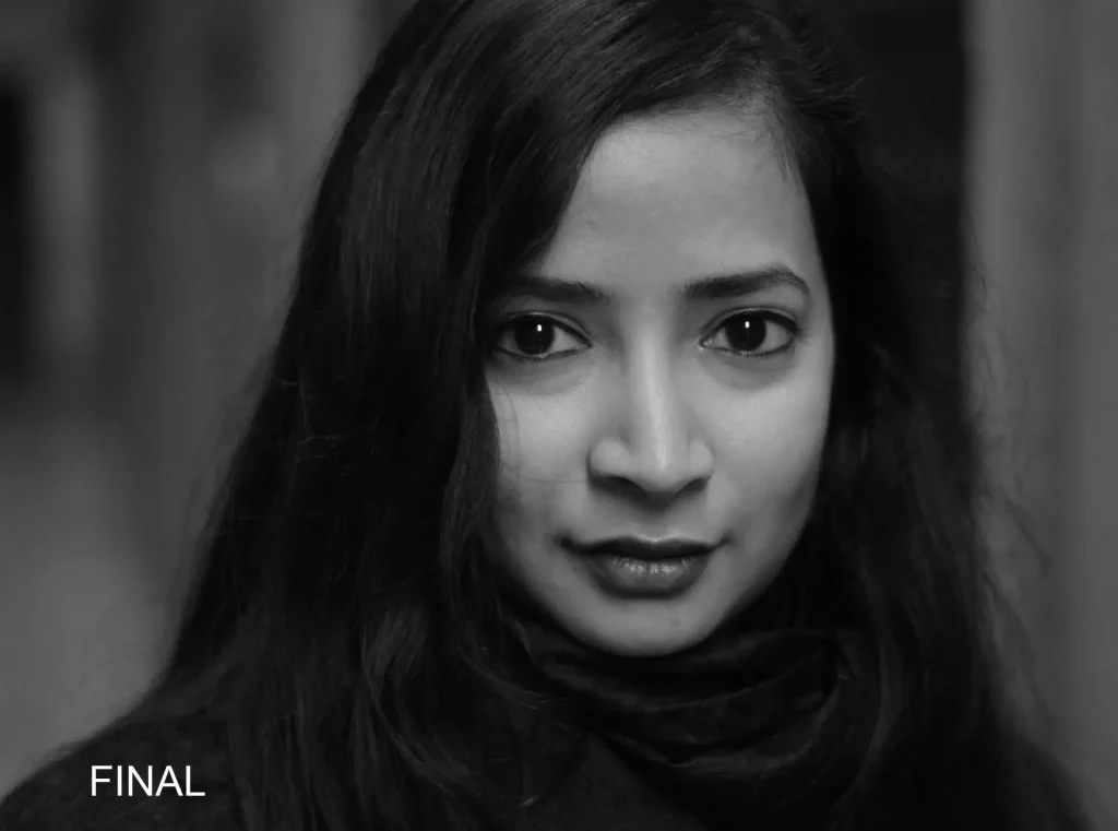
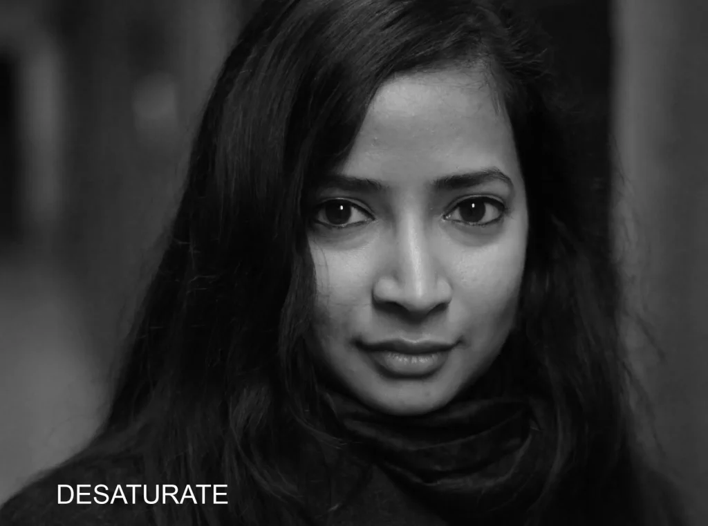
I won’t go into too much detail, but here’s an overview of what I did. For my final edit below, I used what can loosely be described as a yellow filter (Red: +58, Green: +32, Blue: 0) as my base layer – this reproduces some of the red-channel glow, but in a more subtle way. I then used layer masks to make her lips and eyes darker, by “borrowing” from other layers: I “masked in” the lips from a predominantly green layer (Red: +20, Green: +90, Blue: +10) and the eyes from a predominantly blue layer (Red: +20, Green: 0, Blue: +80).
Here’s a comparison between the base layer (yellow filter), and my final edit where I “borrowed” elements from other layer channels to darken her eyes and lips.
And finally, here’s a comparison of the straight desaturation in Photoshop and my final edit:

I’ll pass over the other portrait samples a little more quickly, just highlighting specific points of interest rather than going into all the different channels and edits.
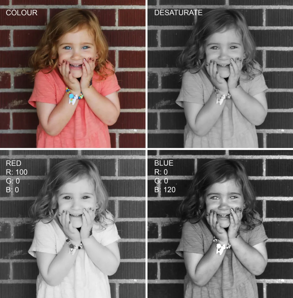
Since red and blue are at opposite ends of the spectrum, the difference between the two filters can be pretty striking. Blue eyes are darkened by a red filter and lightened by a blue filter (like colours are lightened). With blonde or red hair, the same two filters have the opposite effect – lightened by red and darkened by blue.
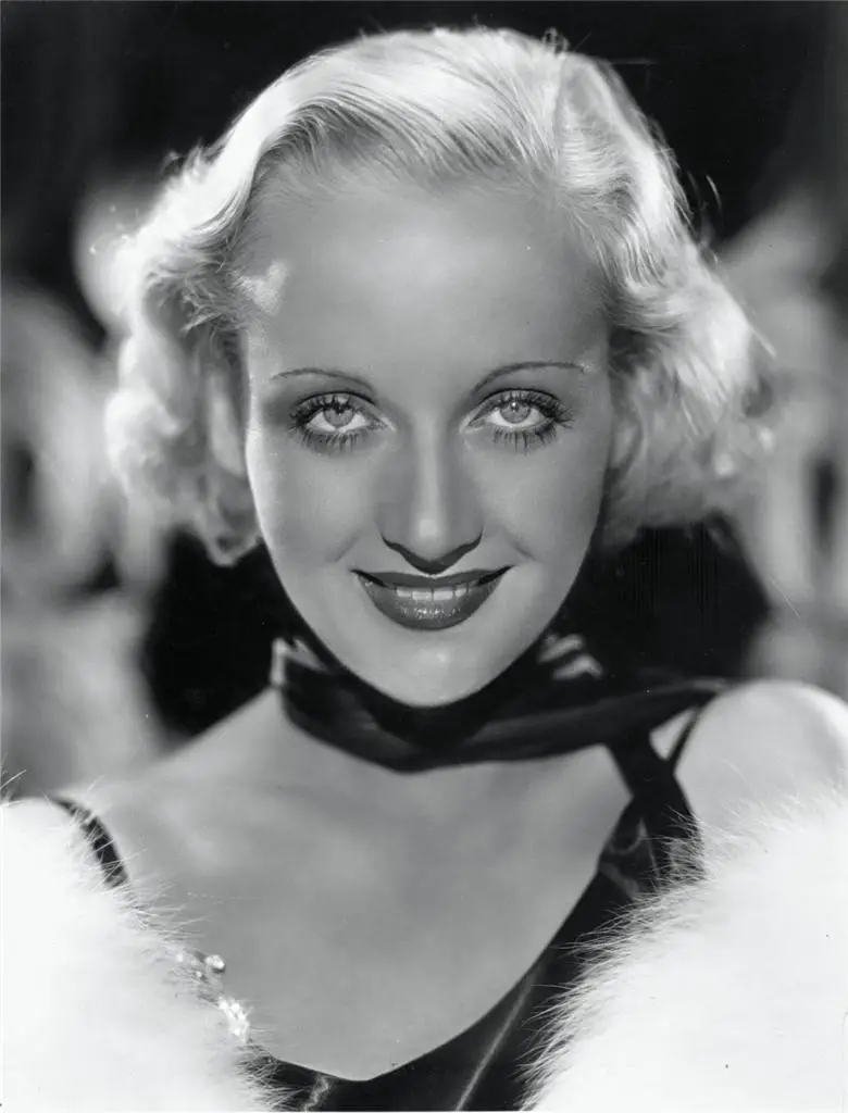
In the early days of cinema, film stocks were more sensitive to blue light and less to red – similar to using a blue filter on a modern film or sensor. If an actor had blue eyes, they would look unnaturally light on film. To avoid this effect and make blue eyes look more natural, pioneering cinematographer James Wong Howe started mounting a black-velvet drape around his camera, using the reflections to darken the actors’ eyes. Presumably, no such tricks were used for this 1931 portrait of Carole Lombard; her eyes look similar to the “blue” edit above.
So much for cinematographic history – back to the image. Besides the more obvious effects on eyes, hair and skin, the red filter also lightens her dress and the brick wall behind her. And there are some subtle but interesting effects on her multicoloured bracelet.
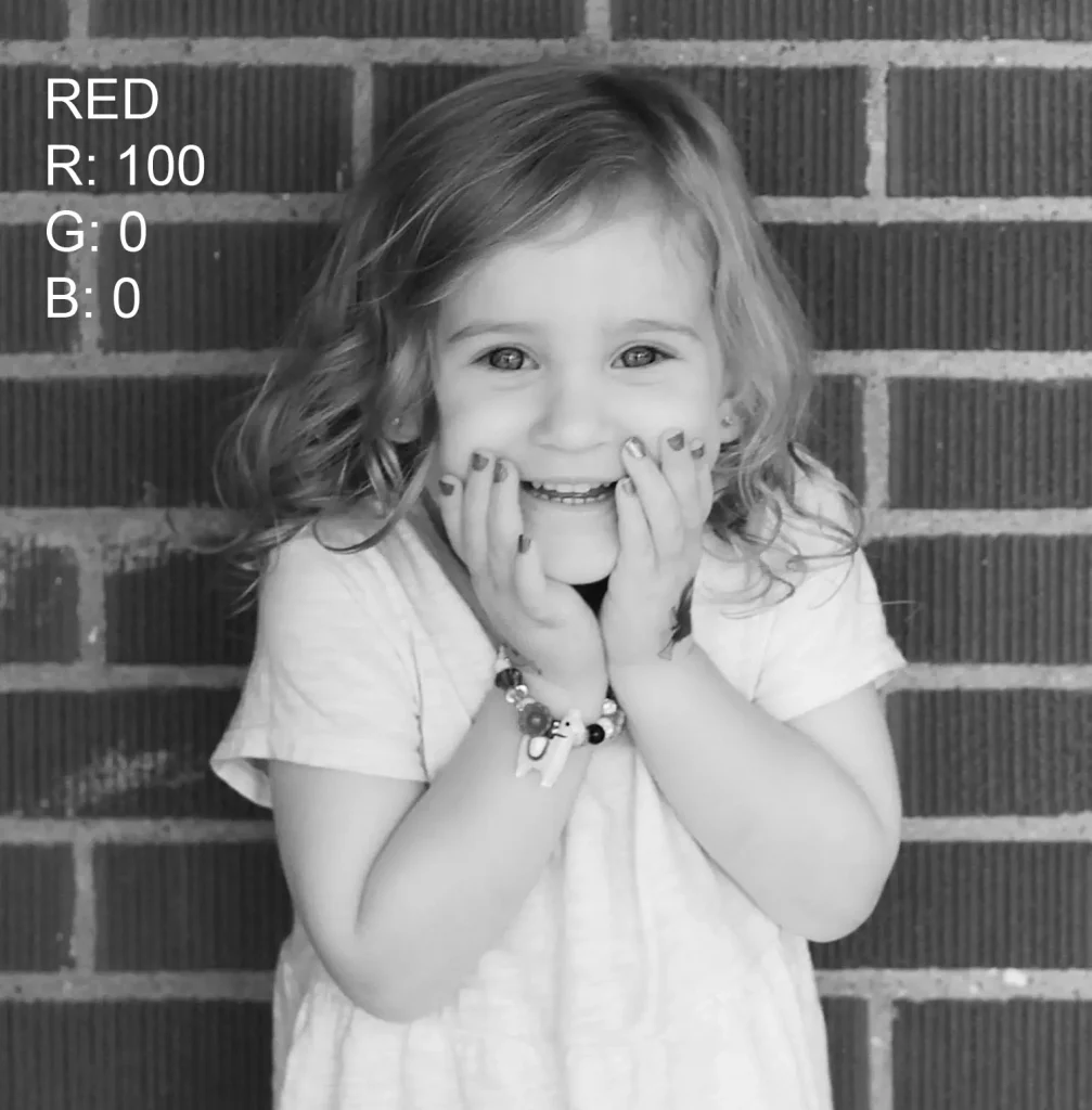
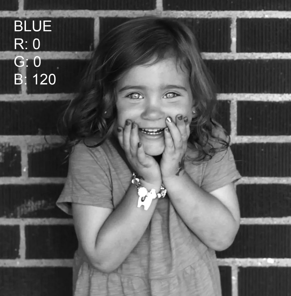
In this particular image, the red and blue edits are instructive, but not really usable; to me, they look a little too unnatural. But by mixing the three channels in different proportions and possibly combining them with layer masks as in the previous image, I think the straight desaturation could almost certainly be improved upon.
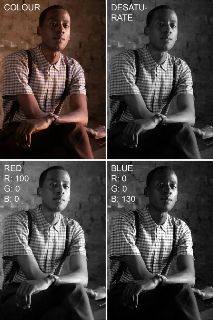
With darker skin tones, the difference between red and blue filters is generally less drastic. Or at least, that’s what I’ve noticed, but don’t quote me on this – skin tones are diverse, lighting matters, and I’m speaking from limited experience. However, it’s certainly true of the next image, a portrait by Beverley Nelson (@positivedread). The red filter simulation is lighter and more “airy”; blue is more of a film-noir look. Two different moods – but with some adjustments, I think they would both be usable.
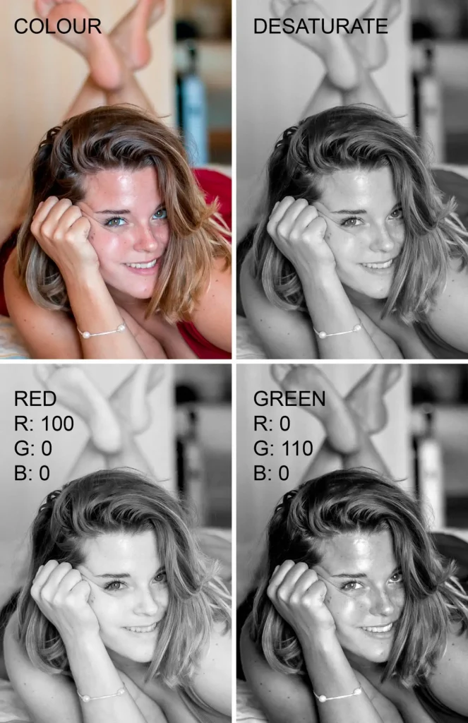
Finally, it’s interesting to see how freckles are affected by filters. The next photo is a self-portrait by my friend Charlotte. A red filter lightens (conceals) freckles – like colours are lightened – while a green filter darkens (emphasises) them. The red filter also darkens her green eyes, while lightening her hair and red dress. The green filter, on the contrary, darkens her dress almost to black. It also adds more dimension and depth to her face, whereas the red filter tends to make lighter skin look “glowy” but relatively flat.
Landscapes
The human eye is very sensitive to skin tones, even in B&W; using a strong filter on a portrait often makes it look unnatural. Landscape photographs, whether digital or film, generally offer more scope for manipulation. In this section I’ll demonstrate the effect of digital filters on two landscape photos. As with the portraits, I’ll discuss the first conversion in more detail, and deal with the other sample more cursorily.
The colour image is a digital photo of a tree in the Ancient Bristlecone Pine Forest in California. The top row shows two “one-click conversions” in Photoshop. Again, there is not much to choose between the basic Desaturate and Grayscale conversions.
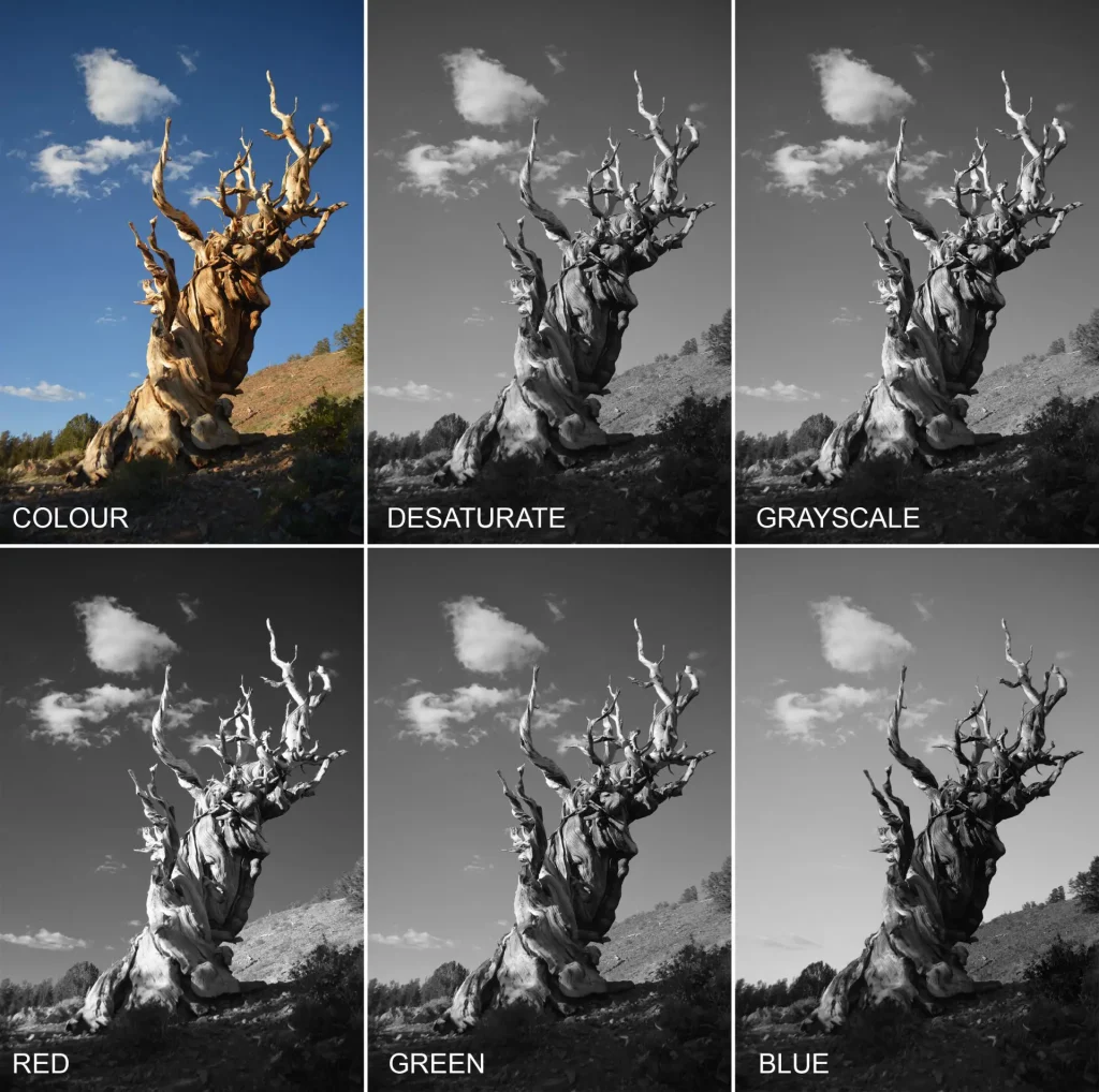
The bottom row shows the red, green and blue channels. Red is the most dramatic – it makes the sky darker, while making the clouds and the tree brighter. Note the hill on the right and the sky just above it. In the straight desaturation, the hill is darker than the sky, while in the red channel, the hill is lighter: the tonal relationship has been reversed. This is something you simply can’t do with global adjustments to brightness and contrast.
Green in this case is fairly similar to the straight desaturation (this is often the case, since green is in the middle of the spectrum – a kind of average). Blue makes the sky lighter (no surprise; the sky is blue) and makes the tree, which is reddish, look a bit muddy. Of the conversions shown above, blue has the clearest separation between the horizon and the sky.
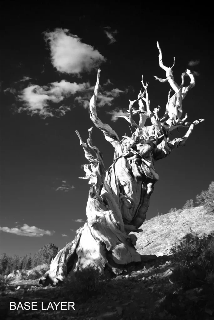
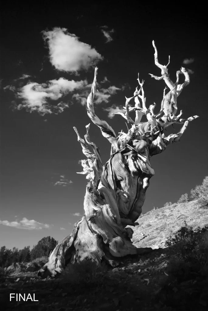
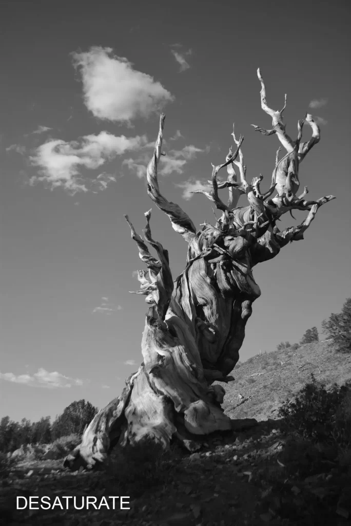
For this photo, I went for a dramatic interpretation (perhaps too dramatic? see what you think). Accordingly, I used a strong red filter as my base layer. I then masked parts of the trunk to reveal the green channel and show more of the trunk texture, especially in the midtones and highlights. I also masked the tree-line on the left to reveal a darkened green channel, creating more separation with the sky.
Again, this is not an editing tutorial, so I’ll refrain from describing all the steps in detail. But here’s a comparison between the base layer (red), and my final edit using layer masks:
And finally, here’s a comparison of the straight desaturation in Photoshop and my final edit:

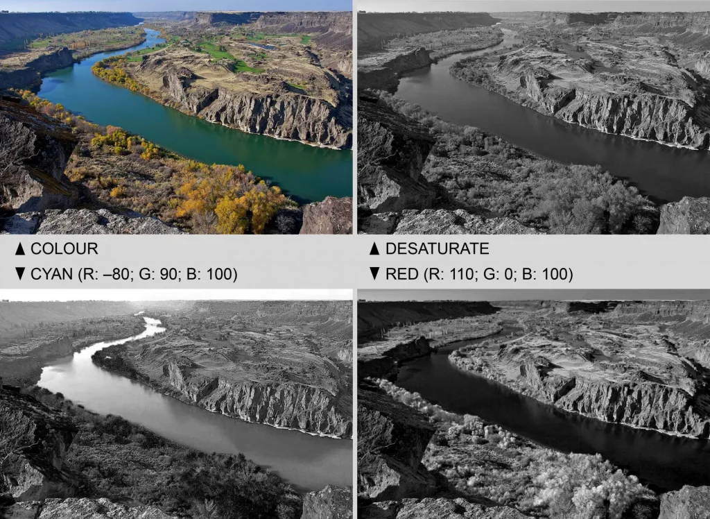
In the next photo, the straight desaturation reduces the river to a similar shade of grey as the landscape around it. A cyan filter (bottom-left) makes the river look lighter, while a strong red filter (bottom-right) makes it darker. The mountains in the distance, which have a typical bluish cast, are also affected. In the cyan edit, they look lighter, hazier and more distant. The red filter creates more contrast, seemingly cutting through the haze.
Other tools
For edits like these, I mostly use the Channel Mixer tool. For even finer control, you can use Curves. For a flexible, non-destructive approach in Photoshop, use two adjustment layers: (a) a Curves adjustment layer to edit individual R, G and B curves, and (b) a desaturation adjustment layer added on top for the B&W conversion. Dragging up the upper-right portion of the Red curve, for instance, is like applying a red filter selectively to the highlights. Dragging down the bottom-left portion of the Blue curve is like applying a yellow filter only to the shadows (yellow and blue are complementary colours, so reducing blue is equivalent to adding yellow). However, in practice, I find that the Channel Mixer tool offers more than enough control for my purposes, and it’s also simpler to use.
Finally, later versions of Photoshop, and some other software like Silver Efex Pro, contain dedicated presets and profiles for B&W conversion. Presets/profiles are faster to apply, but I’m personally not a fan. They apply a battery of different effects in a relatively opaque way, whereas I like to have manual control and see exactly what I’m doing. Besides, such software tends to be expensive, whereas Channel Mixer, layer masks and the various other tools which I used in my sample conversions above are all available on GIMP, which is free and open source. But if you prefer presets and profiles, Thom Hogan has a detailed (nearly two hours long!) video about it.
In-camera conversion
Everything I said so far about digital B&W conversion assumes you’re using a colour image as a starting point. But when the end goal is a B&W image, some people like to set their digital camera to Monochrome mode. The advantage is that you can use the camera as a previsualisation tool. You see a B&W image on the LCD or electronic viewfinder – both in Live View, and also when reviewing photos you just took.
JPEG or RAW
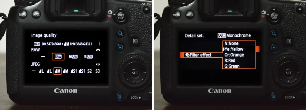
If you’re using Monochrome mode and capturing JPEGs only, the camera does not retain any colour information. You are “locked into” the colour-to-B&W conversion applied by the camera. That’s obviously fine if you don’t plan to explore other conversions in post-processing. But if you want to see a B&W image on your LCD but also capture colour information, you may want to shoot JPEG plus RAW (below left). That way, the image on your LCD will be B&W, as will the JPEG – both using the colour-to-B&W conversion applied by the camera. But the RAW file will retain the colour information, so you can try other types of conversions in post, and edit it to your heart’s content. The downside is that RAW files are larger, and slower to work with. You can’t have everything!
In-camera filter simulations
Incidentally, some digital cameras have different filter effects in the Monochrome sub-menu, such as Yellow filter or Red filter (above right). Here you don’t use an actual filter; rather, the camera converts the colours to B&W in a way which simulates the use of an analogue filter, similar to applying Channel Mixer adjustments in post. I used such “in-camera filter simulations” for the four photos below, taken in quick succession. The differences are obvious, especially with the red filter. But if you’re interested, I analyse the differences in more detail in the section on analogue filters below, which has the same photo taken on B&W film.
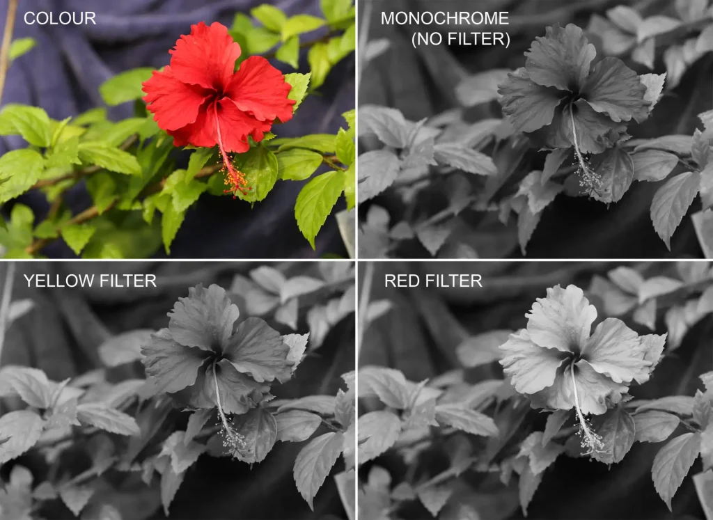
These filter effects are visible on the LCD or electronic viewfinder. But as with the default (unfiltered) Monochrome mode, if you’re shooting JPEGs only, you’re locked into a specific conversion when you press the shutter.
If you simultaneously capture the images in RAW, the colour information is retained, so you can apply other conversions in post. These include more dramatic interpretations, as well as filter effects which are not available in-camera. For example, the camera I used for these photos, the Canon EOS 6D, doesn’t have a blue filter simulation. But if you have the RAW file, a blue filter can be easily simulated in software.
Analogue colour filters
So much for digital images. If you’re shooting on B&W film, there’s no way to control the colour-to-B&W conversion in post-processing. Obviously you can adjust certain things in software or in the darkroom – brightness and contrast, for example. But you can’t modify the tonal relationships between different colours in the same way that you can with software.
Instead, film photographers have traditionally used colour filters. For that, you have to know what effect you want, and what filters to use in order to achieve it. What’s more, you have to know these things at the time of taking the photograph; you can’t play with Photoshop sliders to see what filter works best. And of course, as a practical matter, you also need to have the appropriate filters with you. But personally, I find it quite satisfying when all of these things come together, and I end up with an image I like. It’s also possible – though I can’t say for sure – that this enforced exercise of “previsualisation” has some creative benefit, as opposed to digitally capturing all the colour data and crafting the B&W image later.
Like colours are lightened
A colour filter “passes” light of that colour, so as before, like colours are lightened. And it partly or completely blocks (technical term: attenuates) other colours, thus darkening them.
To demonstrate (and also see for myself), I took some photos of a red hibiscus flower with green leaves, and a blue towel in the background – that’s R, G and B, all in one frame. (This is the analogue version of the earlier comparison where I used the filter simulations on my digital camera.)
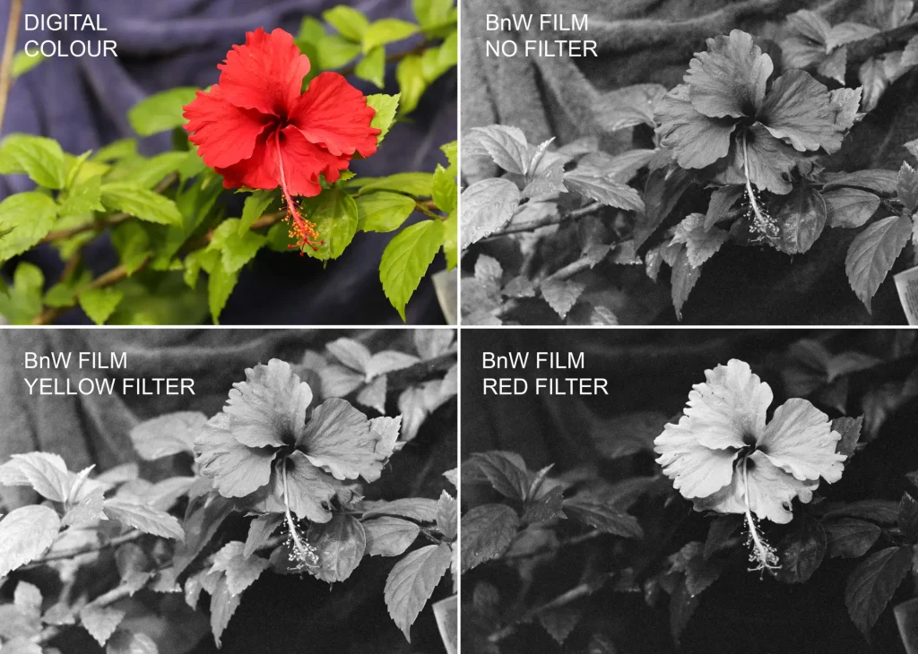
The digital colour photo is “straight out of camera”, just slightly cropped. The three film photos, taken on Ilford HP5 Plus 400, were digitised with identical settings, and received identical, minor adjustments in software. (This, by the way, is true for all my film photo comparisons in this post, unless stated otherwise. If the scanning process is not consistent, comparisons are less meaningful.)
With no filter, the flower, leaves and towel are rendered in similar shades of grey, resulting in a lack of contrast between different elements of the image. In the colour photo (top-left), the colour contrast helps the flower and leaves stand out from each other, and also from the blue background. But the colour-to-B&W conversion applied by Ilford HP5 Plus 400 renders all three in similar shades of grey (for a more extreme example, see the section on tonal mergers below).
Next, the yellow filter slightly darkens the blue towel (blue is the complement of yellow). But the red flower as well as the green leaves are lightened (both green and red are adjacent to yellow on the colour wheel). So, compared to the no-filter image, we get better separation than before between the background (towel) and foreground (flower and leaves). But there is still not much separation between the flower and leaves.
The red filter significantly lightens the flower (like colours are lightened), and darkens both the leaves and the towel. This for me is the most eye-catching of the three B&W versions, but it’s hard to say which is the “best”. That depends on how the photographer wants to interpret the scene – whether they want the viewer’s eye to be drawn to the flower, for example, or to also capture good detail on the leaves. Personally, I prefer the red-filter version, though if I were to print it in the darkroom, I might dodge (lighten) the leaves a little.
This is a good example of the like colours are lightened principle, and of how colour filters can make a subject “pop” in a B&W photo. But I would caution against jumping to simplistic conclusions like, “If you want to emphasise a red flower, use a red filter.” If the background were white, the red filter, by lightening the flower, would actually reduce contrast. Contrary to what some sources say, colour filters don’t always increase contrast. Like colours are lightened is a more reliable guide.
Common filters and their uses
General
B&W film photographers use colour filters in a variety of ways, and to achieve a variety of effects. But there are certain filters, and certain applications, which are more common than others:
- Yellow filters are often used by portrait photographers for a more “flattering” rendition. They are also used in landscape photography to reduce haze, and to increase contrast between blue skies and clouds.
- Orange filters and red filters also reduce haze and increase contrast in the sky, but to a greater degree since they attenuate blue more strongly. Red filters have a particularly dramatic effect.
- Green filters lighten vegetation, and can create better differentiation in foliage.
- Blue filters accentuate haze or mist. They also lighten the sky, so can be used for a more graphic or minimalist look. They can also be used to lighten blue eyes or darken blonde hair, but blue filters are generally regarded as somewhat unflattering for skin tones, and thus rarely used for portrait photography.
- All these filters come in different intensities (e.g. light yellow, medium yellow, dark yellow). As you would expect, darker versions produce stronger effects.
- Infrared filters only pass infrared (IR) light which the human eye can’t see (see the electromagnetic spectrum above), and block the visible wavelengths. This post is limited to visible-light photography only, so IR filters and film are outside our scope. This article by Christopher Schmidtke on Emulsive is a good introduction to IR film photography.
Please note that all of the above are just rules of thumb; there are always exceptions. For example if the sky is orange (as at sunset), using an orange filter may in fact reduce contrast. If in doubt, like colours are lightened is still the best guide that I know of.
Also note that these are just some of the more common uses. Rather than using a red filter just for dramatic skies, I think it’s worth exploring what else it can offer. Once you understand how filters work, the only limits are your own creativity and imagination.
Red filter for skies
Speaking of using a red filter for dramatic skies… In the photos below, you see the “real” scene – a phone pic of my Ihagee Exa camera pointed at the sky, and the scene (laterally reversed) in the Exa’s waist-level finder.
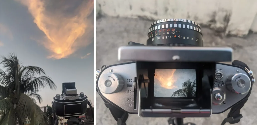
The next two photos were taken on B&W film – one without filter and one with a dark red filter.

The effect is so obvious that I think there is not much to add. The red filter has darkened the sky and separated cloud detail in a way which would be impossible to achieve through post-processing, either digitally or in the darkroom.
Yellow filter for portraits
Another common application: yellow filter for portraits. In the two comparisons below, the photo on the left was taken without filter, and the one on the right with a yellow filter.


As you can see, the effect of the yellow-filter on portraits is indeed flattering as advertised, but also pretty subtle. For me, having to carry the extra filter and screw it on when needed, not to mention losing half a stop of light is often not worth it (exposure compensation is covered in a subsequent section ). Of course, your mileage may vary. If I were a studio photographer shooting portraits on B&W film, I’d certainly consider using a yellow filter more often. As it happens, I do take a lot of portraits, but mostly in available light, documentary-style. And I like to carry as little gear as I can. So in practice, my yellow filter often stays at home.
Some sources will tell you that a yellow filter is a “must” for B&W film portraits, or even for B&W film photography in general. This is a creed which has outlived its time – mostly, I think, due to people unthinkingly repeating what they learned from their teachers or read in books. With older lenses and film, using a yellow filter would kill two birds with one stone: making the images look more natural by counteracting the blue bias of older film, and sharper by reducing chromatic aberration. But both these considerations are less relevant today.
The first reason is less relevant due to advances in film technology. As the B+W Filter Handbook (PDF link) explains:
in earlier days yellow filters were a must for landscape photographs and for portraits. Even films that were sensitized “panchromatically”, ostensibly to match human brightness perception, still rendered blues too lightly and reds too darkly … today’s black-and-white films no longer have that shortcoming.
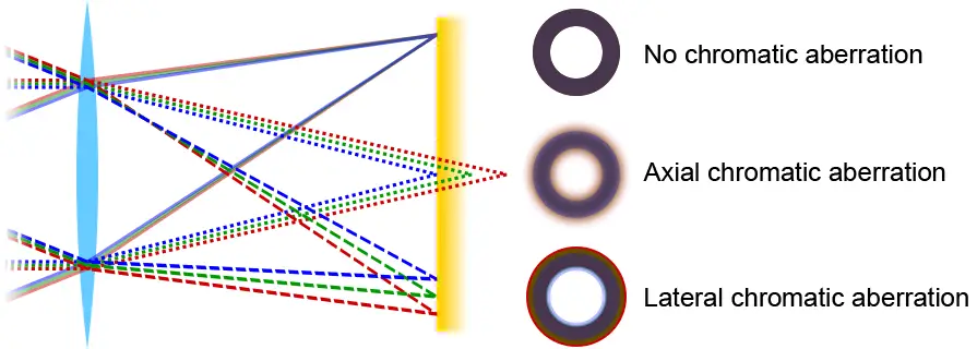
The second reason is worth exploring in a bit more detail. Lenses with chromatic aberration (see diagram above) can’t focus all wavelengths of light onto the same point. This flaw is more noticeable in colour photography (e.g. the infamous purple fringing effect) but it also affects the sharpness of B&W images. Chromatic aberration can be mitigated by limiting the range of wavelengths which reach the film or sensor – by using a yellow filter, for example. However, in my experience, most lenses manufactured from the 1960s onwards, and even some older lenses, are sufficiently well-corrected for chromatic aberration that using a yellow filter doesn’t improve optical performance, at least not to a degree noticeable to me. But when it comes to your equipment and needs, you’re the best judge – if you find a yellow filter helps, by all means use it!
Blue filter for…?
This shouldn’t really come under “Common filters and their uses” because (a) blue is not one of the more common filters and (b) I’ve never used an actual blue filter, so I can’t speak with authority about their uses. But still, here we are.
Most sources say blue filters are used to accentuate haze. Now I don’t have a proper blue filter, but I do have an 80B filter intended for colour film – specifically for shooting daylight-balanced film under tungsten light. No doubt it has different characteristics to an actual blue filter, but I thought I’d give it a try.
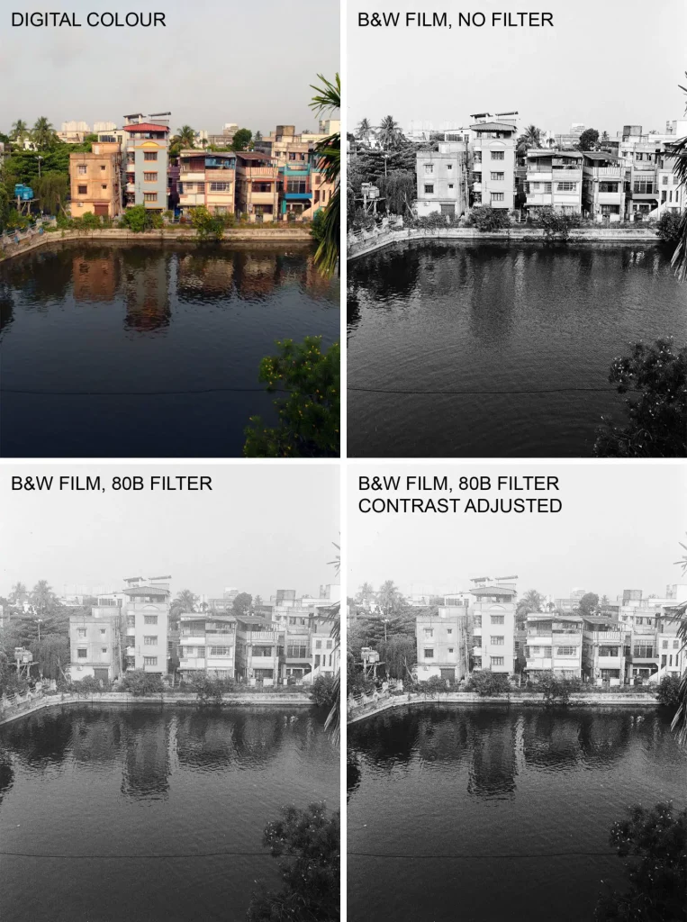
When scanned with identical settings, the 80B image (bottom-left) had a washed out look – I guess I over-exposed by about half a stop. So I slightly increased the contrast (bottom-right) to bring it in line with the no-filter image (top-right). But now the two look quite similar. The 80B image is a little hazier in the distance, but the no-filter image could also be made to look this way in Photoshop or in the darkroom. I’m interested to try the 80B filter in hazier conditions or perhaps in the mountains, but otherwise, I don’t think it adds any real value (not its fault; it’s not designed for B&W photography).
But what about real blue filters? This article by Jennifer Stamps has some great examples and comparisons. Unfortunately I couldn’t find too many other examples online, and in any case, without a no-filter comparison, they are not very edifying because you can’t see what effect the filter had.
Tonal merger
A tonal merger is where adjacent objects have similar colours or tones, so it becomes difficult to differentiate them. Sometimes, a tonal merger can be used for artistic effect or visual impact, as in this photo I took on colour film (Kodak ColorPlus) in Kolkata two years ago.

Whether you want them in your picture or not, tonal mergers in colour are fairly obvious. But they can be a pitfall in B&W, because objects which appear to be clearly differentiated in colour can be rendered as very similar shades of grey. The red flower in my earlier example, so prominent in colour, almost blends in with the background in the unfiltered B&W. But my friend Nanda showed me an even better example, which I simply had to share. (Incidentally, Nanda has been photographing and documenting the Indian railways for several years. You can see more on his Instagram, or his fantastic articles for Emulsive and KosmoFoto.)
Now look carefully at the two photos in the top row. On the left is a phone pic, and on the right is a photograph on Bergger Pancro 400 B&W film. Notice anything interesting?
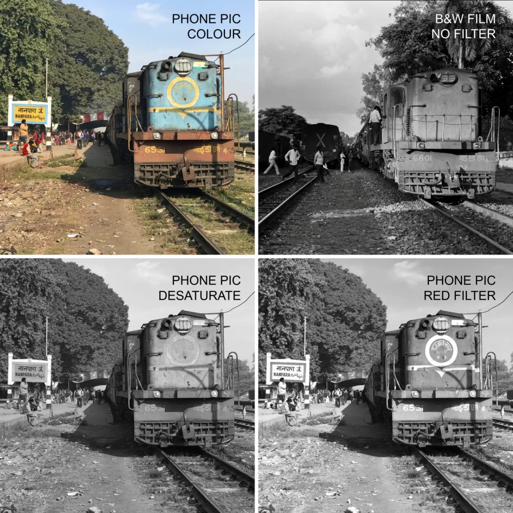
In the B&W film photo (top-right), the engine’s light-blue and yellow paint form a near-perfect tonal merger – the circle, and the line below it, practically disappear. (The phone pic and the film photo are of two different engines, as you can see from the numbers, but Nanda assured me the colour scheme is identical.)
A straight desaturation of the phone pic in Photoshop (bottom-left) reproduces the tonal merger, if not quite so perfectly (Bergger Pancro 400 has a different conversion “algorithm” – spectral sensitivity, to be exact, which I’ll cover in a subsequent post). Applying a red filter simulation (bottom-right) with the Channel Mixer tool produces a clear separation. In the B&W film photo, using an analogue red or yellow filter would have had a similar effect.
Filter gallery
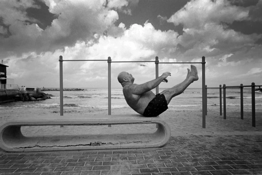
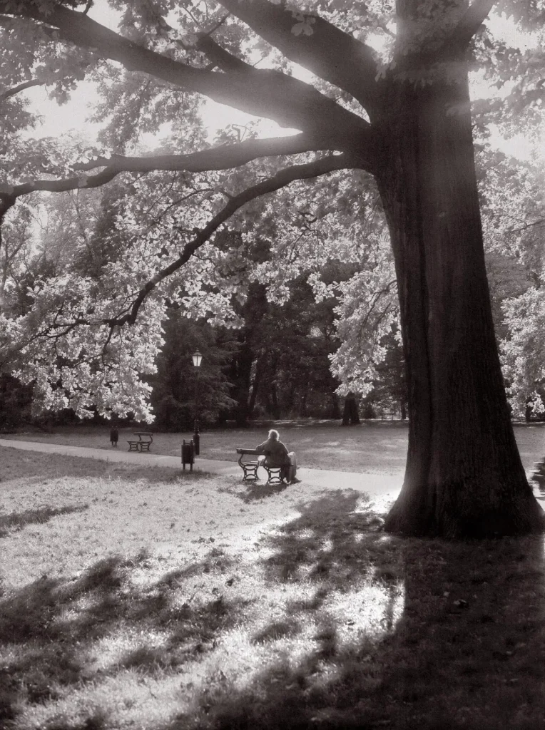
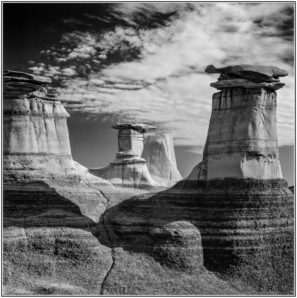
Anyway, this post was getting a bit too technical even for me, so as an interlude, I thought I would feature ten great examples of B&W film photographs made with filters (I found all these online; many thanks to the photographers for their kind permission). The photographs, which span a variety of genres (fashion, street, landscape, portraiture), are presented below with just some basic information. No comparisons or analysis; this section is less about the technical side, and more about the art.
Yellow and yellow-green filters
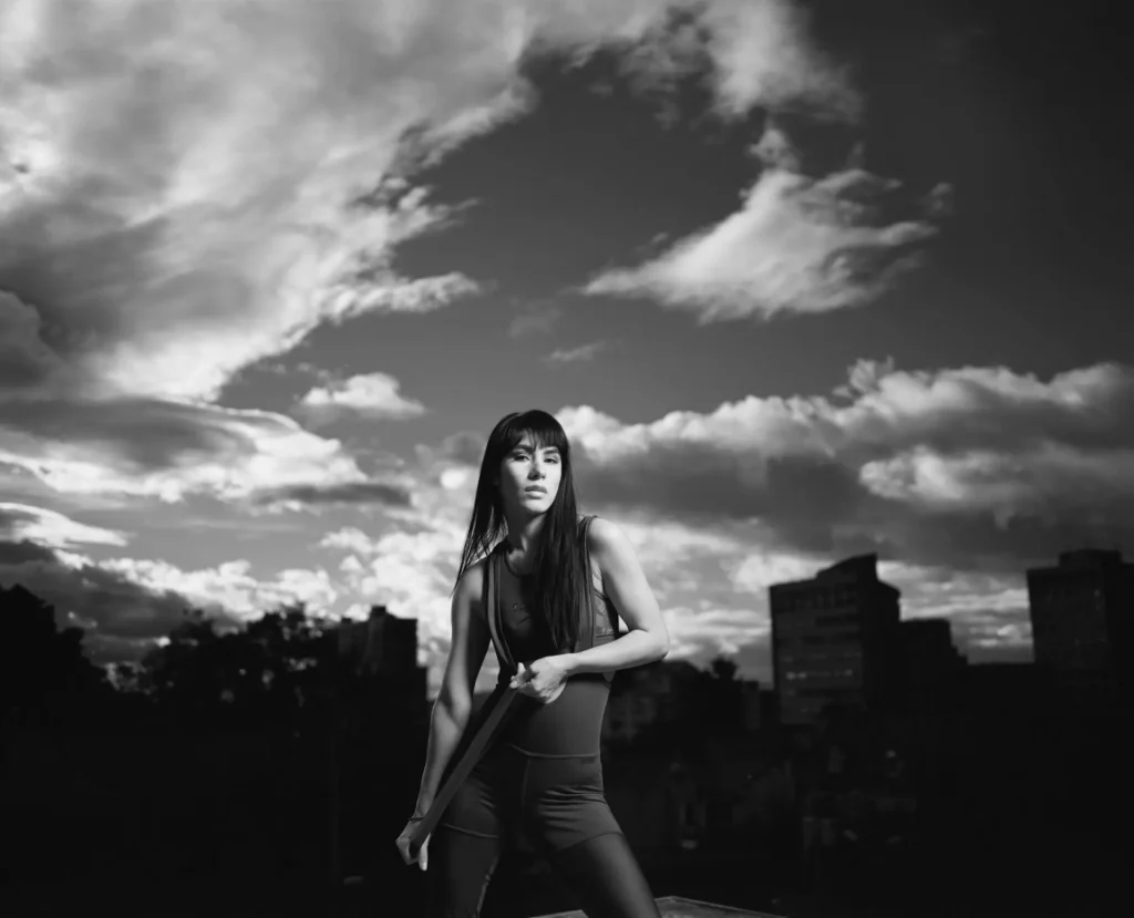
Orange and red filters
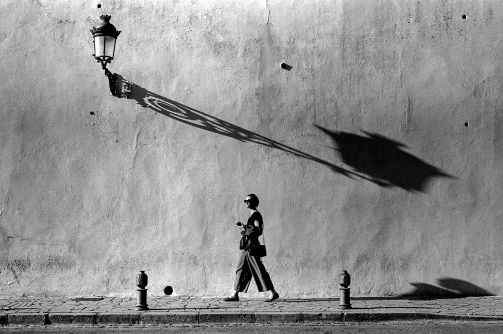
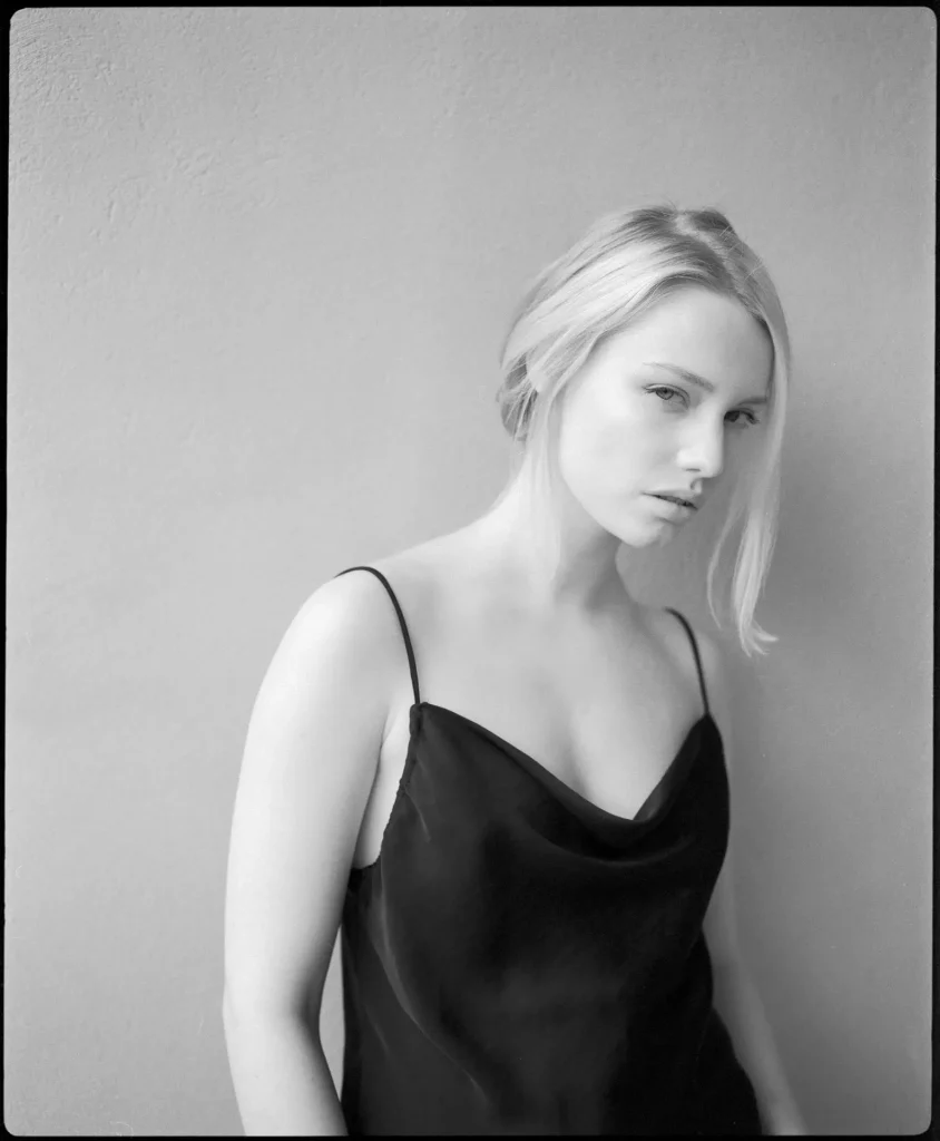
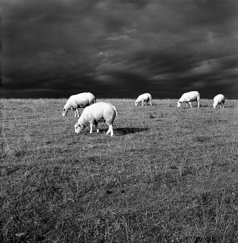
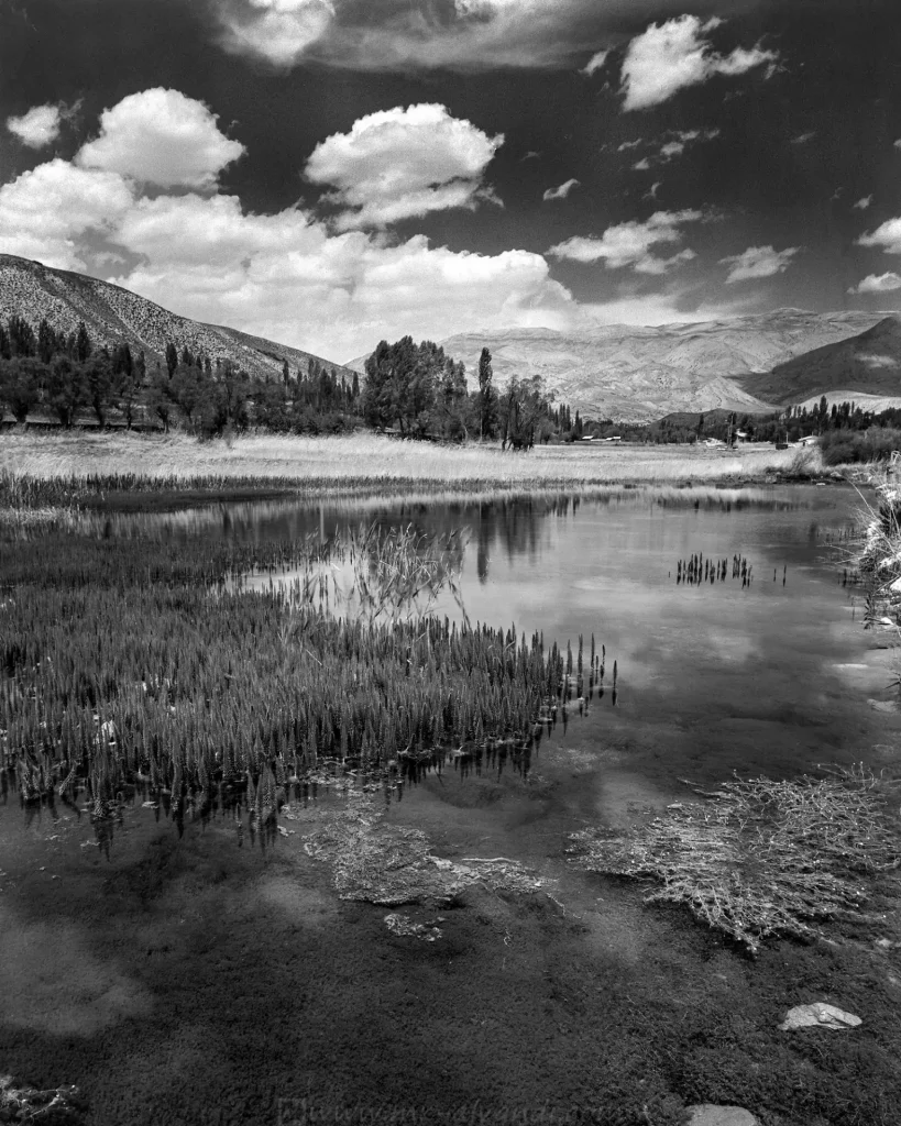
Blue filter
Filter factors and exposure compensation
I hope you enjoyed the art-interlude; now back to the technical stuff!
Colour filters block some light from reaching the film. To compensate, we need to increase the exposure. How much compensation is necessary? I will come to “filter factors” in a moment, but first, some myth-busting.
Some sources say that if a camera has TTL metering, once a filter is mounted on the lens, light loss is already taken into account. Intuitively this seems plausible – after all, the camera is metering through the filter. But it doesn’t always work in practice, especially with darker filters. For example, with my Heliopan Dark Red #29 filter, the TTL reading on my camera (Minolta X-700) is sometimes as much as 1.5 stops off Heliopan’s filter factor. And the resulting exposures show that the filter factor is almost always more accurate than the TTL reading.
Bottom line: whether you have a TTL or some other kind of meter, or if you simply use the sunny 16 rule, my recommendation is to use the filter factor as a starting point. This number can usually be found on the manufacturer’s website or datasheets. For example, my dark red filter, according to the Heliopan website, has a filter factor of 8–12x. However, this number as such is not very helpful in the field, because photographers are accustomed to using stops.
To convert a given filter factor to stops, use the formula: ln(filter factor)/0.7. You can literally type this into Google, replacing “filter factor” with the relevant number – e.g. ln(8)/0.7 – and it will give you the result in stops. Alternatively, you can use a chart like the one given here. To save myself from having to do this repeatedly, I looked up the filter factors for all my filters, converted them to stops, and wrote them on my filter cases with a marker.
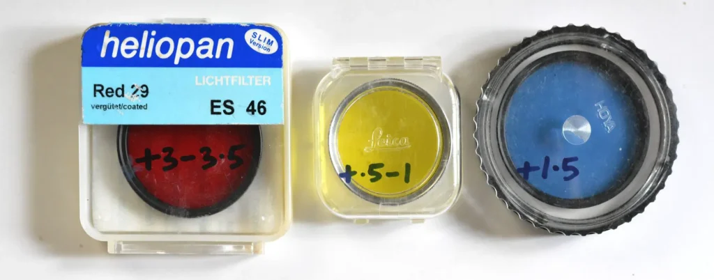
Bear in mind that filter factors are approximate. For example, with a red filter, you generally need more compensation at midday than in “golden hour”. This is because at midday, the light is colder (bluer), so the red filter blocks more of it. To counter that, we need even more compensation than usual. This is why filter factors are typically given as a range (e.g. 8–12x for my Heliopan Dark Red, which translates to around 3–3.5 stops).
Purchasing filters
There are some extremely cheap filters available online. I am all for saving money (as readers of my darkroom series will know) but I think such filters are best avoided. I learned this the hard way when I got a very cheap ND filter, which turned out to have a strong colour cast. Other potential problems include flare, loss of contrast and inferior coatings. Instead, I would recommend getting filters from reputable brands such as Hoya, Heliopan, B+W or Tiffen. I got most of my filters secondhand off eBay, and they were not much more expensive than the cheap filters.
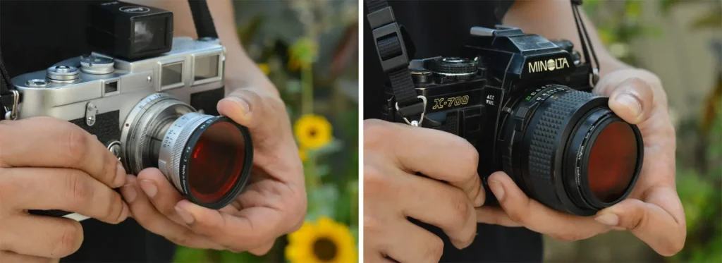
Filters also need to be the right size for your lens. Step-up rings, which are quite cheap, enable the use of a larger filter on a lens with a smaller filter-size. In the absence of step-up rings, I have simply held the larger filter over the lens (below left), taking care to keep my fingers out of the frame. I have even used some smaller filters in this way. A filter really just needs to cover the front element, and on some lenses the front element is a lot smaller than the filter ring (below right). Of course, this is just an emergency measure, and not the recommended way to use filters.
To use or not to use?
Is it worth using colour filters for B&W photography? This may seem like a strange – and rather belated – time to bring this up, but I thought it makes sense to first discuss and show what filters can do, before we talk about the downsides.
Certainly, there are a few disadvantages to using filters. First, you need to have a set of appropriate filters with you, and they need to be the right size for (or adaptable to) whatever lens you’re using. Second, you almost always lose a bit of light, and need to increase the exposure to compensate (though this can sometimes be an advantage, e.g. if you want to take a portrait on a sunny day with wide-open aperture). Third, placing additional elements in front of the lens can sometimes degrade image quality (though a clean, good-quality filter should not – at least, not too much). Fourth, some filter effects can be mimicked (to an extent) with software or in the darkroom – for example, locally lightening or darkening eyes, or increasing contrast in the sky.
At the same time, as I’ve tried to show in this post, filters can create certain effects which simply can’t be simulated any other way – or can’t be simulated as cleanly. For example, it is far easier to darken the sky, or make a red flower look lighter than the leaves around it, with a red filter, than with digital or analogue post-processing. And in some ways – at least for me – it is also more satisfying.
Other online resources
Digital post-processing
- Create High-End Black and White Images Using Multiple Hue/Saturation Layers in Photoshop (YouTube video by PiXimperfect, 19 mins)
- All the Ways to Get to Black and White from Raw (YouTube video by Thom Hogan, 1 hr 58 mins)
- Capture, Conversion and Printing Black & White (YouTube video by Vincent Versace, 1 hr 10 mins)
Analogue filters
- Using Color Filters with Black and White Film (article by Jennifer Stamps, Shoot it with Film)
- Filters for Black & White Photography (YouTube video by Shoot Film Like a Boss, 13 mins)
- Color filters in black and white photography (YouTube video by the120ist, 9 mins)
Conclusion
A one-click desaturation in software, monochrome mode on a digital camera or B&W film are all simple ways to create a B&W image. In this post I tried to show how more sophisticated software tools, as well as analogue filters, can be used for creative photography.
I’d like to end by thanking my friends and family who put up with my “Can you please sit still while I take photos with four different filters” requests, as well as the photographers – you know who you are! – who very kindly allowed me to feature, and in some cases edit, their excellent photos. Thanks for reading; for more B&W film photography, feel free to check out my infrequently-updated Instagram.
Share this post:
Comments
John Furlong on Colour Theory for Black and White Photography Part 1: Digital and Analogue Filters – by Sroyon
Comment posted: 31/05/2021
I look forward to part 2
Comment posted: 31/05/2021
Syl20 on Colour Theory for Black and White Photography Part 1: Digital and Analogue Filters – by Sroyon
Comment posted: 31/05/2021
Comment posted: 31/05/2021
Louis A. Sousa on Colour Theory for Black and White Photography Part 1: Digital and Analogue Filters – by Sroyon
Comment posted: 31/05/2021
Comment posted: 31/05/2021
Alex Vye on Colour Theory for Black and White Photography Part 1: Digital and Analogue Filters – by Sroyon
Comment posted: 31/05/2021
Comment posted: 31/05/2021
Ken Rowin on Colour Theory for Black and White Photography Part 1: Digital and Analogue Filters – by Sroyon
Comment posted: 31/05/2021
Comment posted: 31/05/2021
Tomasz Liniecki on Colour Theory for Black and White Photography Part 1: Digital and Analogue Filters – by Sroyon
Comment posted: 01/06/2021
Comment posted: 01/06/2021
Alexander Seidler on Colour Theory for Black and White Photography Part 1: Digital and Analogue Filters – by Sroyon
Comment posted: 02/06/2021
Comment posted: 02/06/2021
Toby Madrigal on Colour Theory for Black and White Photography Part 1: Digital and Analogue Filters – by Sroyon
Comment posted: 29/09/2021
I’d like to know if the various emulsions give differing results with coloured filters. I’ve mostly been using Ilford XP2 Super for mono work as I find the C41 process to be economical, unlike traditional films such as Tri-X and FP4. Perhaps someone could enlighten us here?
Comment posted: 29/09/2021
Jeremy Mackenzie Lee on Colour Theory for Black and White Photography Part 1: Digital and Analogue Filters – by Sroyon
Comment posted: 07/05/2024
Comment posted: 07/05/2024